How To Design a Tiny Guest Bathroom
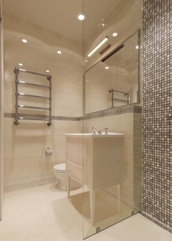
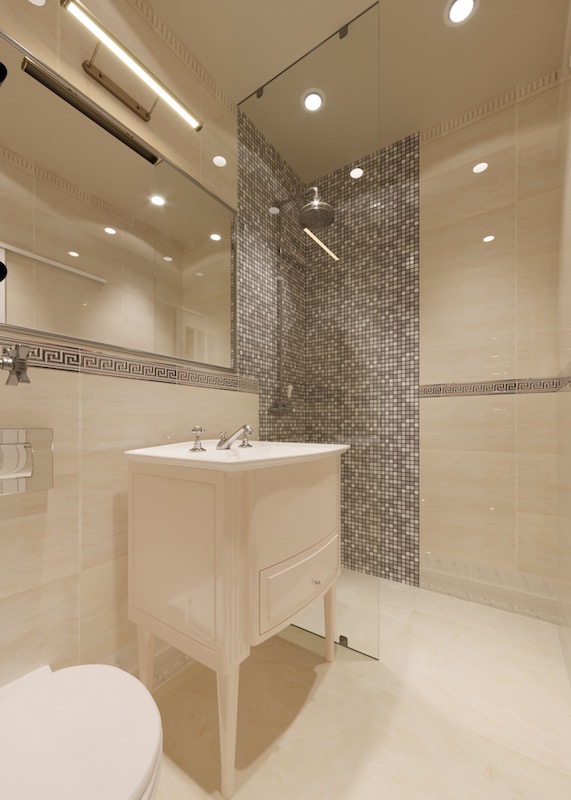
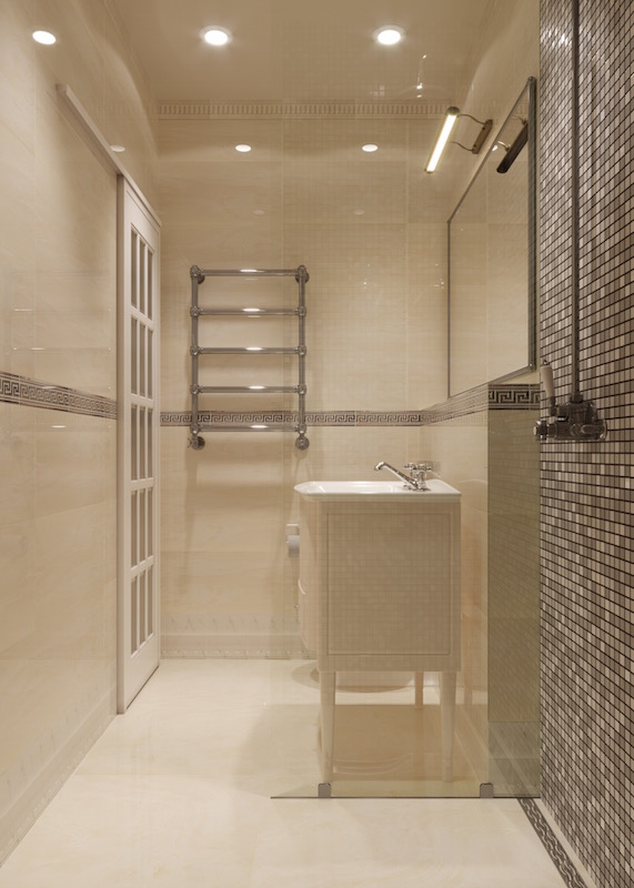
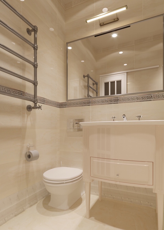
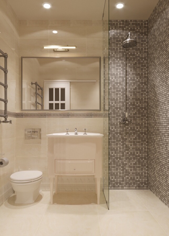
In today’s post, I want to share the pictures of the guest bathroom that I am currently doing for Puerto Banus apartment project. Designing such a small space can be very challenging sometimes, so here are some important principles that I try to stick to when working on tiny bathrooms:
-
Ergonomics is the most important aspect
When space is a luxury, I try to carefully plan every centimeter of the room, putting into consideration such significant aspects as traffic flow, the space required to comfortably use sanitaryware, the height of the furniture and appliances. For example, an adult person needs at least 110 cm in width to use a towel and at least 70 cm for a shower width. For more tips regarding bathroom ergonomics, you can read in this post.
2. Light colours help to visually expand the space
This is the most well-known principle of design when it comes to small spaces. Dark colours make the room look even smaller, while white or off-whites help to make it look more airy and spacious. It is important to consider whether there is or there is not a window in your guest bathroom. Bear in mind that colours look totally different under natural or artificial light, so you should always test a sample of paint or tiles under the actual lighting. For small bathrooms with no source of natural light, consider such colours as light beige, light grey or pastels.
3. Don’t forget about zoning
You might think that creating zones is not important in a tiny space, however, it also helps to visually make the room feel larger than it actually is. Here I divided the shower area with brown mosaics. It vertically “breaks” the wall and helps to correct the proportions of this elongated bathroom.
4. Choose compact furniture and sanitary ware
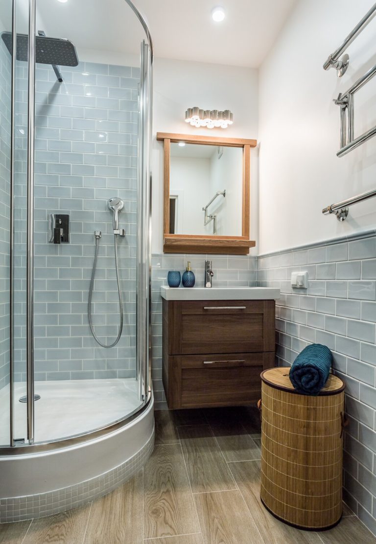
This is one of the most important aspects when designing a small guest bathroom. Although it might be tempting to choose wide vanity cabinets with plenty of storage, it will occupy lots of precious space, as well as will look bulky and disproportionate to the room. The more compact the pieces, the more light and unobtrusive they will look. Consider floating sink shelves and wall hung vanity units. Traditional Victorian style basins could be also a great option if they match the style you are going to create and if the storage under the sink is not so important.
5. Mirrors create magic
Mirrors depending on their size could almost double the visual perception of the room. For this bathroom I have chosen a large wall mirror, which will not only occupy the space above the basin, but will extend above the toilet as well.
6. Opt for transparent glass
Although matte glass for shower divider might seem a more practical option in terms of cleaning, it will block the view and make the room look even smaller, than it is. Transparent glass always looks more modern and neutral. Especially, if you are choosing for the shower area beautiful tiles or mosaics that will be a feature, don’t hide it behind matte glass dividers – let it become a focal point.
7. Consider niches in the walls
Although building a niche with shelves will eat at least 10 additional centimeters, in the small spaces it actually could be a great practical solution comparing to floating shelves. You can make the niche as tall and wide as you want so that plenty of shampoo and other bottles could be stored vertically.
Hope these tips were useful and if you have any questions, I would be happy to answer them in the comments section below.

