Innovative Design of Friendly Rentals Office In Barcelona
Have you been to Barcelona? No? Then, you definitely should go! I will give you now five good reasons why:
1) Sensational architecture of Antoni Gaudí. Barcelona is the birthplace of several masterpieces of the legendary Catalan – the Sagrada Família, the Casa Batlló, the Casa Milà and the Park Güell. All of them were granted the World Heritage status by UNESCO.
2) Delicious food which is very special in Barcelona: the accent is made on the seafood and fresh organic ingredients. And, of course, jam! “Jamon” here is the best in the world (in my personal view and please forgive me the rest of the world).
3) Night life: Spanish people know how to have fun and Barcelona will teach you too.
4) Shopping. My favourite spot is El Corte Inglés, but there are plenty of other places too: from little boutiques to incredibly huge malls. If you happen to come during big sales, don’t forget to take an extra suitcase with you.
5) Outstanding architecture and design. Barcelona is not only the homeland of Modernisme and wonderful gothic cathedrals: its modern creations are as spectacular and interesting as its historic buildings. You will be amazed!
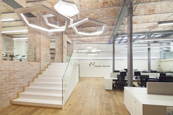
Talking about contemporary design, I want to mention here the project that I have recently stumbled upon: the office of Friendly Rentals in Barcelona. It is an impressive example of modern industrial design.
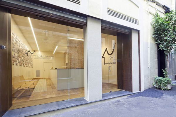
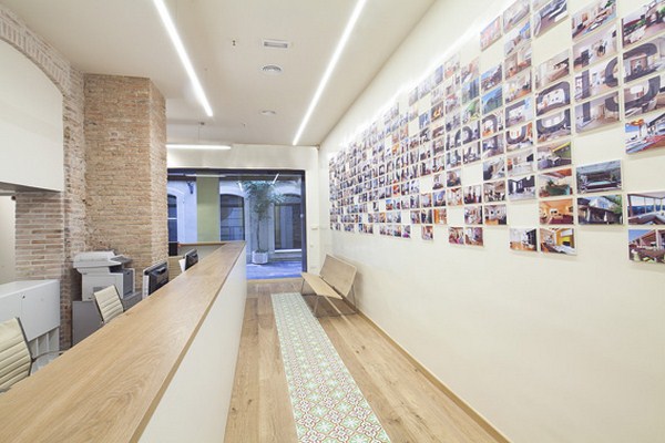
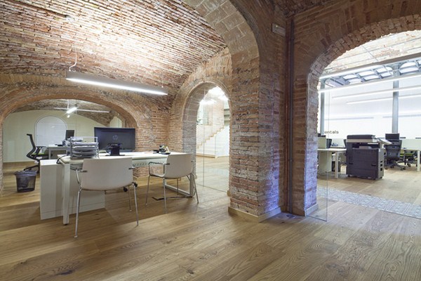
The project was executed by architect Paul Sweeney who transformed the old building in the centre of the city into a stylish office. The concept that he created can be described as “modern rustic” and he skilfully combined existing traditional materials of the building with new technologies and contemporary finishes. Huge windows from floor to ceiling in the reception room allow to bring lots of daylight and also don’t leave indifferent the passers-by who are tempted to stop and have a look inside.
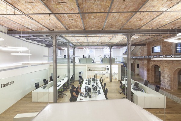
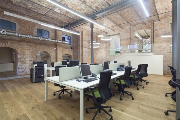
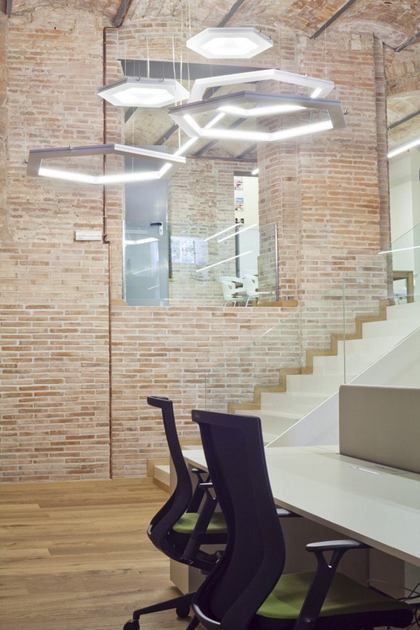
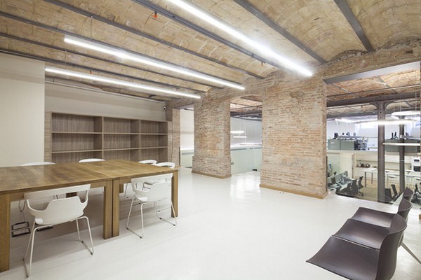
The walls and ceiling are made of exposed brick and supported by steel beams, which creates an industrial yet warm look. The interior walls and employee tables coloured in white and flooring made of light natural wood compensate the lack of exterior windows in some of the rooms and make the whole space look very airy and open.
The architects used an open plan team-oriented ‘bullpen’ layout, where employees are “divided” into several groups and can see and hear each other. This decision has a number of significant advantages: for example, it facilitates communication between people and creates a friendly informal atmosphere within the team. From the architectural perspective it gives the possibility to create complete uniform look which benefits the corporate culture of the organisation.
Lighting was also chosen according to the modern tendencies. Spectacular chandelier at the entrance is made of several hexagons suspended on different levels from the ceiling. It makes a big statement and immediately draws attention. Task lights for the employee tables represent simple horizontal pendant lamps, which by shape and material correspond with supporting metal beams used throughout the office.
Contemporary furniture complements the look of the office and was chosen according to the following design criteria: practicality, ergonomics and modern aesthetics.
