Design Of The Jewelry Shop In the Heart of Marbella
This year was full of interesting and challenging projects. One of them was diving into absolutely different field – jewelry design, and as a result, opening the physical shop in the center of Marbella.
We started renovation in January with the plan to open in March but then the quarantine messed up all our plans. We finally opened its doors in the beginning of June and in today’s post I wanted to share some photos of how it looks like.
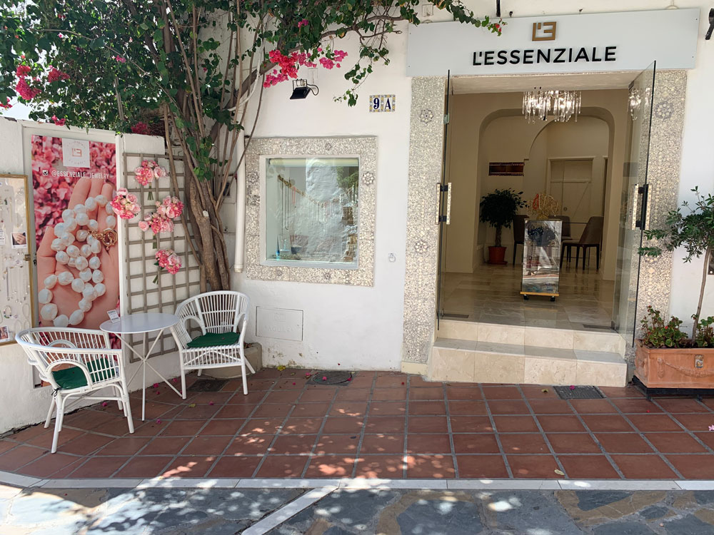
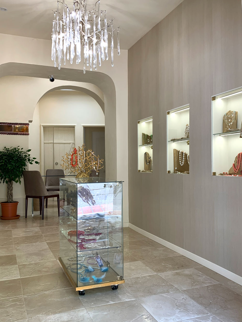
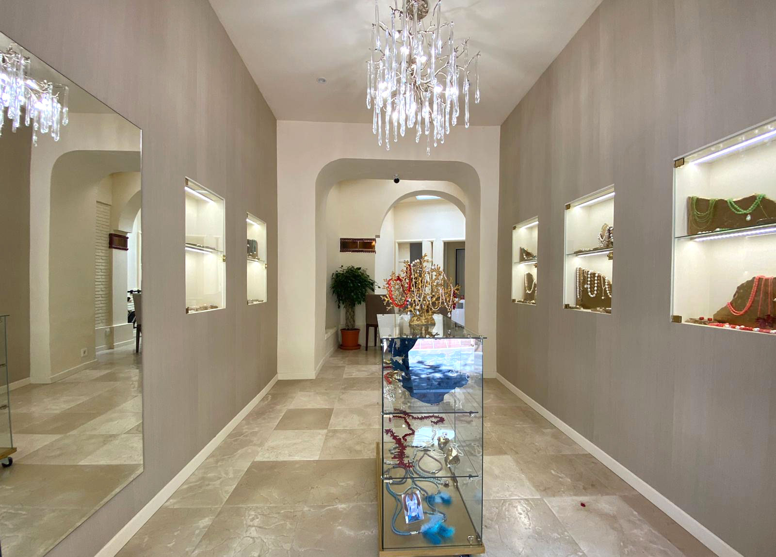
The shop is located in the old town of Marbella – its authentic architecture, greenery, ambience dictated the look and style of our shop.
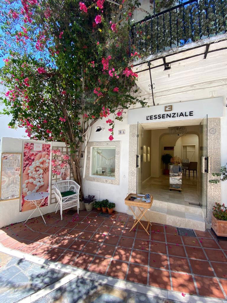
I wanted the shop to look very elegant and refined, but at the same time be in harmony with rustic environment of the old town. The entrance and window is decorated with mosaics handmade of mother of pearl.
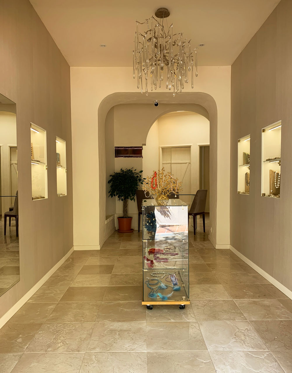
The first thing I wanted to change was the flooring. Initially there was a very old and ugly laminate, it looked very cheap and outdated. I wanted to change it for something more solid. Then I found this beautiful marble – Crema Marfil Envejecido (with special aged effect). It beautifully matched the rustic look of the street and also looked very luxurious and elegant.
The marble became my main inspiration for the overall color scheme. I used its different tonality of beige to look for the paint and wallpaper.
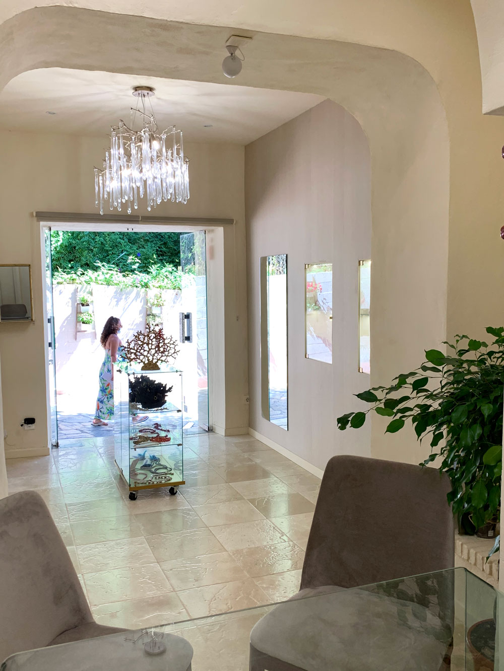
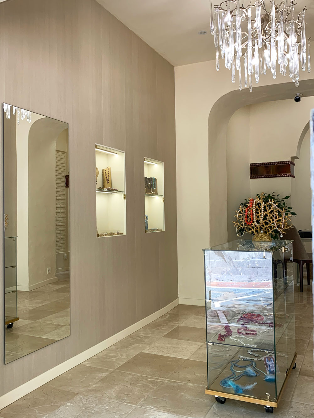
Beige wallpaper on two side walls make the space look more inviting and warm. The rest of the walls, ceiling and niches are painted in light cream. This color also looks very gentle and pleasing to eye – I didn’t want any harsh contrasts within the space but rather to achieve the sense of continuity and flow.
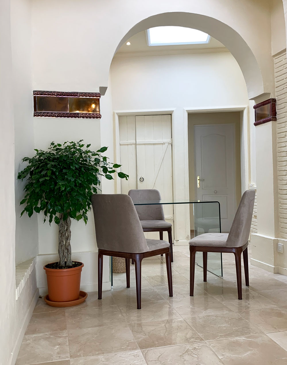
The architecture of the shop visually divides the space into three little areas. I arranged a small “office” in one of them. I wanted to create very clean and minimalist look – that’s why opted for a glass table, and three simple chairs. All equipment (printer, stationery, stock of the shop were hidden inside the storage room). Large ficus plant brings life to the space and makes it look more lively.
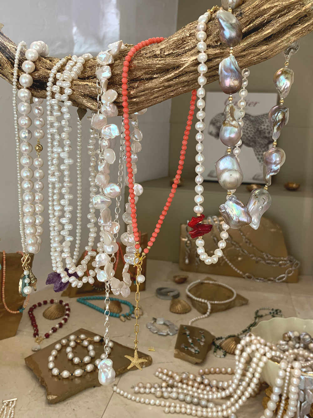
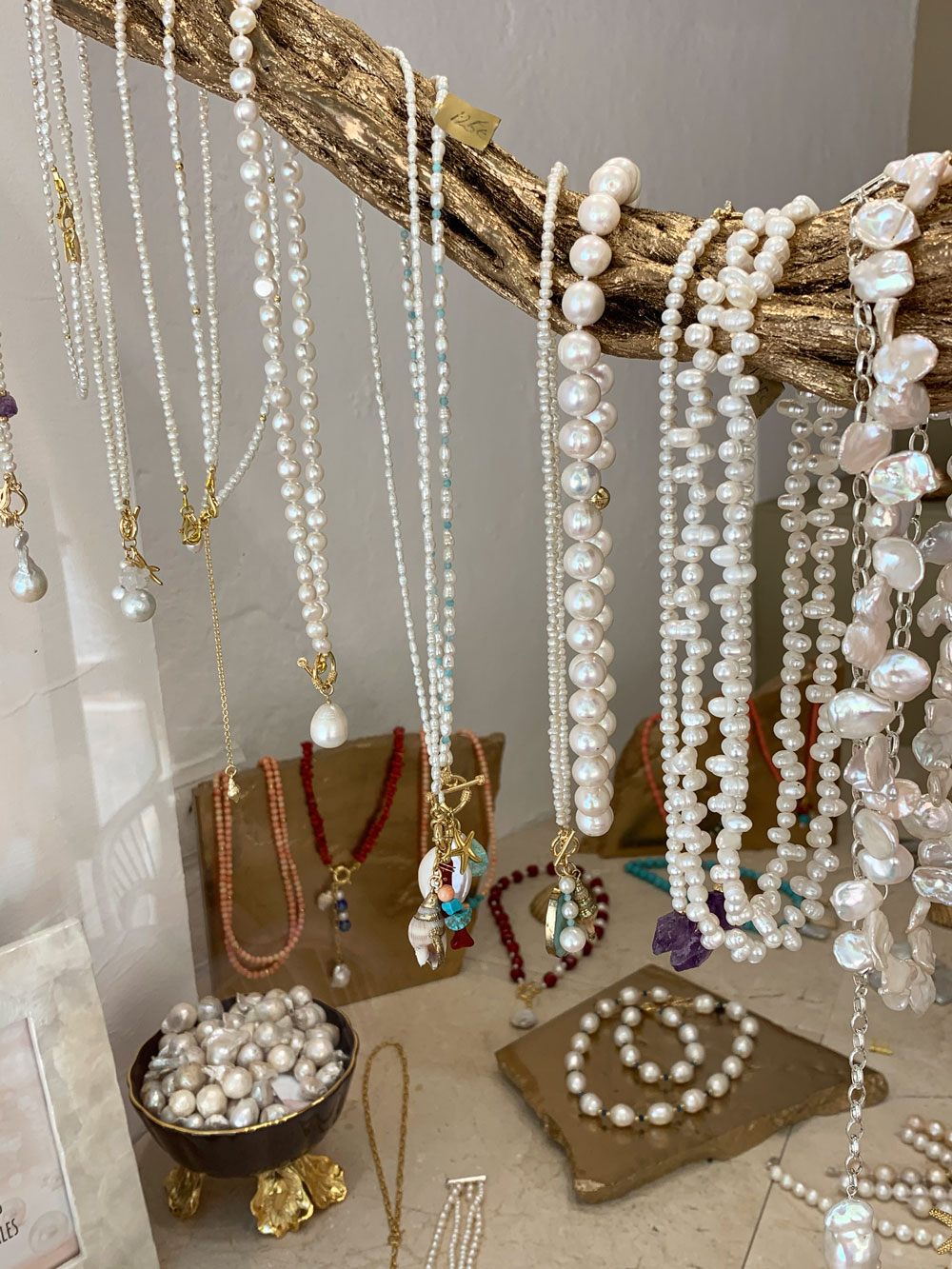
When renovation stage was over it was time for decorating the space. I wanted to try some creative approach of exhibiting jewelry, something different from standard ready made solutions found everywhere. For example, I used a simple tree branch that I painted in gold to display some of my necklaces:
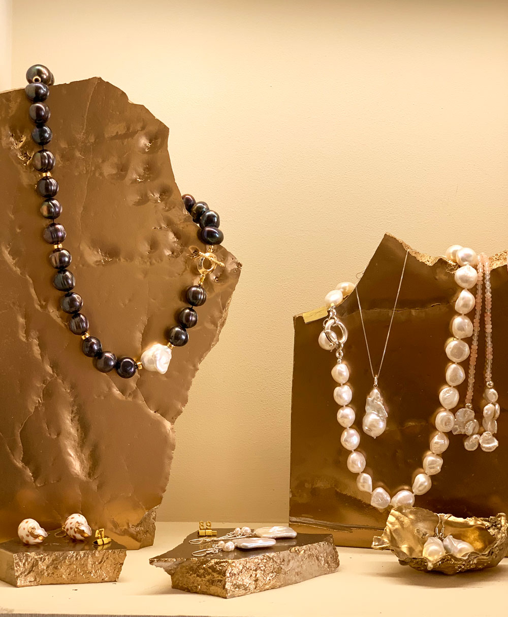
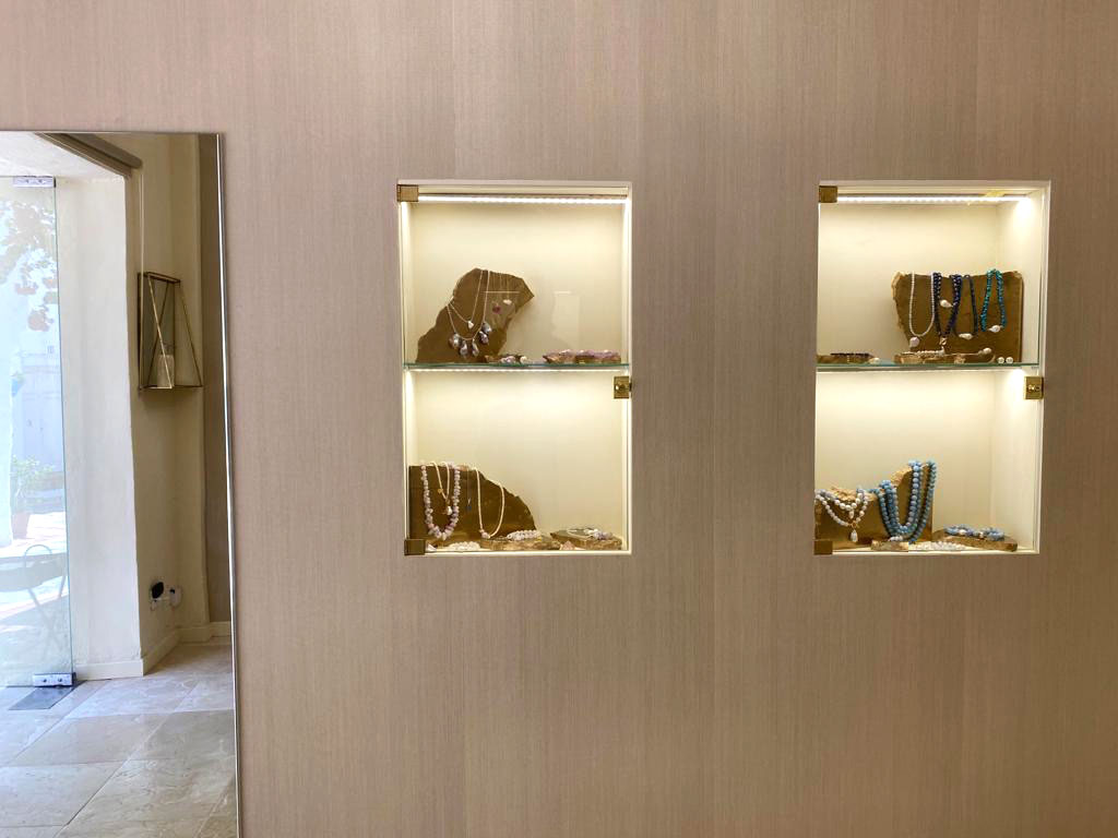
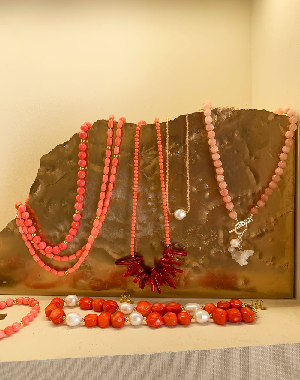
Then I used the pieces of the same marble that we have on the floor to display other pieces of jewelry. Golden spray paint highlights its beautiful texture:
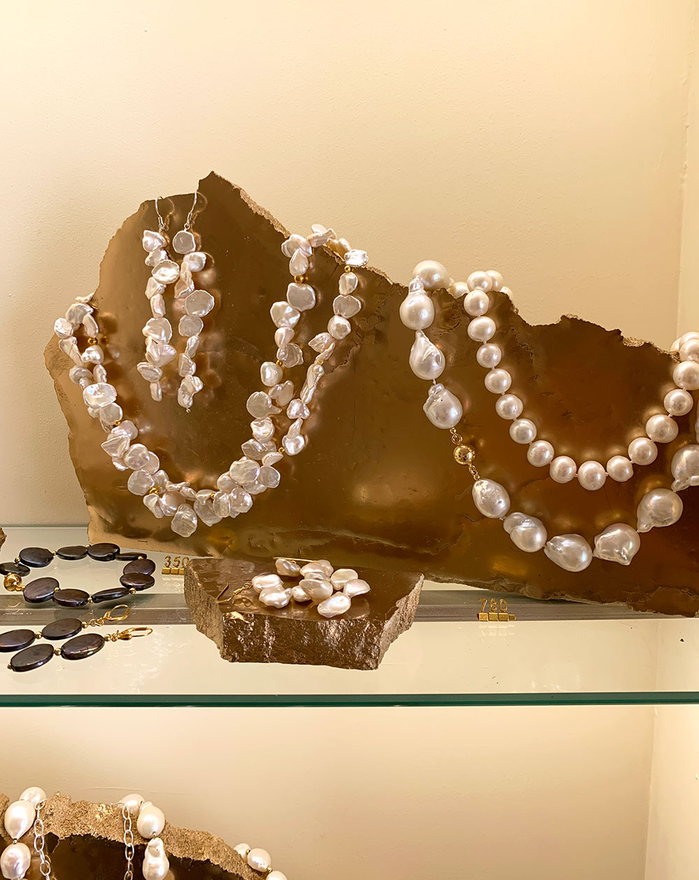
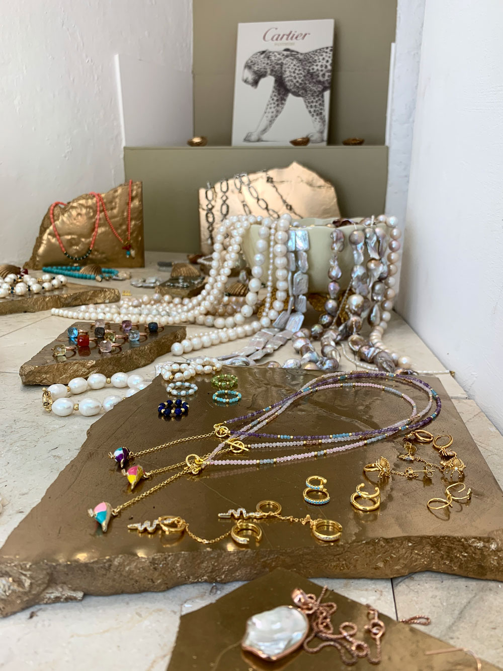
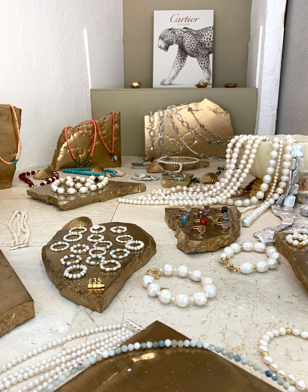
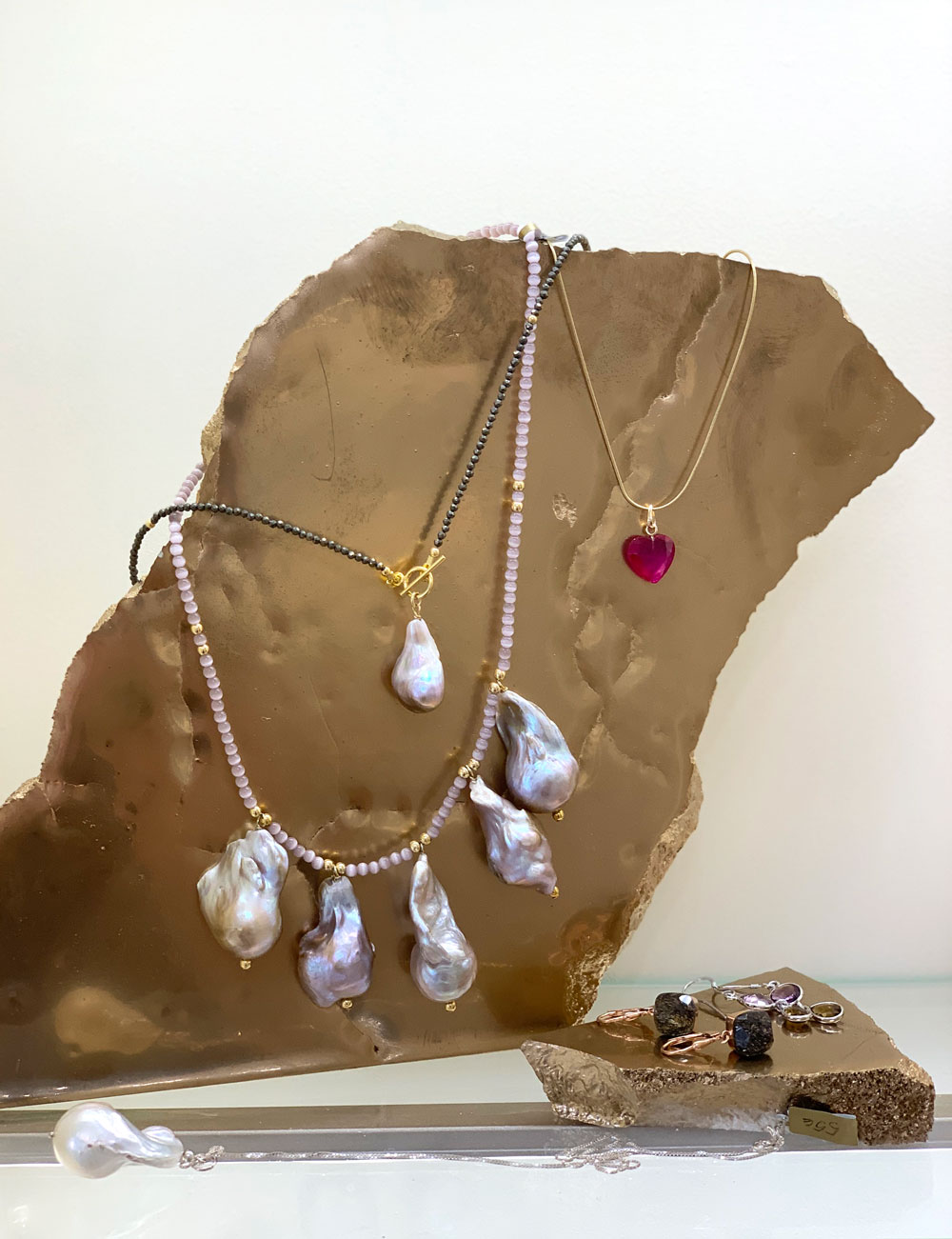
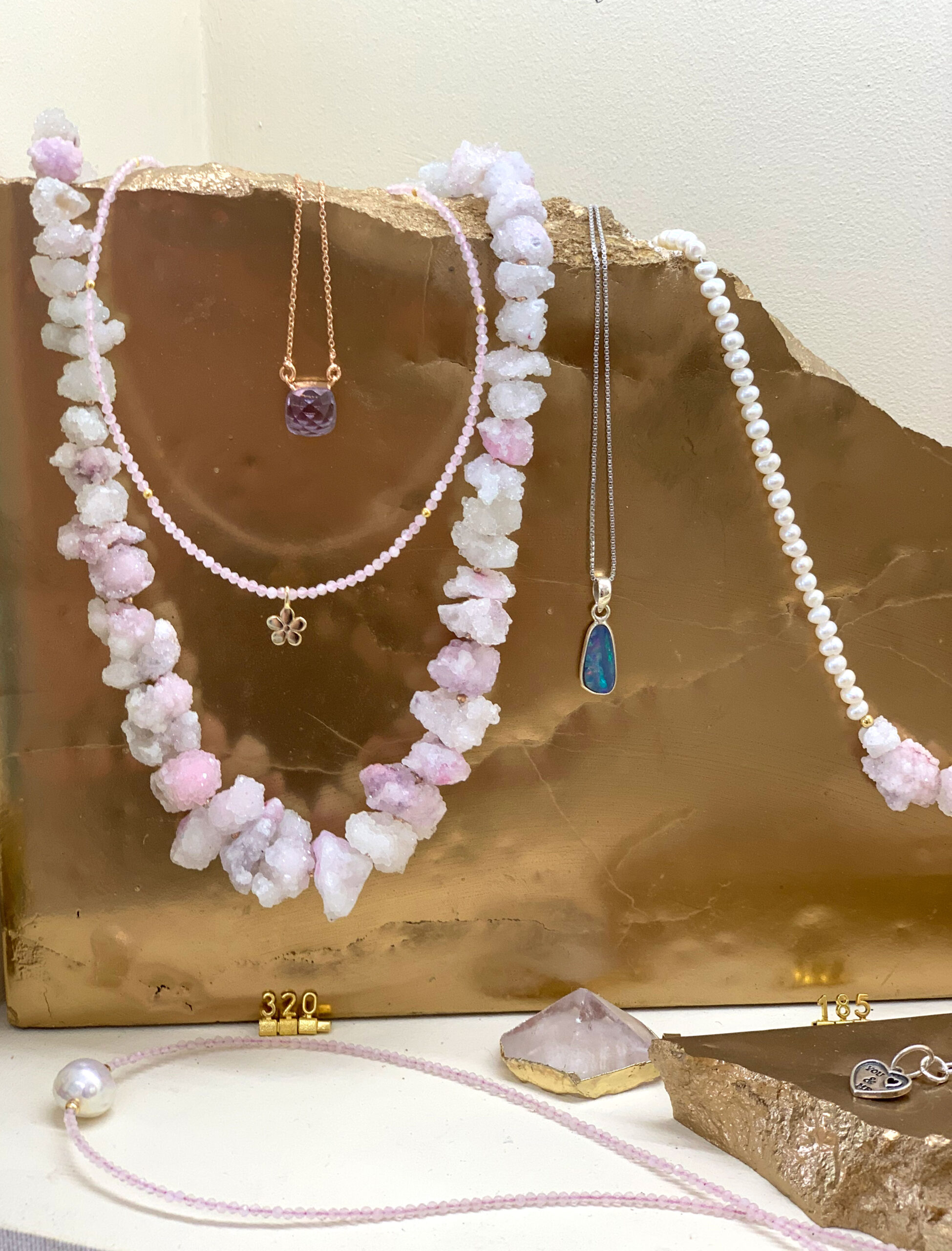
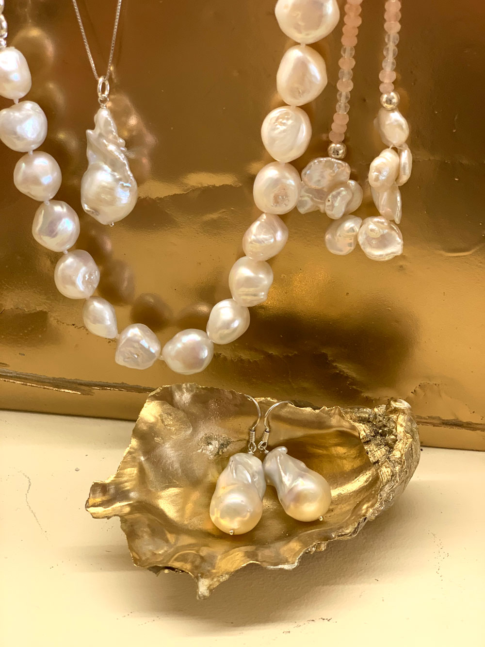
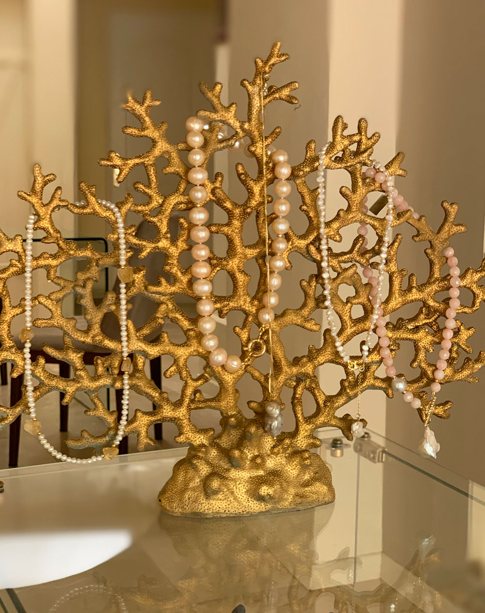
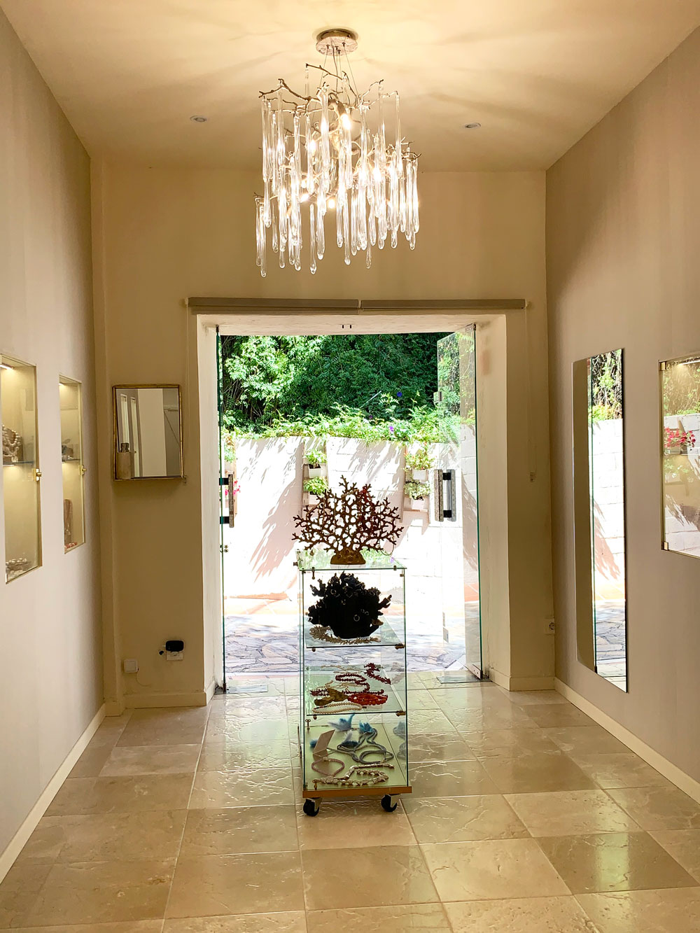
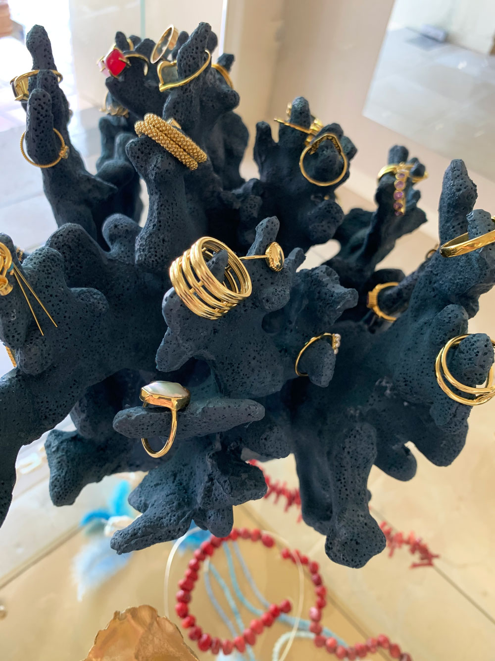
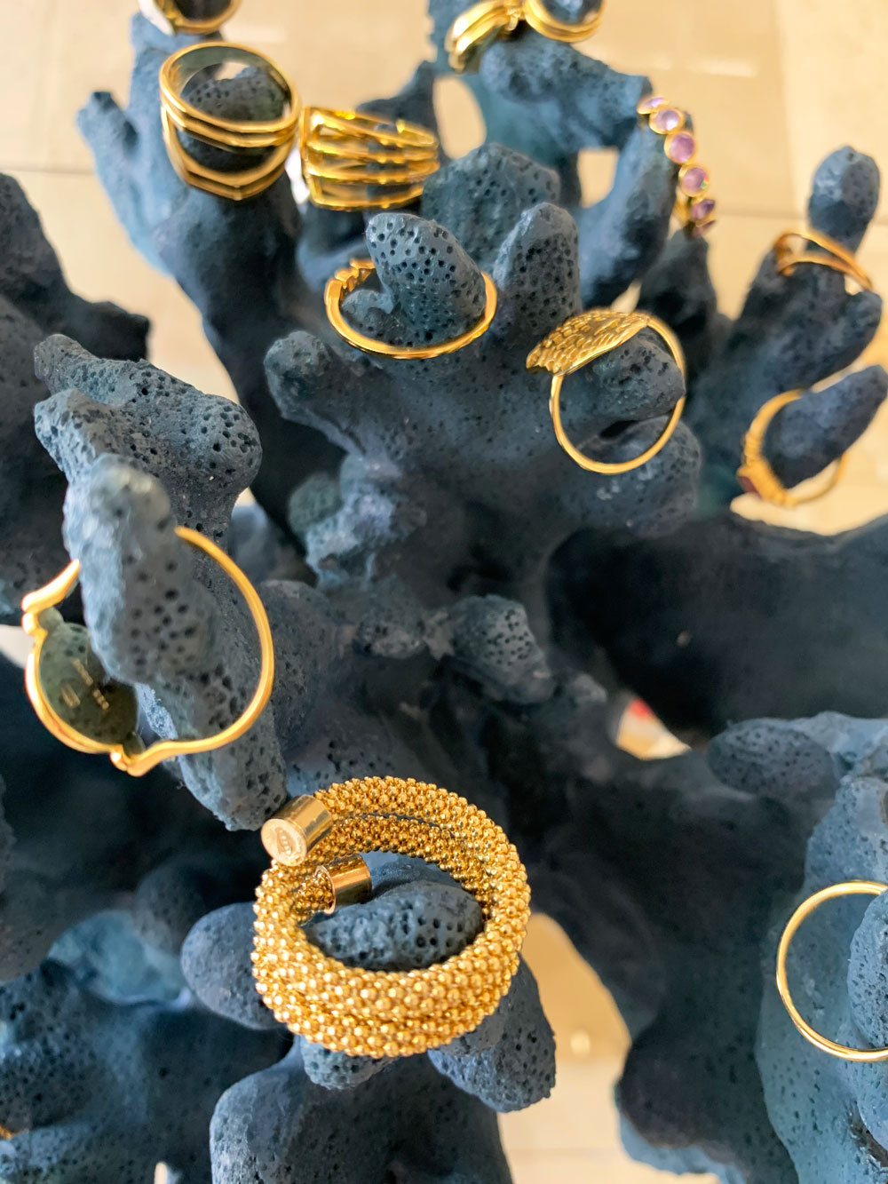
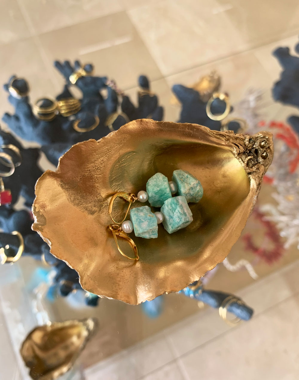
In the middle of the room I placed small glass case to show collection of rings. I used two large artificial corals to display them, dark navy blue colours beautifully highlights each piece:
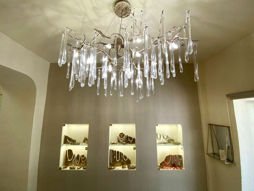
But, of course, the main focal point of the design became this beautiful chandelier from Portuguese brand Serip:
One more detail – the large mirror on the left hides the access to the window display.
What do you think of the design of our jewelry shop? Looking forward to your comments!

