9 Things You Need To Know About Colour
Colour theory is a massive section of Interior Design Course. Professional Interior Designers spend years learning about different colour properties, their behaviour under various lighting and psychological impact they have on our mood and state of comfort. Doesn’t matter how many books about colour you have read, real knowledge comes from experience.
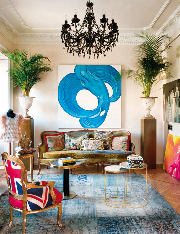
Many people feel very insecure about decorating with colour and prefer to use a safe design approach – neutrals. Neutral colours all go together and can be used in any combination as none of them will try to dominate the others:
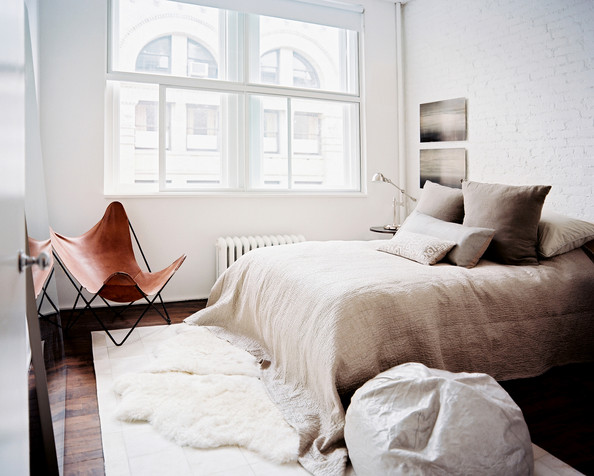
However, knowing some basics about colour and its properties, you can start experimenting with it, which will allow you to create very bold and stylish spaces.
One thing to mention as well is that over the years the colour theory has changed. What before was considered as dogma is every day disproved by modern designers. However there are certain rules which remain unchanged.
Here are 9 things you need to know about colour before starting to decorate with it:
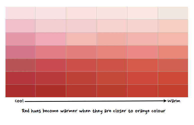
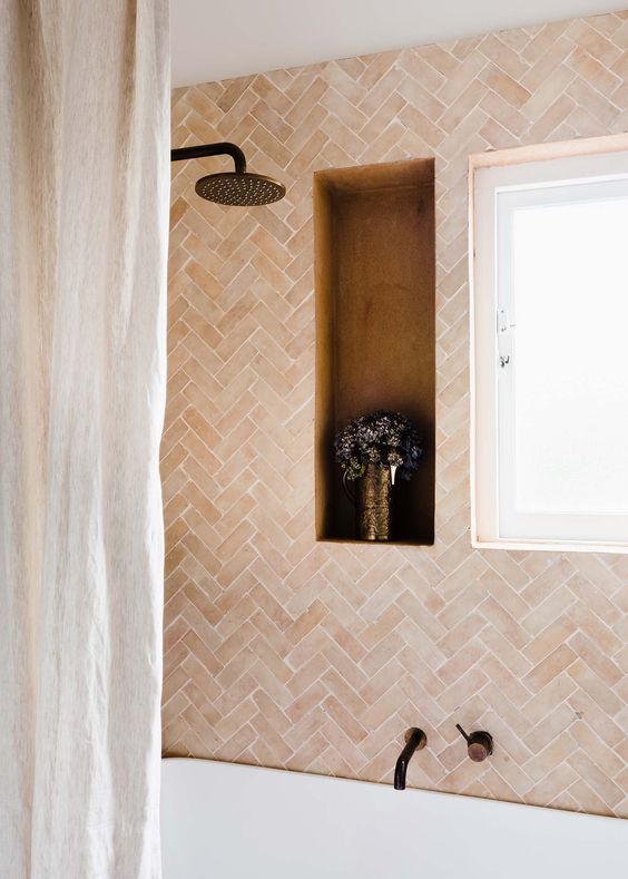
1) All colours can be divided into two categories: warm and cool. Warm colours are the hues from red to yellow including browns. Cool colours are hues from blue-green to blue-violet including most greys. Each colour at the same time has warmer and cooler tints: for example, red, which is a warm colour, can seem cooler, if a bit of blue pigment is added, and, on the contrary, warmer, if it has a lot of yellow pigment in it.
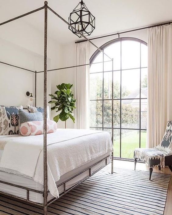
2) Dark and warm colours advance, light and cool colours recede. Remember about this, if you want to make a low ceiling seem taller: you just need to paint it in light cool colours or simply white. A general rule of thumb is that you need to paint a small room in very light colours for it to seem larger. However, there is one important limitation: this doesn’t work in rooms with a low level of natural light (e.g. cloakrooms, bathrooms, etc.). If you paint them in white, light neutrals or, even worse, pastels, these colours will appear dirty. The best solution in this case is to use very strong bold and dark colours, which will pull the attention from the small sizes of the place.
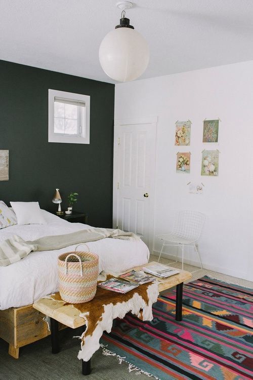
3) Colour can be used to cool down or warm up the atmosphere in the space. A chill of a cold north-facing room can be taken away by using warm colours and vice versa:
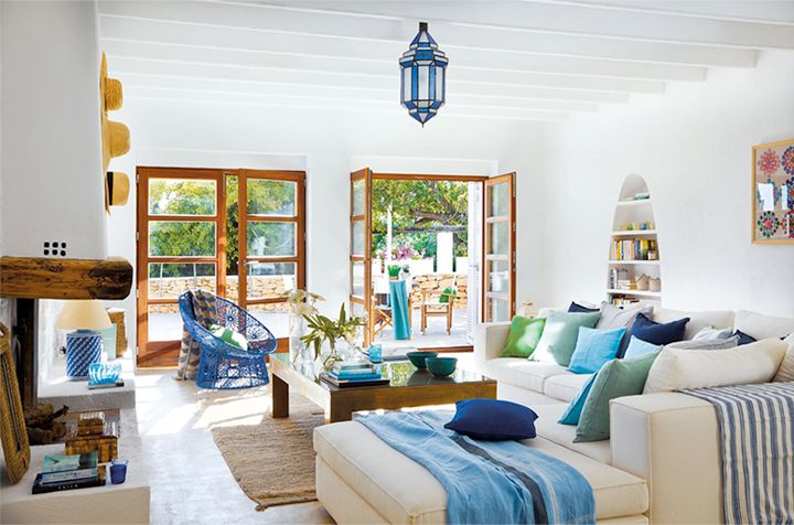
4) Colour affects our mood and psychological state. Did you know that red increases blood pressure and adrenaline, enhances sexual desire and stimulates appetite? Now you know why fast food restaurants often uses red to decorate its interiors: they just want you to eat more and faster. Generally speaking, warm colours, such as yellow, orange, red enhance metabolism and stimulate our activity, while greens, blues and purples have calming and relaxing effect. You can read more about it here.
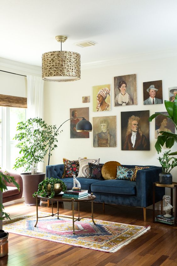
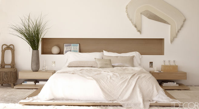
5) About neutrals. Neutrals are colours which don’t have predominant coloration. They include grey, brown, taupe, beige, cream, and off-white. Neutrals have a calming effect on the eye and create a peaceful and relaxing environment. Using neutrals as a background is a safe design approach. However, without some bright accents, rich textures or stylish furniture and accessories, the room might look dull. Cream is the most tricky color among neutrals as it needs plenty of natural light for it to look fresh. If you decided to decorate your room using only neutrals, remember to add a lot of different texture to a space:
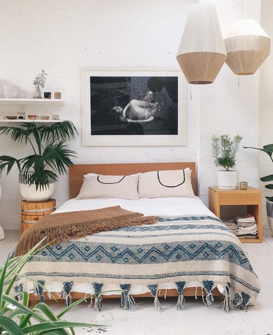
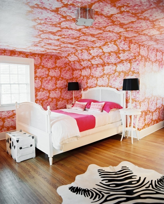
6) About Black & White. Did you know that monochrome can also be divided into warm and cool? Apparently yes: white is cool, black is warm. That’s why totally white rooms often appear cold and sterile, and totally black rooms might seem oppressive. Use a lot of bright and vivid colours when decorating white rooms: add paintings, cushions, rugs, accessories. In very dark or black rooms you need a lot of light reflecting surfaces because black absorbs light more than any colour. Black and white is a very powerful combination, and if you don’t allow one colour to dominate the effect might be too overwhelming.
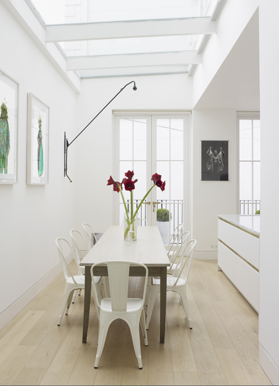
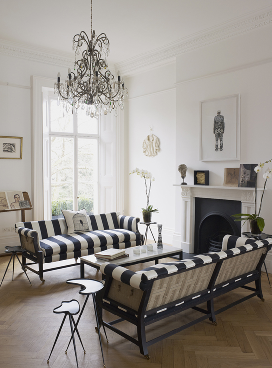
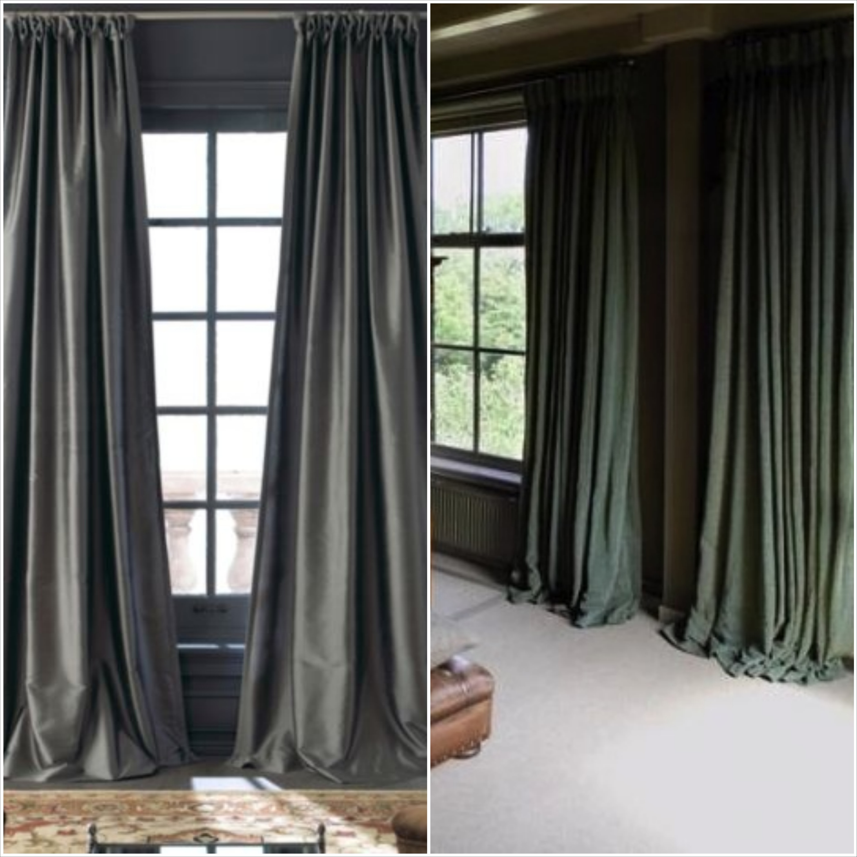
7) Same colour will appear differently, depending on material’s texture. Light-reflective textures (such as lacquer, paints with sheen, silk, satin) bounce the light back so colours on these surfaces look brighter and stronger. Light-absorbing textures (such as matt paints, linens, tweeds and most wools) do not reflect the light so the colors on these surfaces look darker and more subtle.
8) Colours look differently depending on which background they are. Thus, complementary colors (those which are opposite each other on the colour wheel) intensify each other. For example, red on a green background will look even brighter, comparing to red on a grey background.
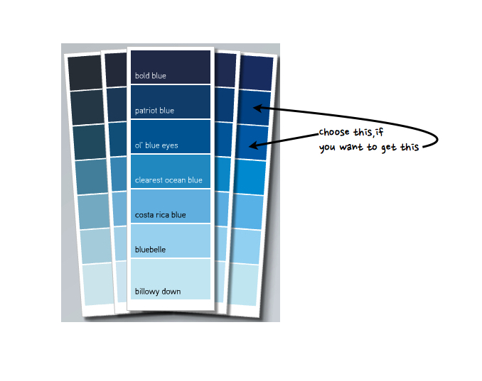
9) When choosing a colour, remember that it will appear darker and brighter on the large surface. When I choose a paint I always take one value higher from the paint chip to get the hue I want. See what I mean:
It is a good practice to paint a large piece of cardboard to see how the paint looks like in actual lighting before starting to paint the walls.
What other tips you can mention about colour? Or what were the challenges you faced? Looking forward for your comments.

