Essential trend 2013: Black & White
FROM RUNWAYS TO OUR HOMES
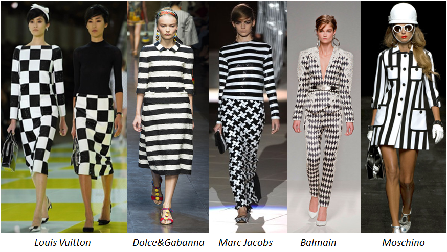
Looking at spring collections of top fashion houses it looks like all designers just fell in love with black and white geometric prints. Without doubt, it has become the hottest trend of Spring 2013.
Judge yourself:
Black and white has always been a classic combination but this season the striking prints make all the difference: squares, stripes, checkerboard, diamonds and chevron. Dresses with these patterns are dramatic, bold and unforgettable. In an outfit like this you will never remain unnoticed.
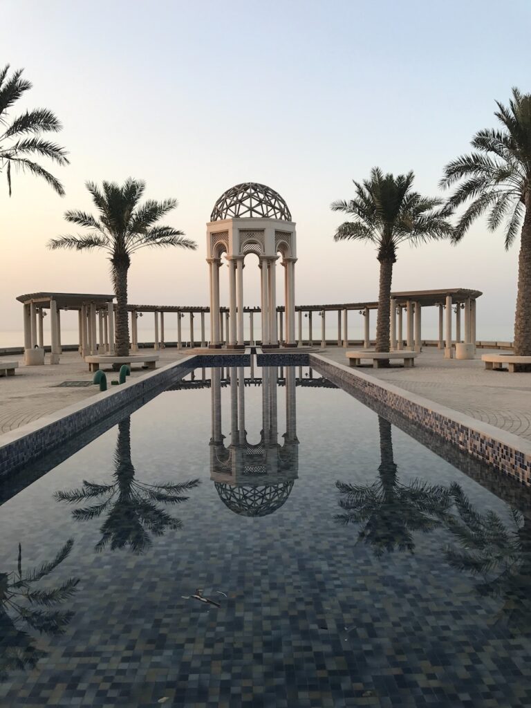
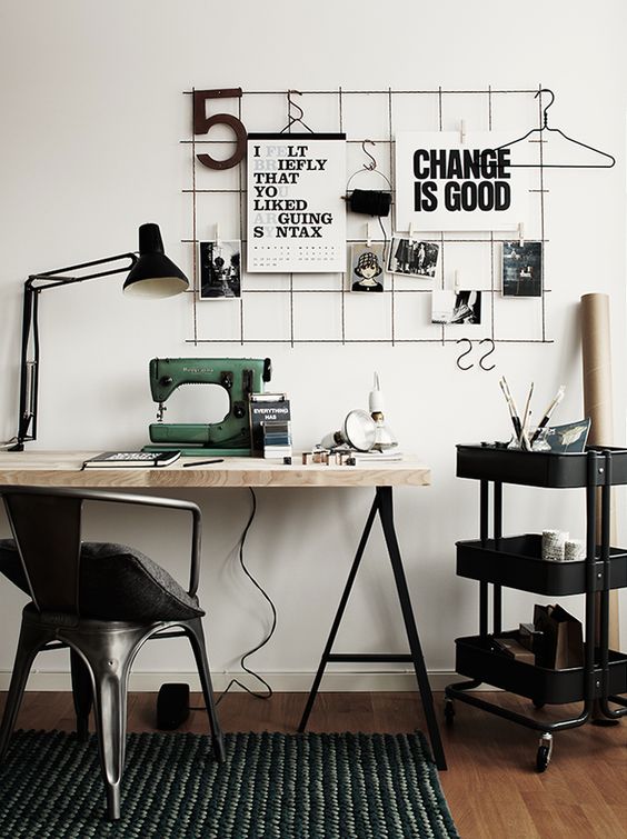
Like always Fashion and Interior Design go hand in hand: many interior and furniture designers have tried this chic and powerful combination:
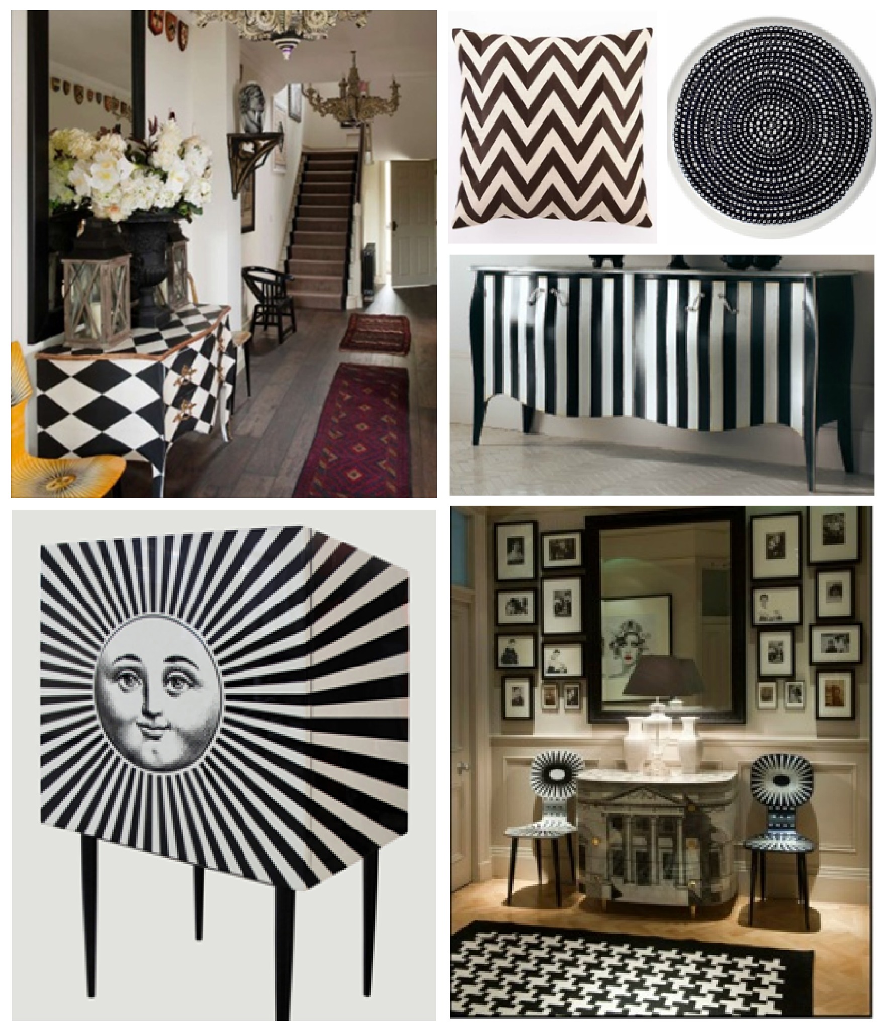
Objectively speaking black and white geometric patterns are not something new in Interior Design. For example, checkerboard floor tiles are the classic feature of traditional interiors. However, if you want to successfully use this bold combination you need to consider several rules:
1) Black & White is always a very powerful duo. Too much of it may be very uncomfortable and tiring for a human eye.
2) When creating a totally monochrome scheme allow one colour to dominate. In equal proportions black & white can be too flashy and loud.
3) Use a touch of accent colour: it will give a lift to the overall scheme.
4) Furniture with black & white geometric prints always draws attention: use one or maximum two pieces, allow it to be the focal point of the room.
5) By using checkerboard tiles or flooring with large geometric prints you can visually expand the space. Consider this option for a bathroom or kitchen or any other room which you want to look bigger.
Black and white can be elegant or bold but never boring. Are you ready to add some drama to your room?
What do you think about this trend – do you like it?

