The Best Color Schemes for Interior Design
Color has the power to completely change your home. Just like our choices in clothing, furniture, and books, colour expresses and effects who we are. It has a tremendous impact on how you feel in your home and the way it presents itself to visitors.
Color’s selection, therefore, deserves a lot of thought, consideration, and passion. And important as it may be, it is also one of the most rewarding phases of design for the simple reason that it allows your personality and that of your family to shine in the home you’ve built.
Take a look at new colour scheme trends and timeless effects colours have for your home.
Before You Start
Hard Surfaces and Furniture
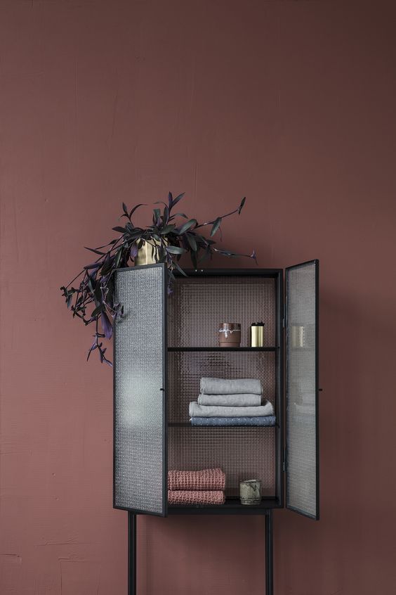
Tile, carpet, and furniture come in less variety of colours than paint so it’s generally advisable that you select these first. One key to all colour schemes is a balance, so if you choose some vibrant fabrics for your upholstery it’s likely you will want to tone down your selection of paint for the room they occupy. Pattern and colour tiles add a great deal of visual excitement to a room and should be similarly balanced with more sombre or serene colour palettes. On the other hand, plainer tiles and stone often act as a base material that can be used with either restrained or vibrant colour schemes.
Mixing Colors
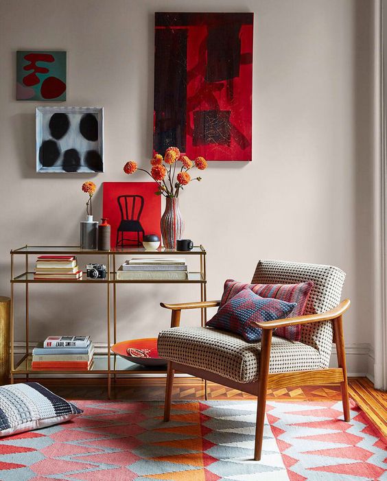
Mixing colors in equal measure is almost never a good choice. Too much competition leads to visual anarchy and will drive you away from the confused look it leaves inside your home. What tends to work best is selection of a foundational base color with 2-3 accent colors. Accent colors will change the space a great deal with just limited use. Use them in moderation, there is no need for colors to compete for surface area. Another rule of thumb is to use some form of white, grey, or brown to balance more vibrant colors to some degree.
Tint and Shade
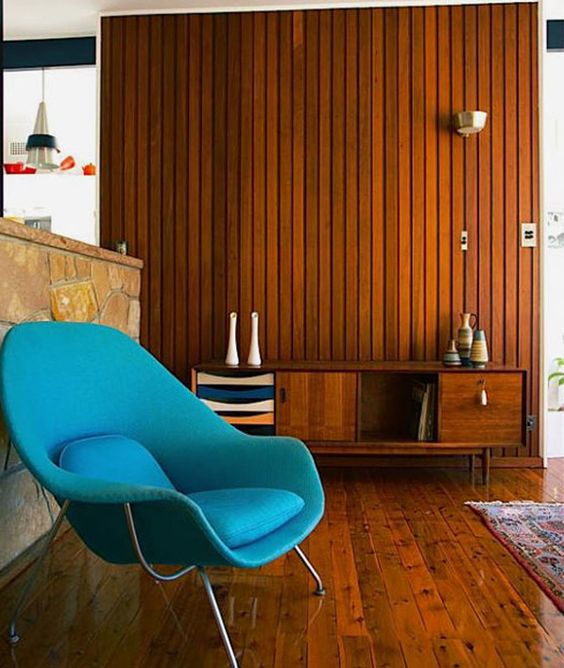
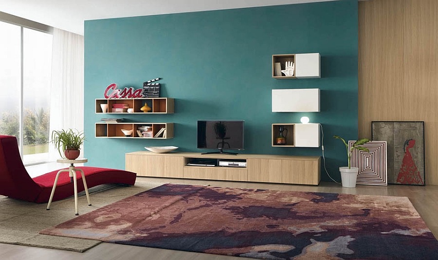
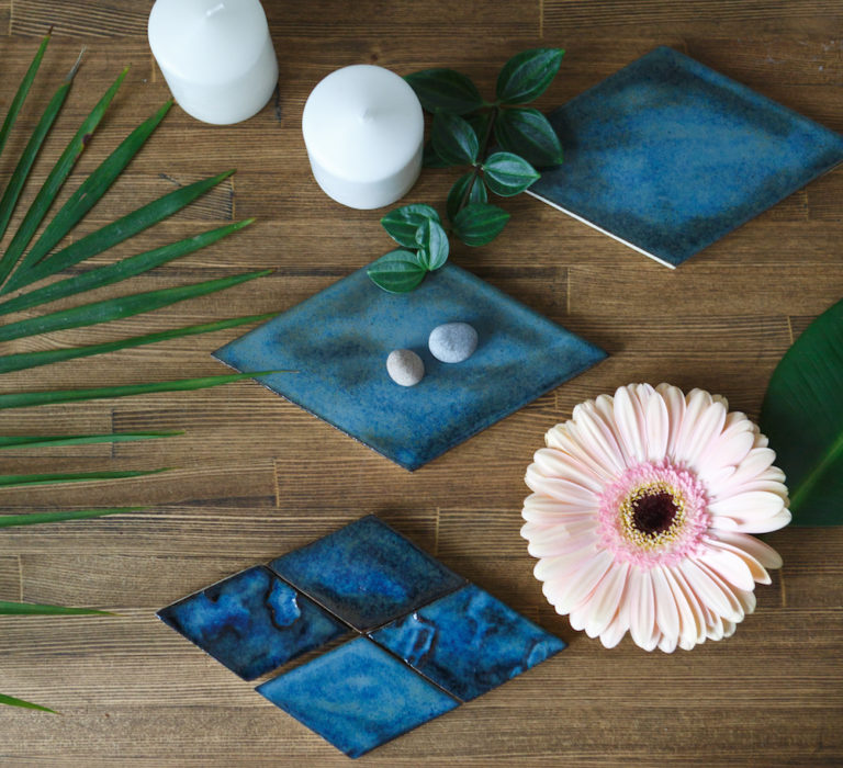
Although different varieties of a color share the same attributes, selecting one with a lighter tint or with a darker shade of the parent color changes their mood. Shades, like navy blue, are stronger and can overpower a space if not checked with calmer tones. Tints, on the other hand often act as a bridge between neutrality and vibrancy, and even other colors. Turquoise, for example, is an even balance of blue, green, and white.
Color and Mood
Different colors can create radically different moods within the same space. Knowing how to capture their emotional value and psychological connotations is key to making colors work for the type of home you want to create. Especially when you’ve purchased a flexible and customizable home like those of Vision One Homes, you want to be sure it bears your personality and your perspective.
Red
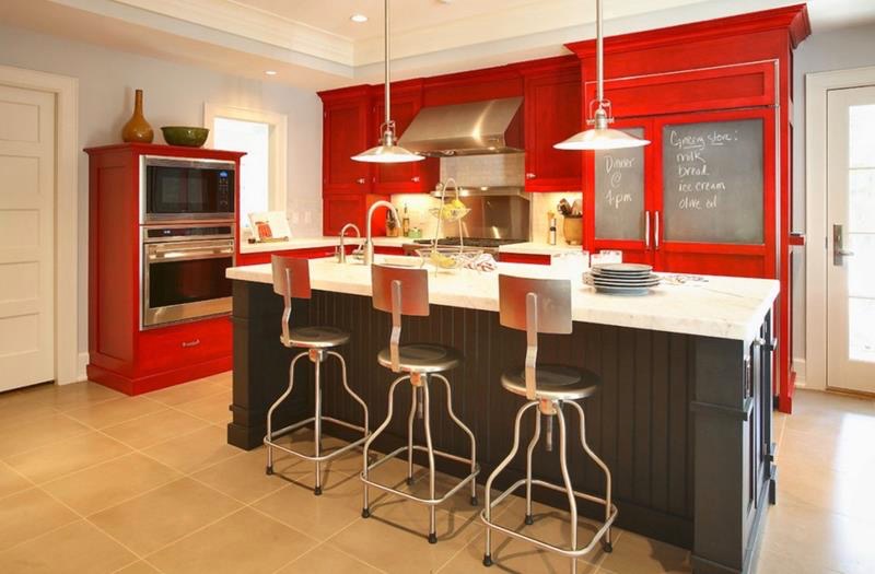
A strong and bold colour, red is not frequently used outside of the kitchen or dinning room accept in more muted and darker shades. Red brings warmth and energy to space, encouraging action and giving off connotations of power. Especially when seen in natural materials like brick or ceramic, red can have also had a cheery effect on a room and work well with other colors.
Green
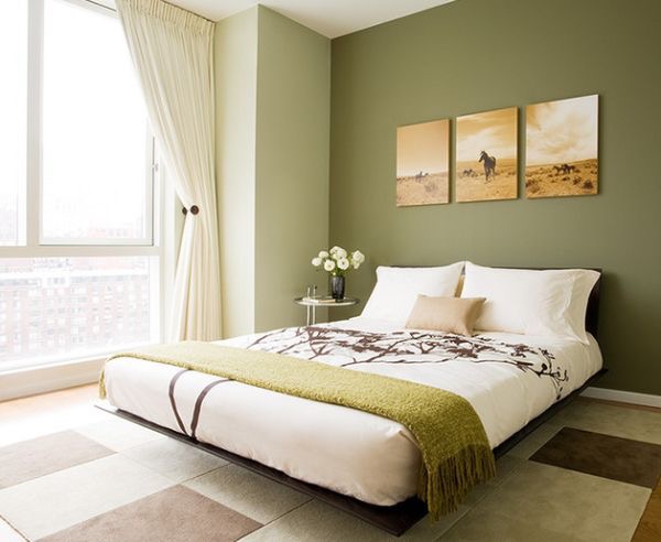
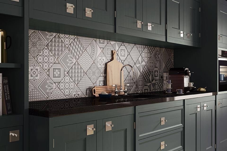
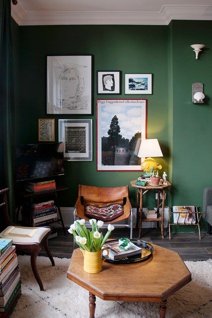
Green is among the freshest and most natural of colours. It brings calm and is suited to places of clarity and contemplation. As a color seen so plentifully in nature, uses of all shades of green can have a regenerative effect on the mind and promote health consciousness in spaces like kitchens and bathrooms.
Blue
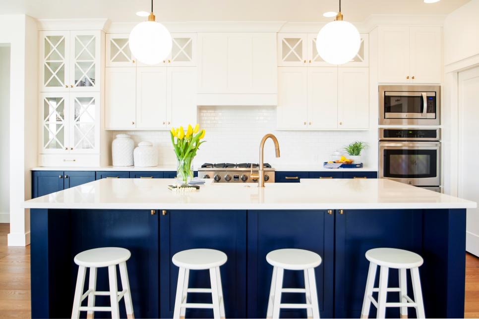
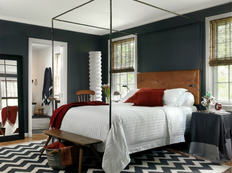
Like green, blue serves a calming purpose for rooms. Blue, however, is a far soberer and reflective color than any other. Evoking images of the vast expanses of lakes and oceans, it works well for relaxing spaces like bedrooms and living areas. Dark blue should be heavily balanced or used as an accent with calm neutral palettes. If this is not done, deep blues left on their own can create a depressive atmosphere.
Yellow
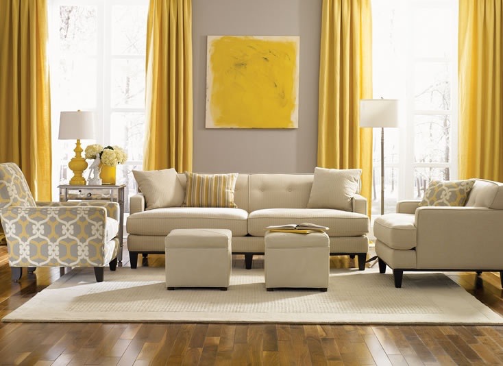
Yellow is a colour that associated with brilliance and energy. It can help to brighten rooms and make them seem larger but is not generally something to be used in a large application. Like too much sugar, too much yellow can be over-stimulating and sour your relationship with rooms too saturated with it. Yellow is much better used in smaller spaces or as a vibrant accent colour.
Orange
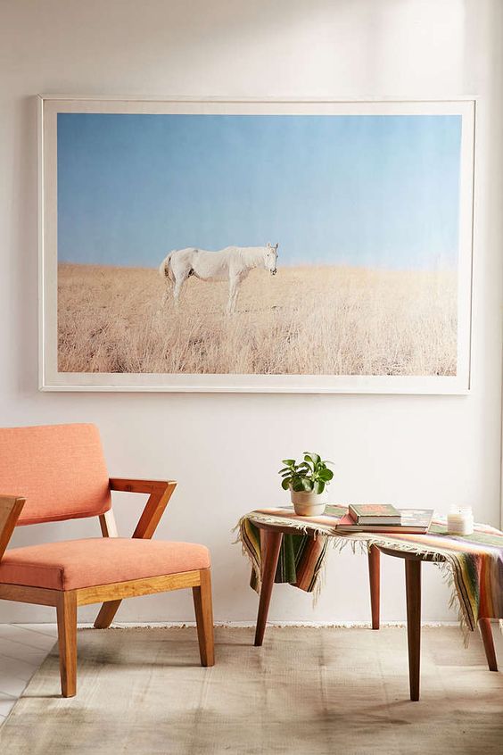
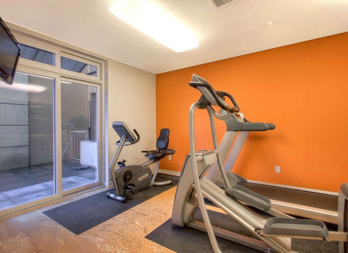
Orange is another color best kept in restraint. Just like the fruit, it has visual symbolism for health and vitality, but can simply be too much if used in electric or overly vibrant shades outside of high energy spaces like personal gyms. Calmer shades of orange like peach work better in larger use and form an acceptable bridge between vitality and serenity.
Purple
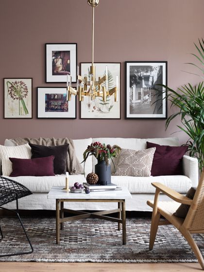
A mixture of the strength of red and the calm of blue, purple is amongst the most enigmatic choices for colour schemes. Long associated with royalty, it brings visual richness to space and is well used in almost any room for its mixed emotional appeal. In darker shades, purple is more contemplative; in lighter ones, it is fresh and lively. It works exceptionally well with plain, neutral colours.
Neutrals
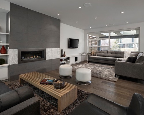
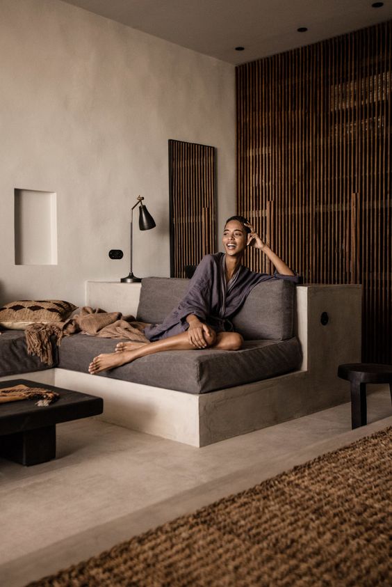
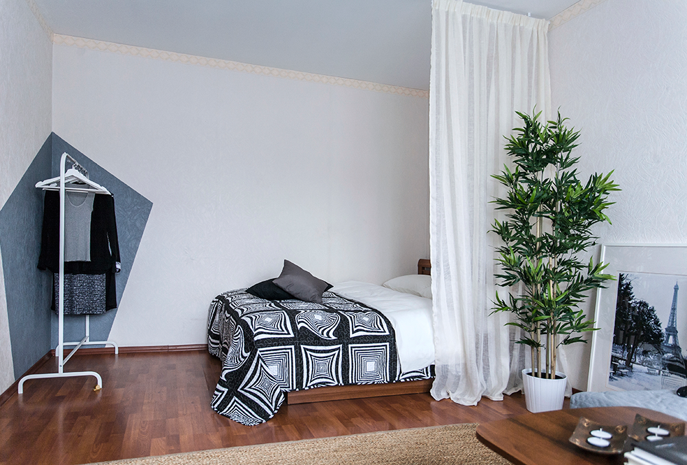
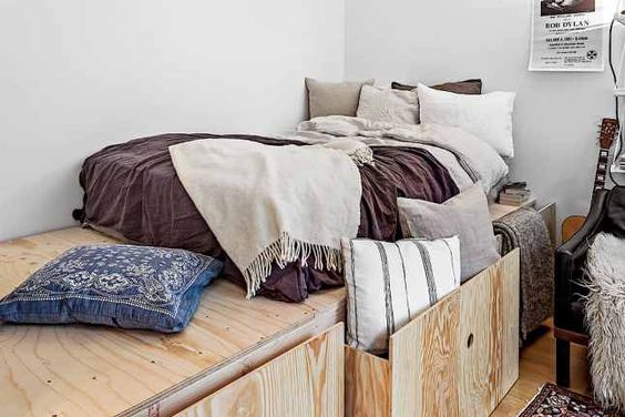
Neutral colours like grey, white, and brown can act as a foundation for more vibrant schemes or set the stage for an all-neutral color palette. Neutrals give a soberer and restrained feeling to space, which makes them excellent for rooms with a more serious purpose. At the same time, neutrals provide calm and clarity that makes them well-suited to bedrooms where people decompress and relax.
Black, although a neutral, is a very strong and overpowering colour choice for large applications. It is well suited to accenting other colors, including other neutrals, in furnishings and fixtures. Similarly, brilliant whites can be too clinical if used outside of the kitchen or bathroom, and require balance with other colours when used even there.
Color Trends on the Rise
Although the essential aspects and connotations of colours haven’t changed for centuries, their endless variety of combinations and tones often create stylistic trends under common themes that fall in and out of fashion. Notice the large use of whites with wood floors in the last decade or common use of purple and greys in brochures? Those were trends. Thankfully, the pink carpet trend of the 80s is well behind us. Today, there are several new trends on the up that you can consider for your own unique application.
Earth Tones
Earth Tones are timeless and have been used throughout history. With concern for healthier and organic lifestyles taking off in many industries, they’ve become a major trend for the future. Pantone has labelled Greenery as Color of the Year for 2017 and shades of green are rising in popularity. Yet the earth tone trend also explores the natural tones of other colours such as dark apricot for orange and ochre for yellow.
Lighter Colors
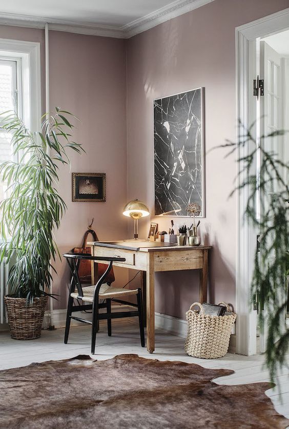
As homeowners hunger for more natural appearance, they look to natural materials like wood to shine, and this is best done with lighter tints of your favourite colours. Light tones like rose quartz, taupe, and aqua can help brighten the natural materials you want to accent in your home.
Eclectic Schemes
Color forms a vital part of new stylistic trends for an eclectic mix of patterns, materials, and historical references that stand out in our somewhat homogenized world. Although not copies of the past, this approach frequently mixes Victorian and Edwardian references into contemporary designs with metal fixtures, black accents, and deep, bold colors.
Conclusion
Colors offer endless variety and opportunity for experimentation. No one color scheme is the same as the next, which allows you to truly make your mark on your home. Now it’s time to get started!
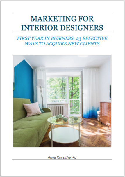
Are you interior design lover? Check out my eBooks about interior design:

