Styling Tips For Interior And Product Photography
I was recently hired to do a styling job for Tile Atelier – high-end artisan ceramic tiles studio. Together with photographer Olga Shangina, we did some beautiful shots and in this post, I want to share with you some tricks that I use for interior and product styling.
1. Look for inspiration
As with any interior design project it is important to start with making a concept. I had a look at the tiles that we needed to shoot and then searched my Pinterest boards for beautiful photos to get some inspiration. I recommend not to look for styling shots featuring similar products as I believe that this might block your own creativity and you might just end up copying someone else’s work. Try to look at beautiful colour combinations, interesting textures, nature and travel photography.
2. Pick a theme
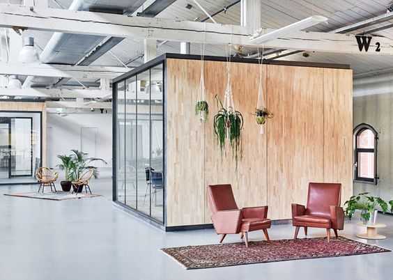
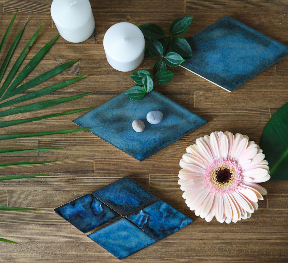
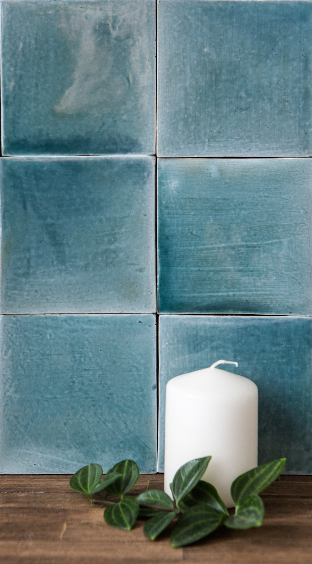
When styling an interior or a product it is important to stick to a theme – the photo needs to tell a story. For example for this photoshooting I made some minimalistic Scandinavian shots and then some lavish tropical themed shots.
3. Get your accessories
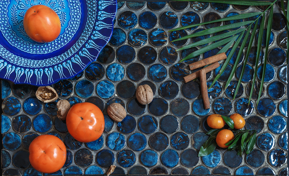
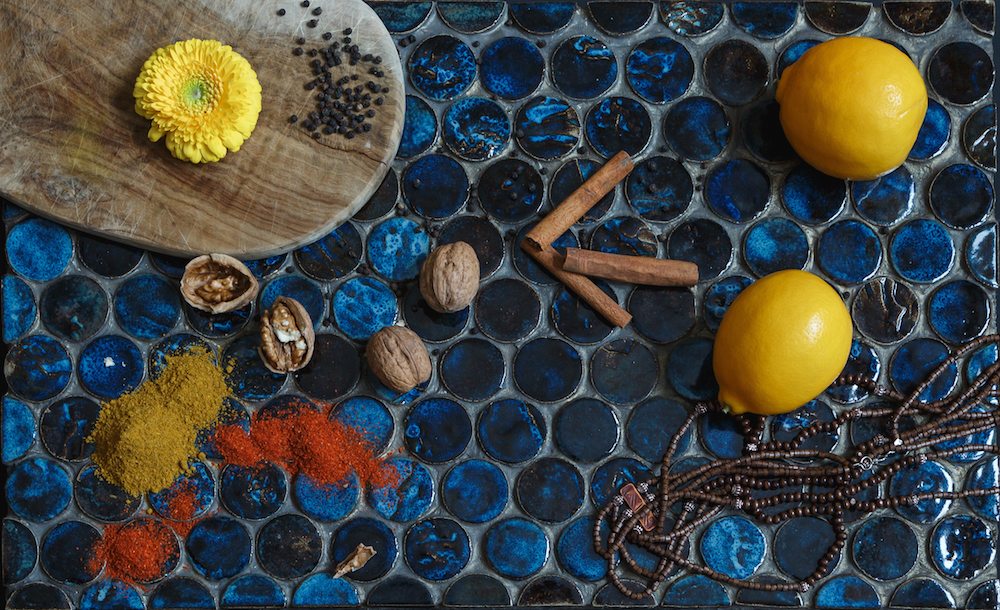
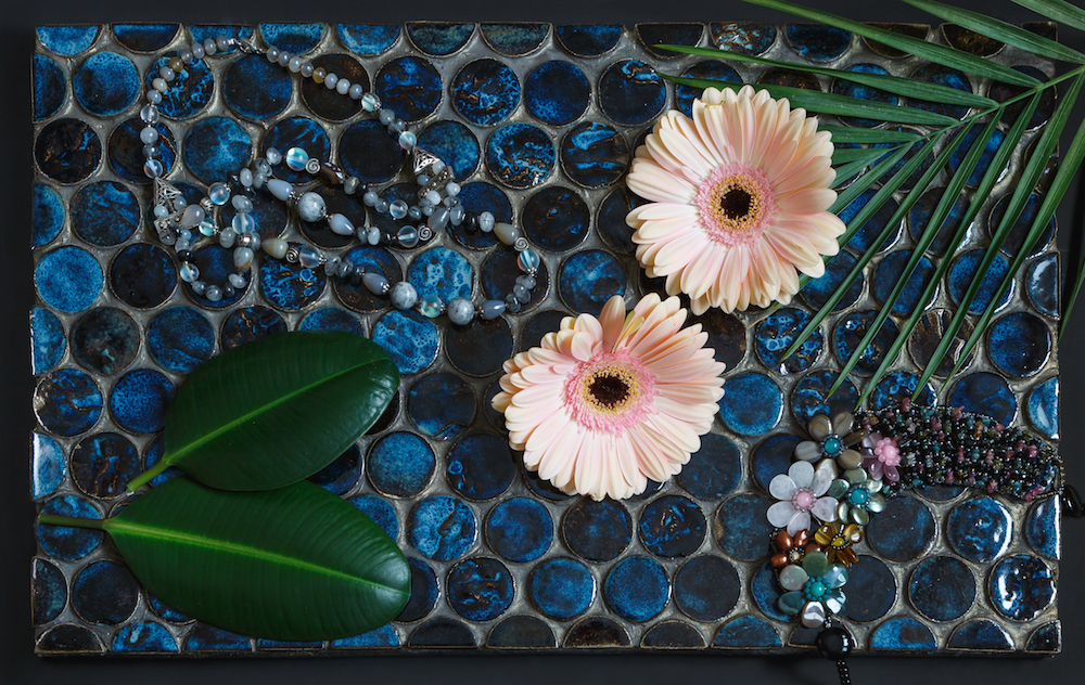
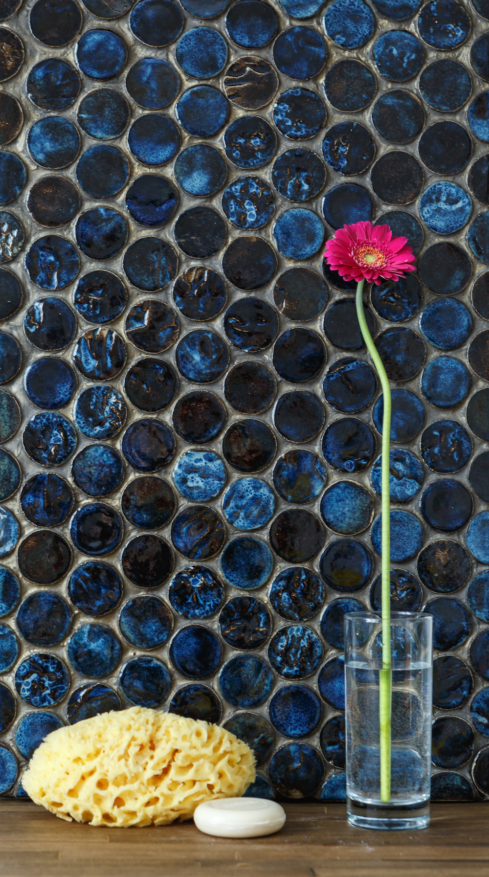
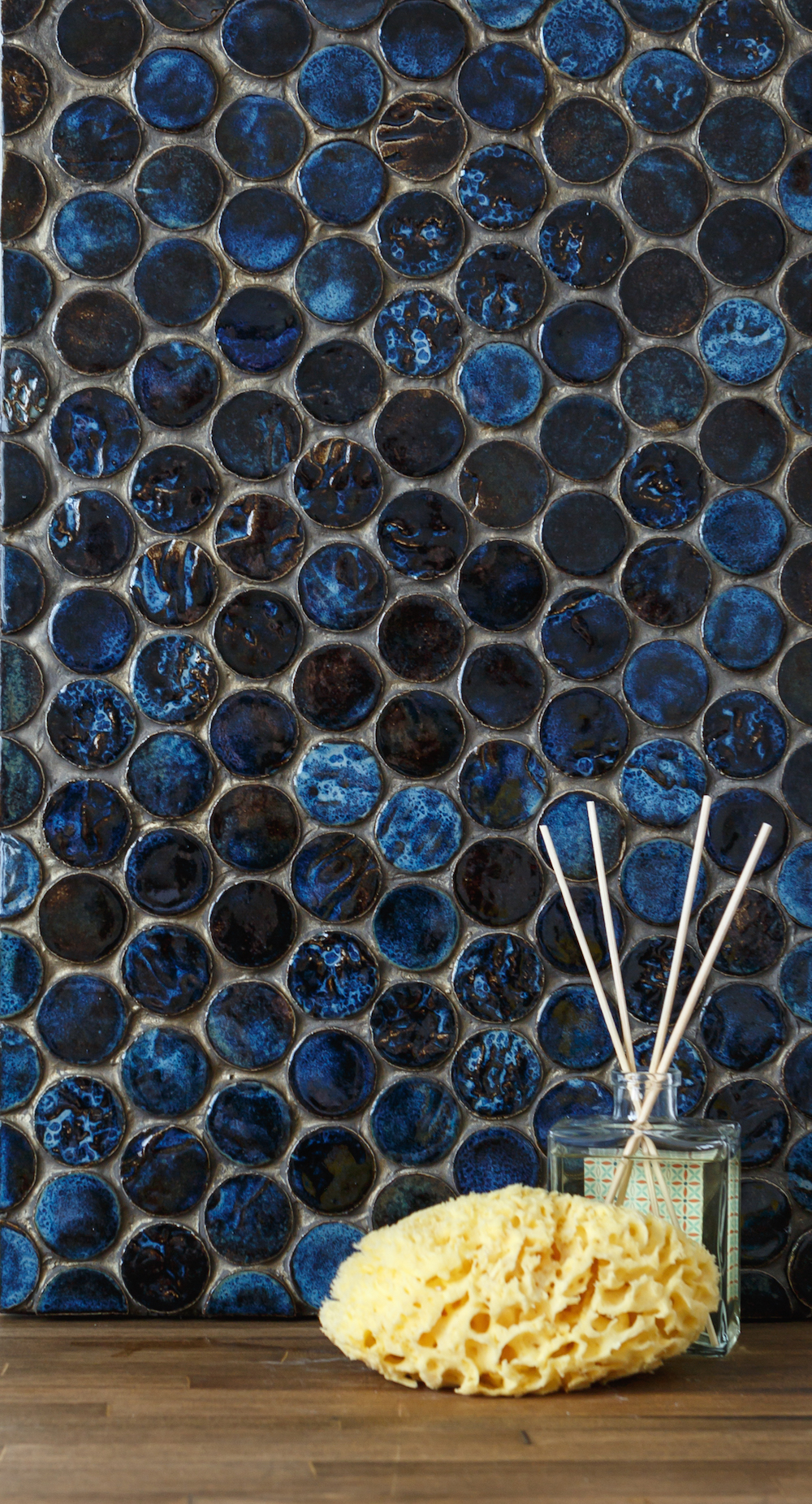
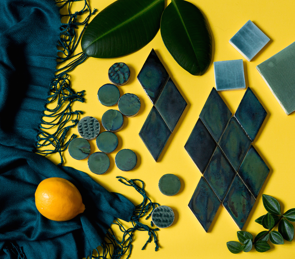
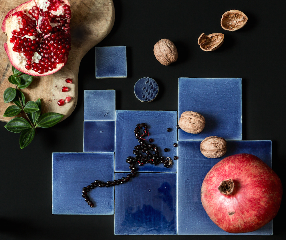
Professional styling is all about accessorizing. One day prior the shooting I usually go shopping to buy fresh flowers and fruits. I also look around my house to pick items that I think might be used to create attractive vignettes – e.g. ceramics, textiles, jewelry. Sometimes the most catchy shots happen with the most ordinary items – it’s all about unlocking your creativity and looking at ordinary objects from different perspective. It is important to stick to the theme and “tell a story” with your photo. For example on the picture above I tried to recreate exotic kitchen theme – various spices, fruits, nuts and flowers were used to highlight the amazing colour and texture of handmade tiles. Don’t forget about the background for the shots – I always have sheets of white and black paper, as well as wooden texture which is also wonderful when used as a background.
4. Think of colour palette
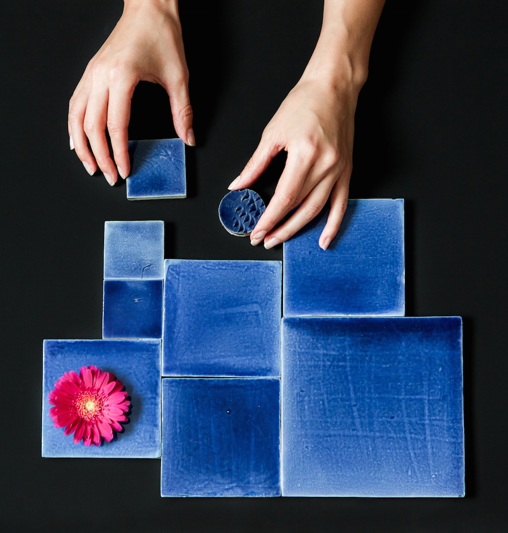
This is one of the crucial points in styling. There is no common recipe for picking up the colours for your shot – it all depends on the mood you want to create: e.g. neutrals and monochromatic schemes create relaxing, calming feel, while bright contrasts look invigorating and stimulating. I often use complimentary colours for my shots – e.g. blue and orange, red and green – those colours highlight each other and make the accents pop.
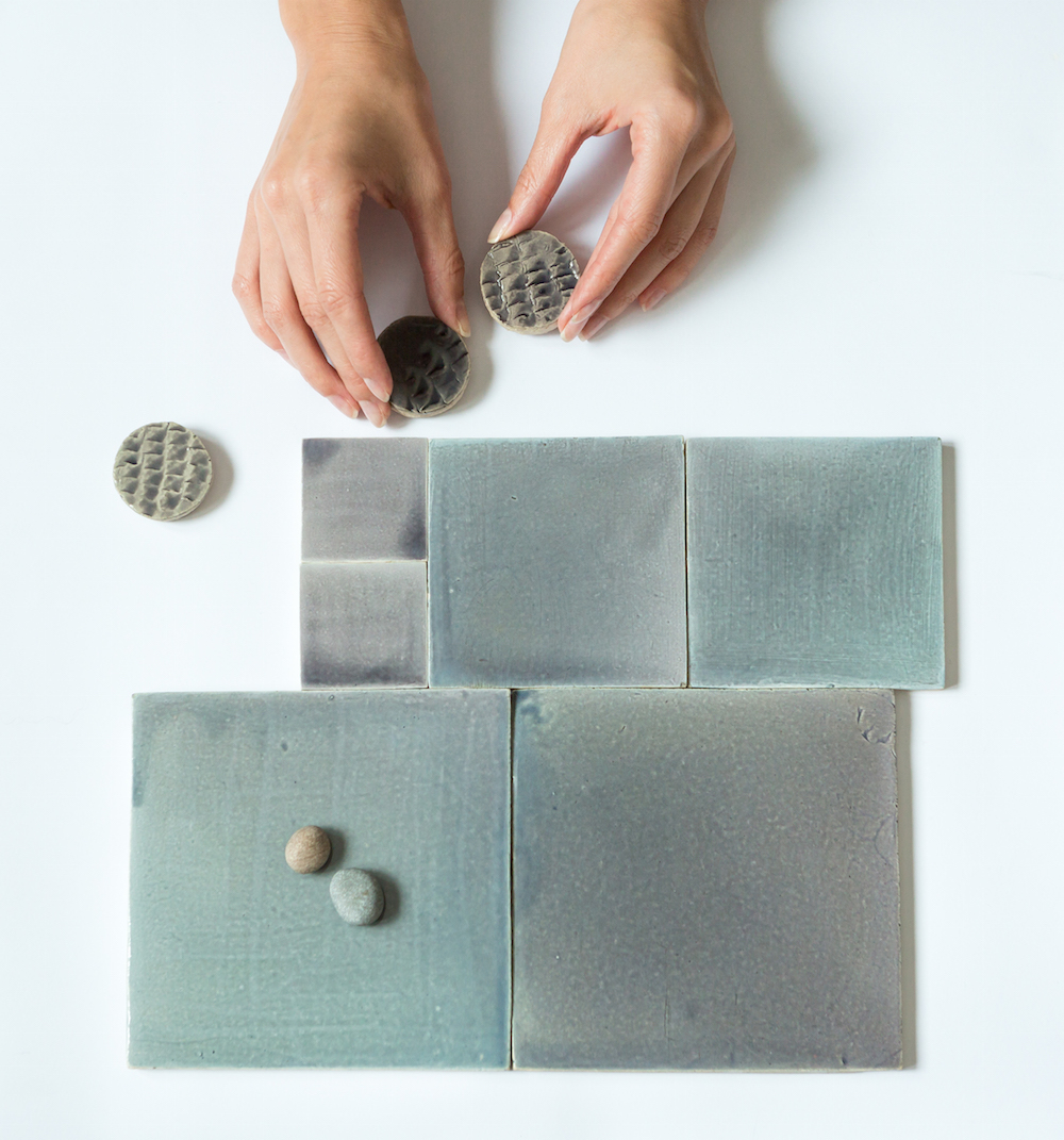
5. Involve human element
Human element, such as hands for example always makes the picture look more lively and natural. For the pictures below I used plain black and white background to create minimalistic, Nordic feel.
6. Get proper lighting
Natural light is my favorite, however, sometimes it is also helpful to have some supportive artificial lighting, especially if you shooting on a cloudy or rainy day.
7. Experiment
Styling is all about being creative and trying various things. Experiment with moving around the objects, trying various angles, adding or removing the stuff from the shot. Sometimes you intuitevely feel how to place items together, sometimes you achieve the best result after several trials and errors.
Hope that these tips were helpful! Happy styling!
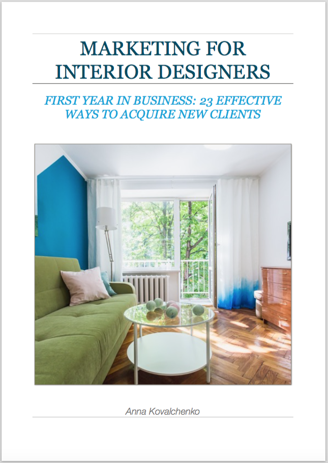
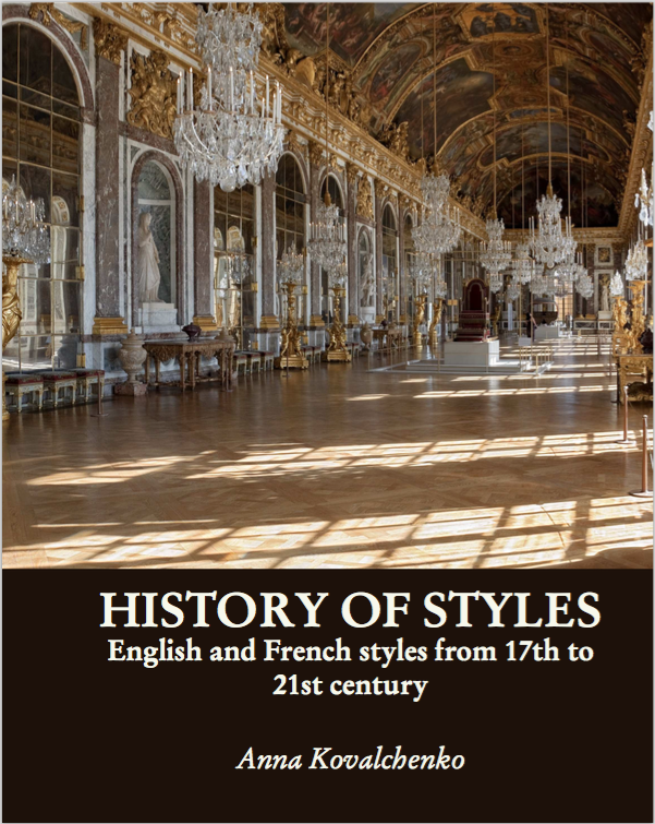
Check out my books: