KLC School Final Project 6: Submitted!
Hey guys,
I feel so much joy and relief – this week I finally sent the last submission for my KLC School of Designe. It took me exactly five years and this path was long, sometimes very frustrating, sometimes full of inspiration and finally it is over.
So here is the brief for the final project:
Brief: Sarah and Harry will soon be moving into a 2 bedroom, loft-style apartment. It is on the fourth floor of a 1930’s building with river views and overlooking a major city. You may not remove any of the existing interior structure. The apartment features a small, southwest-facing balcony with access via French windows.
Your clients would like the apartment to have a comfortable, contemporary, modern city atmosphere. The scheme needs sophistication, individuality and style. Spacious but discreet storage should be incorporated into the design (including the bedroom, study and bathroom) and consideration should be given in the design to acoustics in this large open plan space. The clients are keen to see your ideas for interesting and practical window treatments for the large, modernist-style windows in the main living space. They also want to see a plan for the kitchen along with your proposals for its location within the living area.
For a long time Sarah has wanted a designer bathroom, and she feels that finally this property will give them the chance to achieve her wish. When working in the kitchen, they both feel that it is important to be able to converse with their friends in the main living area.
After a meticulous analysis of clients needs I’ve come up with the following concept and design statement:
Light, fresh and comfortable space. A relaxing oasis within urban surroundings of a modern megapolis. The mood is wafted by spectacular panoramic view on East River in New York and couple’s favourite pastime – vacations on boats. Glimmering textures, subtle light colour palette and reflective surfaces will remind on the calm water of the lake on a good day, while natural textures and colours will add cosiness and warmth. In these surroundings, you can escape from city hustle and feel the freshness and calming beauty of countryside nature. Glamorous textures with added glitz will bring sophistication to the space. Overall the style will be modern classic.
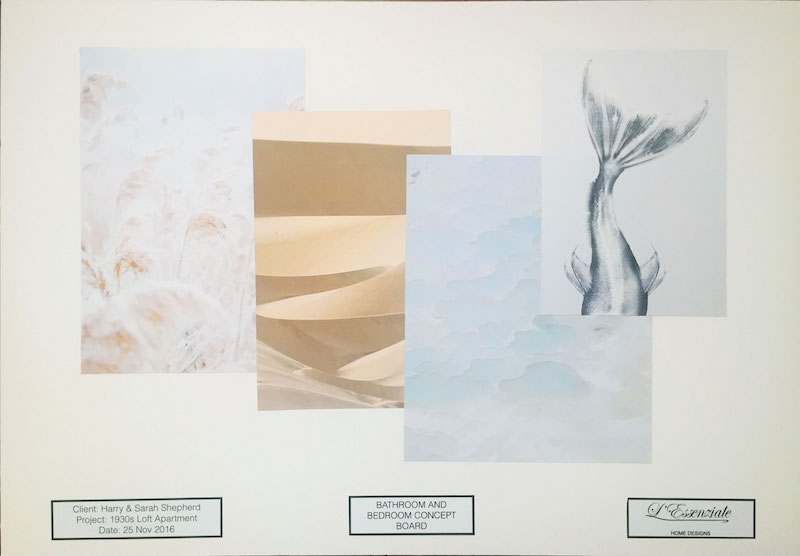
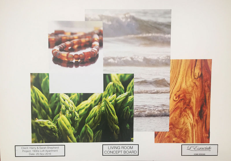
I have prepared two different concept boards – one is for the living room another one is for bedroom and bathroom. You can read about how I make concept boards in this post.
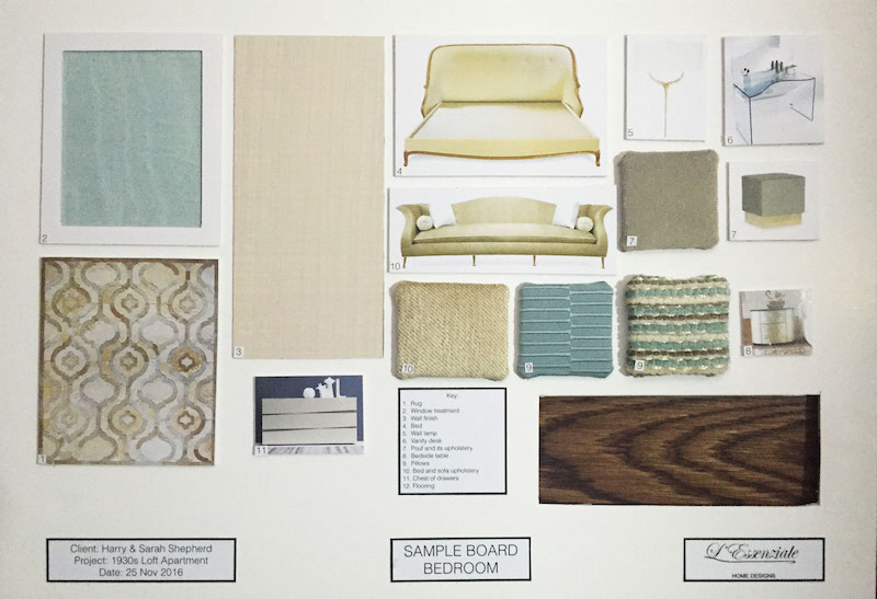
The concept for the bedroom and bathroom is based on calming textures and colours – soft beige, subtle blue and gold. I intentionally use very soft hues, so there will be no bright accents in these spaces and no harsh contrasts – ideal environment for rest and relaxation. The wow-effect will be achieved through the use of luxurious finishes and custom-made furniture from famous manufacturers.
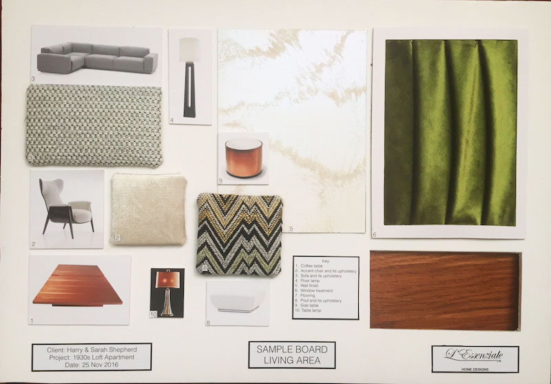
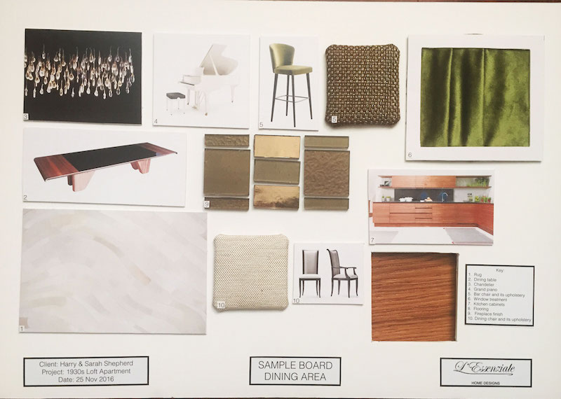
The concept for the living room has warm rich colours, such as off-whites, brown of natural walnut wood, and the bright green of fresh grass used as an accent. This space will be more contemporary comparing to the bedroom, yet will have more relaxed and informal feel – a place where you will meet and entertain your friends, have some relaxing time after work and cook dinners and lunches in the kitchen area. The furniture will have a very modern look which will be softened by rich textures of natural wood, smooth, pleasant to touch surfaces. Luxury custom lighting will create a «wow» factor and the same will be achieved by the dramatically looking fireplace which will also divide two areas – living and dining space.
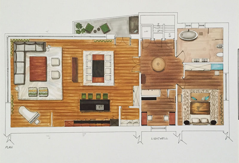
Furniture plan
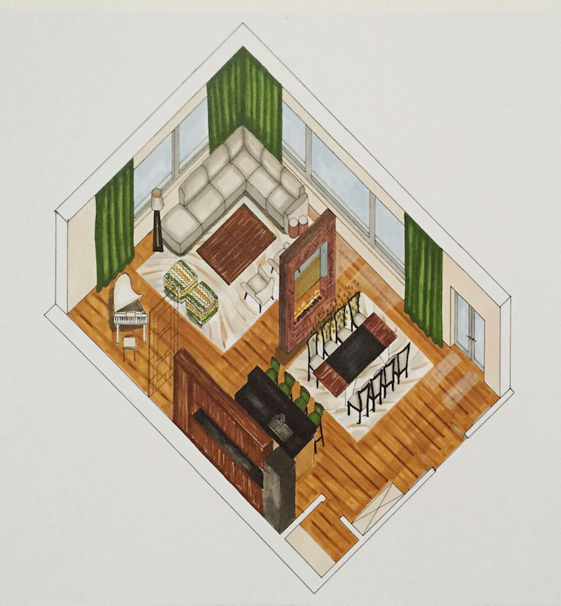
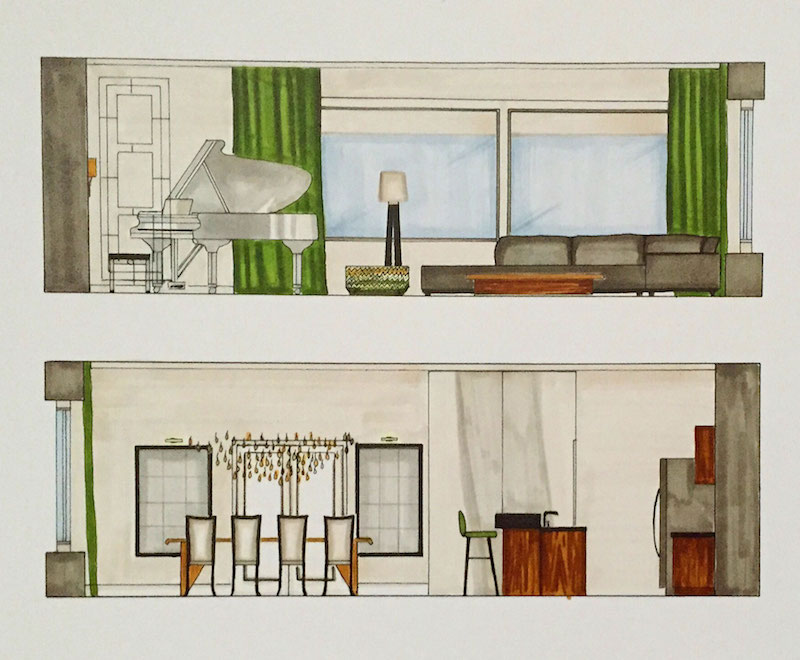
The first thing that you will see when entering the living room is the dining area – large table for 1o people with huge custom pendant light above it will create a sense of drama. Large mirror on the opposite wall will reflect this area so you will be able to see the effect the chandelier produces also in the mirror when dining.
Behind it the fireplace will visually divide the space and make the sitting area more private. The fireplace will have two sided chimney – you will be able to see the fire both from the dining and sitting area. The kitchen is located on the right side which makes it easy to serve food to the dining area. It will have the open layout, however, the kitchen island will also create a separate zone for cooking.
The large corner sofa will allow your guests to sit all together, hence enjoying the company of each other and socializing. Sitting on the sofa, armchairs or pouffes will allow you to enjoy the panoramic view on East river from any place. The TV will be concealed in the ceiling and hence this area could be converted into media-room with a remote control. The panoramic windows will have automatic roller blinds which will create blackout whenever needed. Finally, the piano next to the living room makes this space more classic and again is a design feature.
I suggest that we divide a small room for the pantry on the left side from entrance – there we will locate washing and drying machine as well as some storage for cleaning products and chemicals.
Next to it we will make a built-in wardrobe that will accommodate some of your clothes and other belongings, since there is not so much space in the entrance area for it. The wardrobe will be very discreet and will seem more like a wall.
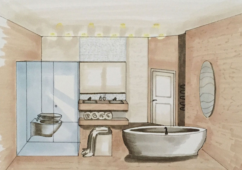
In the bathroom, the focal point will be the bath located next to the window. It will be a luxury tub of oval shape and itself it will be a feature. Once taking a bath you will be able to enjoy the view of the sky from the window. The shower cabin made of transparent glass will be almost invisible and at the same spacious – visually it will not «eat» the square meters from this room. Double vanity will be located opposite the window with a huge mirror that will not only reflect the natural light but will also make this quite spacious room seem even larger. Because of the solution of closing one entrance we now have enough space to allocate both toilet and bidet as suggested per brief.
No was time to source materials and furnishings!
Walls will be finished with decorative paint that has a texture resembling sand on the beach and waves.
Pendant light that looks like drops of water will be fixed above the dining table and reflect in its surface as well as mirror on the wall. Brown mosaics will glimmer during the evening – it is a quite unusual finishing for the fireplaces hence it will immediately draw attention.
Another feature in this room – gorgeous velvety green curtains – they will drop freely from the ceiling to the floor – considering the big height of ceilings they it will look very impressive. Larger contemporary sofa will be upholstered in grey fabric, while two poufs in zigzag Missoni fabric will be accents and also tie with window treatments, since they also have green undertones. Walnut flooring looks warm and inviting – two large carpets from Kyle Bunting are inspired by waves from the concept and they will also help to create zones in this room, as well as providing additional acoustics since the area is quite big. White piano looks very elegant and light. Kitchen cabinets with warm walnut finish look modern but at the same time will bring warmth and coziness to the space. Bar stools will be upholstered in green fabric which will be coordinating with the window treatments.
Bedroom and bathroom
I opted for luxurious fabrics that are soft and pleasant to touch. Moire fabric on the window reminds of water and brings calming feel to the space. Additional roller blinds for blackout will be provided. The shapes in this room – for example, headboard, chest of drawers and rug are inspired by dunes picture from the concept board. The overall concept here blends three elements together – earth, air and water. Dark timber flooring will make the space grounded – for it not to look oppressive it will be complimented with a custom rug in light beige and grey colours – it’s pattern again is inspired by waves.
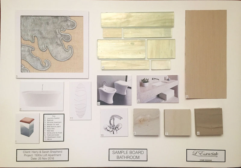
Marble finishes in the bathroom are inspired by grass field image from the concept. It looks very tranquil – perfect for relaxation and rejuvenating your body. White mosaics on one wall will add more texture to the space – otherwise, it might look a bit boring. The huge bathtub is a focal point in this room and main feature. The window will be treated with roman blinds – again in blue and beige colour palette. I would avoid the use of long textiles in the wet area, that’s why roman blinds will be a perfect choice here.
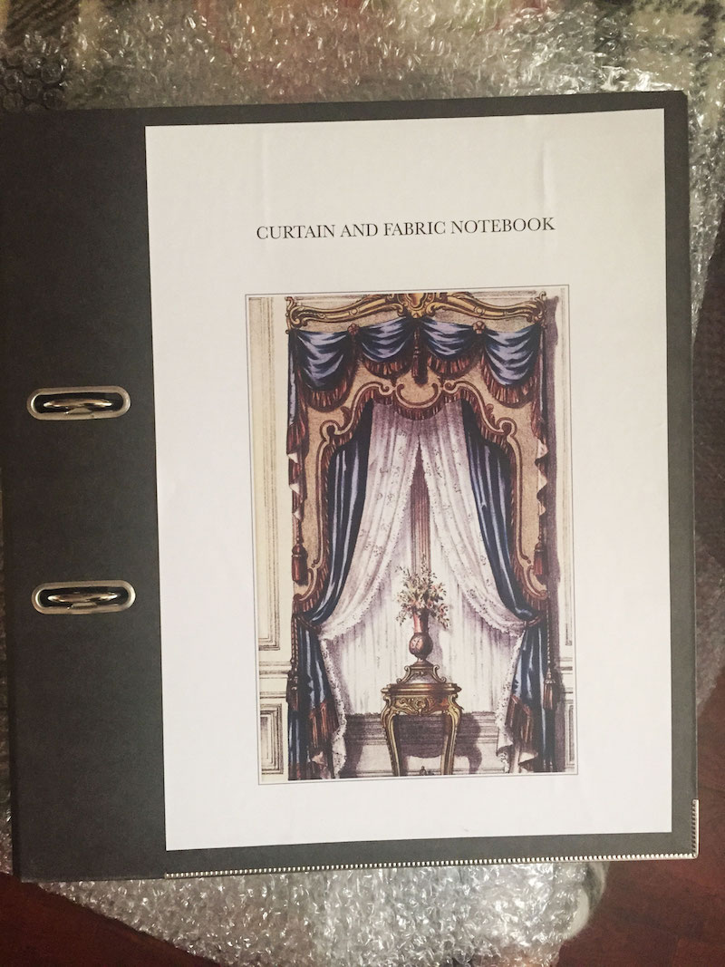
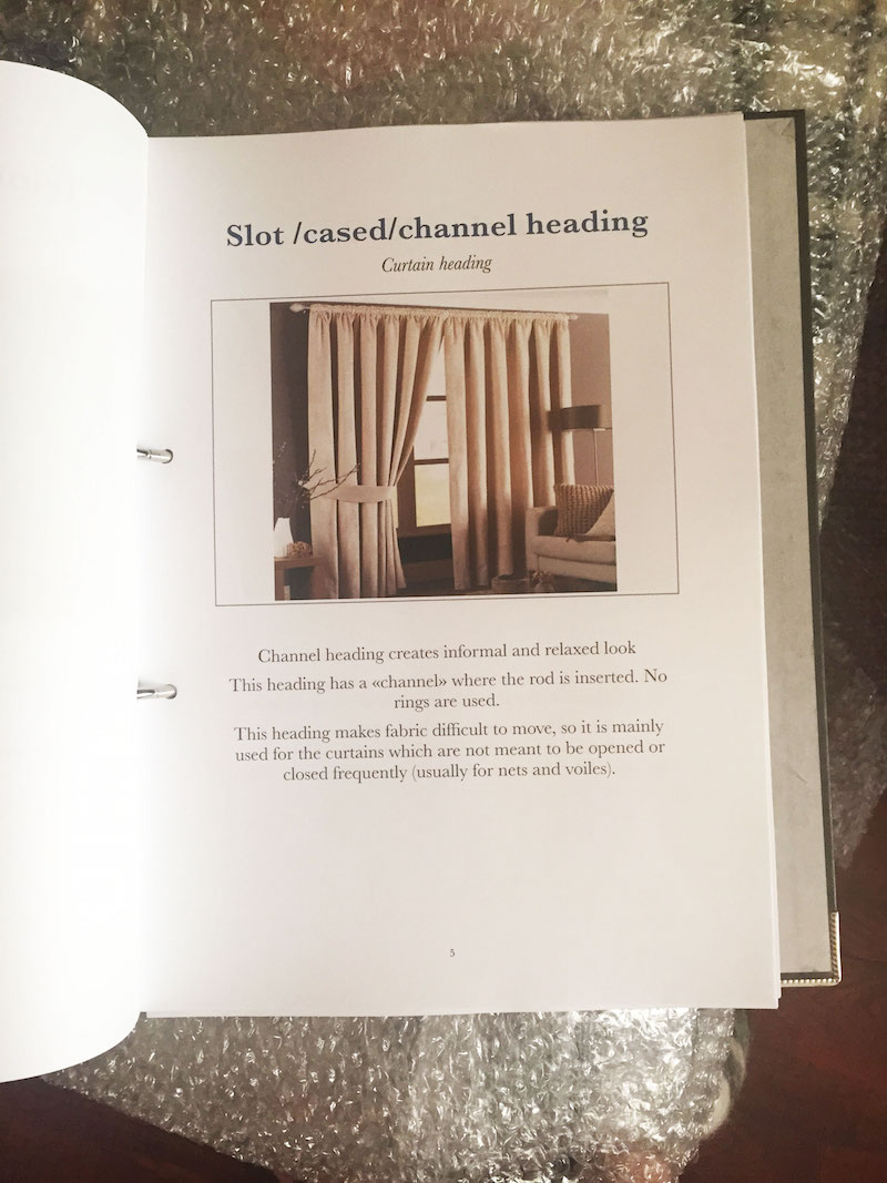
Next part of the project was to make Curtain Notebook – basically a guide where I will explain various window treatments that exists and explore the use of different fabrics:
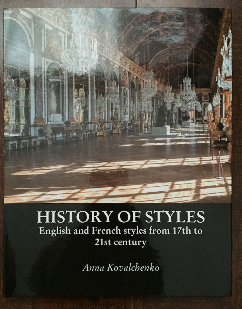
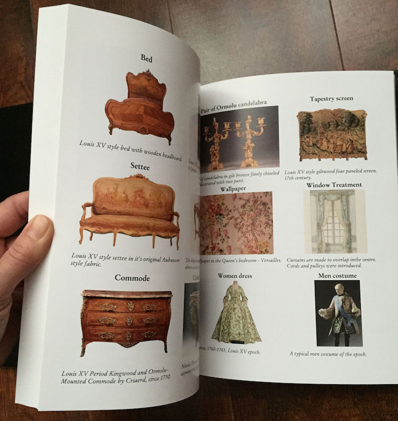
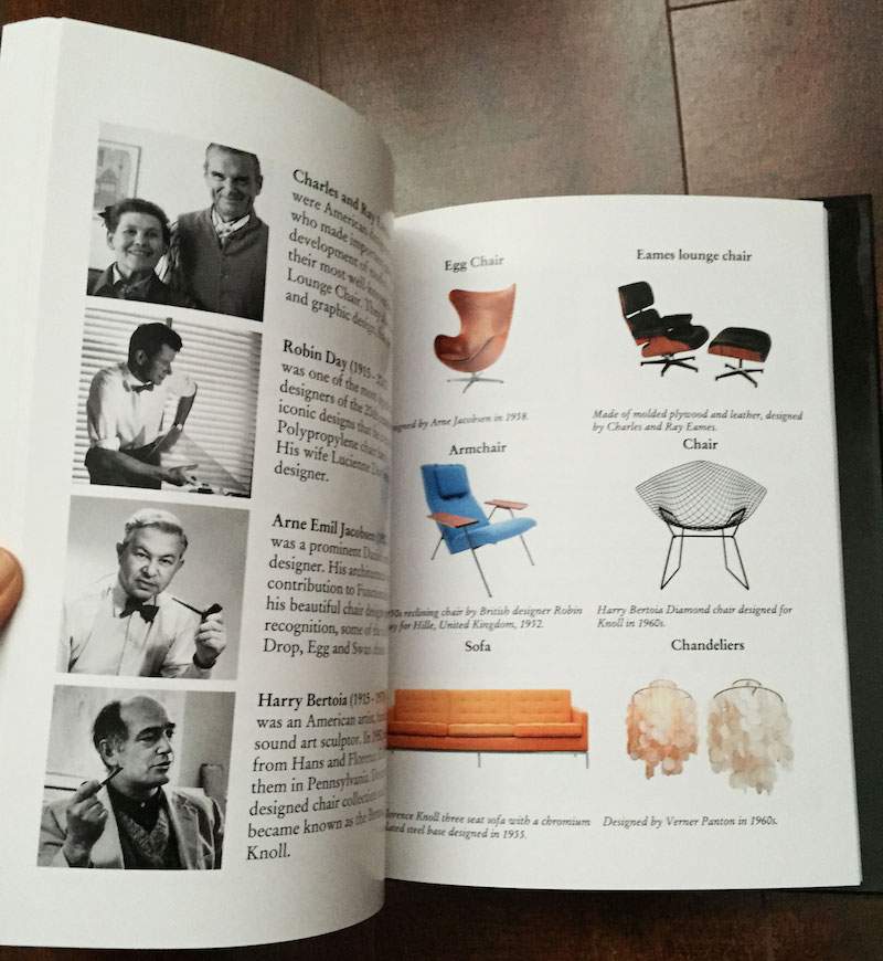
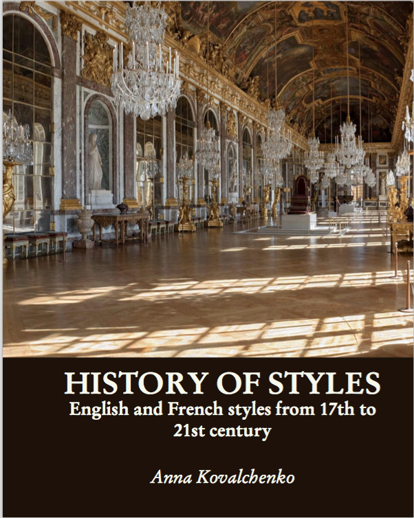
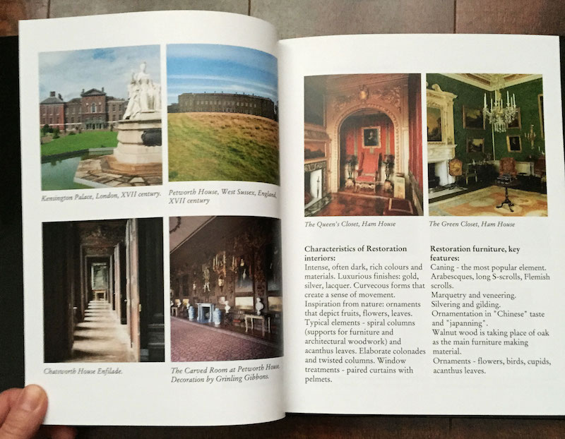
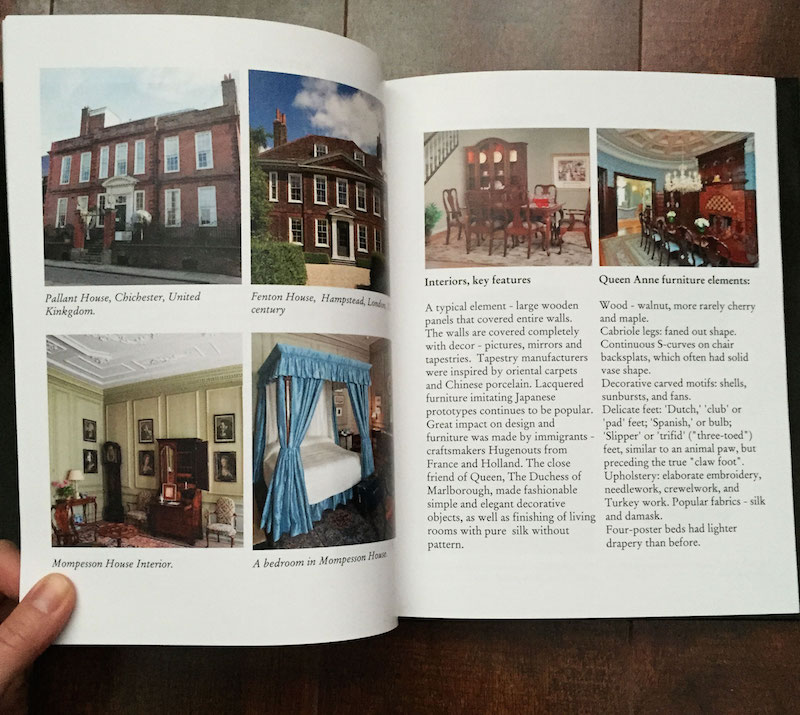
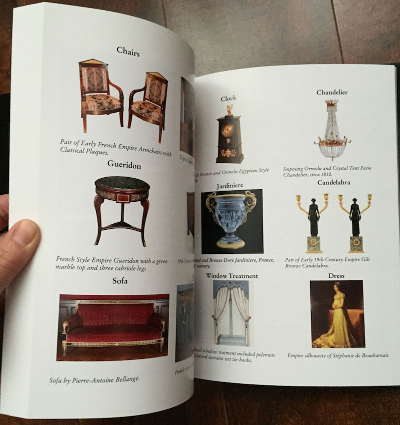
The final part was probably the most time consuming. Here is my pride and my glory – the book called History of styles. In this book I am tracing the evolution of interior design — from the early English and French styles – Baroque, Rococo to 20th century Midcentury Modern and Art Deco – History of Styles is a stunningly illustrated guide to more than three hundred years of shifting trends and innovative developments in the world of interiors. From this book you will learn how to define various styles and their main characteristics.
I thought this research will be useful to anybody who wants to learn about various interior styles, so I am now selling this as an ebook on my blog and electronic version could be purchased right here:

