Project 3 for KLC – Ready to Submit!
When I told that I am going to push my studies for interior design diploma with KLC, I really meant it!
The Module 3 for me has been incredibly long, difficult and overwhelming… There were so many things to study and to make for the project that at times I felt completely helpless and frustrated. Studying online is entirely different from studying in a classroom where a teacher would help you, guide you, motivate you. I have already written a little bit about self-motivation in this post and now, before I share my project I wanted to give several tips, which helped me to speed up my current project and finally get it done:
- Establish a regular schedule and stick to it no matter what.
- It is better to study at least 15 mins every day, than 3 hours once a week.
- Divide one big task/exercise into smaller parts: e.g. creating sample board to 1) sourcing flooring 2) sourcing upholstery fabrics 3) printing labels, etc.
- Have a special diary for your studies with “to-do lists” and records on your progress.
- Communicate with tutors and other students.
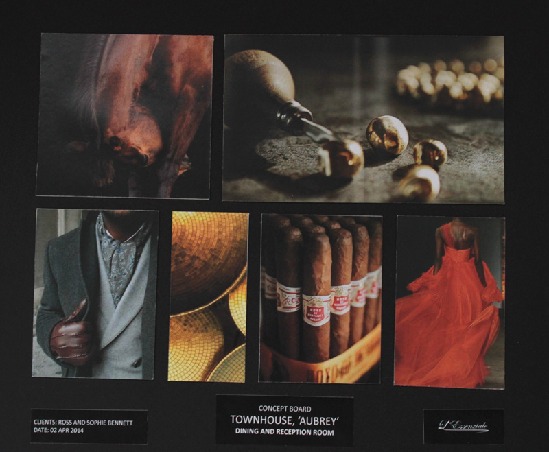
In one of my previous posts I have already shared my Concept board for the Townhouse Aubrey. Here how it looks (just a quick note – for Module 3 I needed to design 2 rooms – Living/ Reception room and dining room. I’ve came up with a single concept for both spaces so that they will correspond in colours and textures to create a sense of flow and repetition between them):
Sorry the image looks a little distorted – in the real life everything looks straight 🙂 Following the concept, I have composed the following design statement:
DESIGN STATEMENT
The design scheme will be based on the game of contrasts reflecting different personalities of clients. Thus, overall dark neutral colour palette will be livened up with bright accents, such as deep reds or burnt oranges. Warm and soft textures will encourage observer to touch and relax, while symmetrical layout will be used to hint at formality.
Overall design will be in contemporary style with solid finishings such as wood and leather. Some glimmer and sparkle will be added to gain glamorous and sophisticated look.
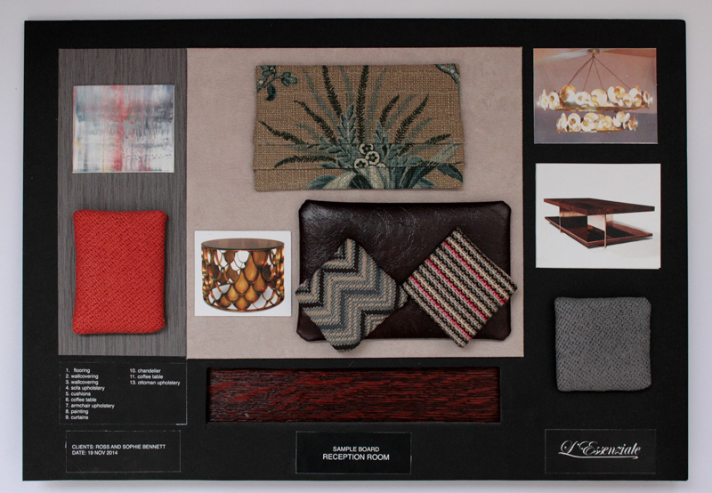
The next step of the project was creating the design scheme – I needed to decide which furniture and materials I would use in the interiors. So here is my sample board for the living room:
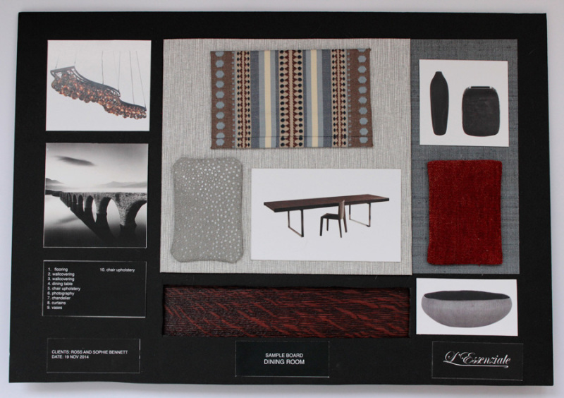
And dining room:
The colour schemes for both rooms were made based on the same concept: since the rooms are interconnected, similar palettes were used to unite the two spaces. A neutral and one colour scheme has been used with different shades of grey and warm, striking tangerine as an accent.
The colour palette was inspired by clients’ own preferences in colors, dressing style and way of life. Their difference in characters and tastes has found reflection in the proposed design scheme. Thus, masculine greys and browns neighbor with frivolous and feminine oranges, while glamorous gold is put against solid, robust wood and leather. This will create an interesting game of colors and textures, which would give an unexpected twist to otherwise too formal surroundings. Complimentary to orange dark blue will be introduced in the form of little accents – patterns on textiles – this will add balance and harmony to the overall scheme.
Since both rooms will be typically used in the afternoons and evenings, great consideration was taken on how the colors would behave under artificial lighting. Hence, greys and taupes, under warm light of chandelier will create very cozy and intimate ambiance.
Both dining and reception room will have lots of light-reflective textures, such as mirrors, polished wood, gold – this will build additional layers in the rooms, giving them greater depth and creating dramatic effect. They will also help to reflect the light and make the space look more airy and spacious – otherwise the abundance of dark colors might evolve an oppressive feeling.
Colour will be also used to highlight interesting architectural features: brighter shade of grey (comparing to the neighboring walls) will be applied on the feature walls – it will draw attention to the artworks placed on them.
Dark timber flooring will ground the rooms and will make them look more solid and distinct.
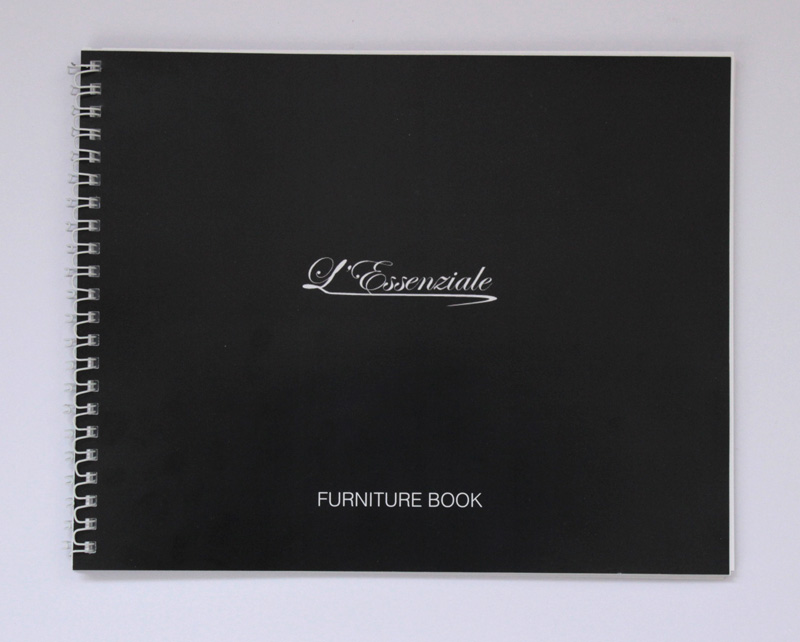
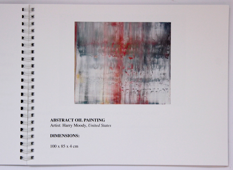
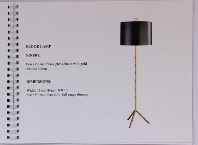
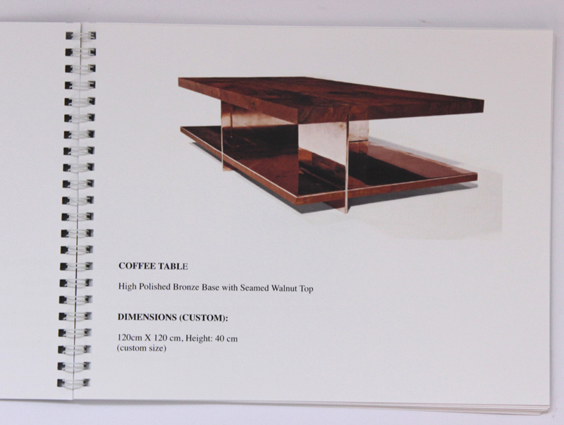
On my sample board I’ve placed only key furniture pieces. The rest went into the furniture book – a brochure which will be shown to the clients:
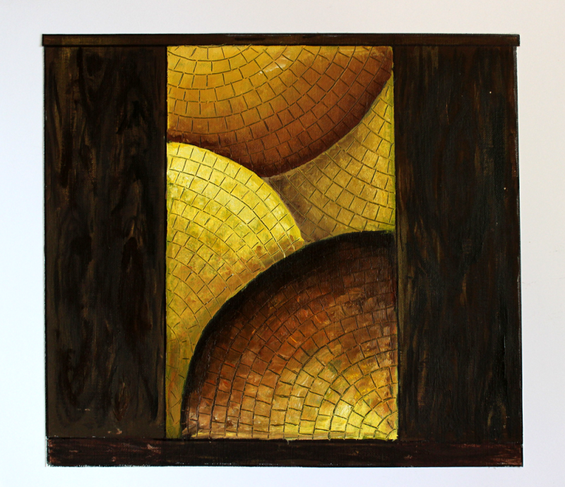
The design of my custom drinks cabinet (above) was inspired by one of the images on my concept board.
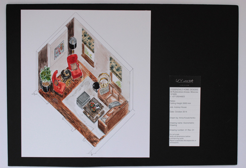
To make my presentation more “visual” I have drawn the axonometric (room in 3D) drawing of the living room. For rendering I have opted for my favourite medium – watercolour (just love its delicate and subtle effect):
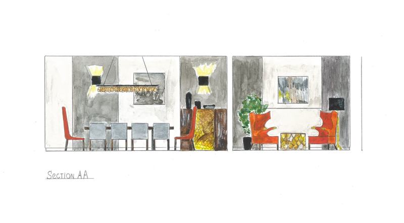
As well as section drawing :
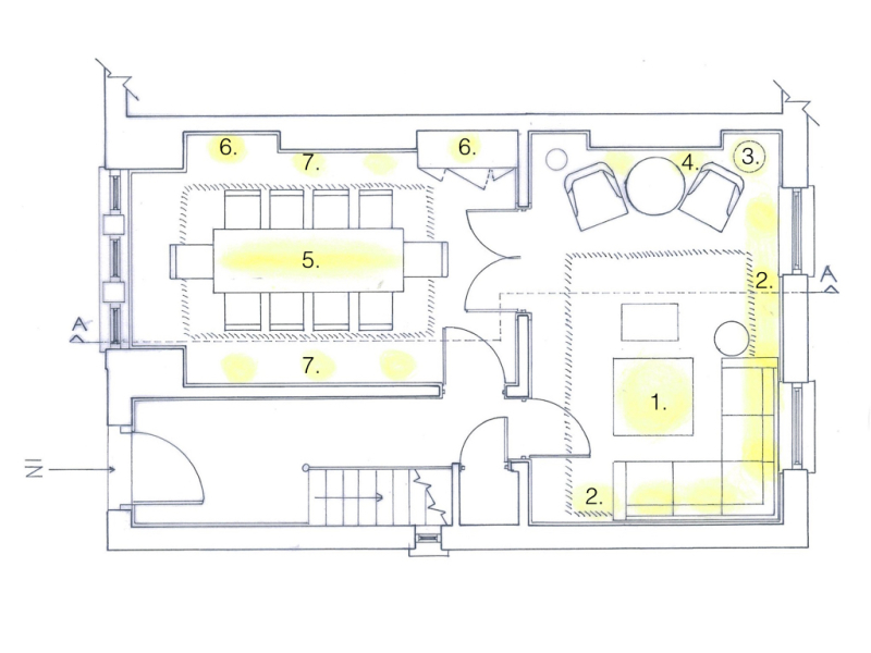
About my visual lighting proposal for both rooms you may read here:
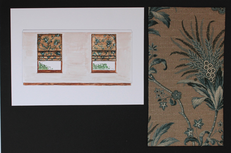
And finally the last part of my presentation is window treatment board. I have chosen Roman blinds for both rooms because I love their minimalistic and elegant look (Just need to add titles and images of headrail system onto the board).
No need to work a little bit more on my PRJ and finally I am ready to submit my Module 3 Project!!! Please, wish me good luck!
Studying interior design? Want to learn more about various historic interior styles? Check out my History of Styles e-book:
Tracing the evolution of interior design — from the early English and French styles – Baroque, Rococo to 20th century Midcentury Modern and Art Deco – History of Styles is a stunningly illustrated guide to more than three hundred years of shifting trends and innovative developments in the world of interiors. From this book you will learn how to define various styles and their main characteristics.
[ebook_store ebook_id=”15760″]
© L’Essenziale Home Designs, 2014. Unauthorized use and/or duplication of this material without express and written permission from this blog’s author and/or owner is strictly prohibited. Excerpts and links may be used, provided that full and clear credit is given to Anna Kovalchenko and L’Essenziale Home Designs with appropriate and specific direction to the original content.

