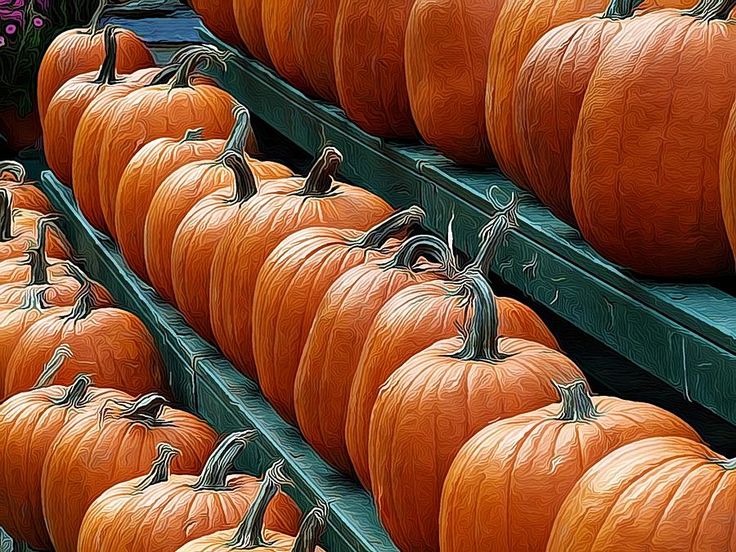
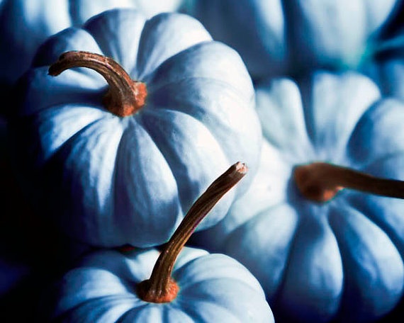
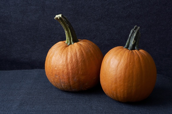
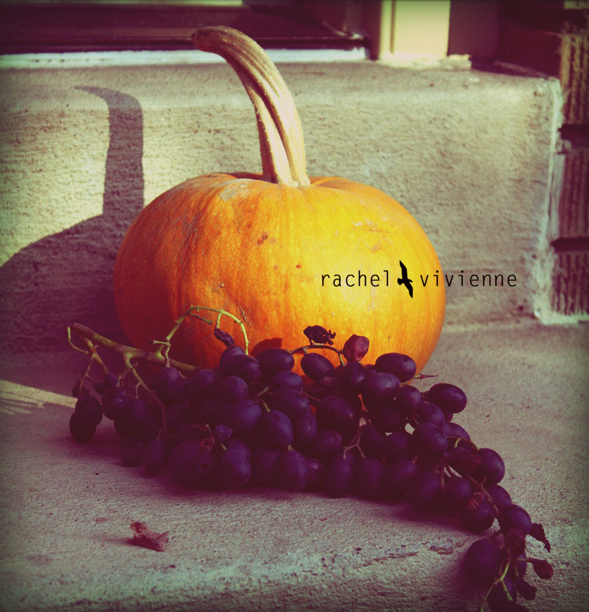
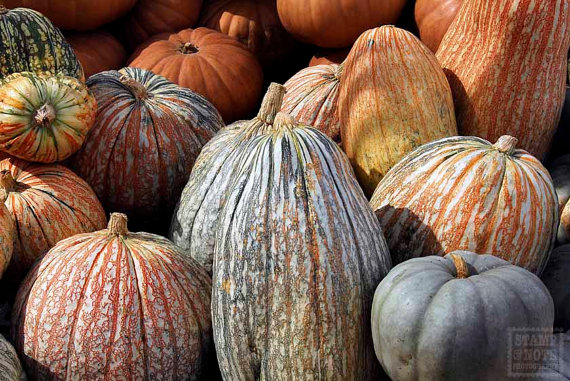
October, Essential Colour: Pumpkin Orange
Orange is the colour perhaps mostly associated with autumn. It reminds us of falling leaves, breathtaking October sunsets, Halloween celebration and pumpkin harvesting.
Orange is the warmest hue on the colour wheel as it is located between red and yellow and is obtained by mixing these two pigments together. That’s why it combines characteristics of both of them: It is warm and inviting as yellow though less striking and intensive than red.
People who love orange colour are usually very enthusiastic, hard-working, persistent, friendly and communicative. They are extroverts and like to be among the other people. At the same time they love changes in life and sometimes can be capricious.
If you choose orange for decorating your house, it will bring in it bright emotions, good mood and energy. It also stimulates appetite, that’s why many companies use it for food packaging (remember about it, if you want to incorporate orange in kitchen decor – might not be the best option for people sitting on a diet). Orange is ideal though for decorating living room or entrance area: it will always make the room look welcoming and cozy.
Though generally orange can be used together with many other colours, here are some combinations which I consider the most successful.
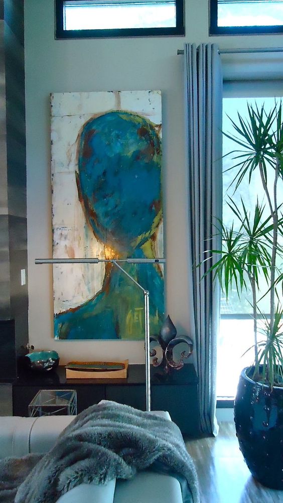
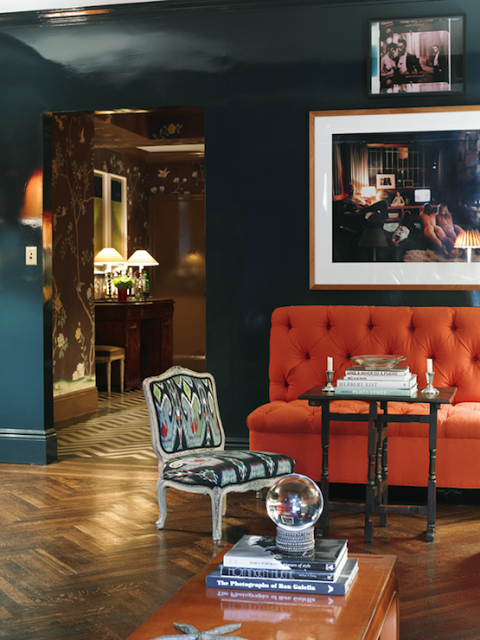
PUMPKIN AND DARK TEAL
One of the most sophisticated, exotic and luxurious combinations. This is almost a complimentary scheme where brightness and vividness of orange is even more enhanced and highlighted by teal. Never use these two colours in equal proportions: one of them always needs to dominate. I recommend to use teal as primary colour and orange as an accent: cushion, rug, accessories or wall decor. Vice versa combination is also possible, though interiors with orange as main colour look less elegant and refined. Also orange is a very striking colour and when used in big quantities it might seem overwhelming.
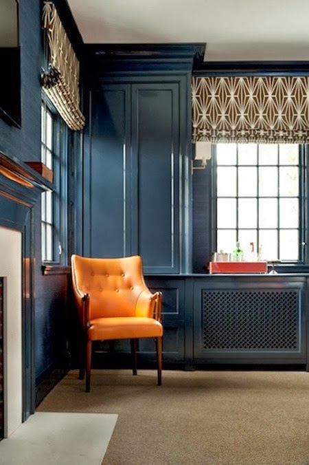
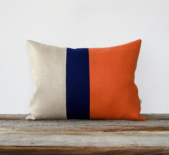
PUMPKIN AND DARK BLUE
Similar colour scheme where orange is put together with it’s direct supplement – blue. I recommend to use dark shades of blue, otherwise if you combine it with light tones the room might seem too bright and vibrant.
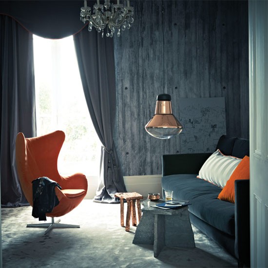
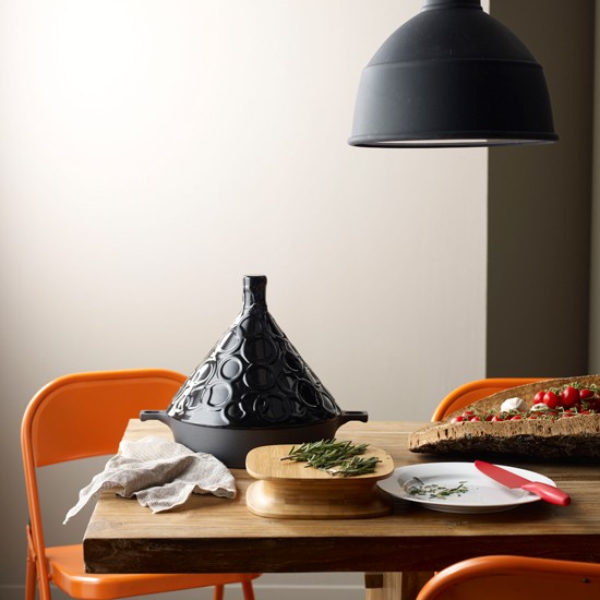
PUMPKIN AND CHARCOAL
If you like dark grey and want to use it as main colour for decorating interior, you need to introduce some bright spots, otherwise your room will look like a cave. Orange is a perfect colour for it:
PUMPKIN AND AUBERGINE
This is a very elegant and tasteful colour combo, which will suit best living and dining rooms.
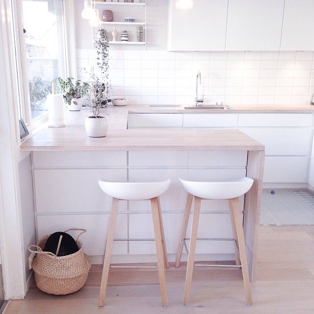
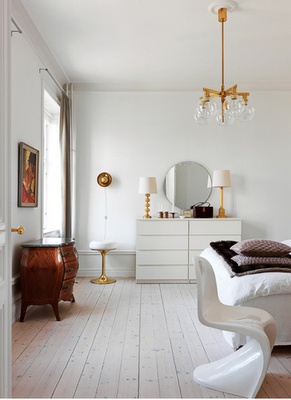
PUMPKIN AND LIGHT NEUTRALS
As always neutrals are the perfect background for any bright colour. If you don’t like bold combinations, then this option is for you. Light gray, taupe, beige and off-cream – all of them will look great together with orange.
Do you like Orange colour? Would you to use it to decorate your own house? Looking forward for your comments!