The Color Scheme Bible
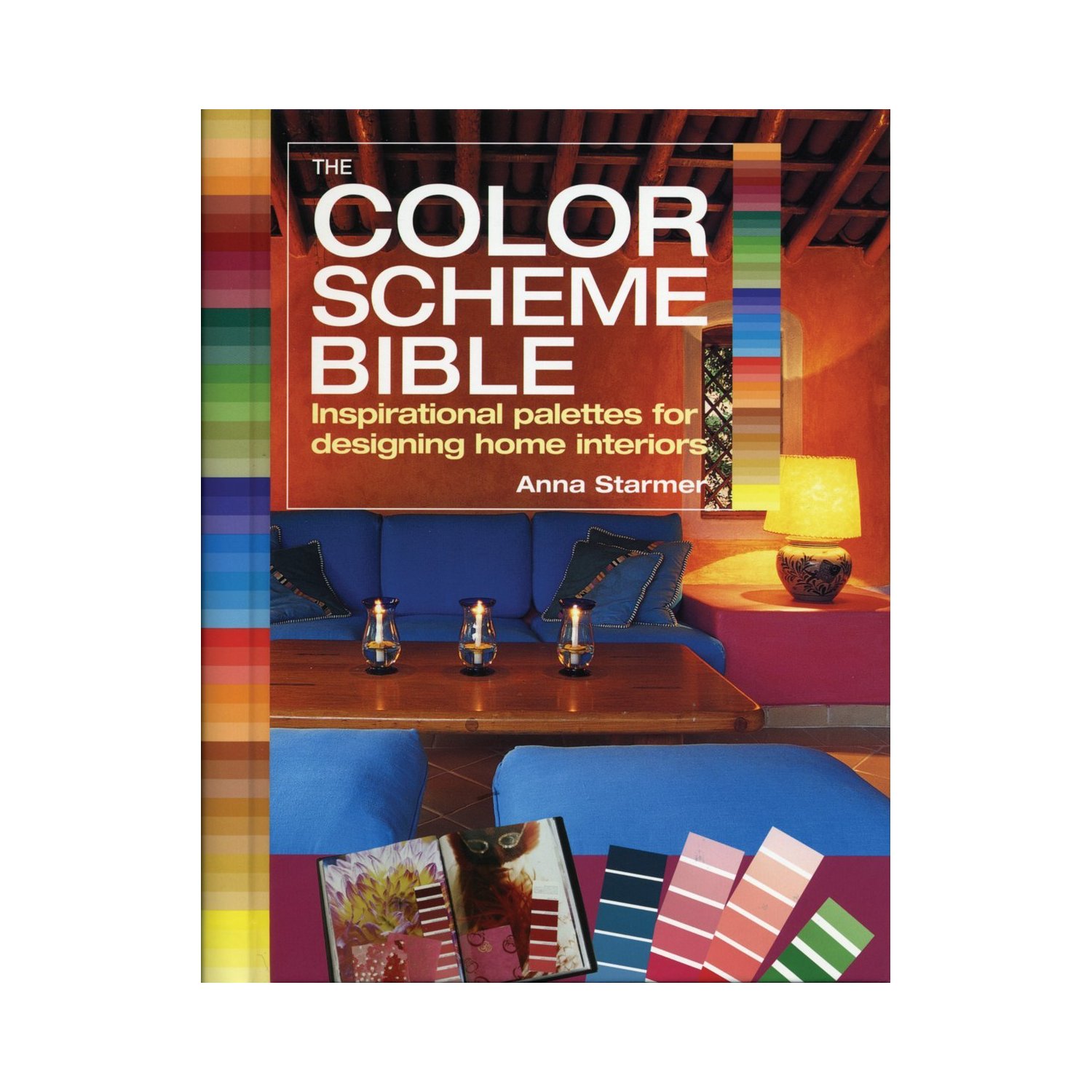
Modern society lives in a constant state of rush. Our life is fast and hectic: we don’t have time to sleep, to eat, to read… We prefer “Ready-to-implement” solutions rather than doing time-consuming research and analysis. We like when other people do it for us. Our book shelves and the Internet are invaded with “easy-to-fix” guides such as “How to become successful in 5 minutes”, “How to earn million dollars a year”, “How to become an interior designer without learning in school”…
The book I recently read, “The Color Scheme Bible”, relates to the same class of quick-solution-books. If you want to find a ready colour palette for decorating your house, then this book is probably for you. The algorithm is easy:
1) you choose the primary colour you like,
2) you open the corresponding page with the ready palette,
3) you start painting the walls in your house.
I bought this book looking for some relevant information for my Colour Theory project with KLC and relying on very positive reviews on Amazon. The book has a beautiful design and a wire bound page format which I found very handy.
The first 25 pages are dedicated to the introduction to Colour Theory. I must say that I found it to be very generic and shallow, basically nothing new and above the information I found in the Internet.
The next two chapters describe how to make mood boards and use colour scrapbooks. “Collect bus tickets, candy wrappers, magazine pages, restaurant cards and flyers, and stick them in your book”, recommends Anna. I am sure that bus tickets and restaurant cards could be an incredible source of inspiration but I would have really appreciated some more tips on how to work with all this scrap I finally collected in my book. However the author prefers not to go deep into detail.
The next 214 pages are devoted to the actual colour schemes. Each of them has an overview describing the mood it is supposed to evoke, inspirations behind the colour choices and explanation on how to feature colour scheme to a real-life interior.
I must say that some of the palettes I found so unusual and bold that I hardly imagine them to be implemented in the actual interiors. That’s why probably some photos of these interiors might be really helpful but unfortunately the book doesn’t contain them.
The strong point of this book is that it inspires you to be brave with colour, try some bold combinations, rather than always sticking to more safe “neutral” approach. I also liked very poetic and imaginative descriptions for each palette, which could be useful for preparing project to a client and developing presentation skills.
Resolution:
The book can be used as an additional source of inspiration for interior designers while preparing proposals for clients. The book lacks theoretical material on how to combine colours and create palettes. Instead of this it offers ready colour schemes, some of which I found difficult to implement in real-life interiors. My rating: 3 stars out of 5.
Have you read this book? What do you think?

