How To Create a Concept Board For Interior Design Project
The work on my 3rd Module with KLC is moving forward, though I’ve been procrastinating with it for such a long time (it is really hard sometimes to push it and stay organized with studies with so many other tasks to do – the best thing is to work on projects every single day: even 15 minutes is better than nothing). The biggest challenge for me is lack of feedback, so I keep working on the same thing for an incredible amount of time, trying to get the “perfect” result, which I think will please my tutors. One thing I managed to complete though (finally!) is my Concept Board. And this is perhaps the essential part of the whole project.
I want to share in this post my work on it – step by step – perhaps this information will be useful for other interior design students as well.
So what is the concept and why it is so important? I would probably define it as a starting point of any interior design project, which consists in the visual presentation of style, mood, and color of the future space. Client looking at a concept board must be able to understand the overall feel and look of the room. Though it doesn’t show the concrete furniture, finishes or accessories yet, so the designer has the freedom when working further on the project. Let’s say, the concept is showing the direction, but not the particular road.
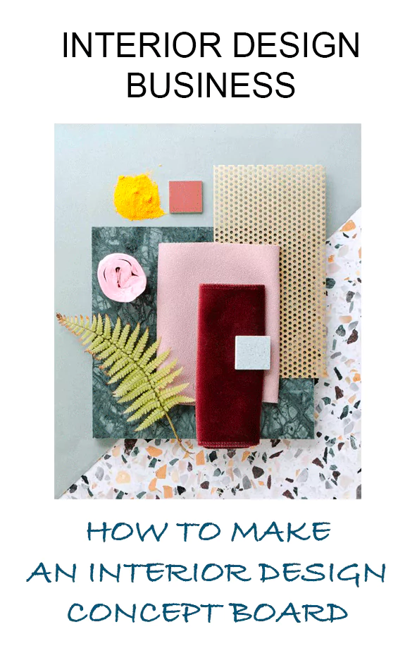
And here are the steps of creating my concept board:
1) Meeting with clients, design brief and analysis
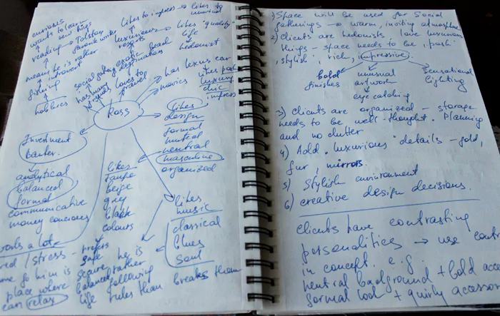
My starting point was clients’ portfolio with their profile and design needs. From it I learned the following information: age, profession, the scope of work, likes and dislikes of the clients. I needed to analyze it, understand clients’ personalities, make conclusions based on their habits, the way they dress and live. For example, my client Ross is an investment banker, he wears expensive clothes and smokes cigars. I can thus conclude, that he appreciates solidity, quality of materials and expensive look. In no case, I would suggest to him design in shabby chic style or cheap furniture. For my design analysis, I used my PRJ, where I “digged” into clients personality and character.
A picture is worth a thousand words – so I widely used images (cuts from magazines and printouts) to illustrate clients’ taste:
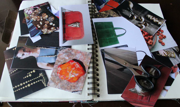
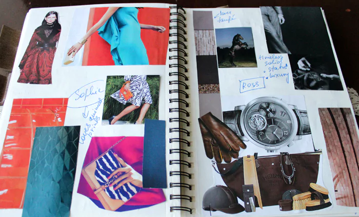
PRJ is a notebook reserved only for the designer, it is not shown to the clients, so I allowed myself to be a little bit messy, playful and free to express any thoughts that came to my mind (I used a lot of mind maps and collages):
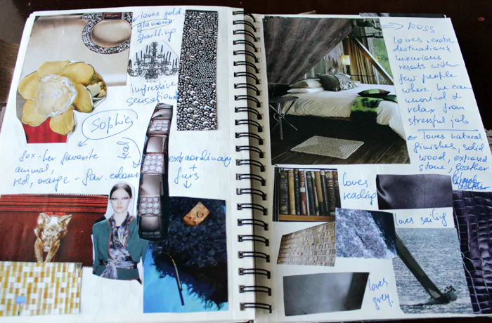
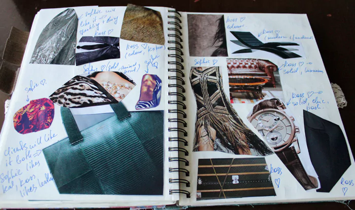
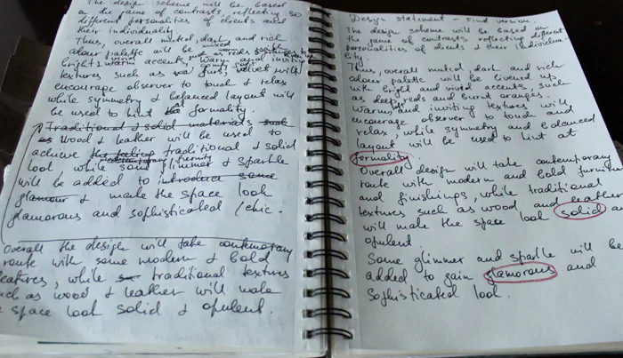
2) When the design analysis was ready, the next step was to write the design statement: short paragraph reflecting the essence of the proposed scheme:
DESIGN STATEMENT
The design scheme will be based on the game of contrasts reflecting different personalities of clients. Thus, the overall dark neutral color palette will be livened up with bright and rich accents, such as deep reds and burnt oranges. Warm and soft textures will encourage observer to touch and relax, while symmetrical layout will be used to hint at formality.
The overall design will be in contemporary style with solid finishing such as wood and leather. Some glimmer and sparkle will be added to gain a glamorous and sophisticated look.
4) From that point, I needed to highlight “key” words in design statement and search for the images which would illustrate them. Mine were “Solid, Glamorous, Formal”. It is important not to be too literal and not use images of interiors and furniture as it might mislead in the wrong direction.
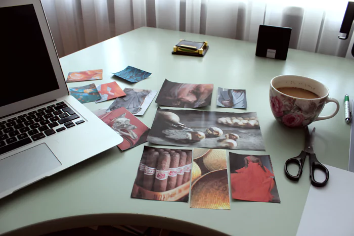
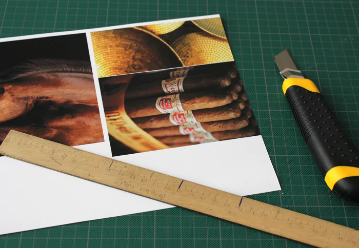
5) I sourced probably more than fifty images, but for my concept board, I’ve selected only six, which I thought would better illustrate the proposed scheme. I printed them on the photo paper and accurately cut them out using special mat and paper scalpel:6) I also used white carton underneath my images to mount them on the board: it made them stand out and look more impressive. For sticking them to the board I applied double-sided tape.
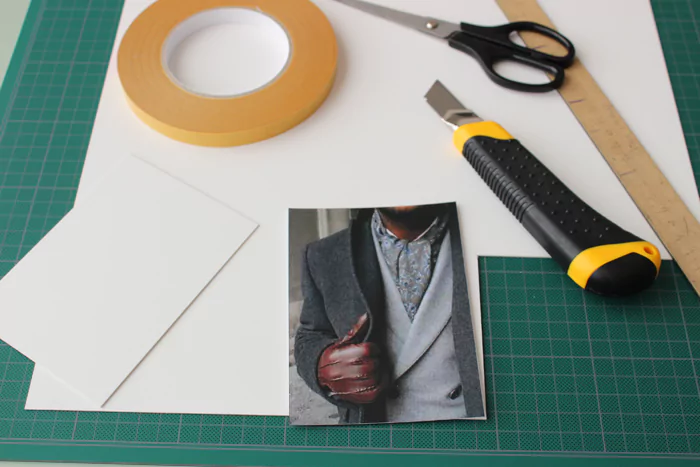
7) It is important to think about background color and layout of the concept board: they should also coordinate with the proposed scheme. Since my concept was interior in dark tones, I have chosen black board, while symmetrical layout of images would reflect the formal look of the space.
Voila, my concept board is ready:
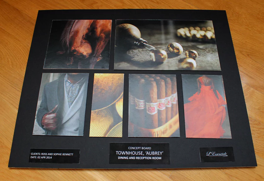
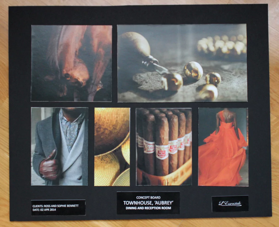
The next step of the project will be sourcing furniture and finishes, based on the forms, textures and colors from my concept board. I will be writing about it in one of the future posts.
Check out my eBooks for interior designers:

