How To Create The Perfect Design Portfolio
Whether you’re an interior designer, artist or journalist, having the perfect design portfolio can make all the difference between being hired or not. After all, a portfolio expresses who you are and what you can do – if it’s not up to scratch, and doesn’t wow your audience, it’ll simply be cast aside.
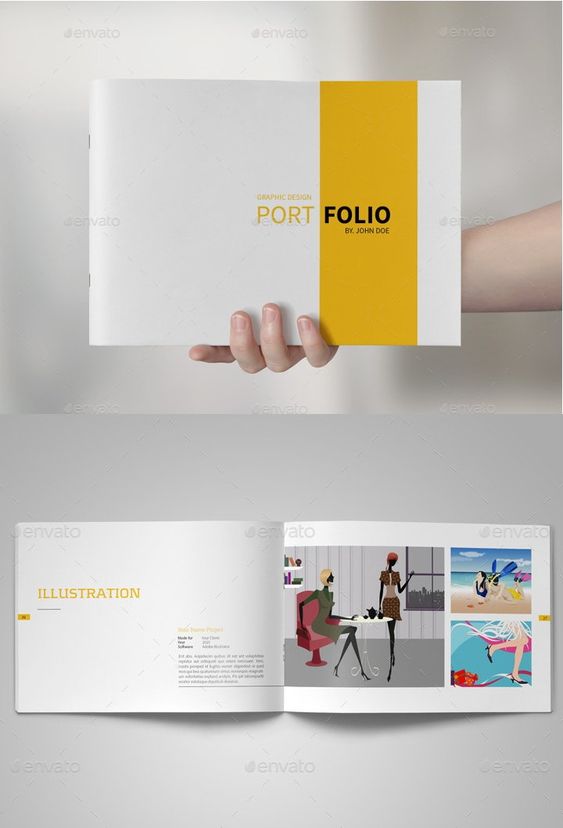
Creating the perfect design portfolio is therefore much easier said than done, and it can be very easy to get things wrong. We’re here to make sure that doesn’t happen by not only clarifying which mistakes you should be avoiding, but also telling you what you can do to make it stand out from the rest.
Three Mistakes to Avoid:
- Too many work examples.
While it’s perfectly fine to be proud of your work, having too many examples or case studies of your previous work could just become distracting and put potential employers off. Focus on showcasing your best work. Rather than having 15 average projects on display, pick your top five quality projects and show them off instead.
When it comes to creating your perfect portfolio, quality over quantity really is the best way to go.
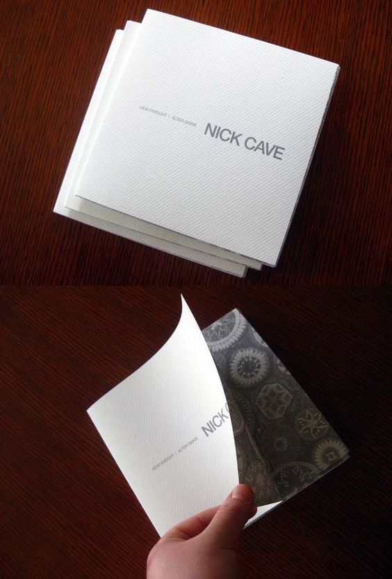
- Not enough work examples.
While having too many examples of your work can look bad, the reverse can be true as well. If you think that your portfolio looks and feels bare, then it probably is. Trust your gut and put yourself in your audience’s shoes – how would you react if you were them, looking at your portfolio for the first time? Include enough of your work, but don’t overdo it and, where possible, make sure its ‘wow’ factor shines through.
- Lack of contact details.
It’s all well and good having the most beautiful portfolio in the world, but if somebody doesn’t know how to contact you then you’ll only shoot yourself in the foot. Your contact information should be simplistically portrayed and easy to navigate to. Include links to your social media profiles and, most importantly, make sure your contact details are kept up to date. The last thing you want is for a prospective employer to reach out to you on an email address or phone number you no longer use.
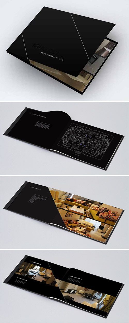
Which work should you feature?
Choosing which work to include in your portfolio can be a difficult decision. In general, the more varied it is, the better, but don’t sacrifice one of your best bits of work just for the sake of varying up your portfolio.
Depending on what it is you’re trying to showcase – your art, design work or articles – your portfolio should ideally demonstrate your top skills to employers and potential clients. Say you work as a magazine journalist, for example; rather than including feature article after feature article, show off your journalistic prowess by including any news pieces, Q&As or Photoshop work you have done instead.
The more obvious you can make your talents come across, the more likely it’ll be that they resonate with whoever’s looking at your portfolio.
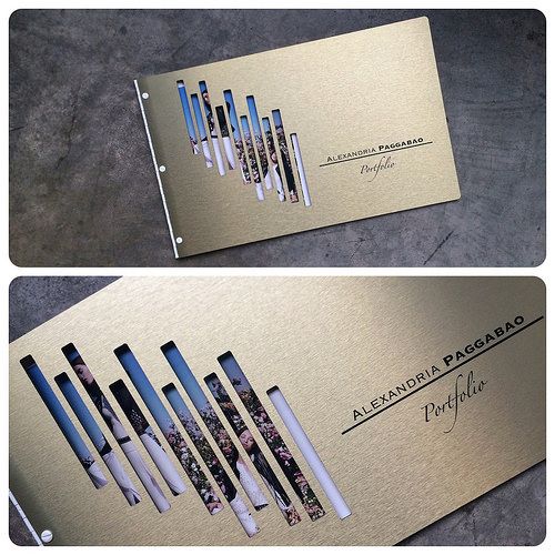
How should it be displayed?
While many designers tend to use online portfolios, having your own physical portfolio can be a fantastic way of standing out – especially when it comes to in-person job interviews. Going back to our magazine journalist example, by designing, developing and printing a bespoke magazine filled with your previous work, this will not only demonstrate your skills for innovation, but also your ability to think outside of the box.
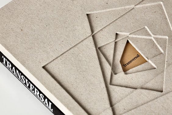
You could even go one better, by personalizing your design portfolio to each prospective employer you interview with. Employers see portfolio after portfolio so doing all you can to stand out is of paramount importance.
If you’d rather go down the online portfolio route, that’s fine as well, just make sure you stay on top of it. It’s all too easy to forget to renew your website domain and make your portfolio all that more difficult for employers to find. Likewise, as a general rule of thumb, make sure to use high-resolution images, an easy-to-read font, a natural colour scheme, and a clean layout. Just because it looks great on your laptop screen won’t necessarily mean it’ll look good on a large monitor or mobile phone – make sure it’s user-friendly before publishing it to the masses.
Want to learn more on how to develop your interior design business? Check out our Marketing for Interior Designers eBook:

