Kitchen Design Challenge: 7 Ways To Make The Most Of Sloping Ceilings
Loft conversions, quirky architecture, unusual buildings or just irregular spatial proportions… whatever the particular characteristics of your interior space, sloping ceilings are a common problem. How do you deal with these features in your kitchen design?
The good news is that with a bit of planning and arranging, you can make the most of awkward angles and maximize the space available. Here are some useful tips, ideas, and inspirations to overcome some of the design challenges.
Unify with color
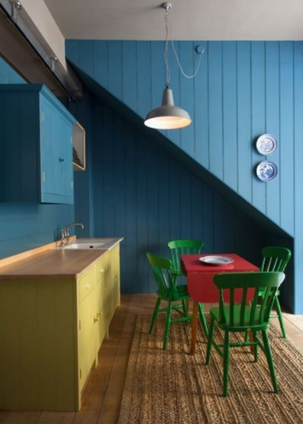
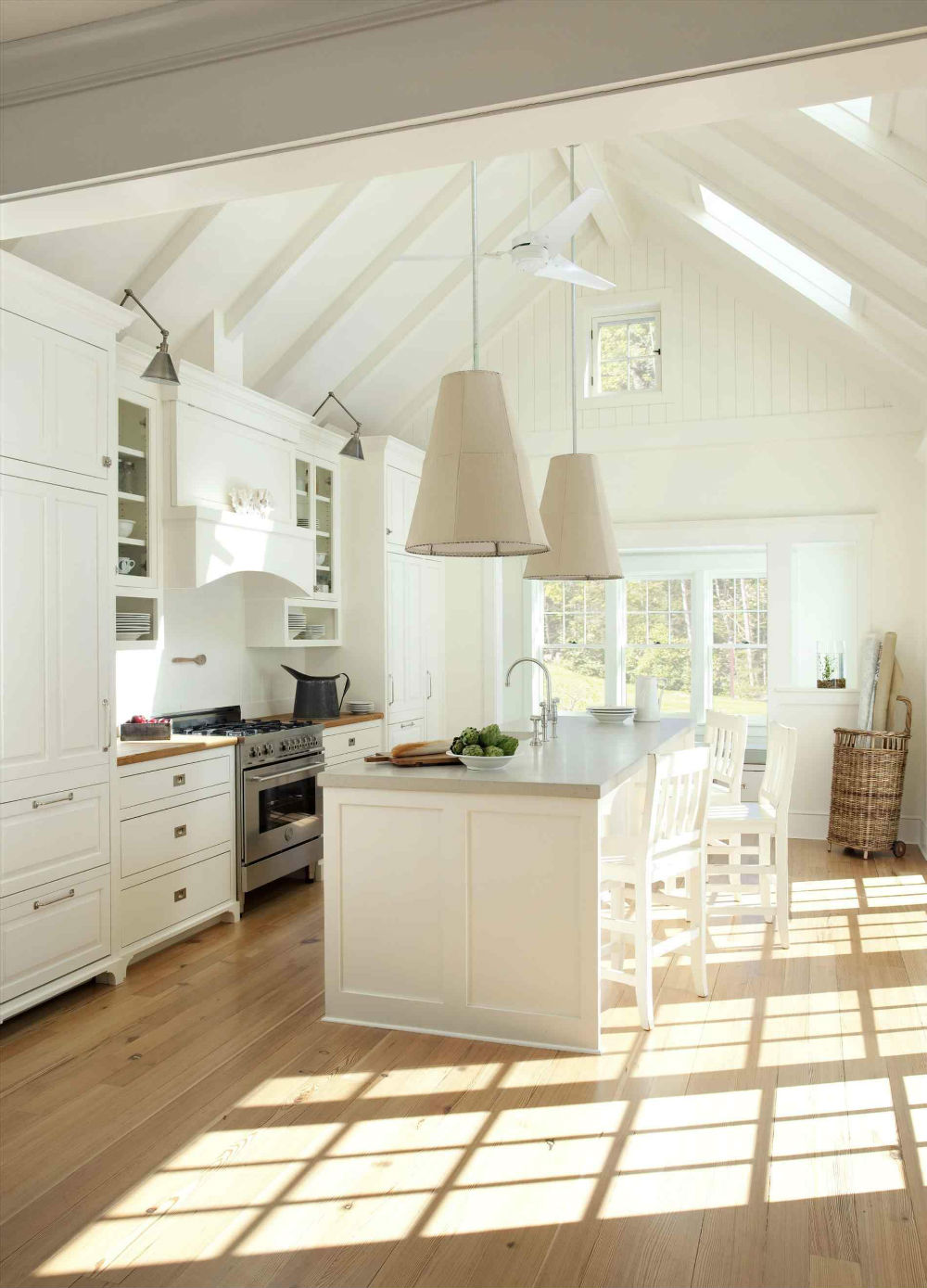
In terms of aesthetics, a diagonal line across a wall or ceiling can be visually jarring. One excellent solution is to paint the entire area in the same color, which has the effect of making the steep angle disappear. Whether you reach for the trusty brilliant white option for maximum invisibility or choose a deep accent color such as the rich blue shown below, the awkward space immediately feels more harmonious and united.
Source: Houzz
Create a contrast feature
Alternatively, if you can’t or won’t hide a pesky ceiling flaw, why not make a feature of it instead? Contrasting textures and colours can be used to create a bold juxtaposition that adds drama and excitement to an otherwise unremarkable room. Whether you use exposed brickwork against a smooth plaster, or interesting, patterned ceramic tiles against a plain ceiling, the steep lines will stand out and add definition.
Source: Decorpad
Add hidden storage
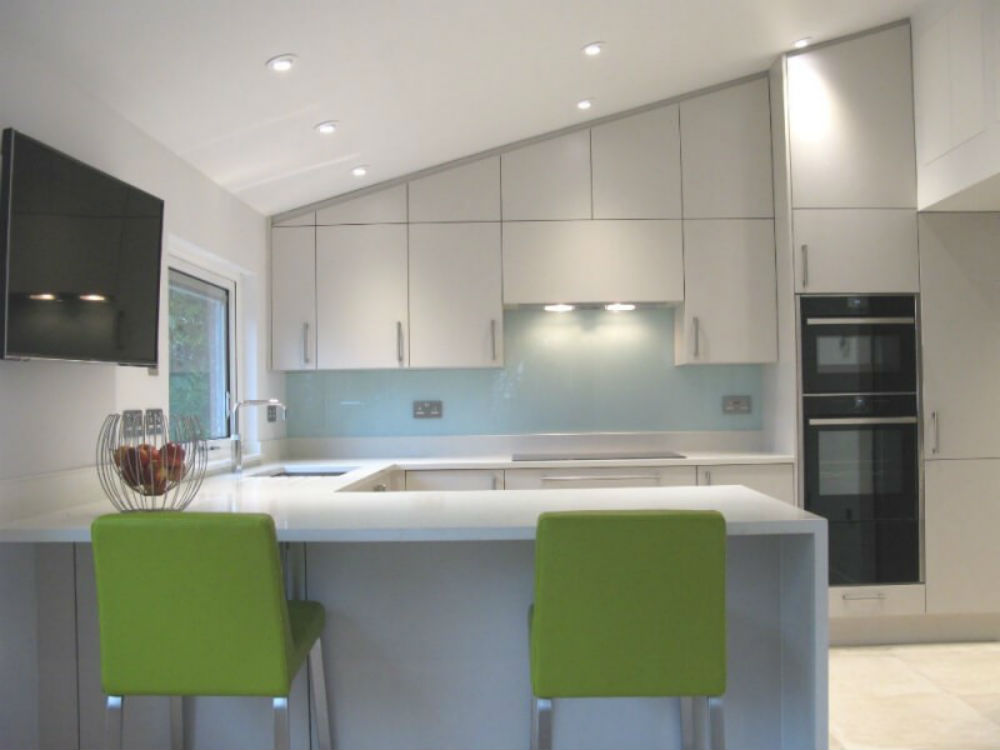
There’s no such thing as having too much storage, particularly in the kitchen. Great built-in kitchen design should be tailored to the exact dimensions of the room, taking account of all available nooks and crannies as well as unusually shaped areas in order to maximize the available spaces and create additional kitchen storage. Sleek cupboards added above base units will fit in seamlessly, offering plenty of extra storage for all our ‘stuff’.
Source: David Haugh
Fit open shelving
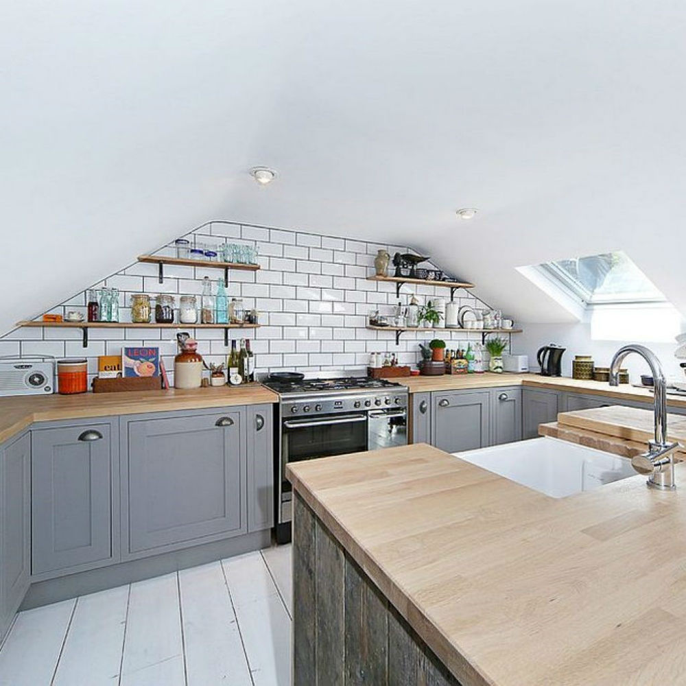
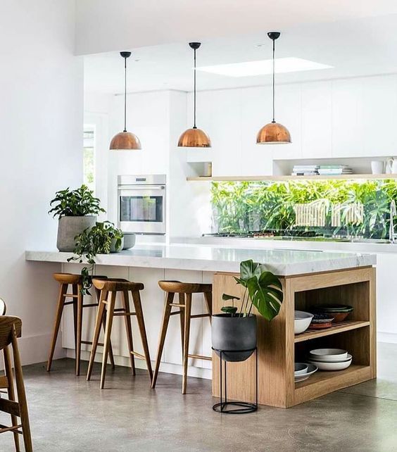
Who says that kitchen storage has to be concealed? Sometimes it’s easier to have everything within view and close at hand. For far too long, open shelving has been the poor relation of kitchen storage, a higgledy-piggledy assortment of paraphernalia that would be better stored behind doors. But: with a bit of creativity, you can curate your storage jars, china, and utensils to produce a visually attractive solution that adds to the overall ambiance of your kitchen.
Source: Militant Vibes
Let the sunshine in
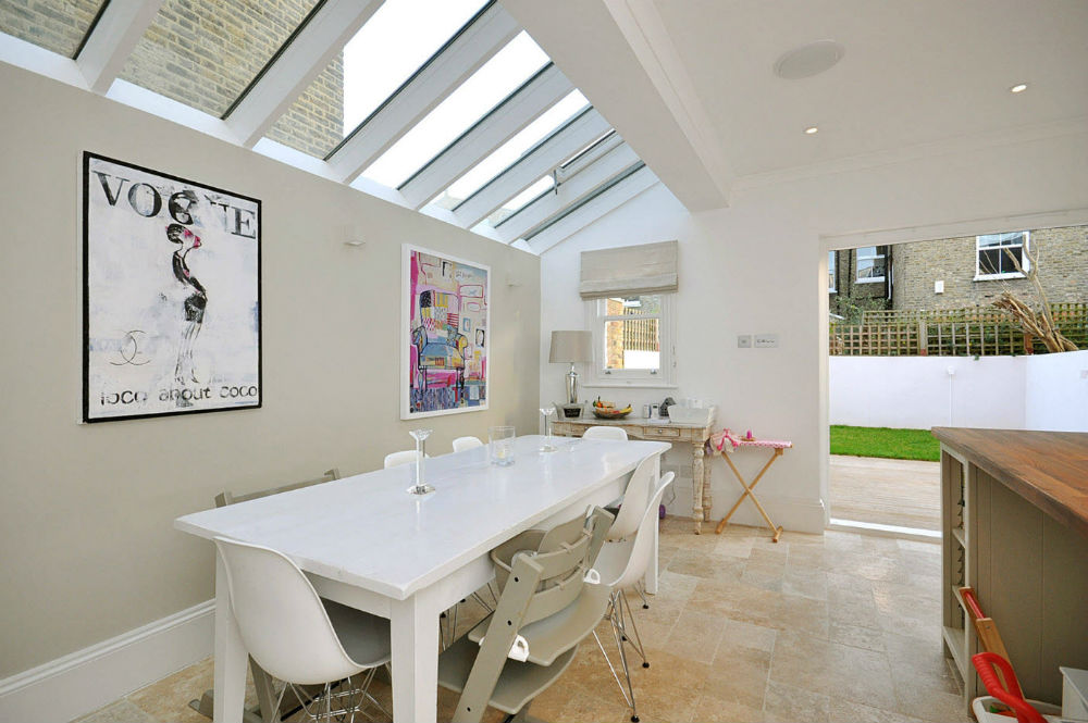
The smaller and darker your kitchen is, the more it will benefit from additional natural light and ventilation. A slanting ceiling can be the perfect place to install windows or skylights that will totally transform the feel of your kitchen without getting in the way of the everyday hustle and bustle in the heart of the home. Modern skylights and contemporary glazing options come in a wide range of shapes and sizes and technologies, so you’ll be spoilt for choice.
Source: Decoist
Layered lighting
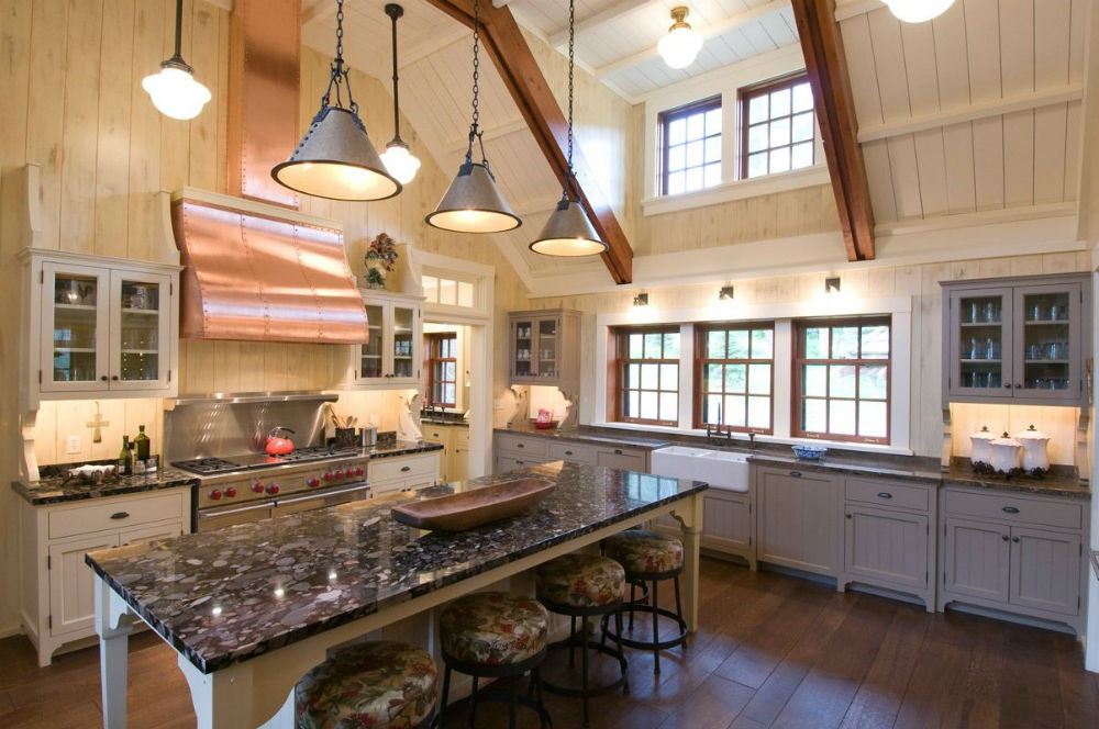
Getting the lighting right is key to any interior design project, and layered kitchen lighting schemes should consist of at least 3 different elements – ambient lighting, task lighting and accent lighting. Use under cupboard lighting to help with food prep and other worktop tasks. Recessed downlighters can be positioned in a slanting ceiling, angled towards a particular area or task. High sloping or vaulted ceilings can be the perfect backdrop for feature pendant lights to add interest and aesthetic appeal.
Source: Pinterest
Make the ceiling the main event
Who says that having a sloping ceiling in your kitchen has to be a problem? If the room is gorgeous all the way to the top, you should think about showing off the ceiling in all its glory. Double height spaces and vaulted ceilings are coveted architectural features that can make a real impact in the kitchen. Take the example below where the homeowner has taken great care to feature exposed timber beams and original wood paneling.
Source: Elle Decor

