Creating Colour Scheme Using Photography For Inspiration
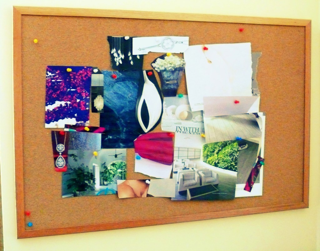
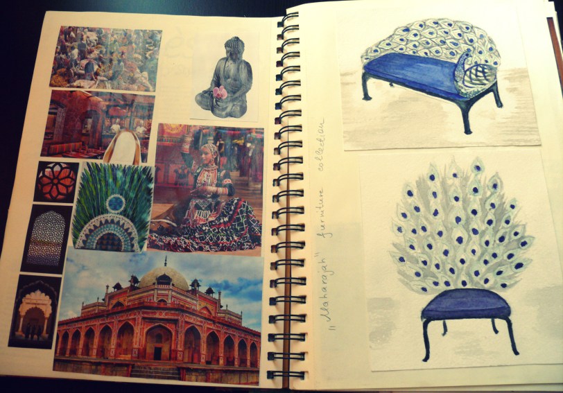
Creating a colour scheme for interior design can be a very fun and interesting process. Usually it starts with inspiration which can be found in everything that surrounds us. Every day I collect things that attract me in terms of colour, texture and form: images from the magazines, my photographs, samples of fabrics, paint chips, beads and buttons, stones and shells, leaves and so on. I have a special box where I store all my finds. When I start to work on a project I look for inspiration in this box. Selected things I pin on my Mood board and stick in my Scrapbook – this is how the design process starts. I also use the digital tools which I will talk about later in this post.
Creating a beautiful, coordinating and an unconventional colour scheme is not an easy thing to do. It requires knowledge of Colour Theory, sense of harmony and desire to experiment.
The traditional approach of Interior Design is that strong colours shouldn’t dominate the weak ones. That’s why it was suggested that large areas of the room (floor, walls, ceiling) should be neutral and strong colours can be introduced with furniture, curtains and accessories. You might want to neglect this rule, but always try the colours which you choose in actual interior using big samples – the effect which it creates on a larger scale can be absolutely opposite that you imagined looking at small sample. You should also keep in mind that on a large surface paint tends to look darker and more intense.
Generally, all colour schemes can be divided into related harmonies and contrasting harmonies. Within these two camps there are several types of them, which I will briefly describe in the presentation below:
When I create colour schemes for my projects I often use photography as inspiration. This can be images that I find in the Internet and magazines or photos that I make myself. There are several websites where you can find ready colour palettes, for example, Design Seeds, but it is so interesting and exciting to do it yourself. Fortunately, there are some amazing software that can help you to do it within several minutes. Two of my favorite are ColorSchemer from iTunes and Kuler from Adobe. ColorSchemer is a great application for iPhone and basically, you can create a colour scheme immediately after taking a photo with your phone.
Further, I will describe how to make colour schemes with Kuler, but the algorithm remains the same for ColorSchemer as both applications are very similar to each other.
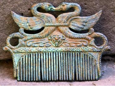
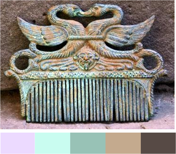
1) Choose the image you would like to use for creating colour scheme. Analyze it beforehand: can these colours be successfully transformed in interior decor? Do you want to use all hues or you like specific colour combination on the image? This is the photography which inspired me:
2) Download image into Kuler using buttons Create – From an Image – Upload.
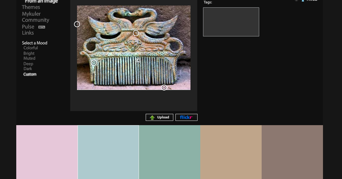
3) Start extracting colours for custom palette by moving your mouse on the image:
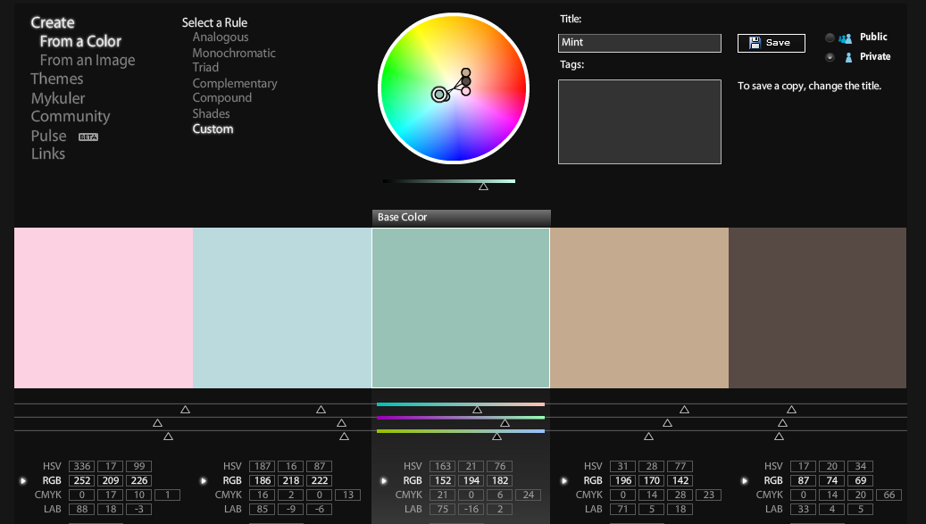
4) You can also change the values of the selected colours using special toolbar:
4) After all necessary adjustments are made, you can safe your palette or you can upload it in the Photoshop for further amendments. My colour palette is ready:
Creating colour palette is just the first step in the design process. Now you need to think on how to apply it in decorative scheme. I usually stick to the following rule: one colour needs to be dominant and used for the major surfaces in the room like walls and large pieces of furniture, second colour is applied in the smaller proportion just to support and enhance the primary colour and the rest hues go for accents to create an interest and dynamics in the overall scheme. I try not to use very intense colours for large areas as it could have too strong effect and will become tiring very quickly. Neutrals are the best option to make a background and then you can create some very effective bold accents on it.
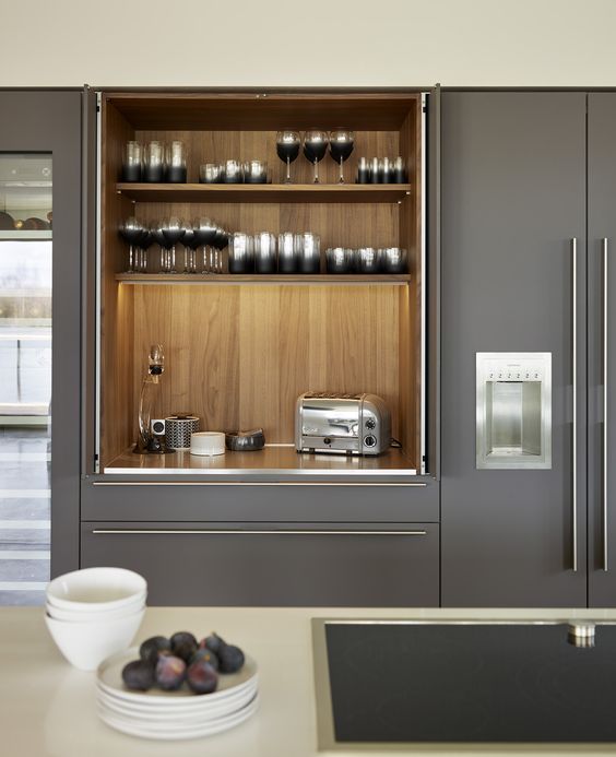
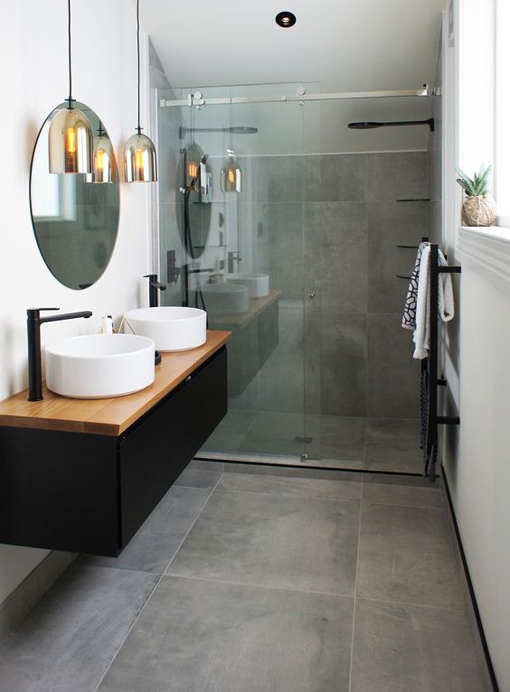
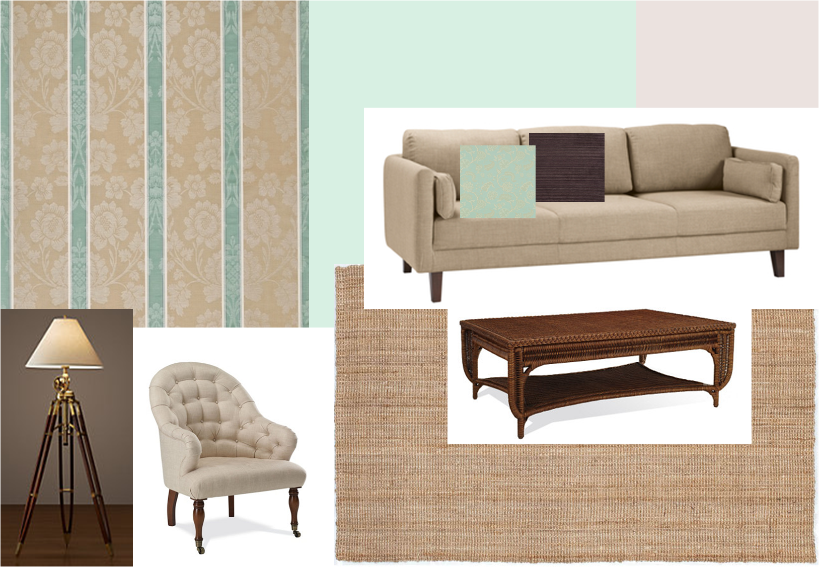
Since my palette is very subtle I decided to use light mint and off-white for the wall paint, beige and dark mint as secondary colours and dark brown for accents:
When working with colours it is also important to consider their psychological effect on our mood and health. This is a very interesting topic as well and I will explore it in one of my future posts.
Was this article helpful? Looking forward to hearing from you and don’t forget to share it, if you enjoyed it.

