Designing for a Charismatic and Multifaceted Client: A Case Study
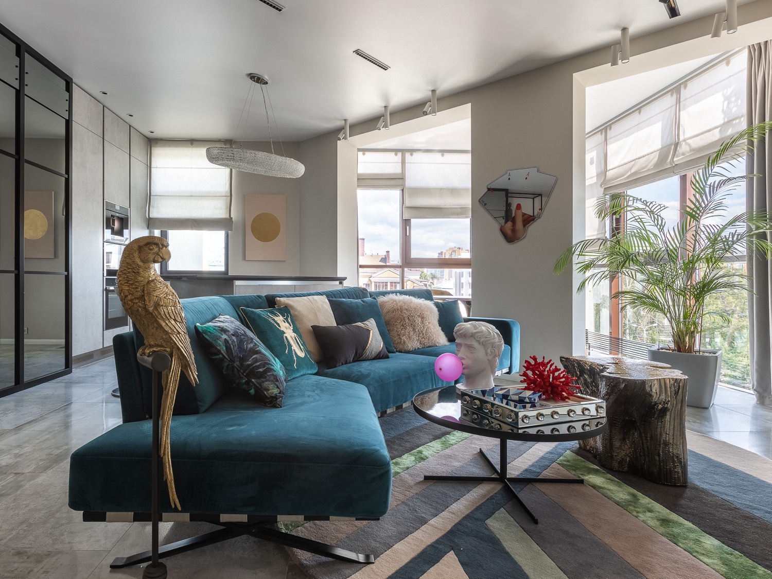
Creating an interior for a charismatic and multifaceted client is a challenging task that requires a well-developed concept and a keen eye for detail. The designer must take into account the client’s wishes and the layout of the space to create a cohesive and functional design. In this case, the client’s not quite ordinary layout added stars to the task, but due to the well-developed concept, everything was successful and even the triangular shape of the kitchen-living room was a plus and added individuality to the interior.
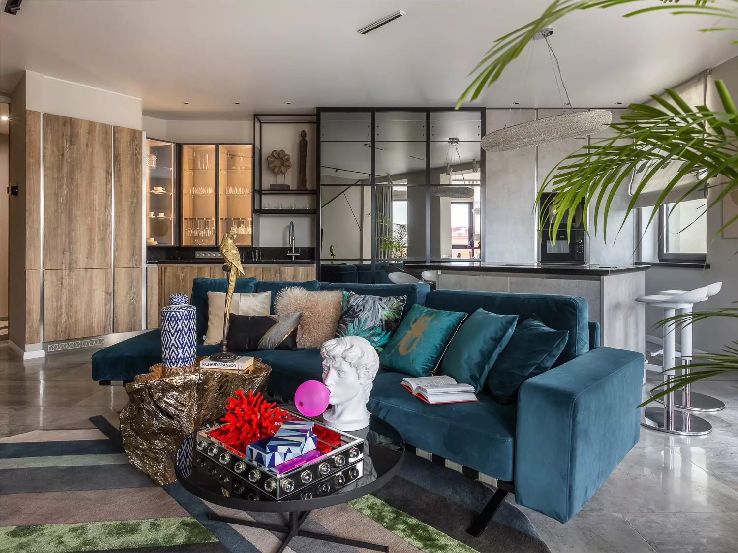
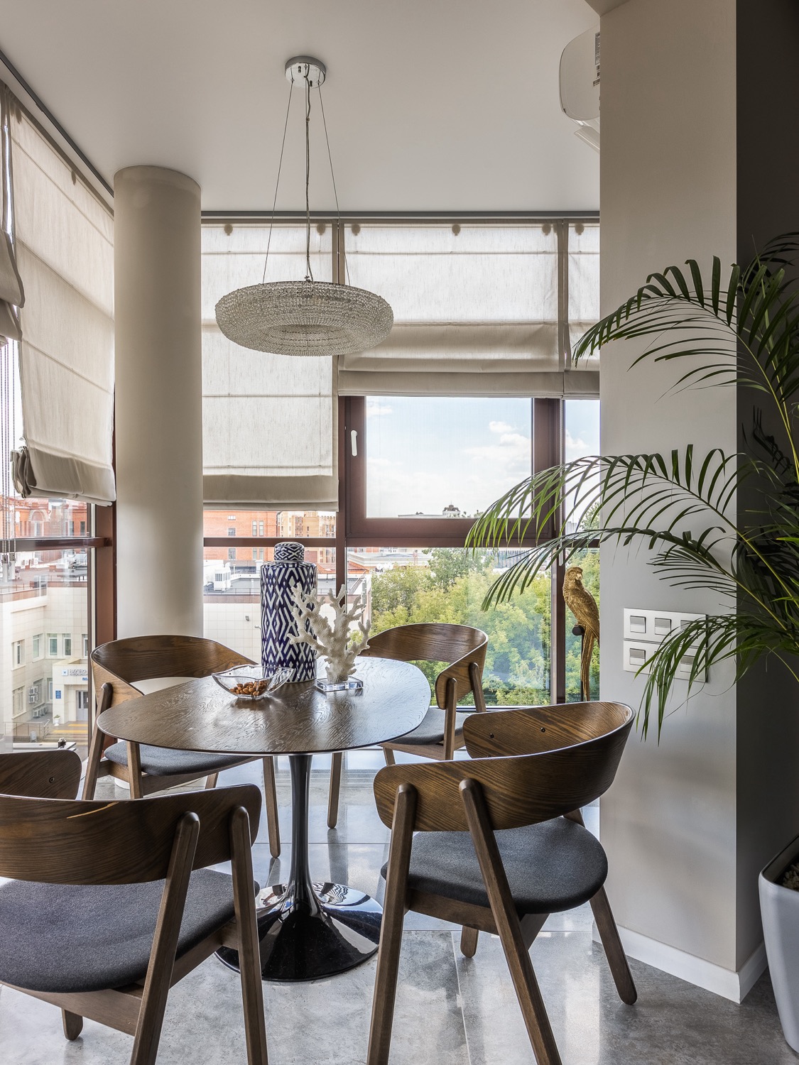
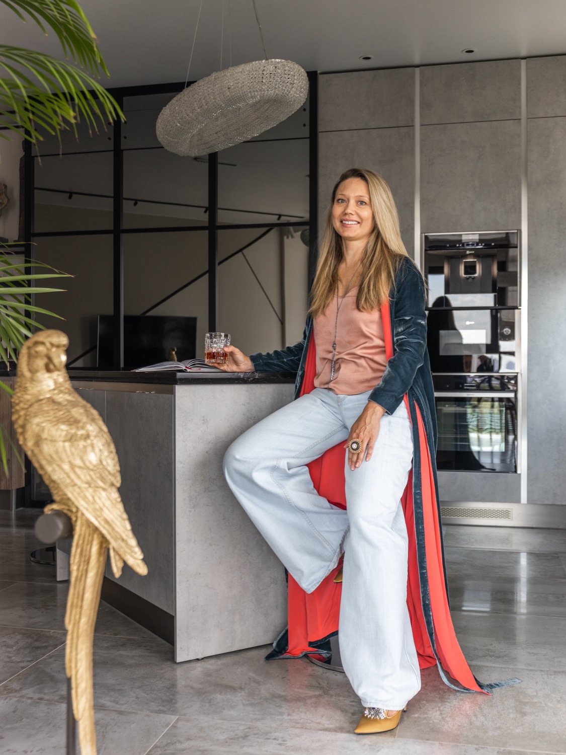
The designer’s approach to this project was to maximize the functionality of the space while creating a cohesive and visually appealing design. At the client’s request, a kitchen, an island, and even a dining area were placed in the living room area. Everything came together thanks to the verified redevelopment – demolition of walls and the addition of a balcony. The mirror with wooden overlays imitates stained glass and the reflection creates the impression of a square room. The kitchen cabinets are maximized in height and look like a showcase, which fits perfectly into the living room area. A large sofa in the color of Berlin azure with a scattering of soft cushions turns the center of the living room into a real lounge area and adds a bright accent, enlivening the space. The round coffee table seems to float in the air due to its mirrored table top and graceful legs. Art-object “stump” can have a utilitarian function, and if a large company gathers, it can serve as an additional seating place. And sprawling palm trees in tubs as a finishing touch emphasize the scale of panoramic windows.
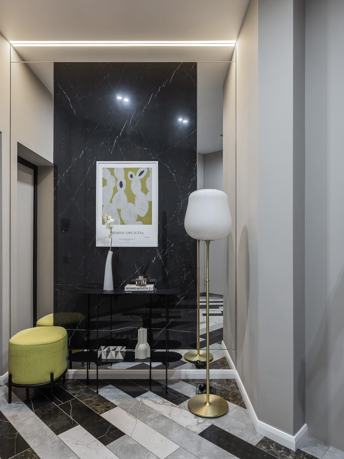
The hallway tiles are made according to the designer’s sketches. Its asymmetrical pattern sets a cheerful rhythm and repeats the complexity of the living room. The tulip floor lamp on a bronze leg echoes the abstract poster on the wall and the rounded banquette. The white walls add light, while the graphite insert opposite the mirror adds depth.
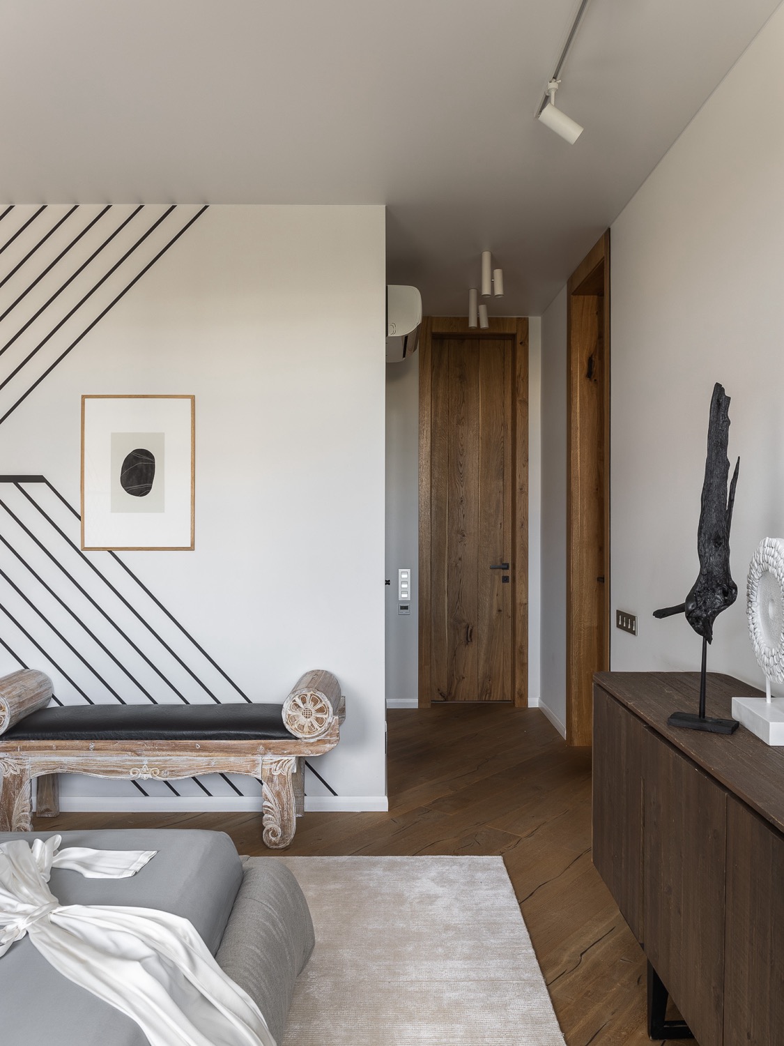
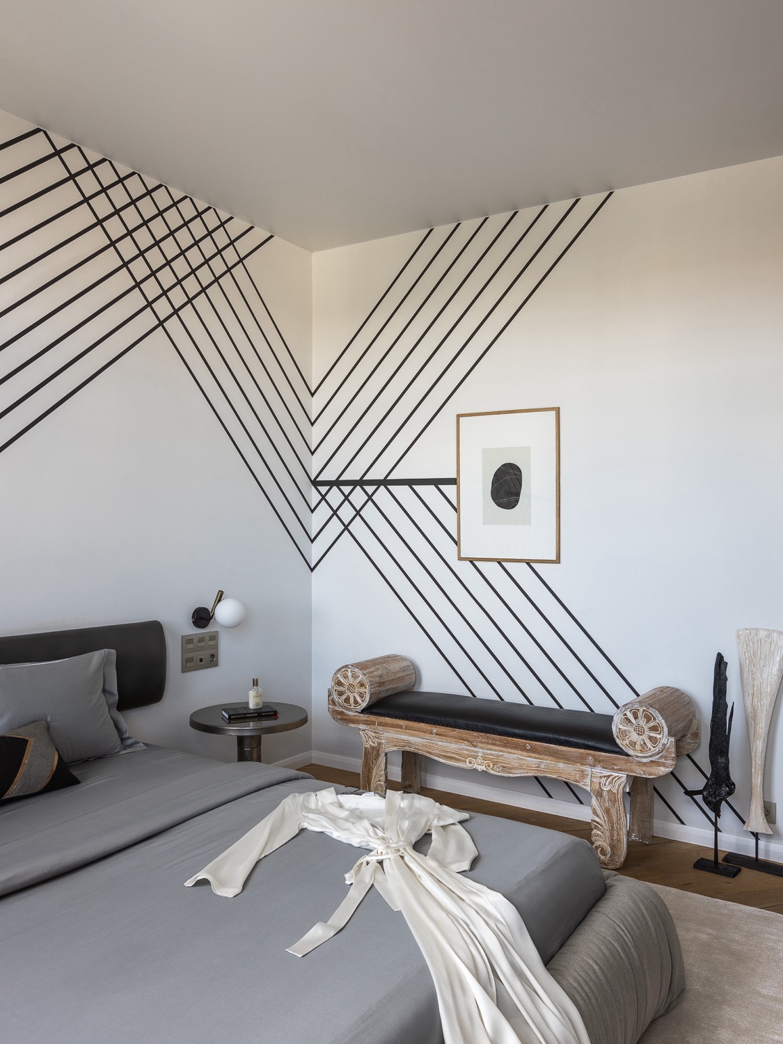
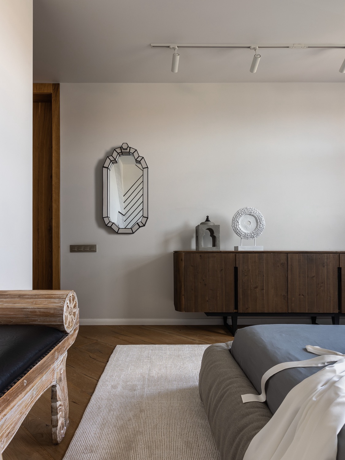
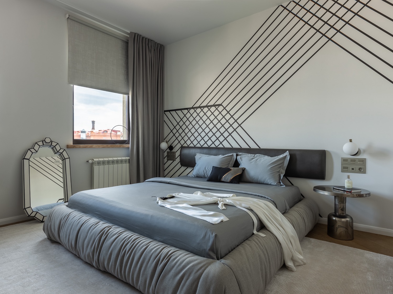
The bedroom supports the concept of asymmetry with a pattern on the walls. The graphic ornamentation is balanced by the softness of the gray-beige range of the room. The spacious bed disposes to rest. Cozy textiles in natural shades add warmth and comfort to the space.
In conclusion, this project is a testament to the designer’s ability to create a functional and visually appealing design that meets the client’s needs and exceeds their expectations. The designer’s attention to detail and creative approach to the space resulted in a unique and inviting interior that is both beautiful and functional.
Design Tamara Strugova
Photo Roman Spiridonov
Interior stylist Diana Mukhtarova

