Apartment Full of Light and Air by Kerimov Architects
A lot of light and air: the interior of an apartment in the residential complex
“Vorobiev House”.
The architectural bureau Kerimov Architects designed the interior of the 200 sq. m
apartment in the residential complex “Vorobiev House” (Moscow). The clients are
a young couple.
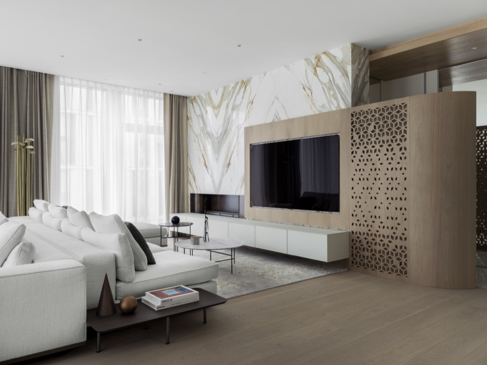
The natural materials and light colors, used in the project, visually enlarge and
expand the initially large space.
MULTIFUNCTIONAL ZONE
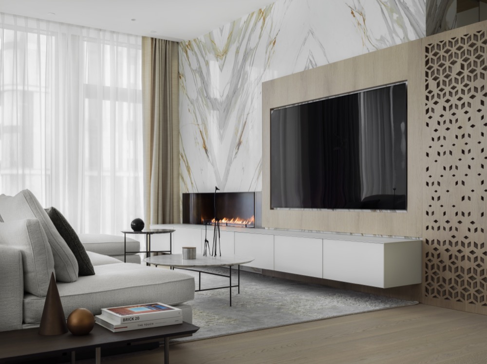
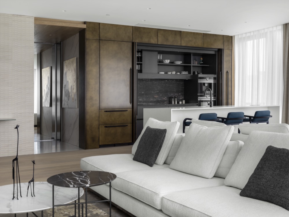
The spacious multi-functional area includes a living room, dining area, and
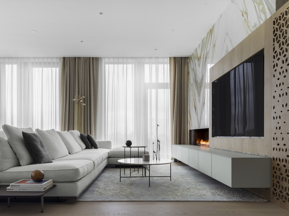
kitchen. The interior is organized by Minotti sofas, oriented to two sides: the linear
sofa faces the dining area, and the L-shaped one frames the lounge area in front of
the TV and fireplace. De Padova tables with slim round tops and linear bases look
graphically on the background of a light gray sofa and Jan Kath rug. The
Rimadesio TV cabinet and the Minotti sofa are co-scaled and height-equal, thanks
to this design approach, the living room looks visually light and compositionally
complete. The main accent in the living room is the wall made of an Italian natural
marble panel and perforated veneer screen which specially created for this project
by Kerimov Architects. The thin Paola Castelli floor lamp practically merges
with the vertical drapery of curtains, bringing atmospheric light to the lounge area
at night.
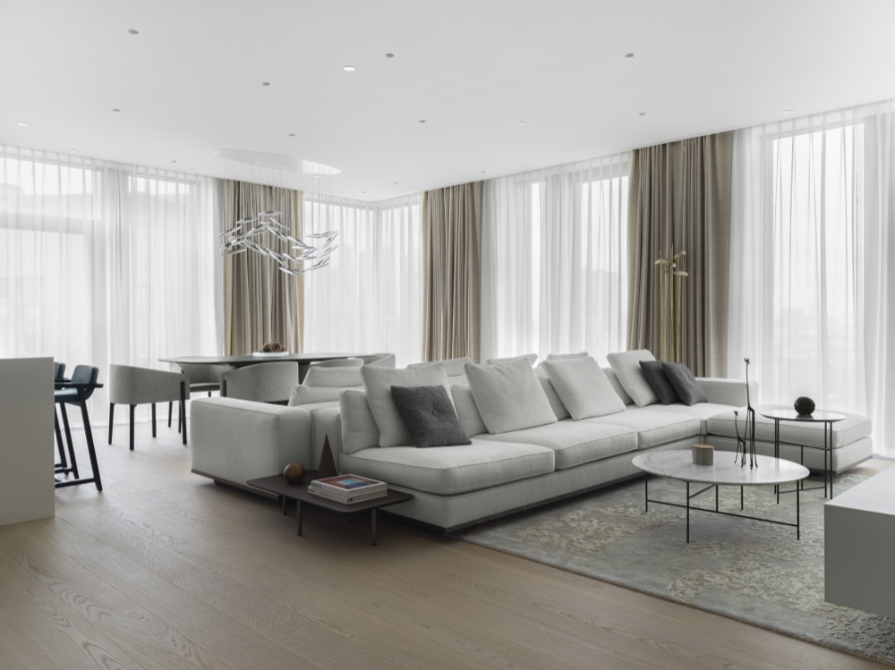
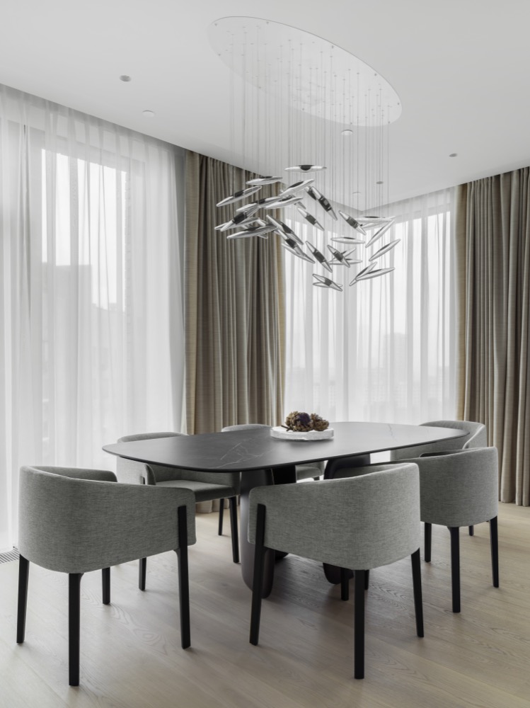
The dining area is formed by a Bonaldo table with an original base and De Padova
chairs with a low backrest tapered to the armrests – these items have common
features like laconic stable forms, thin lines, and common proportions. An airy and
undulating Ochre chandelier literally hovers above the table adding dynamism to
the static dining group.
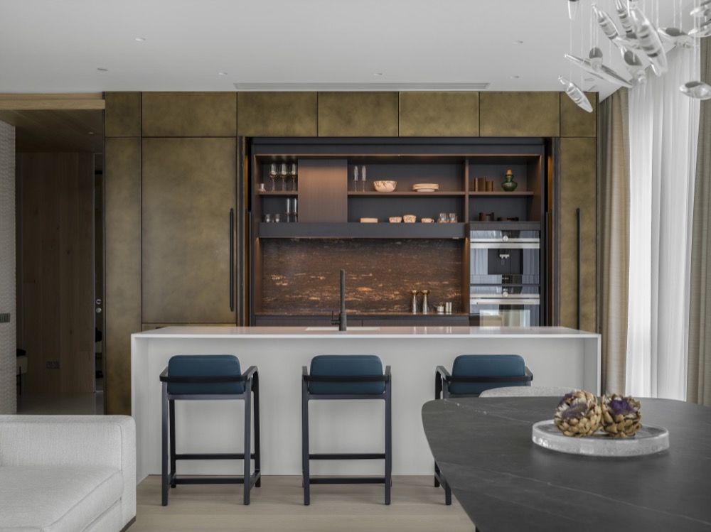
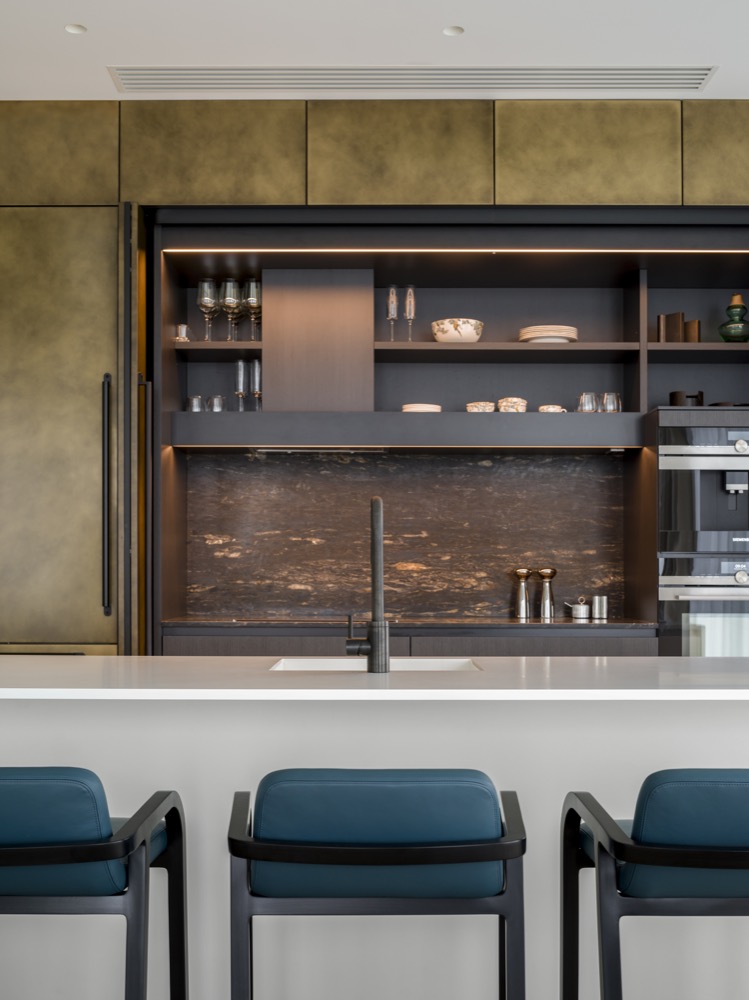
The highlight of the interior is the multifunctional Boffi kitchen. Convenient
shelves, sections for storing kitchen utensils and accessories, and a compartment
for built-in appliances are hidden behind the monolithic metal facade. The splash
back is made of Black Cosmic marble. For ease of use, in the kitchen, there is a
built-in backlight. When the kitchen is not in use, the facades are tightly closed –
this allows not violating the integrity of the interior and minimizing visual noise.
The kitchen island also serves as a bar or a breakfast area. It surrounded by
Maxalto bar stools.
WALK-IN-CLOSET
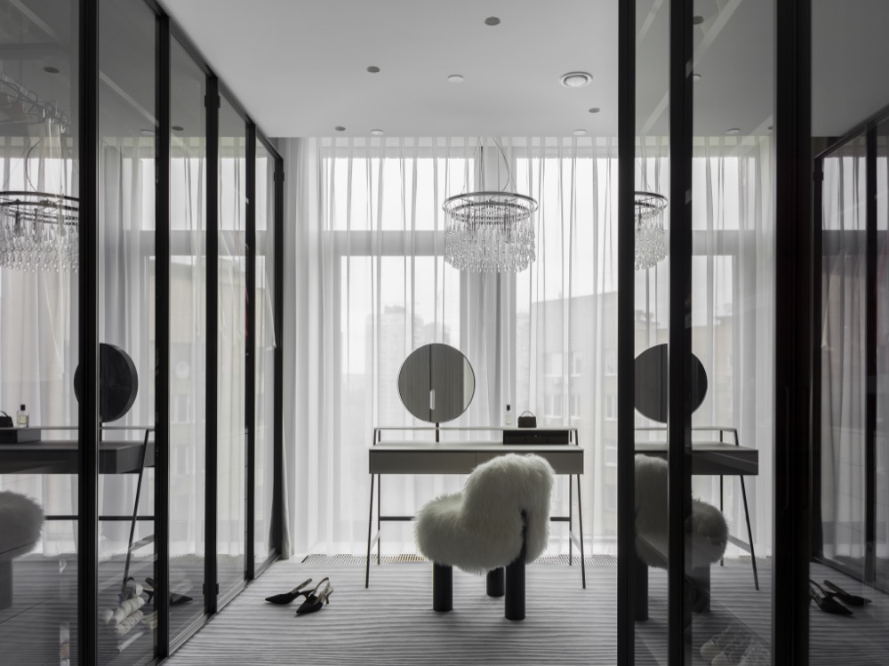
For an airy, light, and graphic walk-in-closet the architects chose a spacious Porro
wardrobe with mirrored doors, a weightless Ochre chandelier, a Galotti Radice
vanity table with fine geometry and, in contrast, a voluminous fluffy Arflex
armchair, and a carpet by Michaela Schleypen.
MASTER BEDROOM
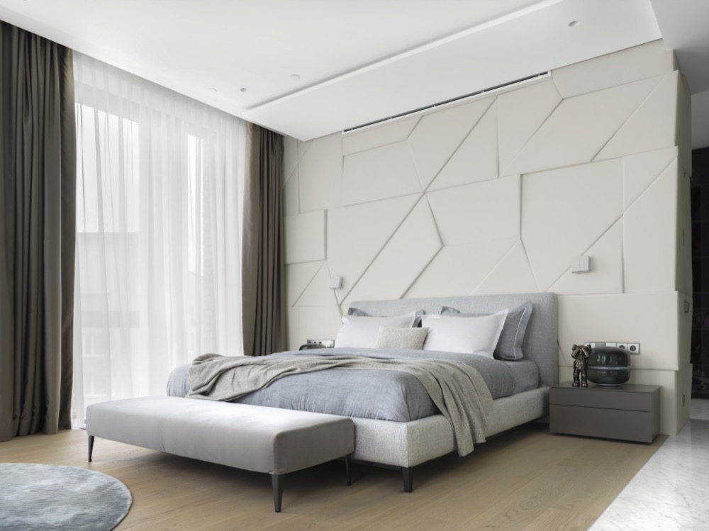
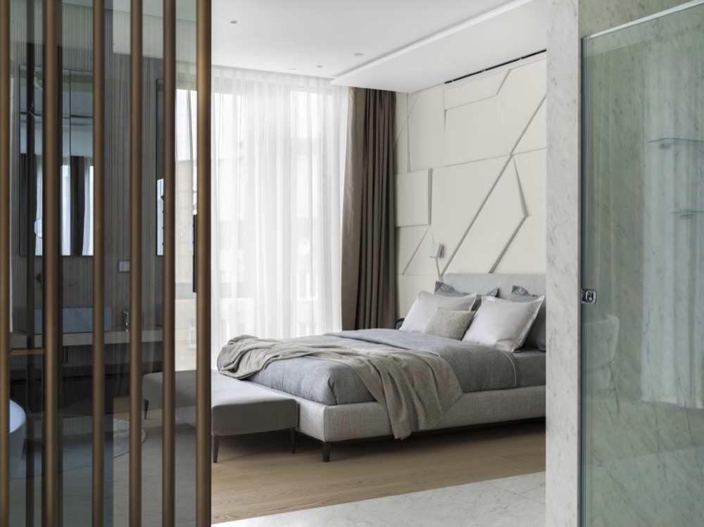
The master bedroom is designed in light colors. A characteristic feature of the
interior is a relief alcantara panel created by Kerimov Architects with built-in top
lighting, which plays beautifully on three-dimensional geometric planes while
enlighted.
The Minotti bed with a comfortable fabric upholstered headboard is perfectly
complemented by the Maxalto bench and the Porro bedside tables.
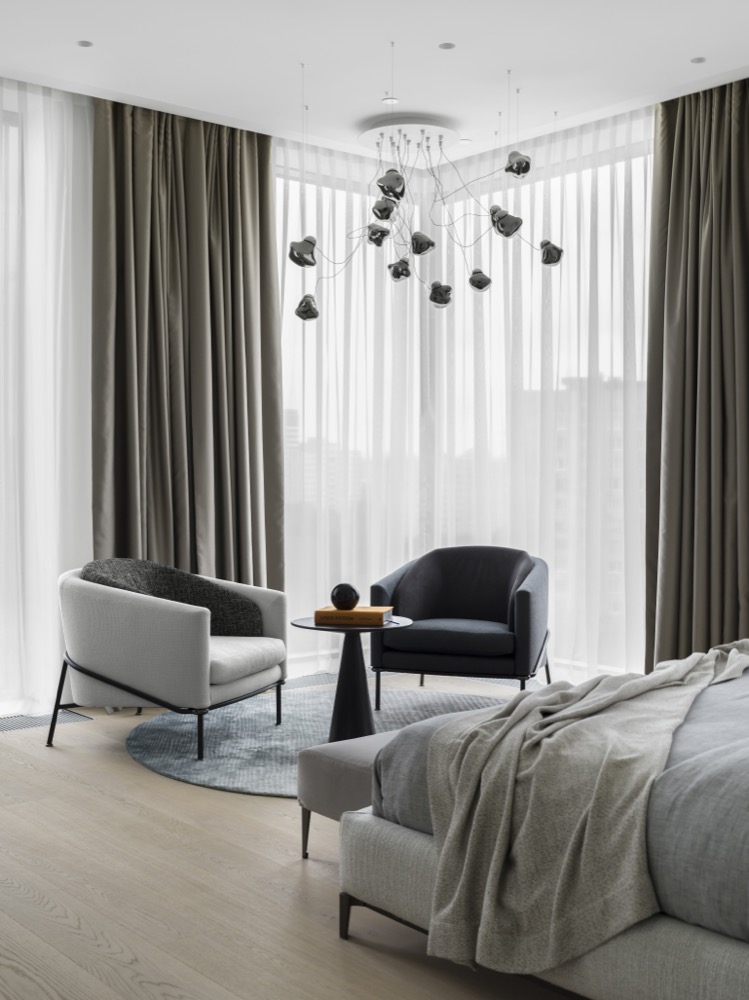
The lounge area in the bedroom is formed by two-tone Minotti armchairs with
enveloping U-shaped backs and a geometric Baxter table on a round carpet by
Michaela Schleypen. Above this group, there is the Bocci branched lamp with
flower-like shades.
MASTER BATHROOM
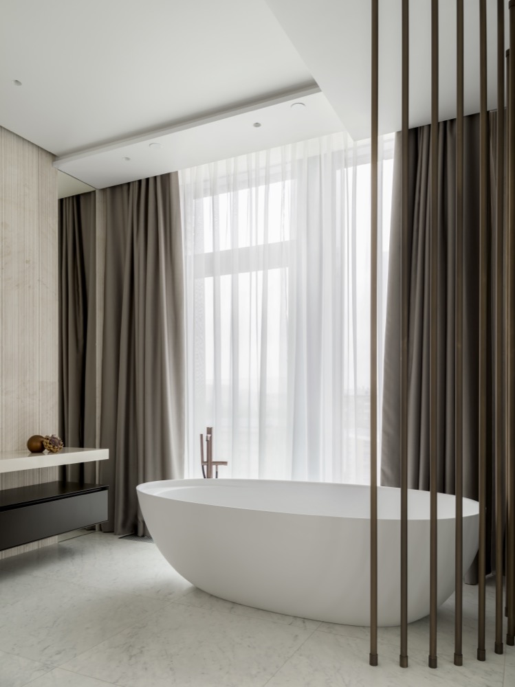
The master bathroom is adjacent to the master bedroom: the spaces are
interruptedly connected by Rimadesio sliding glass doors. Like the bedroom, the
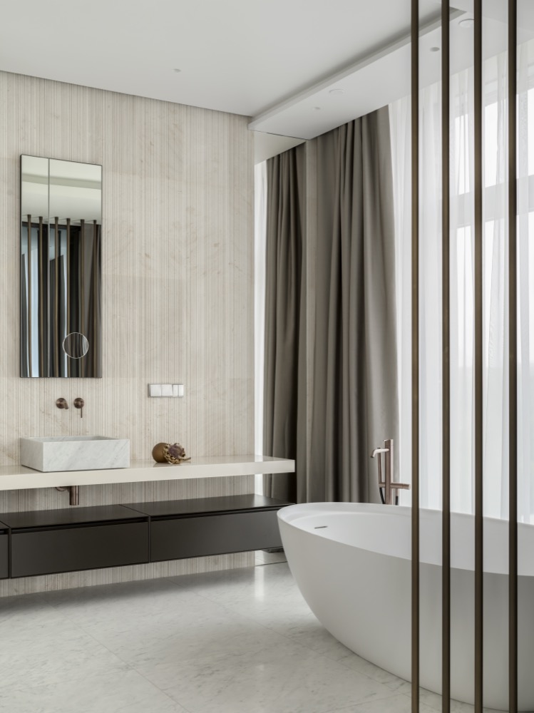
bathroom is designed in light colors multiplying the natural light that enters the
interior. The necessary privacy is provided by blackout curtains and a metal
decorative screen, designed by the architects, that frames the bathtub by Antonio
Lupi.
In the design of the master bathroom Salvatori natural stone and Antonio Lupo
sinks made of natural marble are used.
GUEST BEDROOM
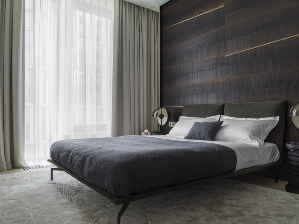
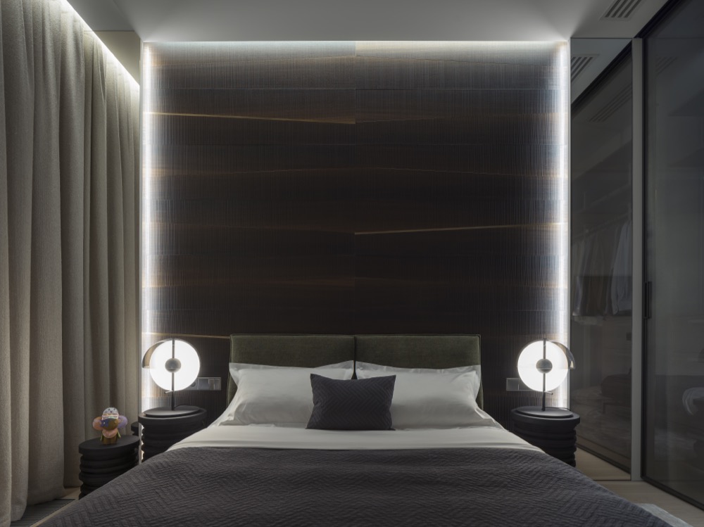
The guest bedroom is designed in dark tones, in contrast to the master bedroom.
The key feature of the interior is the wall panel behind the bed, created by the
architects, with built-in perimeter lighting, which nicely reflects on the texture. On
the sides of the panel, there are full-height mirrors with adding some visual effect.
The Saba bed is distinguished by a two-part high headboard and thin legs, visually
lightening the structure. Baxter bedside tables, as if made of rings, naturally
continue in expressive sphere its shape in the lamps with a two-tone shade.
GUEST BATHROOM
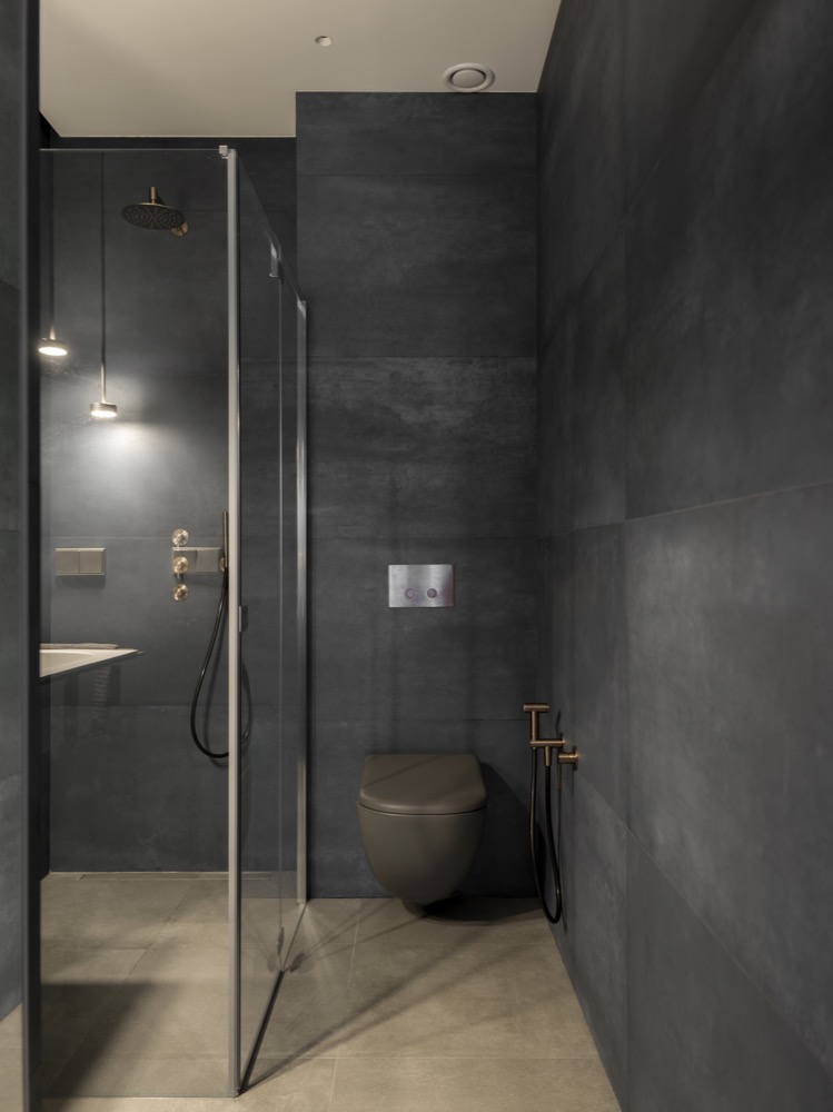
The guest bathroom is made in dark tones, creating a spectacular background for
the glass shower cubicle, graphic pendant lights, and fittings in a warm golden hue.
The brand of the bathroom furniture is Cielo.
HOME OFFICE
The home office for two is designed in neutral light colors, accentuated by a carved
Louis Vuitton leather partition. It is not only a decorative element but also
functional – it adds privacy, allowing focusing on solving important tasks.
Another feature of the interior is a textured wall, pleasant to the touch – tactile
sensations allow switching attention during moments of relaxation. Galotti Radice
furniture and Occhio table lamps were chosen for the home office.
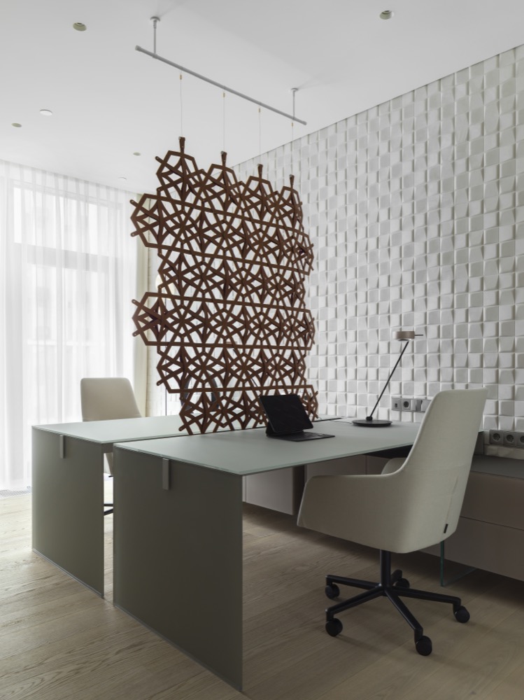
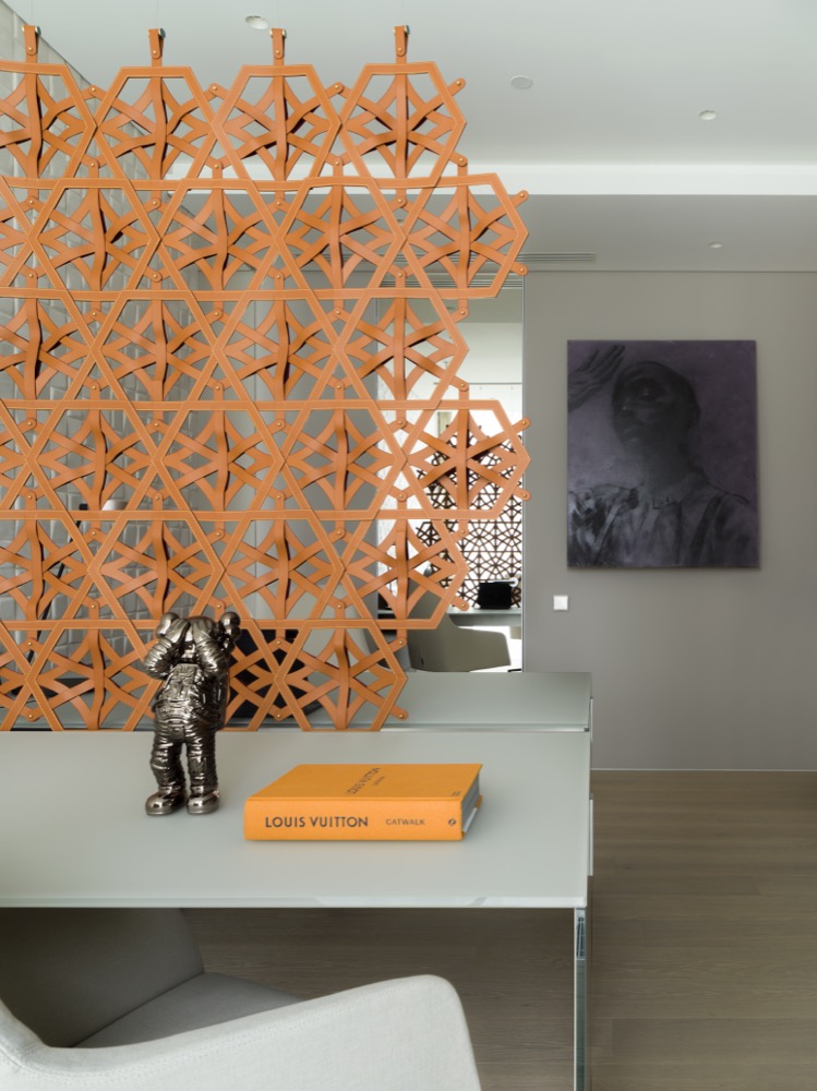
Photo: Dmitry Chebanenko. Styling: Ekaterina Kudinova.

