5 Beautiful Colour Schemes For Your Living Room
Understanding which color scheme is right for your living room, dark or light, is not so difficult. Enough to see how much natural light enters the space. But to immediately determine the colors is not always easy. And the easiest way to do it is to spy some ideas in favorite design projects. I have picked these five inspiring color palettes and also some beautiful products from Love Home to illustrate how you can introduce these colors into your interior.
-
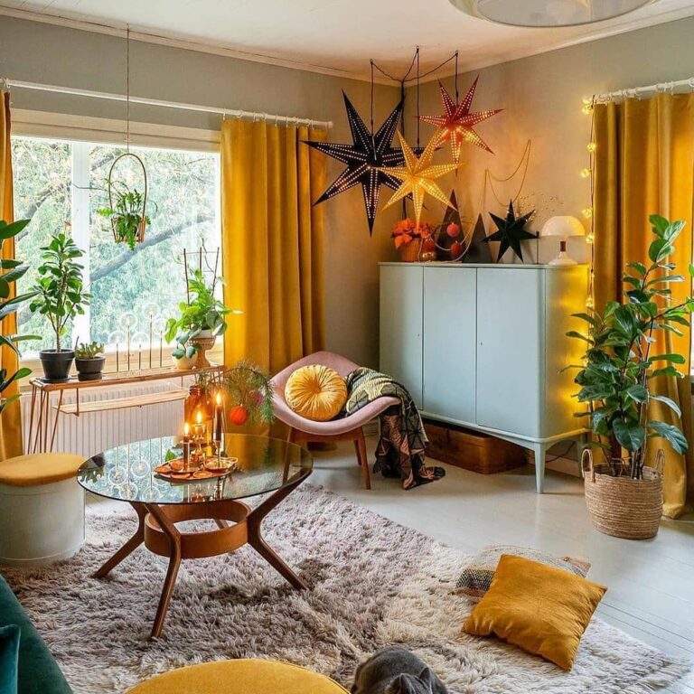
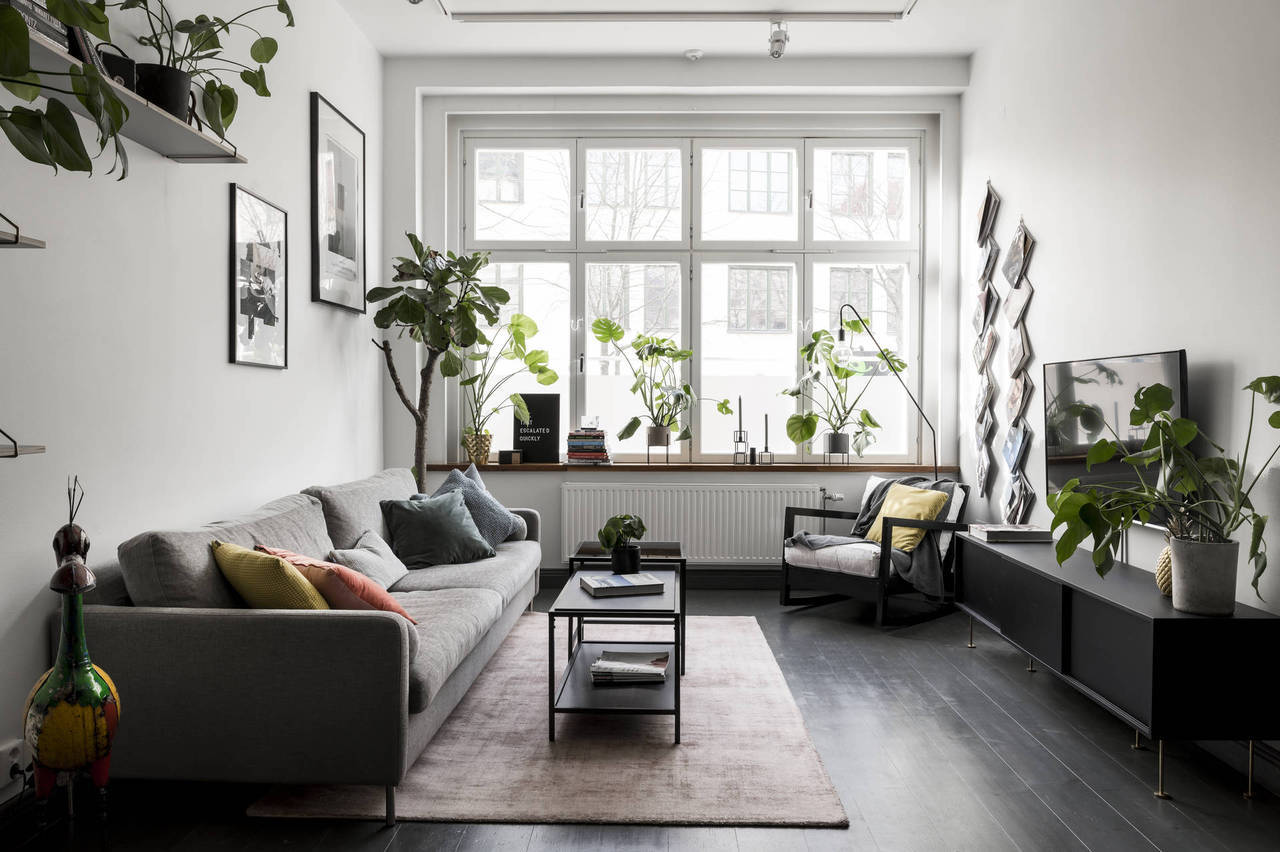
White plus pastels
Support white walls with light neutral furniture and delicate powdery accents. Take the example from Scandinavians: their interiors do not look boring, although the color palette is rather limited. The main secret of success are accessories – bright decor, comfy textile, and indoor plants.
Get the look:
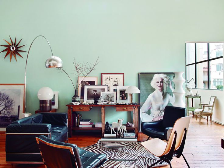
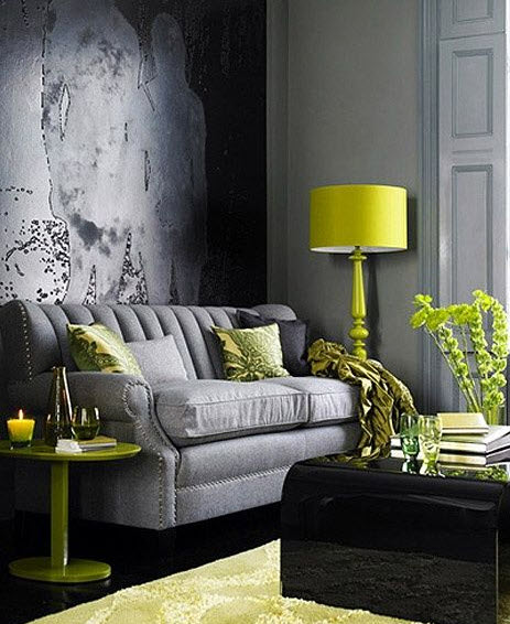
2. Yellows plus grey
If you dream about never-ending summer, decorate your interior in bright cheerful colors. Psychologists believe that yellow has a positive effect on mood and helps to cope with chronic fatigue. The main thing is not to overdo it and add bold colors to the interior in moderation.
Get the look:
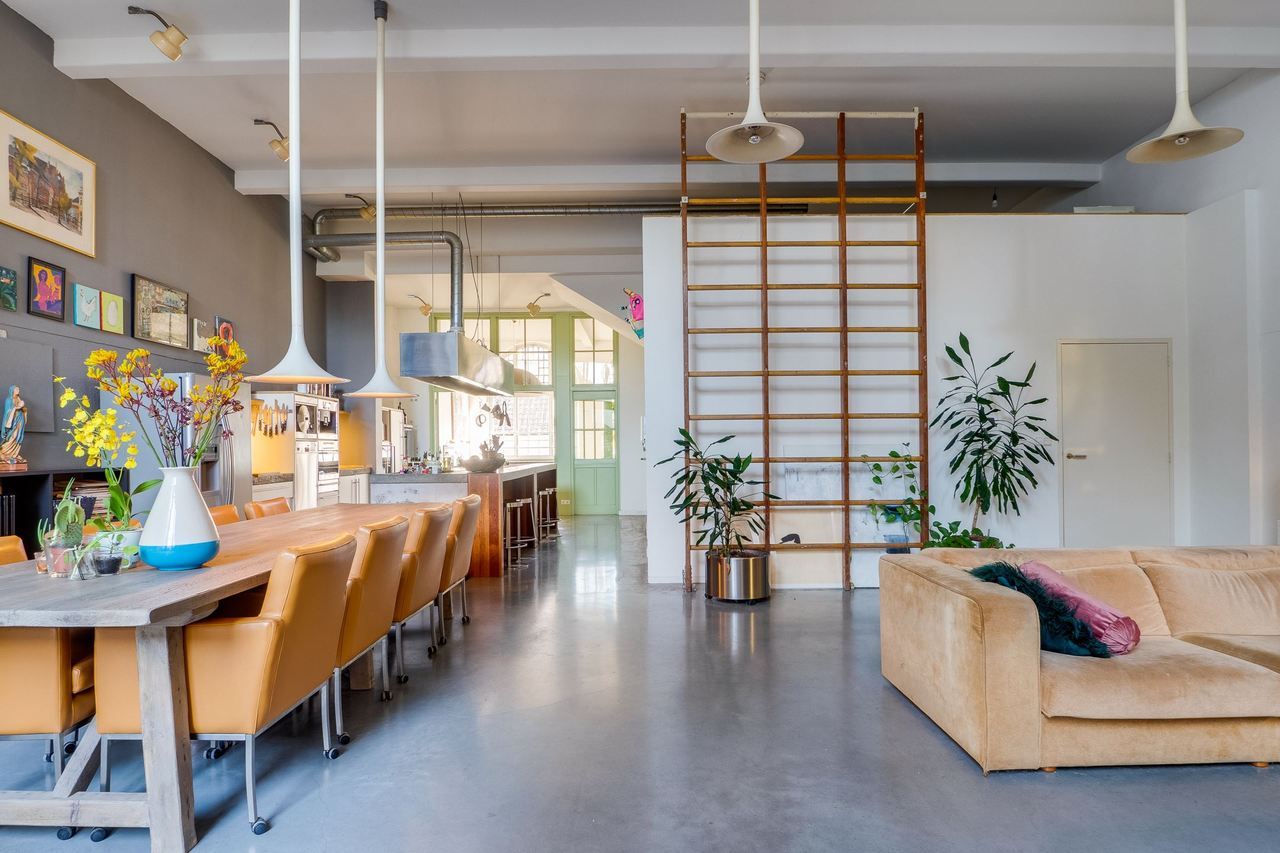
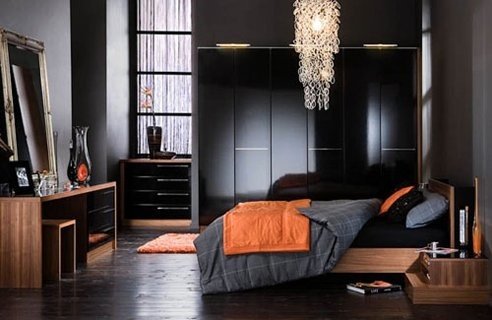
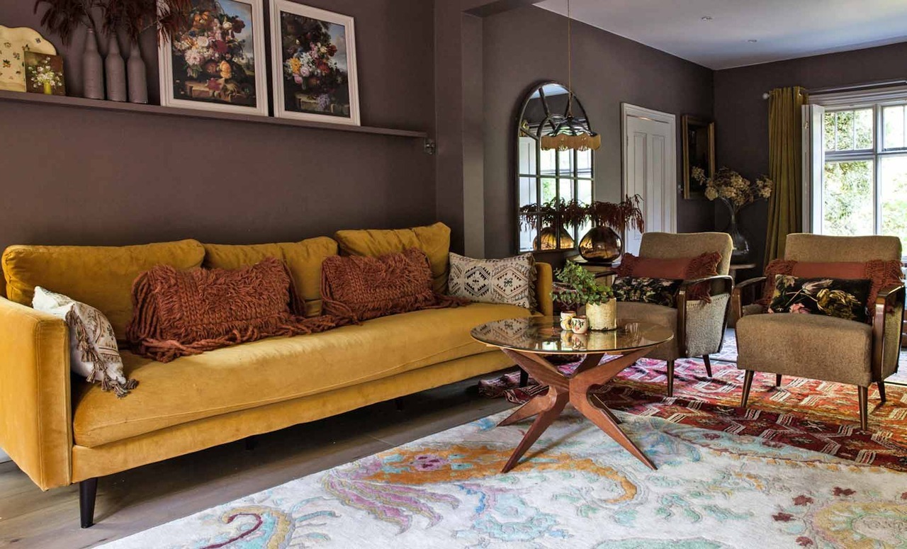
3. Browns plus reds and oranges
If you are looking for something inviting and cozy, yet unusual and charming have a look at this very original color palette below. Browns, mustard yellow and terracotta hues make this room very original. Bear in mind that this color scheme would work in a space with plenty of natural light, otherwise, the room will room too dark and gloomy.
Favorite products:
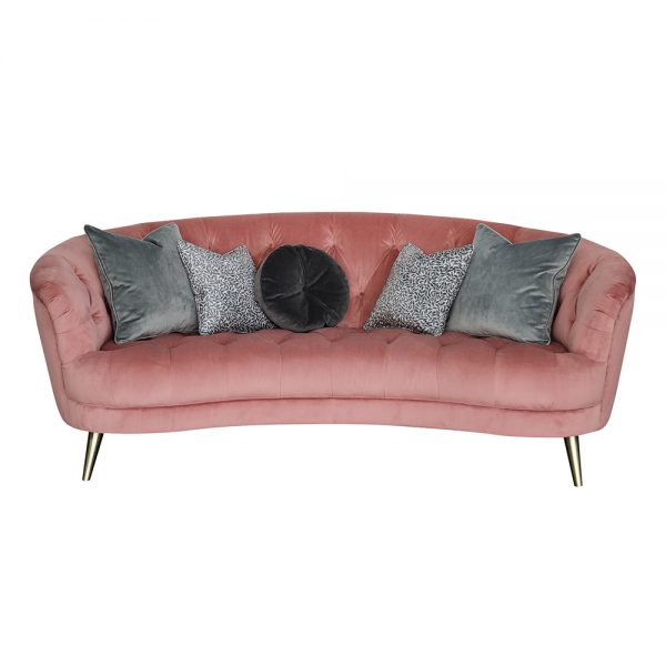
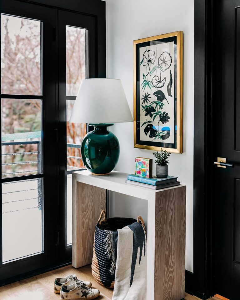
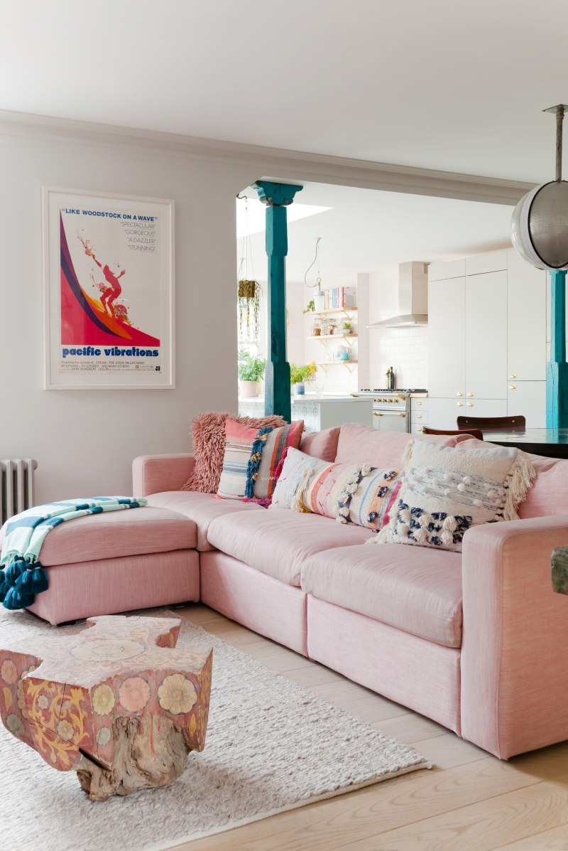
4. Emerald green plus pink
Emerald green and pink are two colors that are in vogue right now – the combination of these two will look even more glamorous and chic. Green color brings freshness and depth to the interior, while pink gives a bit of tenderness and softness. If you use these colors as secondary in your living room (for example, as large furniture pieces – sofa, armchairs, etc.), support them with little accents – pictures, decorative pillows, decor. This will bring a sense of flow and continuity to the space.
Favorite product:
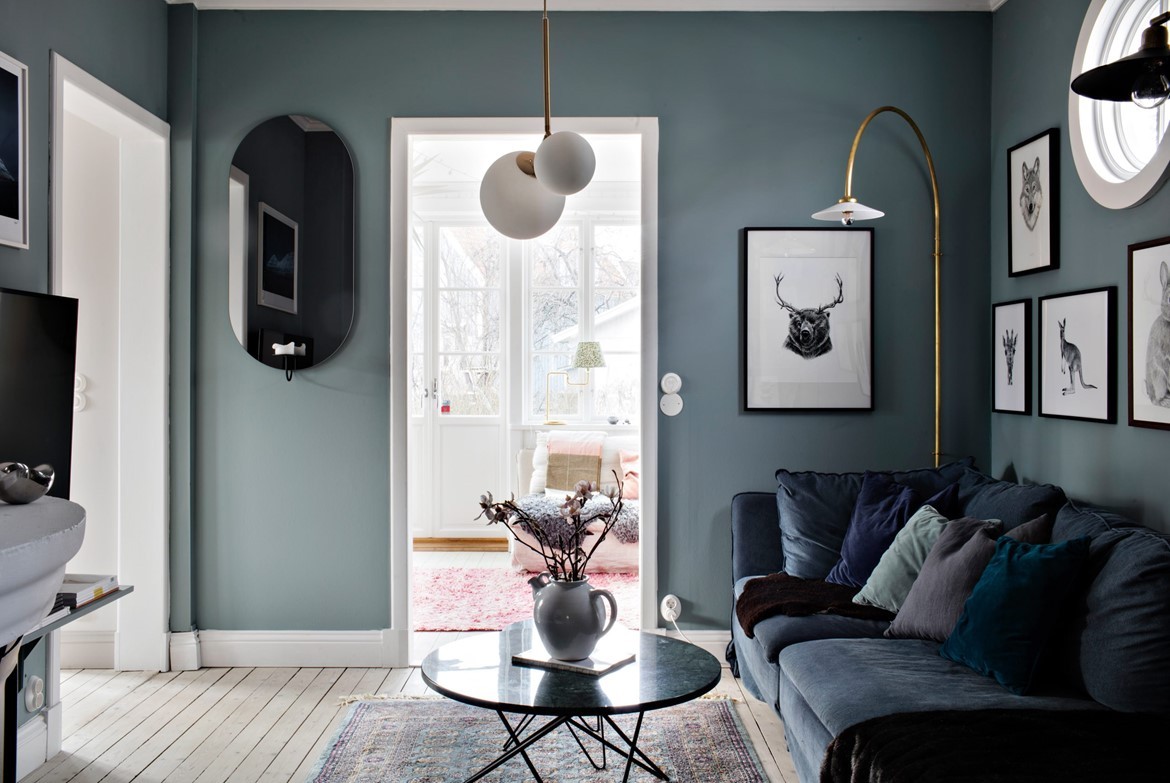
5. Dark blue plus gold
This is one of the classic color combinations which probably will never lose its popularity. Dark blue, whether it is navy or royal blue, always looks elegant and refined. A touch of gold (with accessories, art or textiles) will soften and warm up the color palette. Have a look at how skillfully designers have used it below:
Favorite products


