How To Decorate a Room Using Posters
One of the biggest trends today in interior design is decorating walls using various posters. They not only look modern and stylish but often help to conceal various flaws of the space. Today I want to share with you several ideas on how to decorate with posters and which rules to follow to do it successfully.
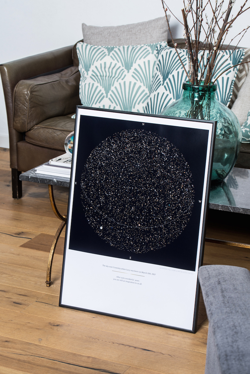
Tip number 1: A sense of unfinishedness
Speaking about the latest trends, many designers use a trick spied in the artists’ studios: not hanging pictures on the walls at all.
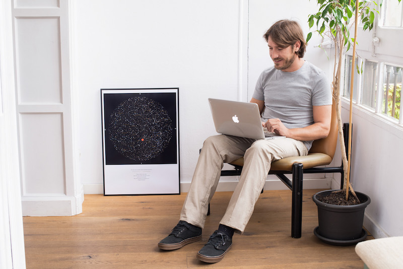
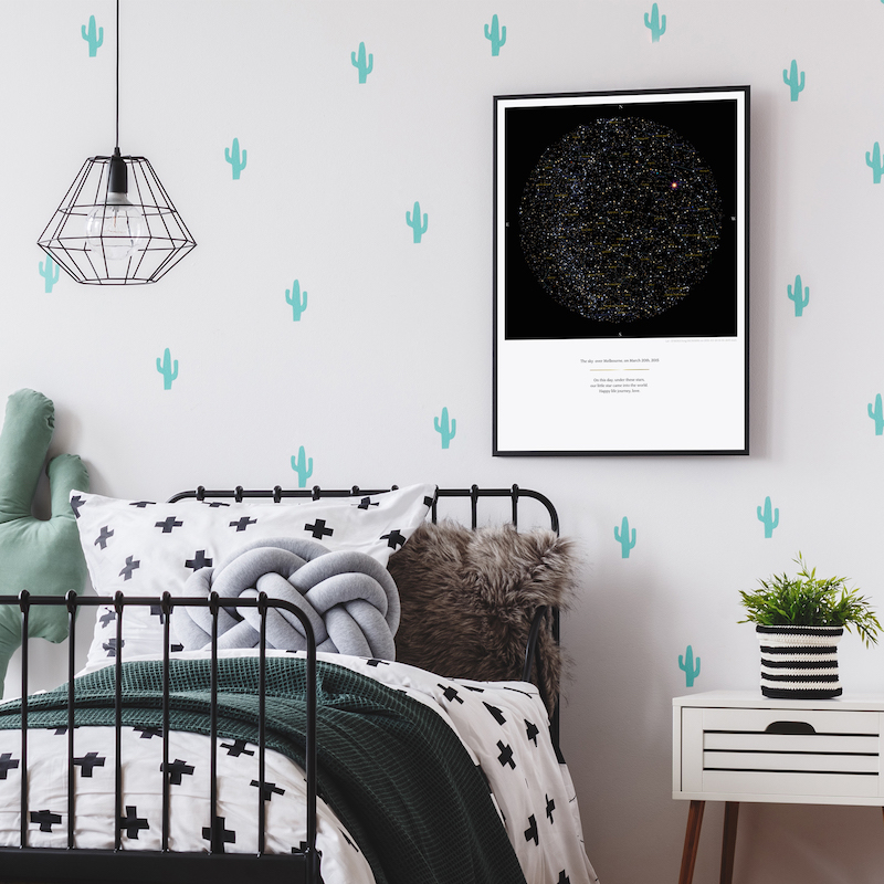
Like on the photo above the Constellation Map Poster is simply leaned against the wall, which is actually a very original idea; besides being an element with a decorative value, saves significant information about a special moment in life, since you can customize it to mark the date you want. This way you can rearrange the pictures depending on the mood, while not spoiling the walls with nails.
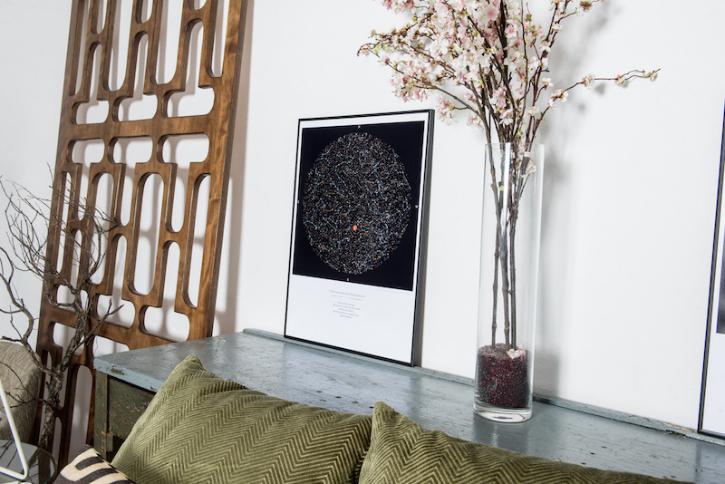
If the pictures are large enough, they can be put directly on the floor. The pictures could be also placed and layered on the console table or chest of drawers. As an option, you can install a shelf along the wall and use it to display your posters together with various art objects and statuettes.
Tip number 2: Mutual harmony
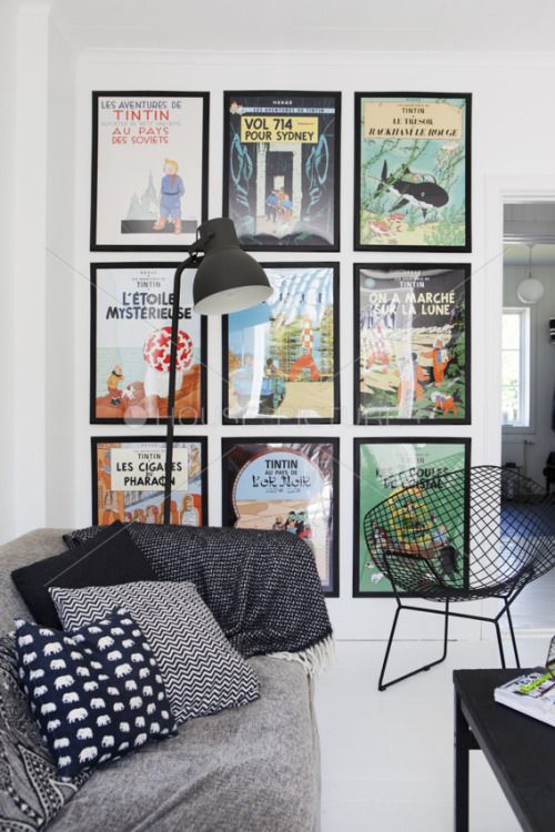
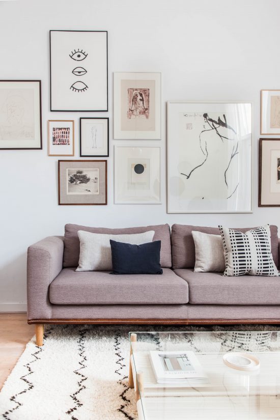
You can group various posters together to make a gallery wall – this will create a feeling of continuity and flow. Grouping similar objects together is a well-known design trick which always works. You can use the same frames for your posters to unite them in one gallery.
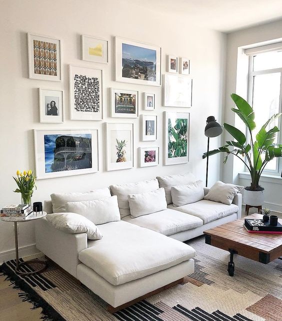
If you prefer more traditional look use posters of the same theme and same size: they will create a feeling of harmony if hanged above a sofa or dining table. You can group them in 3 and hang in one row if you have a low ceiling, or group them in 4 or 6 and hang them in two rows if the ceiling is high.
Tip number 3: Symmetry and asymmetry
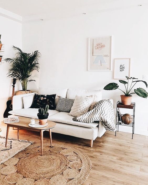
Also, it is possible to arrange the compositions by mixing the sizes and shapes: symmetrically and asymmetrically. In this case, consider the general theme or style. In some cases, contrasting options are appropriate.
With an asymmetric arrangement, use posters of different sizes with one general storyline. To ensure that the composition is not violated, the distances between posters should not be large (7-10 cm). Asymmetric layout always adds dynamics and energy to the room.
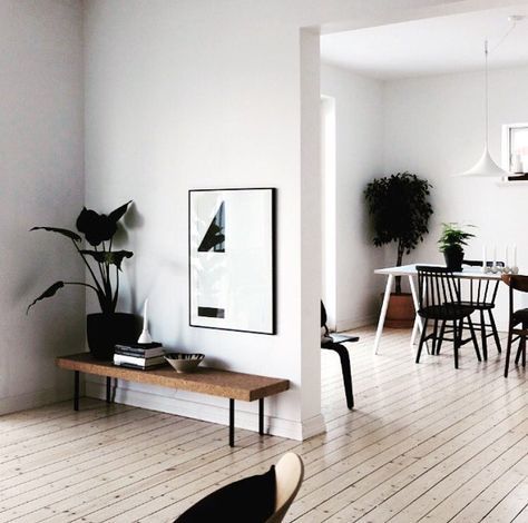
Pictures, posters or photos with the same dimensions and frames are perfect for a symmetrical arrangement. This method balances the interior well, making it rigorous and stable. Have a look how I used symmetrical layout to decorate the hallway in my recent project.
You can also follow the rule of the swarm, when pictures, posters or photos are arranged around one main picture.
Tip number 4: correcting the room’s flaws
With the help of correctly placed posters, you can distinguish various zones within one space.
If you want to increase the height of the ceiling, then the images should be placed vertically.
With the horizontal position of the posters, you can visually increase the length of the wall.
Use large sized posters for the interiors with massive furniture: small pictures will be simply lost in there.
Black and white paintings, arranged in an asymmetric order, will look good in the home office placed above the work desk. They won’t distract from your work, yet will provide the necessary rest for your eyes, especially if you work long hours in front of the computer.
Tip number 5: Find the right place
Another important consideration is that you need to find a suitable place for the picture in the room. There are generally no restrictions, but not near the TV! Traditionally good places for posters of small and medium sizes are above the console table, fireplace, sofa, or headboard. You can also create a special niche with LED lighting that will draw additional attention to the posters display. Large, oversized pictures, do not like the neighborhood with furniture or other artworks and require lots of neutral space.
Tip number 6: The joy of contemplation
When arranging the posters in the room, use the most basic rule: it should be comfortable to observe it. Use the museum rules: the exhibits are placed so that the distance from the floor to the middle of the picture is 152 cm. By European standards, it can be 160 cm.

