7 Website Design Trends to Watch Out for in 2018
You have probably noticed, that recently I totally changed the look of this blog. Since many people ask me about it, I decided that it will be a good idea to write a post about popular website design trends.
So far, 2018 is proving to be an exciting year in web design. There are many trends that are emerging to improve user experience and that is mobile-friendly. To incorporate these trends effectively in your web design, get a professional on board. This list has 10 good choices of web design companies that you can choose from. If you are planning on building a website yourself, take a look at some of the trends in web design that you should watch out for.
Organic shapes
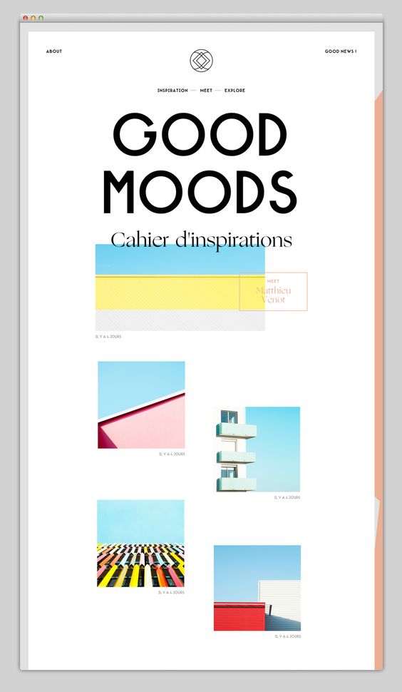
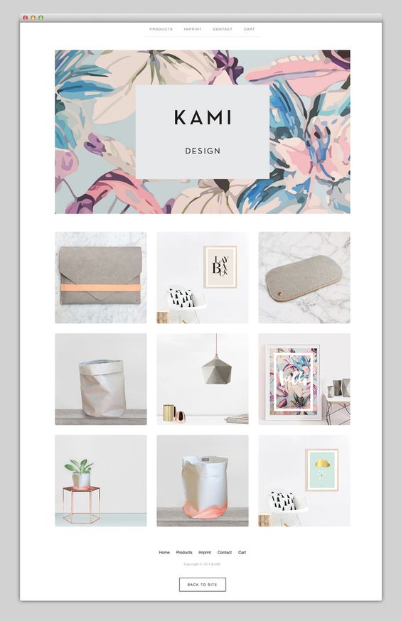
Broken grid layouts, flowing lines and organic shapes are emerging as one of 2018’s more prominent web design trends. Angular and sharp-edged UI’s are being replaced by interesting shapes like circles and diagonals for cards, input boxes, and account avatars. These shapes typically have bright neon colors that are modernistic, bright, and vibrant. These new organic shapes are going above and beyond the limits of contemporary design and are definitely a trend that will become increasingly popular as the year progresses.
Minimalistic and engaging imagery
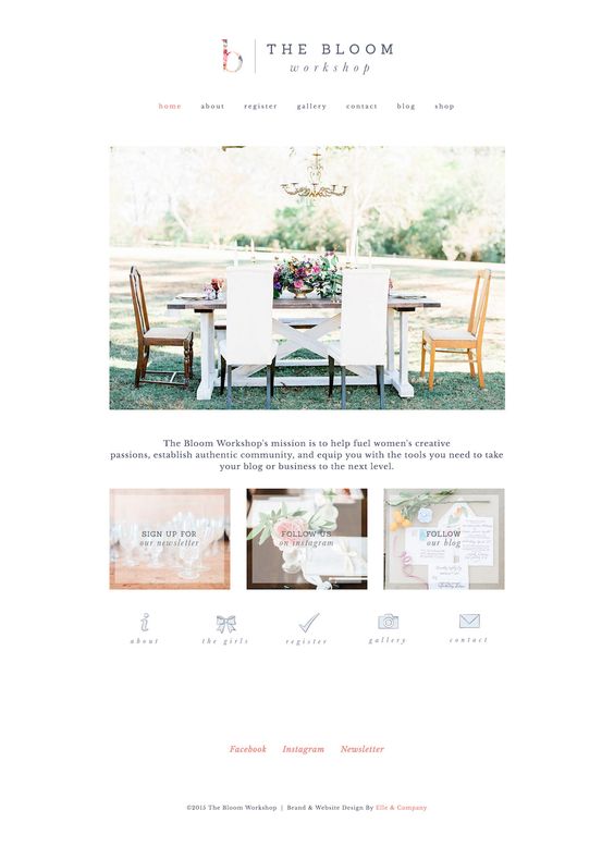
Bold minimalism has been a long time coming. Minimalism allows designers to make the most of imagery and put the users in a place where they can only do one thing, and that is to take the desired action. Users actually prefer this as they don’t want to be bombarded with different options and choices. It simpler for them and it saves them time. The crisp lines and vibrant colors make interaction more engaging and memorable.
Page transitions
Animated page transition enhances user experience. You can achieve the page transition animations by using CSS transitions and designers are using a transition-delay value for each animated page turn to perform them in the correct order. Animations have been trending for a long time, but these types of animations can increase conversion as it doesn’t distract the user from the essential marketing message and call-to-action.
Floating navigation menus
Visually detached navigation menus that stick to the top of your screen as you scroll down are always there if you need it and is turning out to be quite a handy little trend. Ease of navigation is vital for conversion rates and floating navigation bars prevent a visitor from getting lost as they navigate the website.
Engaging photography
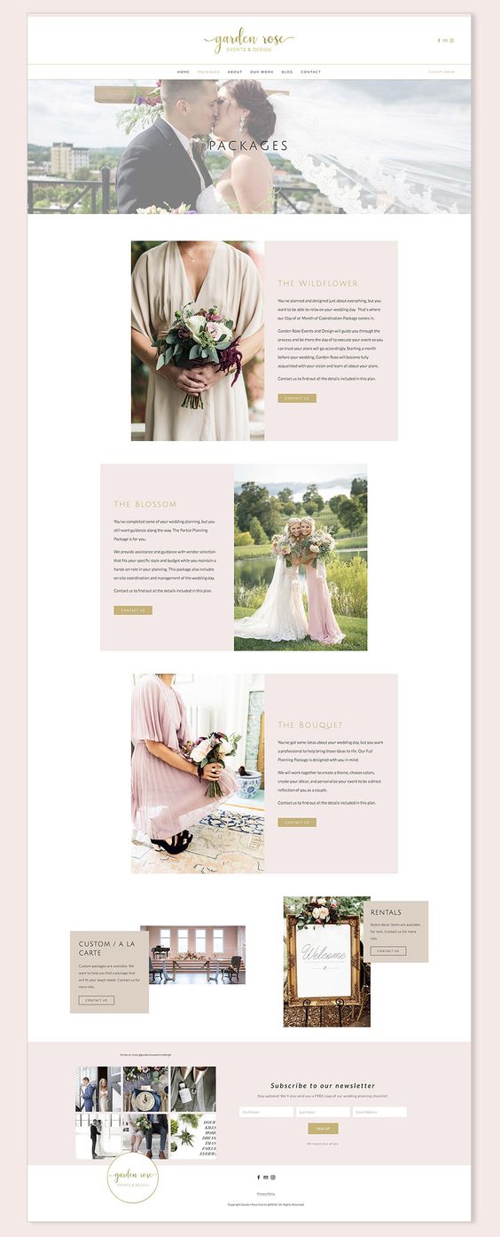
Stock photographs have been dominating marketing efforts for some time. It reached a point where stock imagery is inhibiting a business’s perceived authenticity and brand identity. Businesses are increasingly becoming aware that photography on their websites should portray real people engaging with their business in real-life settings. Engaging and genuine photography on a website can establish social proof and are more believable to a website’s visitors.
Call-to-actions
Call-to-actions are no longer the small, insignificant buttons hidden away somewhere at the bottom of a page. Nowadays they are being displayed in bright and high-contrasting displays that confront visitors. They are big and very clickable. Research has shown that shy, camouflaged call-to-action buttons didn’t get as many clicks as the newer, more aggressive ones, even though the text on them remained exactly the same.
80’s-inspired web design
Retro web design is making a comeback in 2018. This type of web design is characterized by geometric shapes, bright colors, and lots of visual interest. The typography is easy to read and the designs are pixelated. Many designers like this style because it takes them back to their younger days. And still, there is a modern element to these designs. These websites are mobile, and tablet-friendly and their user interface is everything but old-school.
There are many more web design trends that you can embed into your website’s backend. The basic of a high-converting website, however, remains the same. Nothing can boost your conversion rate like an enticing offer and the promise of solid customer service.
You can vastly improve easy navigation, a clear call to action, and an active presence on social media by these trends and it is important to stay on top of them. The constant improvement of web design can give dynamic companies a competitive edge when they perpetually educate themselves on these trends and incorporate them into their web designs.
Businesses that ignore these trends may find themselves struggling to compete for the attention of their audiences. These trends force businesses and designers alike to start thinking more creatively to enable them to improve their user experience and increase their websites’ conversion rate.

