5 Crucial Factors for Designing Your Café
When it comes to designing the interior of a casual dining establishment, the good news is that a large portion of your customers will never pay attention to the shape of your tables or the colour of your walls. The bad news? These things are going to affect them anyway – particularly if you haven’t got them quite right.
Firstly, there’s the simple fact that poor design is always noticed on some level, whether it’s a door that pulls open but looks like it needs to be pushed, a cupboard that opens the wrong way or the fact that for some reason a USB stick never, ever slots in the correct way first time. These almost imperceptible micro-frustrations are everywhere, slowly chipping away at our mood, while interacting with good design should always feel effortlessly stress-free. Which customer would you prefer, the mildly annoyed one, or the relaxed one?
Secondly, there are the complex nuances of consumer psychology, which all restaurants can use to their advantage. Certain colours, subtle scents and even the use of particular phrases (like ‘organic’ or ‘locally sourced’) all have a small but noticeable impact on customers in terms of how much they spend, or how long they stay.
You might not be quite at the level of pumping out the artificial scent of freshly-baked cookies, but when it comes to setting up shop there are five essential aspects that you should plan carefully.
-
Your Table Plan
Squeezing as many tables and chairs into your space will not translate to having more customers, or enjoying better business. It’s critical that your seating is arranged to maximise the usability of the space, allowing a smooth flow of diners and staff for a stress-free experience.
The general rule of thumb is that you need at least one metre between seat backs, with at least half a metre between parallel tables. If you’re designing a café to be accessible for wheelchairs or pushchairs, a metre and a half would be better.
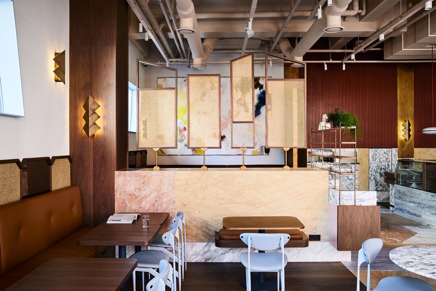
You might want to experiment with a few different layouts, to determine the most efficient settings. The final design should be intuitive for customers to walk in, see your creative menu design, place an order and collect it.
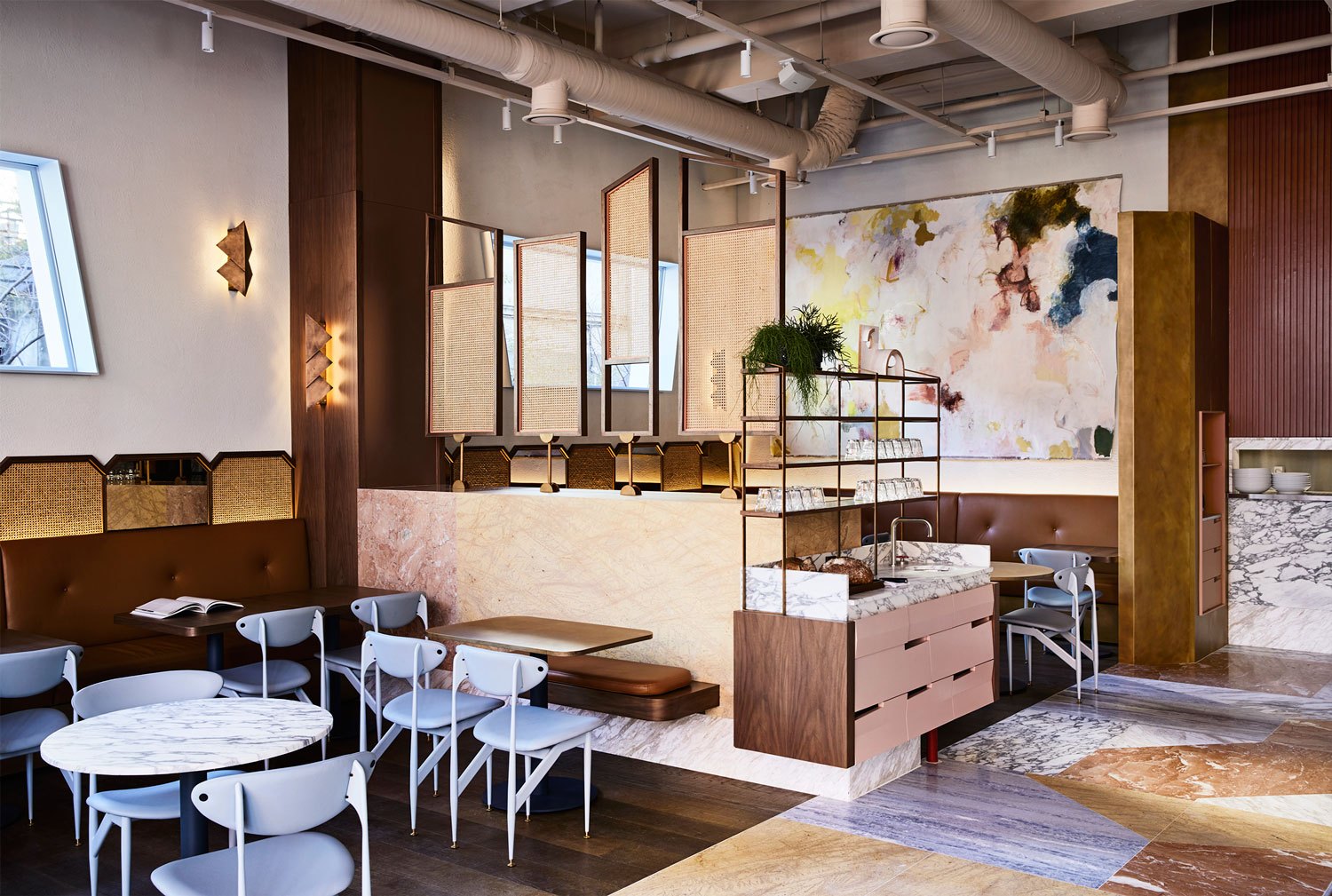
The style of your tables and chairs is going to play into this considerably, so when you design your café floor plan, keep in mind the type of guests you expect. Large groups of friends coming to enjoy a quick lunch will expect a different kind of seating arrangement to the sole coffee-drinker who is trying to get some work done. Even if you picture your venue as a ‘squashy armchair’ kind of place, try to mix in a few café tables and chairs that will attract different customers (and take up less space)!
-
Counter Positioning
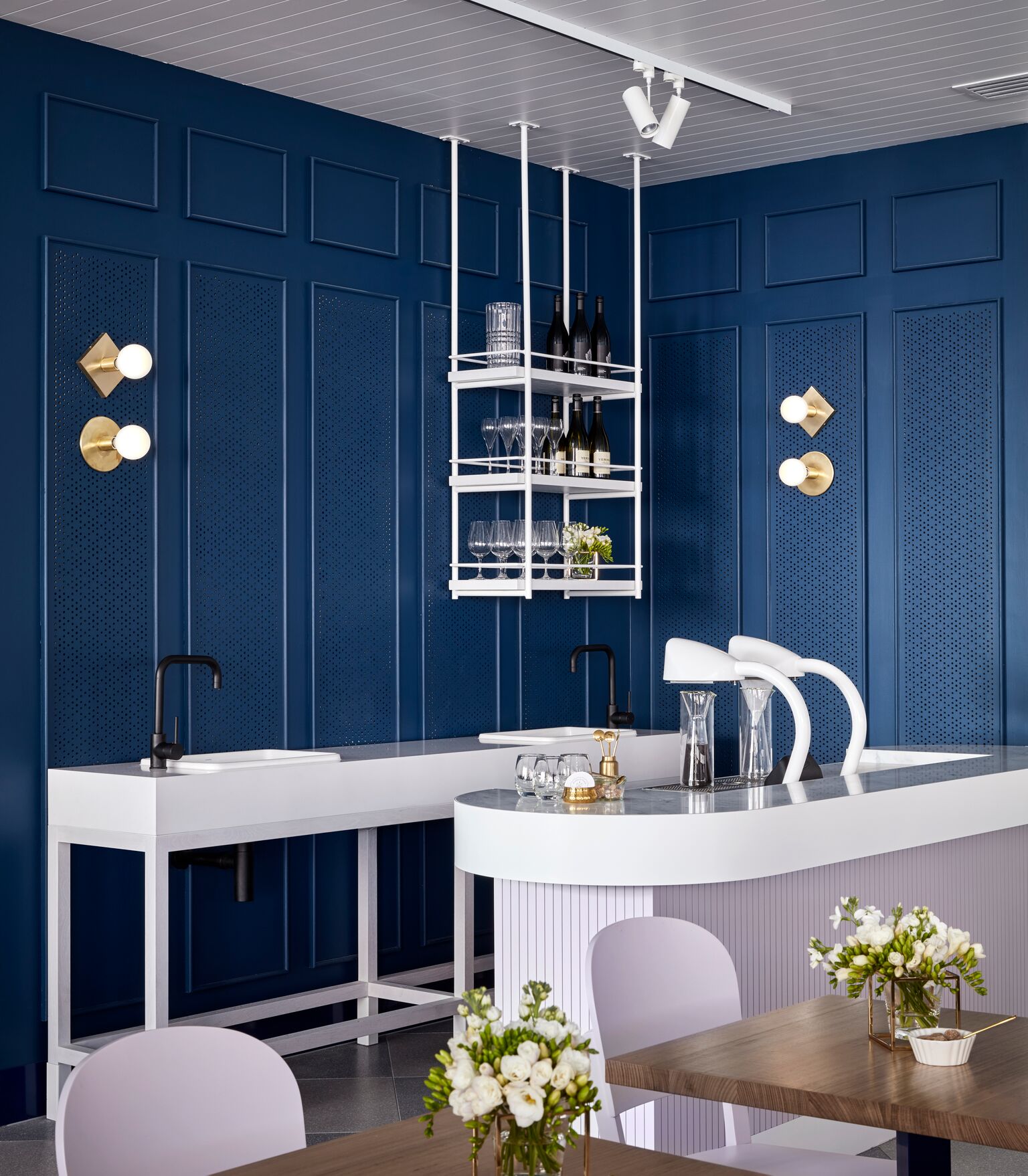
Counter placement makes a huge difference to the kind of venue you’re running. If you position it right by the door you’re more likely to get people ‘popping in’ off the street, while making people walk through your café to order will encourage them to find a table and stay awhile.
In either position, consider how the counter placement will affect your barista (will they have enough room?), your waiting staff (can they easily move around the space), and your customers (will the queue block the door or annoy people already sat down?)
-
Flooring Design
It’s fairly common for café owners to underestimate the importance of their flooring, but it actually has a huge impact on the daily functionality of the entire venue.
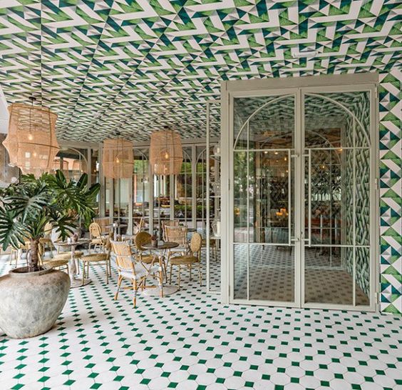
For starters, the way it looks is going to go a long way for setting the visual tone of your café. Do you want rustic wooden floorboards for a homely vibe, or ultra-modern rubber flooring? It might sound obvious, but the floor is a big space and its colour, pattern or texture should be chosen carefully. If you have a relatively large, open-plan space you may even want to consider using different flooring to create ‘zones’ that break the room into multiple areas.
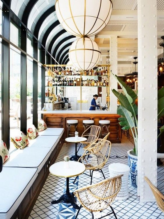
Your floor is also going to have to be exceptionally durable, slip-resistant and easy to clean. A lot of venues opt for a hard-wearing vinyl flooring, which can be made to look just as welcoming as wood, but with much less maintenance. It might be tempting to try and save money with your flooring (will people really be looking at it?), but after a few hundred customers have walked across it, you’ll likely spend a fortune getting it replaced sooner rather than later.
-
The Lighting Scheme
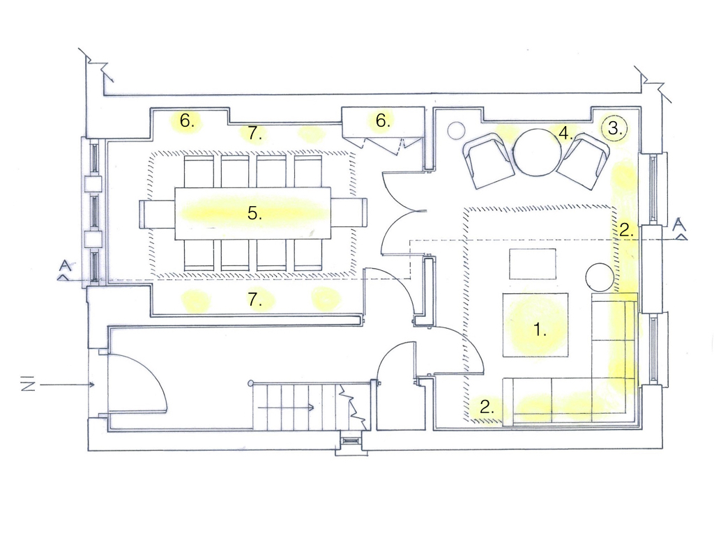
The essential thing to remember when choosing the lighting scheme for your café is its purpose. You might like the quirky, multi-coloured fitting in the showroom, but if it doesn’t provide enough brightness (or throws unappetizing hues over your food and drinks), your customers aren’t going to feel the same.
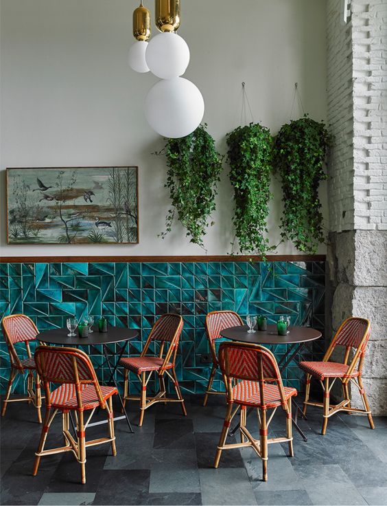
Warm, bright lights will make your café feel warm and welcoming, throwing your guests into a flattering light that makes them feel cosy and comfortable. Lowering the lighting levels (particularly if there is limited natural light) will make your venue feel more intimate. Slightly cooler tones will emphasise the natural colours of your food and drinks to make them look more appetising.
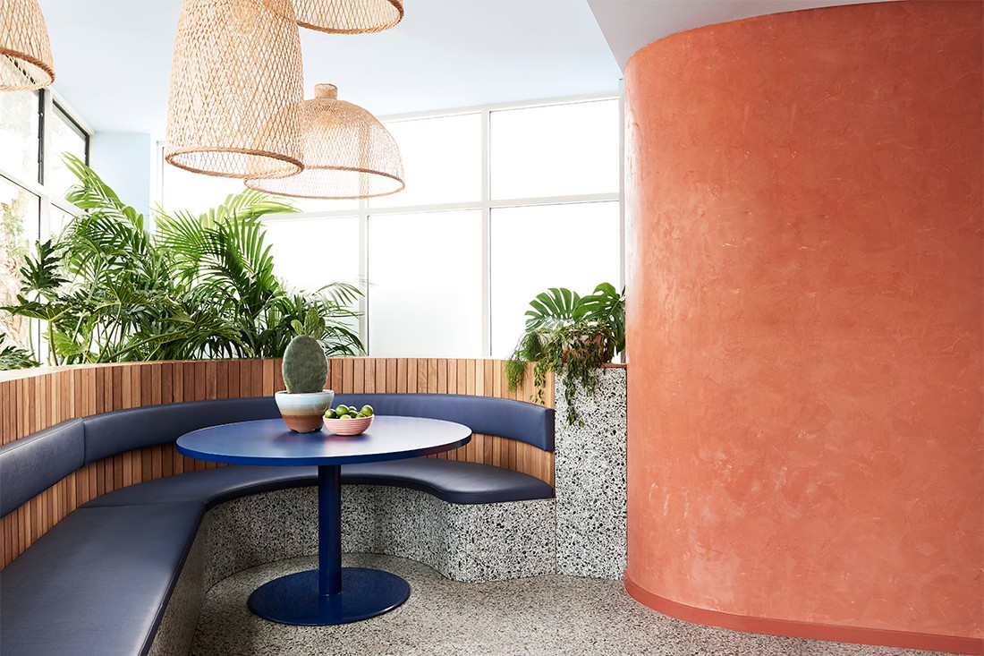
The secret to a successful lighting plan is to combine any natural light with electric light to create balanced ambience throughout the day.
-
Your Colour Palette
Last, but certainly not least, it’s important to be colour-conscious when choosing the palette for your café. From psychologists to marketers, countless people have conducted research into the effect that certain shades have on consumers, so there’s no excuse for using colours that send out the wrong message.
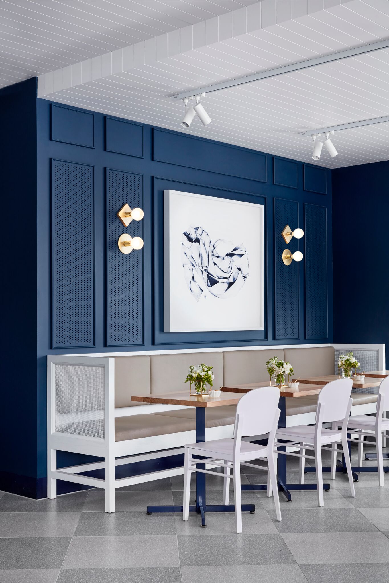
For example, green is usually associated with fresh, healthy produce, so works wonderfully in salad bars or health-conscious venues. The earthiness of brown shades will help customers to feel relaxed – which is why you often see them in modern restaurants and coffee shop chains. Blue and purple should be used sparingly as these hues are rarely seen in natural food and can put people off their meals, especially if the colour of blue walls or tables gets reflected onto their plates.
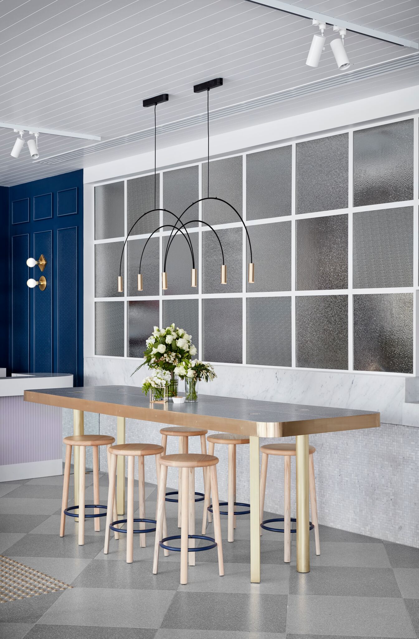
When picking your scheme, you don’t want to overwhelm your customers when they should be focused on their food or drink. You’ll notice that a lot of cafés have plain table tops and only simple patterns in their upholstery for this reason.
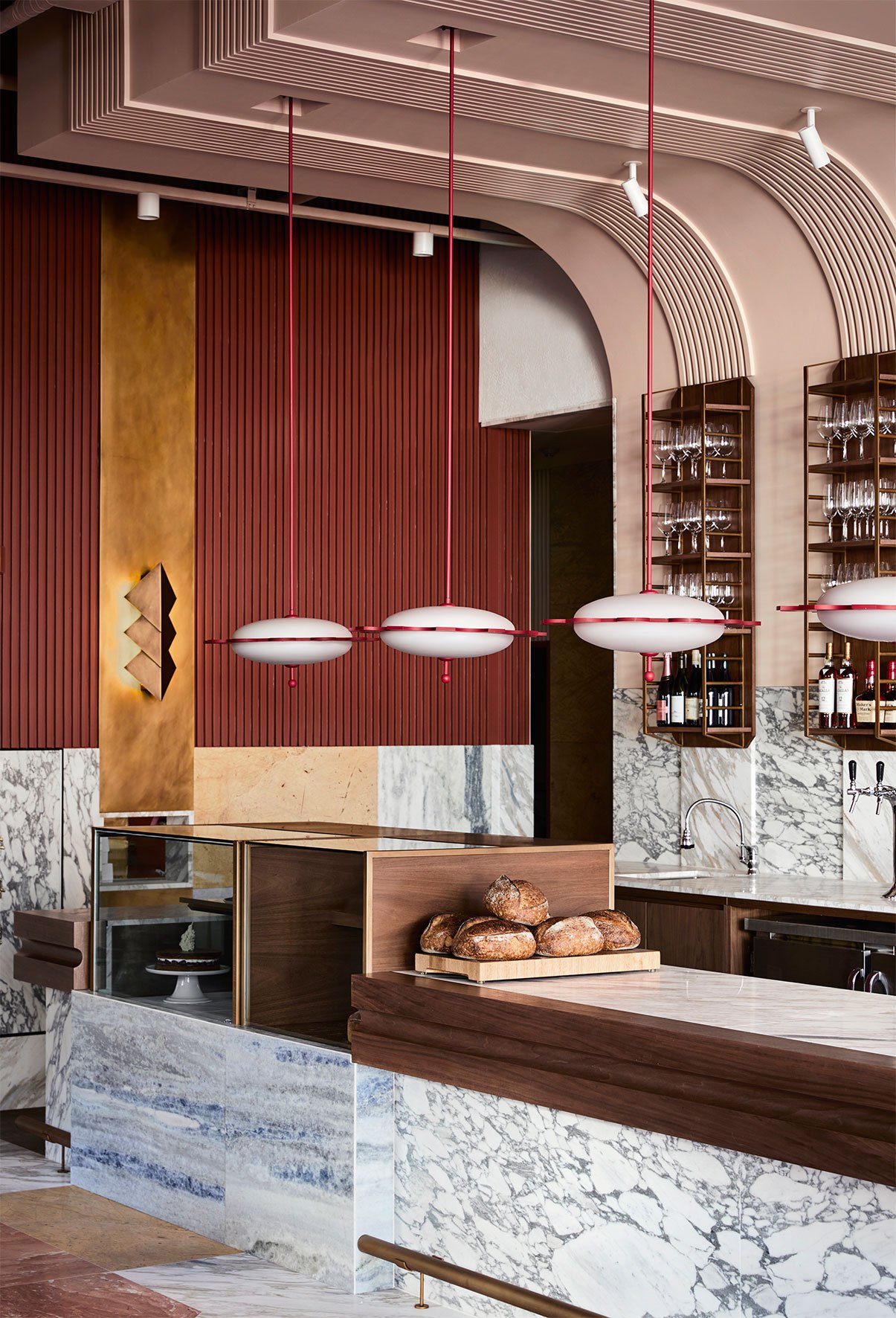
When designing your cafe, try to make every table feel like the best table. Don’t let poor spacing or dim lighting allow customers to feel hemmed in, and choose comfortable, coherently-styled decor to provide a relaxing ambience. Even in areas like flooring or lighting that may seem unimportant, it’s absolutely worth taking the time (and spending the money) to make your cafe the best it can be.

