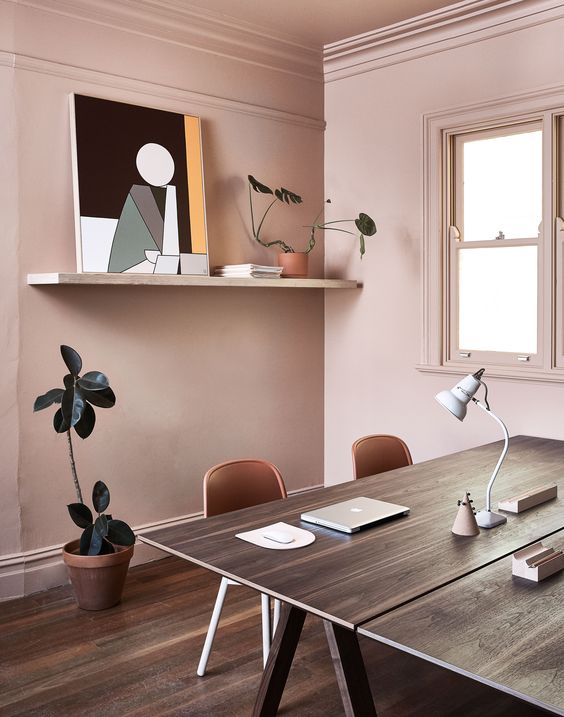
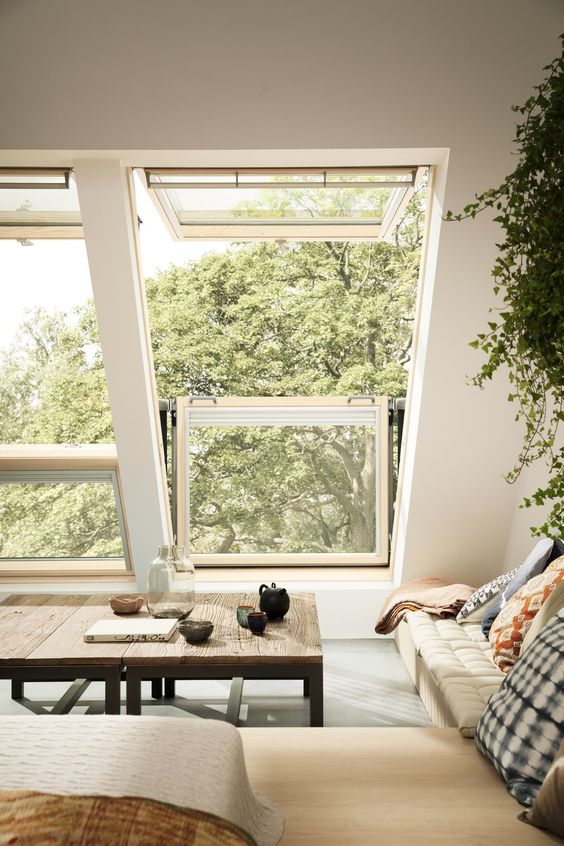
Are You Making One of These 3 Focal Point Mistakes?
The importance of a focal point in a room can’t be underestimated. Focal points give the eye something to rest on and create an immediate wow factor. They also help to highlight a special part of the homeowner’s personality that’s been showcased in the decor or hide an unwanted design element that cannot be otherwise removed.
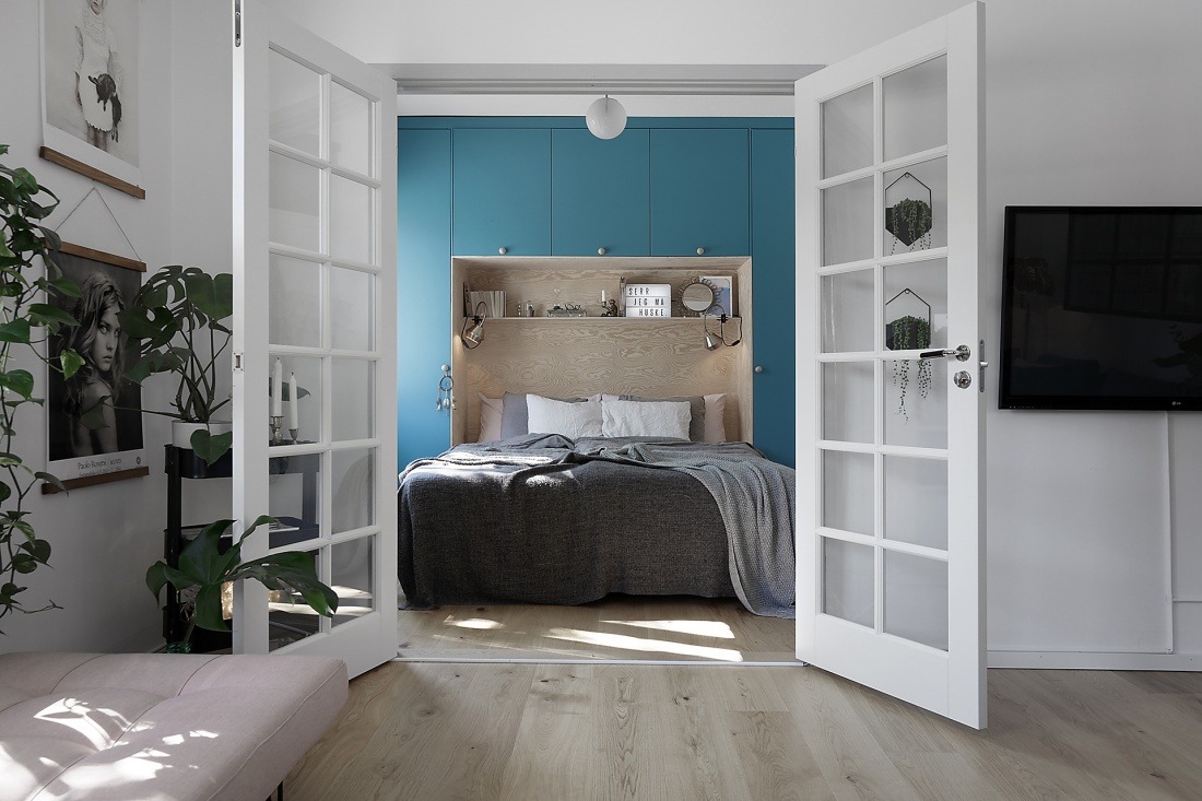
There are many ways to create focal points: using colorful spreads, adding pillows to sofas, installing an electric fireplace, hanging a chandelier, or creating colorful or dramatic table settings, for example. Below, however, are three mistakes you might be making as you decorate, as well as how to correct those mistakes and creatively move the focal point when necessary.
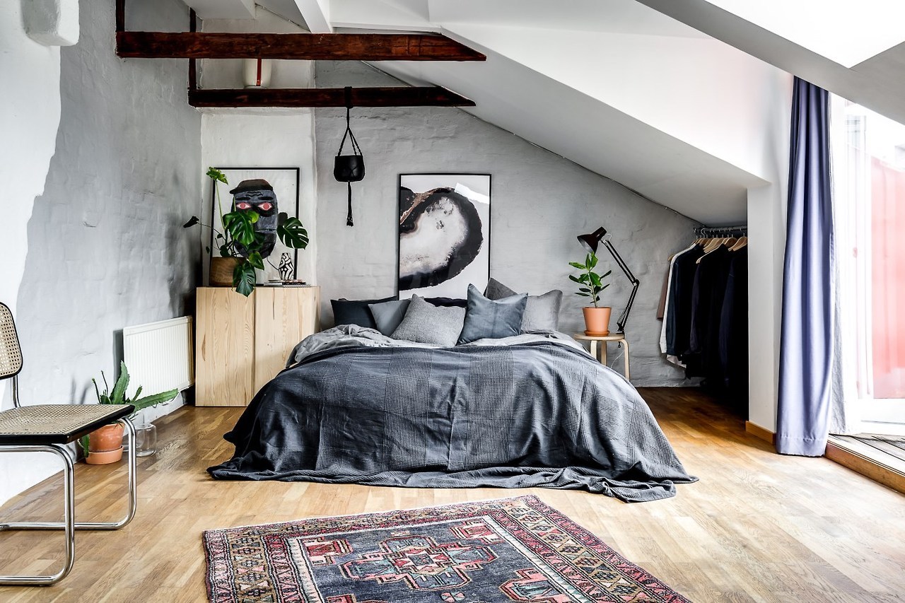
Mistake #1: Are You Scaling All Wrong?
It’s all too common for beautiful windows to be dressed with window treatments that are too small, or for a wall to be hung with a piece of art that is too large or too small. Using decor that is too large or too small creates an immediate jarring note. We might not be able to exactly explain what’s wrong with the room, but most of us notice immediately, and will often attribute this feeling to a lack of professional design work.
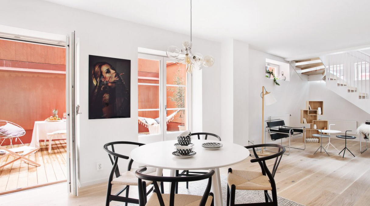
Instead, make sure the art or furniture you use as the focal point of your room is the proper scale. You might need to experiment a bit to get it exactly right, but it’s worth the time.
Mistake #2: Are Your Focal Points Clashing?
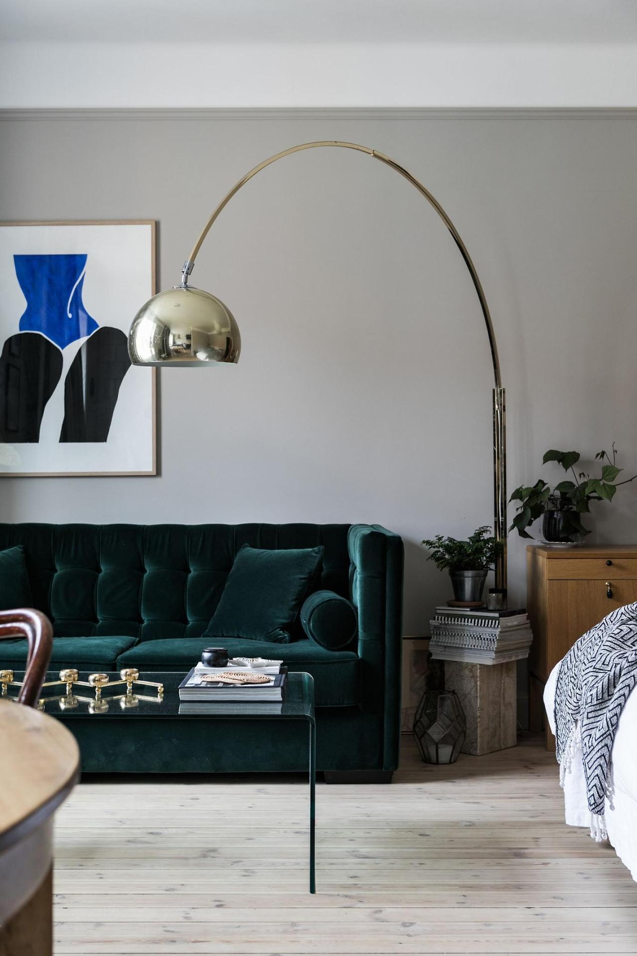
You might have your heart set on an oversized or brightly colored couch, for example, but if there’s already a focal point in the room, your center points are going to clash. Instead, find the natural focal point in the room, and decorate to that. Is the view stunning? Make sure the television is framed or small and in the corner, so it doesn’t pull the eye away from the window. Is the chandelier magnificent? Make sure the decor on the table underneath mirrors – and doesn’t clash with -what’s happening above it.
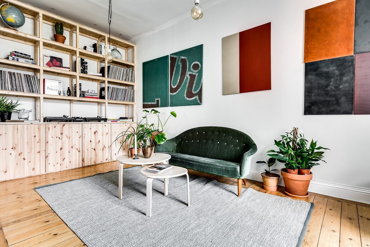
Mistake #3: Are You Focusing Solely on Color?
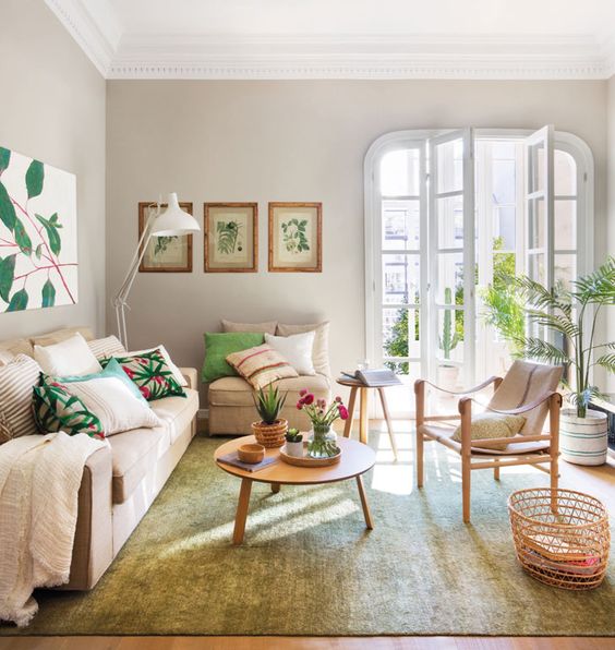
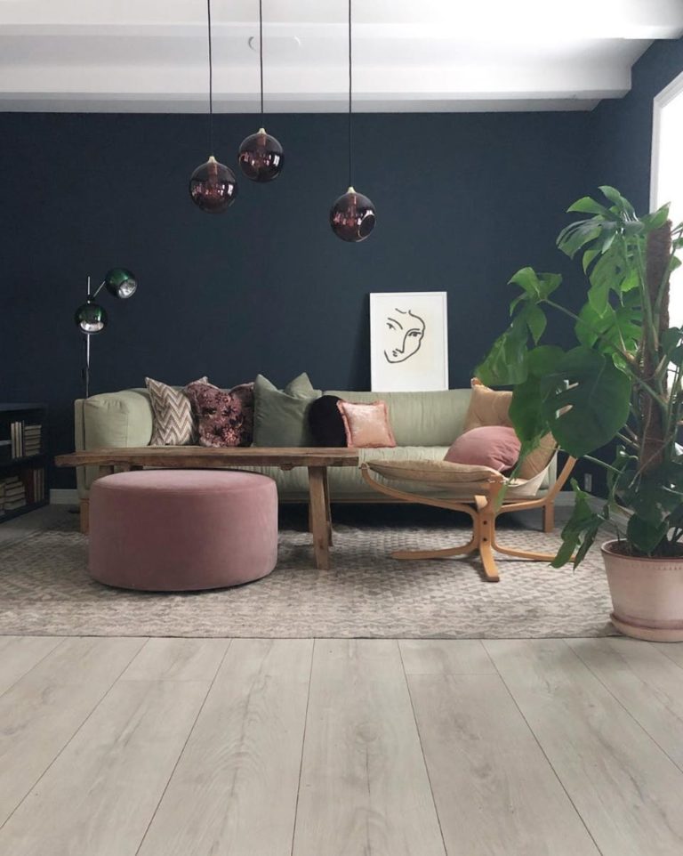
Bright, bold splashes of color are certainly exciting and make natural focal points, but don’t forget about patterns or textures. Neutrals can become powerful center points for the eye when the texture is strong. Patterns, whether in neutrals or colors, can be just as exciting. In fact, possibly even more so, as the eye tends to be relaxed by the natural movement of a repeating pattern.
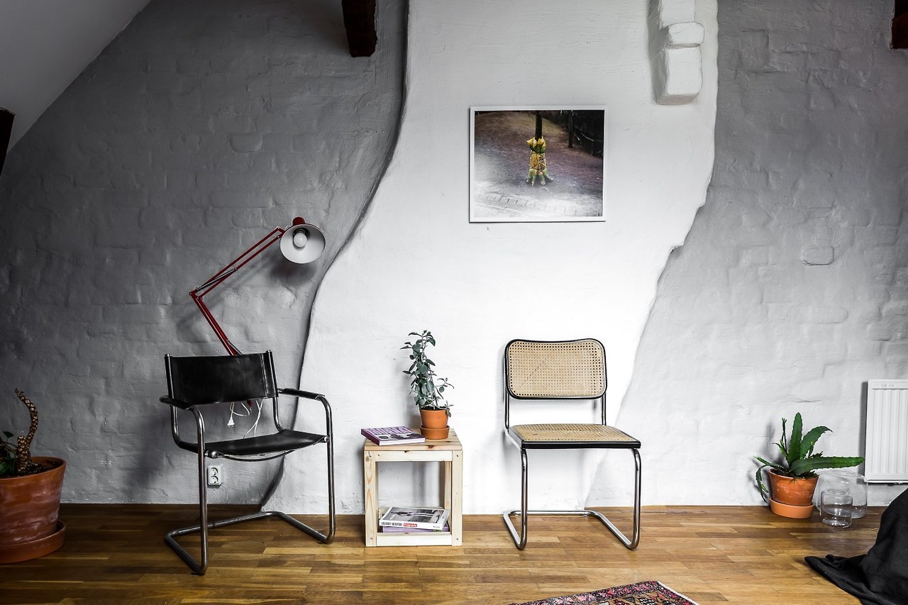
Done right, a focal point can make a room into a truly stunning piece of art. If you make sure you scale correctly, don’t clash your focal points, and are creative outside of the color box, you’ll be well on your way to using them correctly and making your decor work shine.

