My Progress on New Project: Navy Blue Living Room
Good morning, friends!
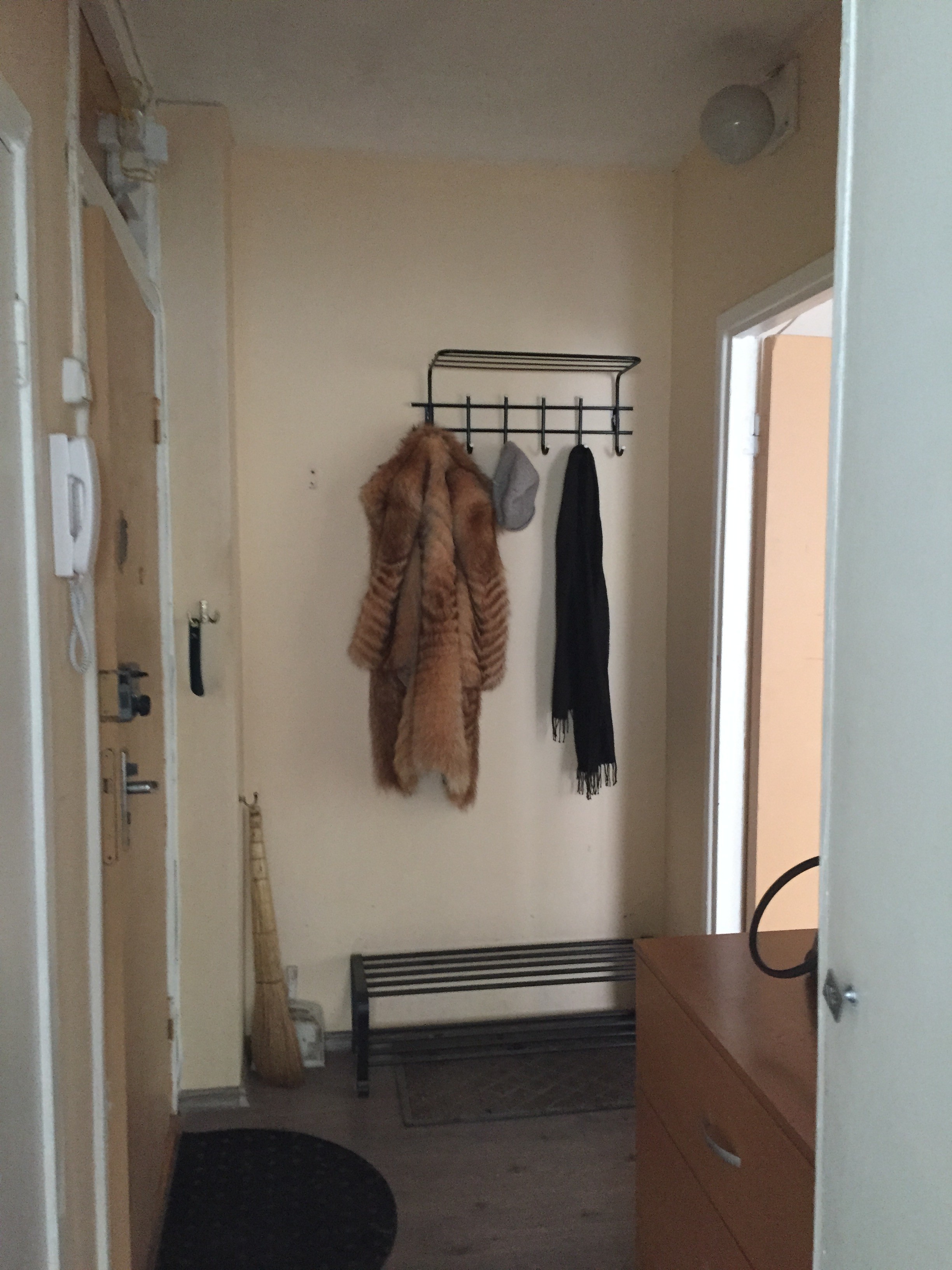
In today’s post I wanted to share with you the little decorating project I am currently working on. My client asked me to decorate a small living room. Before we started it looked like this:
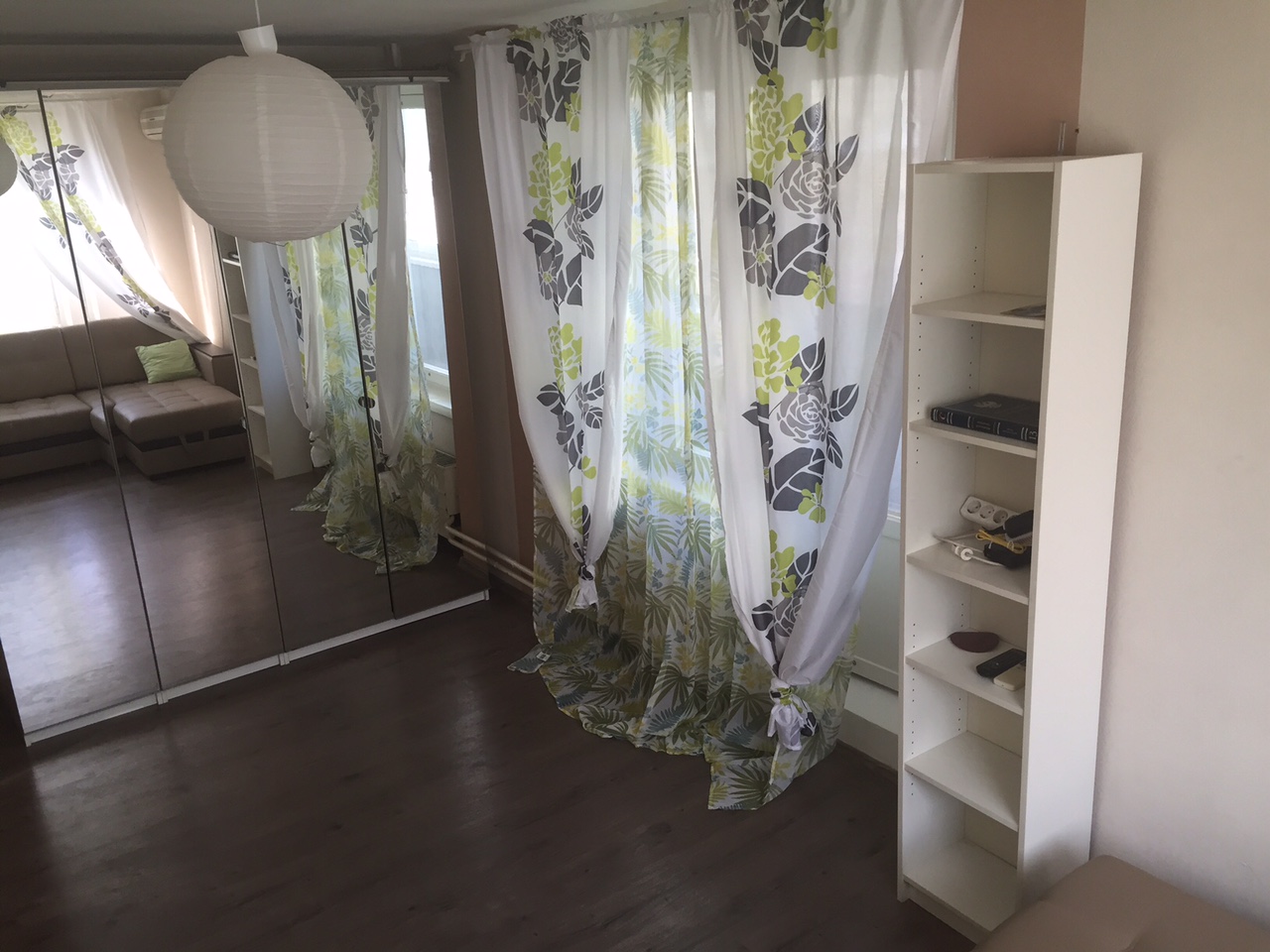
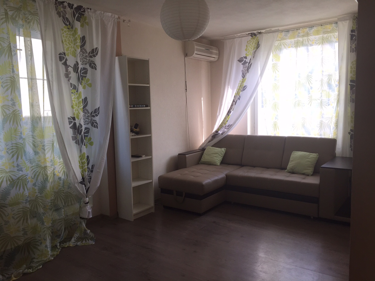
The client asked if possible to keep all major furniture – the sofa and the mirror wardrobe. The flooring had to stay too, but we agreed on repainting the walls.
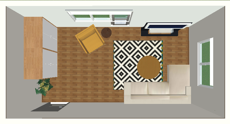
I suggested him 2 different layout options (I used Live Home 3D – super quick and easy software for interior designers to make floor plans and visualizations):
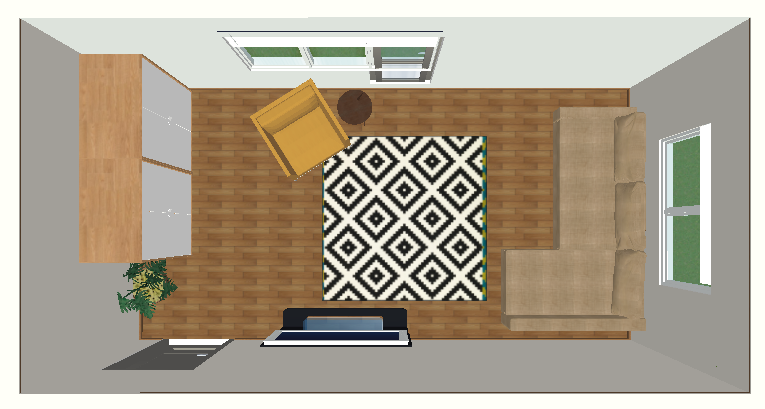
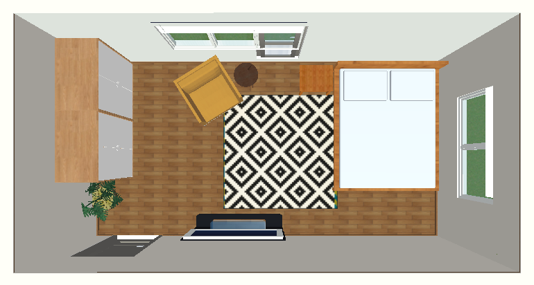
Another idea was to convert this room into a bedroom, so my client asked me to prepare a layout with a bed too:
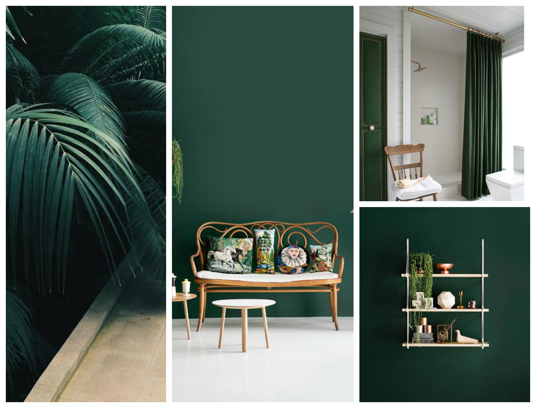
Now it was time to work on a concept and design scheme. I suggested to client to introduce strong colour, which would distract from all room imperfections. I gave him two options: emerald green and navy blue:
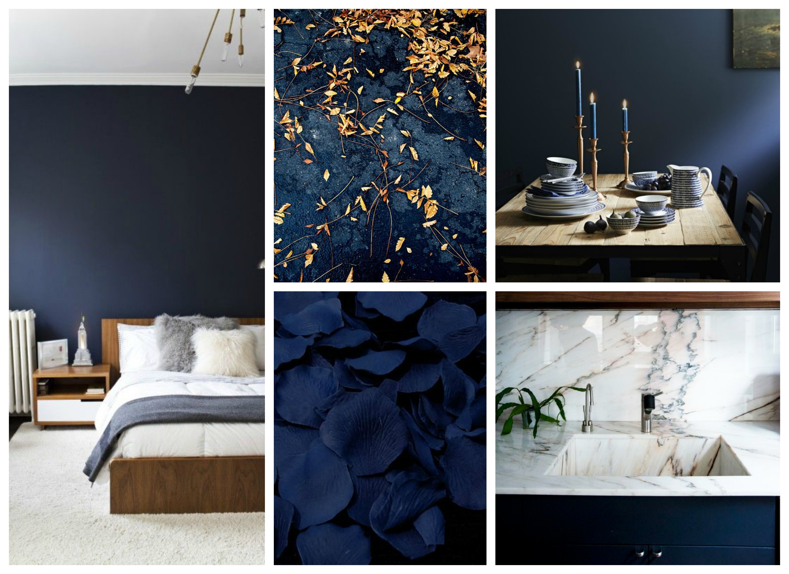
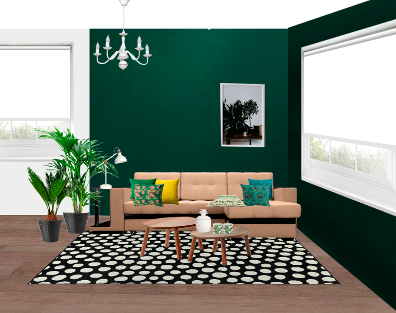
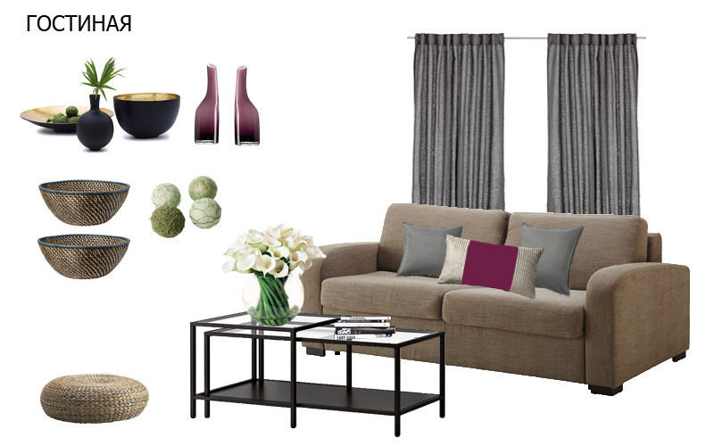
I have also made two simple collages to help him to visualize how the scheme can be translated into actual interior (to make them I used Adobe Photoshop):
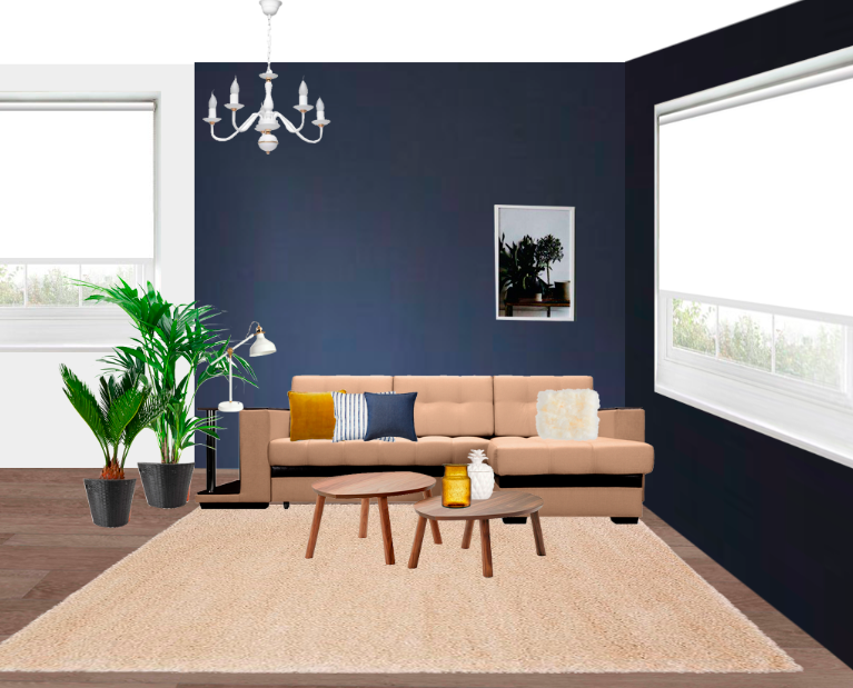
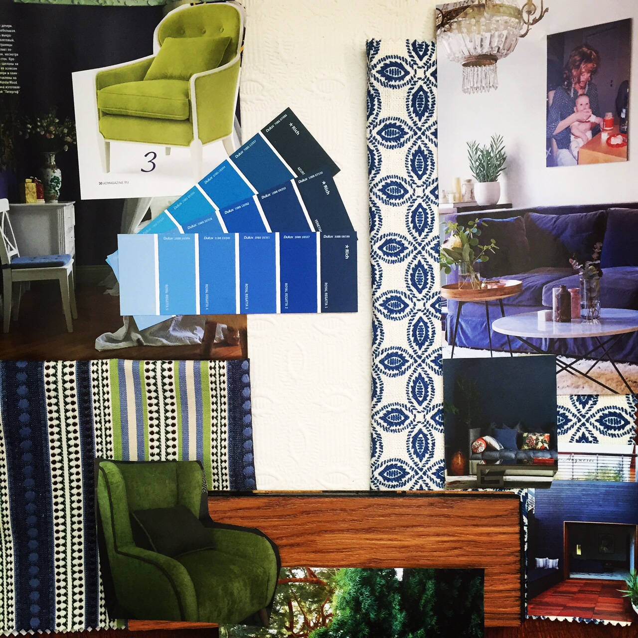
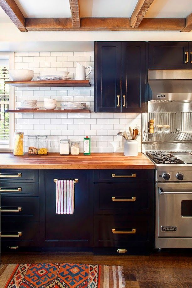
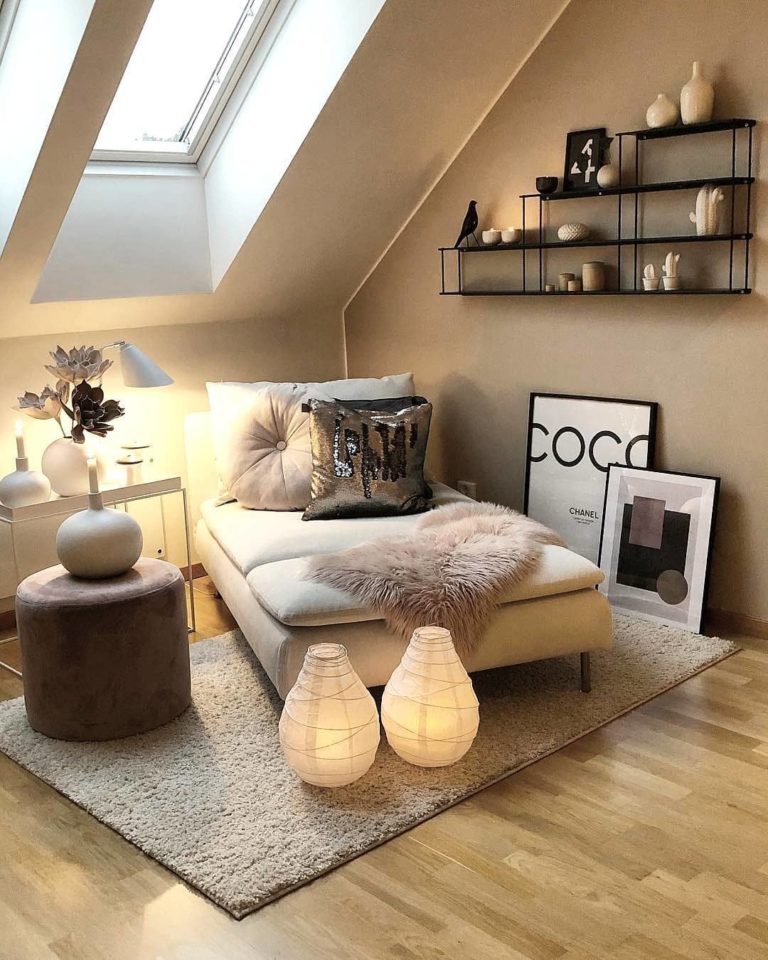
He liked the blue option and I started to work on it in detail. I usually collect lots of inspirational images from Pinterest and magazines and also use actual samples of fabrics, paint chips and flooring:
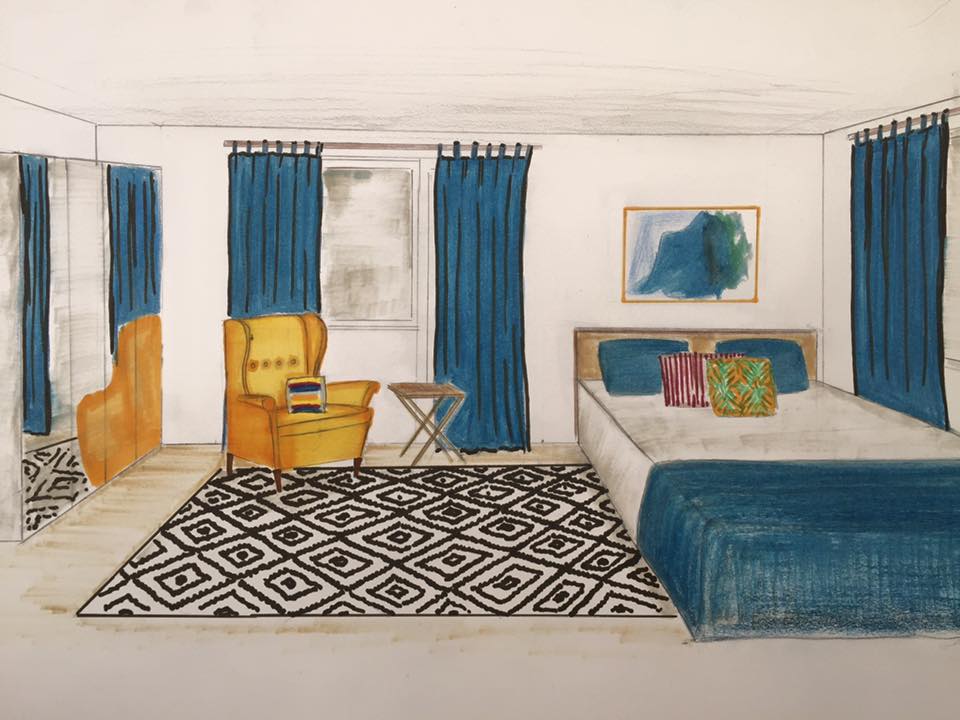
I also do some quick renderings with pencils and markers:
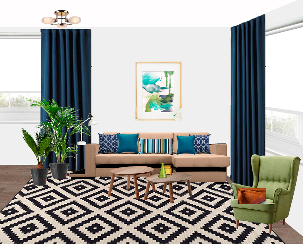
At this stage my client has decided that we still keep the existing sofa but will use cushions and throws to decorate it. He has chosen blue and green combination versus blue and yellow and we also decided to paint the walls in the living room all white to make it feel airy and spacious and introduce large blocks of navy blue through curtains and accessories. We decided to paint in dark blue small entryway to create a sense of flow and since there is no source of natural light it will look much better than all neutrals and pastels:
The final concept looked like this:
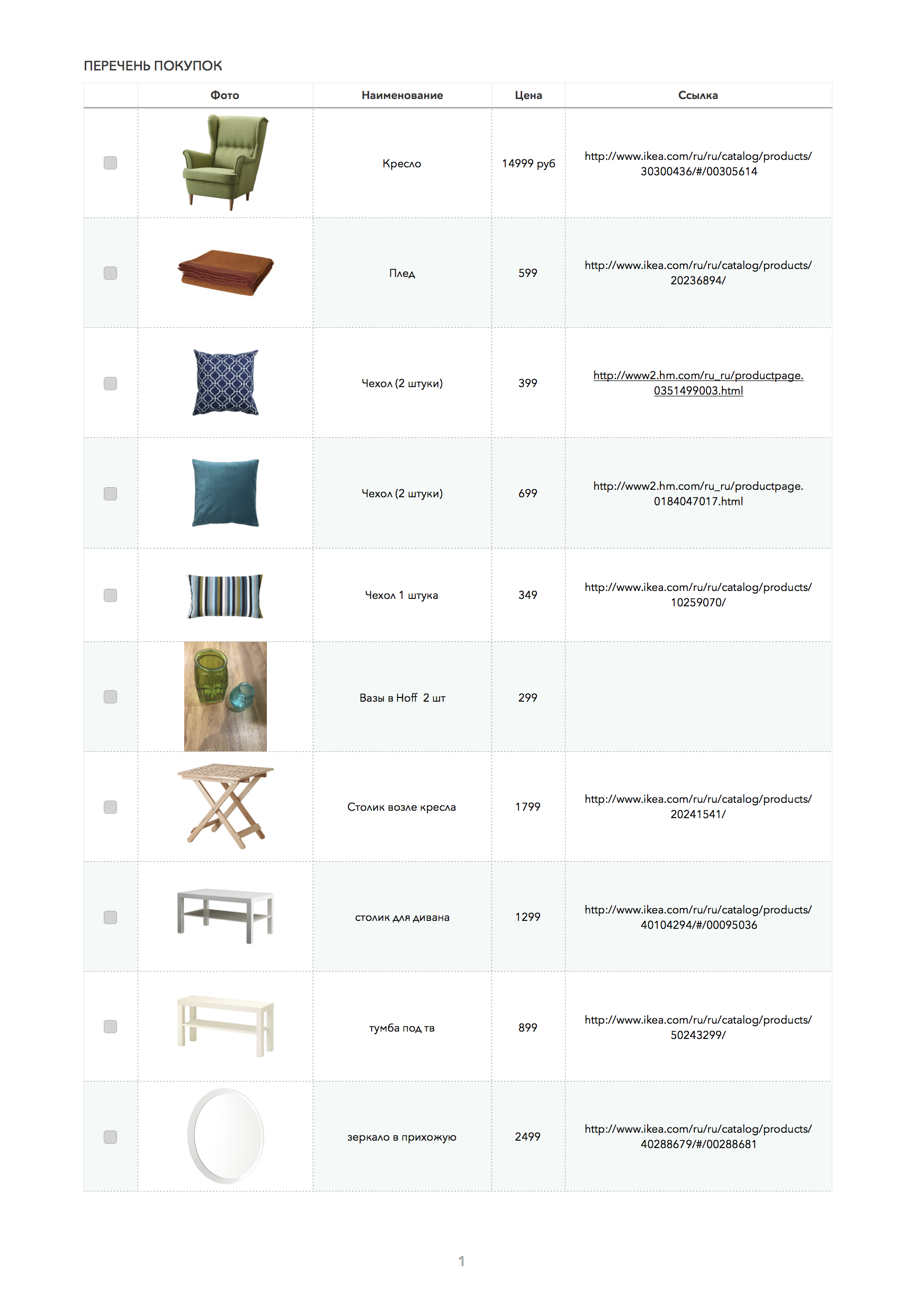
I have prepared the detailed list of all things we need to buy:
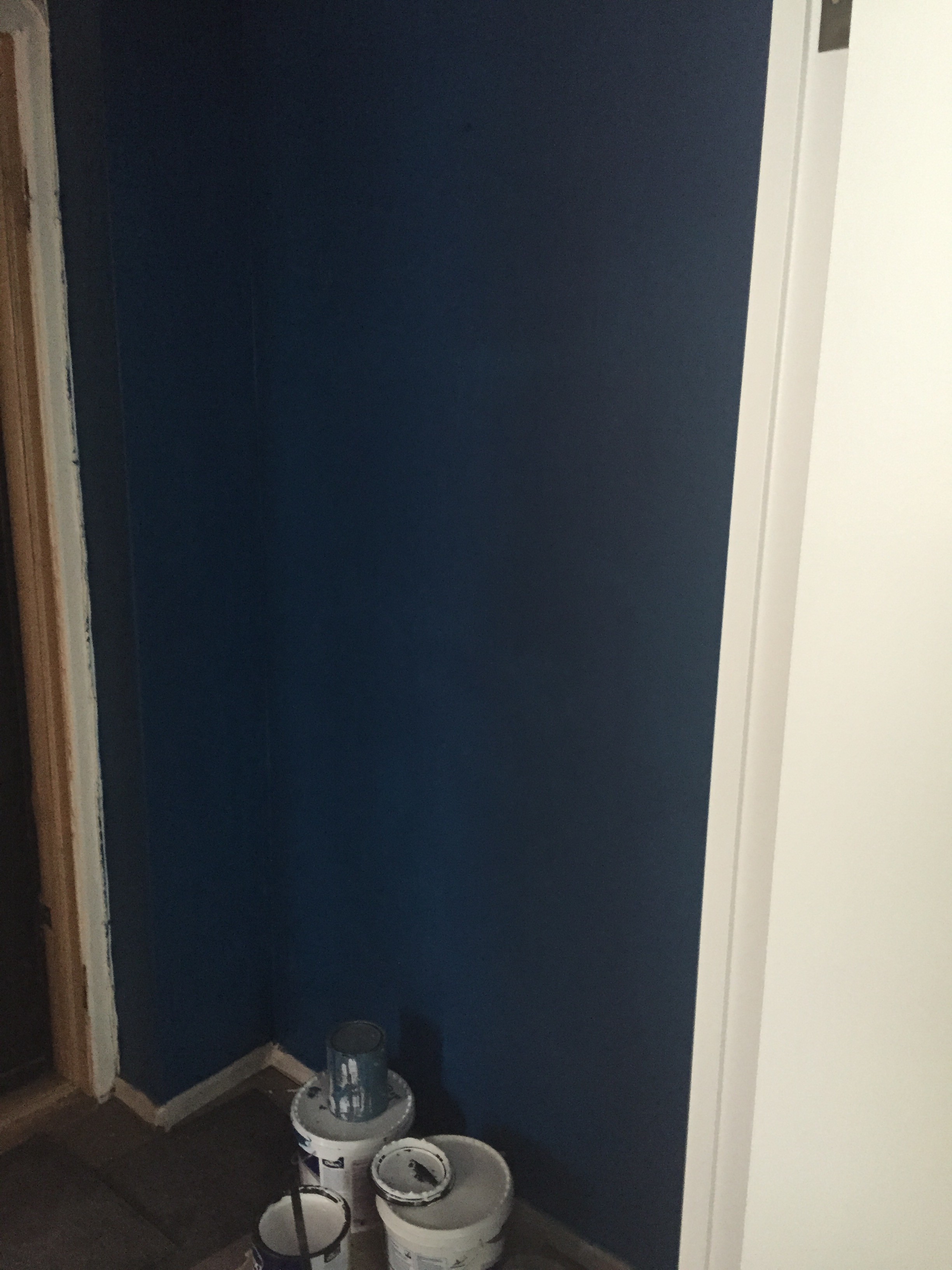
In the meantime the workers have already painted the walls, I really loved the colour of the entryway! I used Dulux Venetian Crystal #2, though added a little bit of white pigment in it, since it appeared very dark (almost black) on the walls once we tried it.
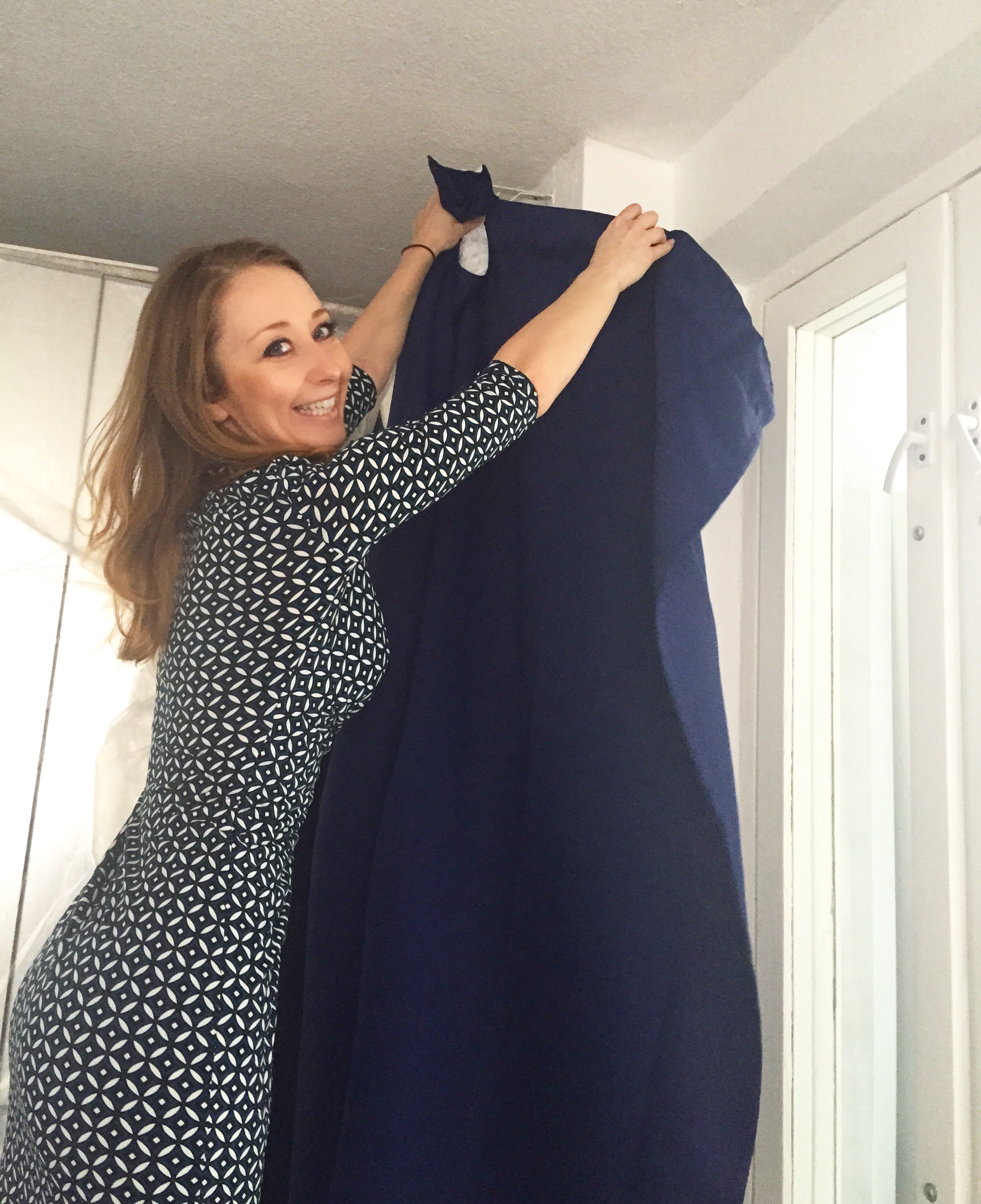
and it matched perfectly with the curtains that I purchased for the living room:
Now we just need to buy the rest of the furniture and accessories and I will share with you the final photos of this little makeover very soon.
Like this project? You don’t need to live in Moscow to work with me. Check out my very affordable e-design packages. Once you send me the measurements of your room, I will help you to make furniture layout and space planning, help to pick colour palette and choose furniture and accessories.

