Clients’ Kitchen Makeover – My Progress so Far
Hello friends,
In my previous post I mentioned that I am busy working on the apartment renovation project here in Moscow. Yesterday I was busy putting together the concept for a kitchen and I thought I will share the progress with you today.
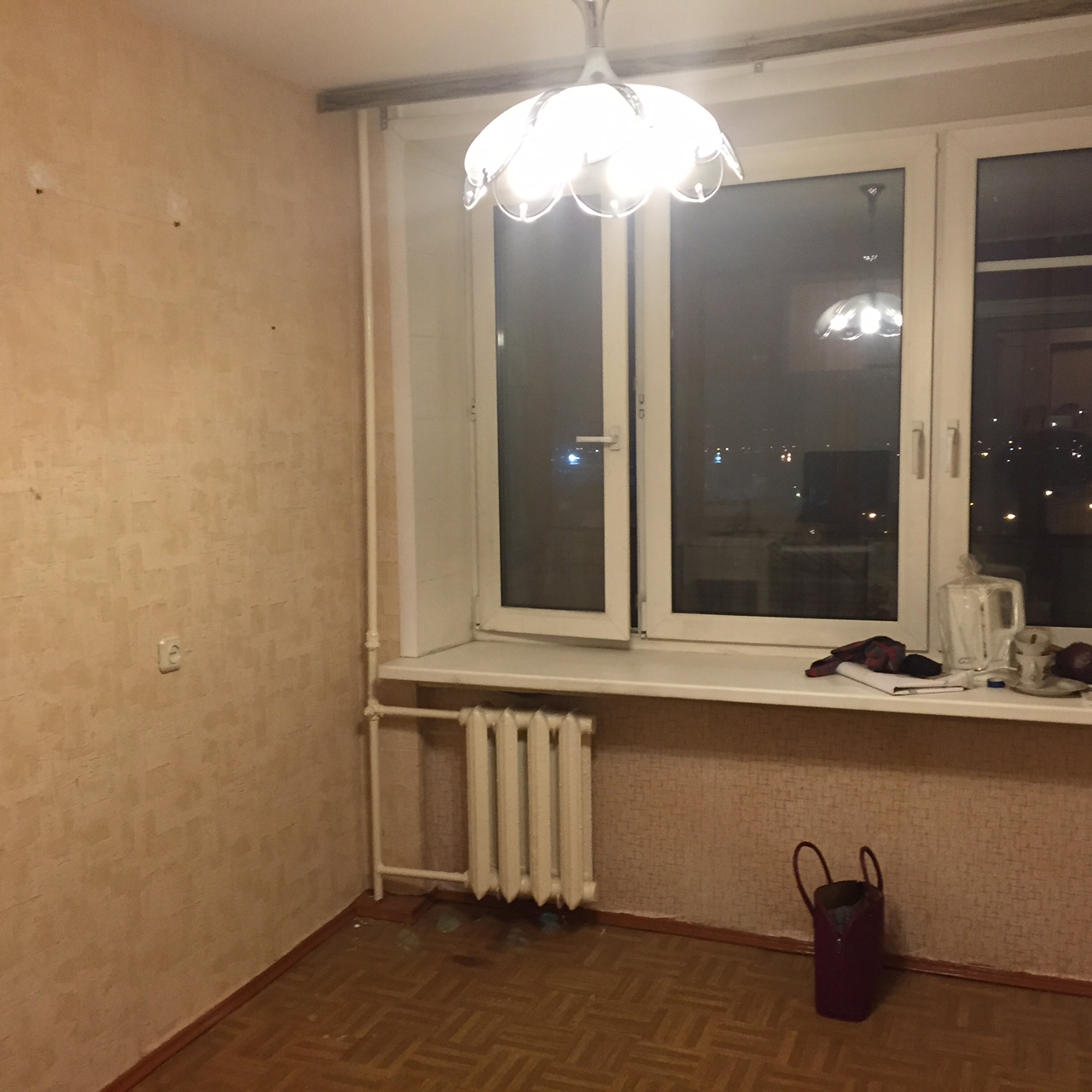
So here is how the kitchen looked like before:
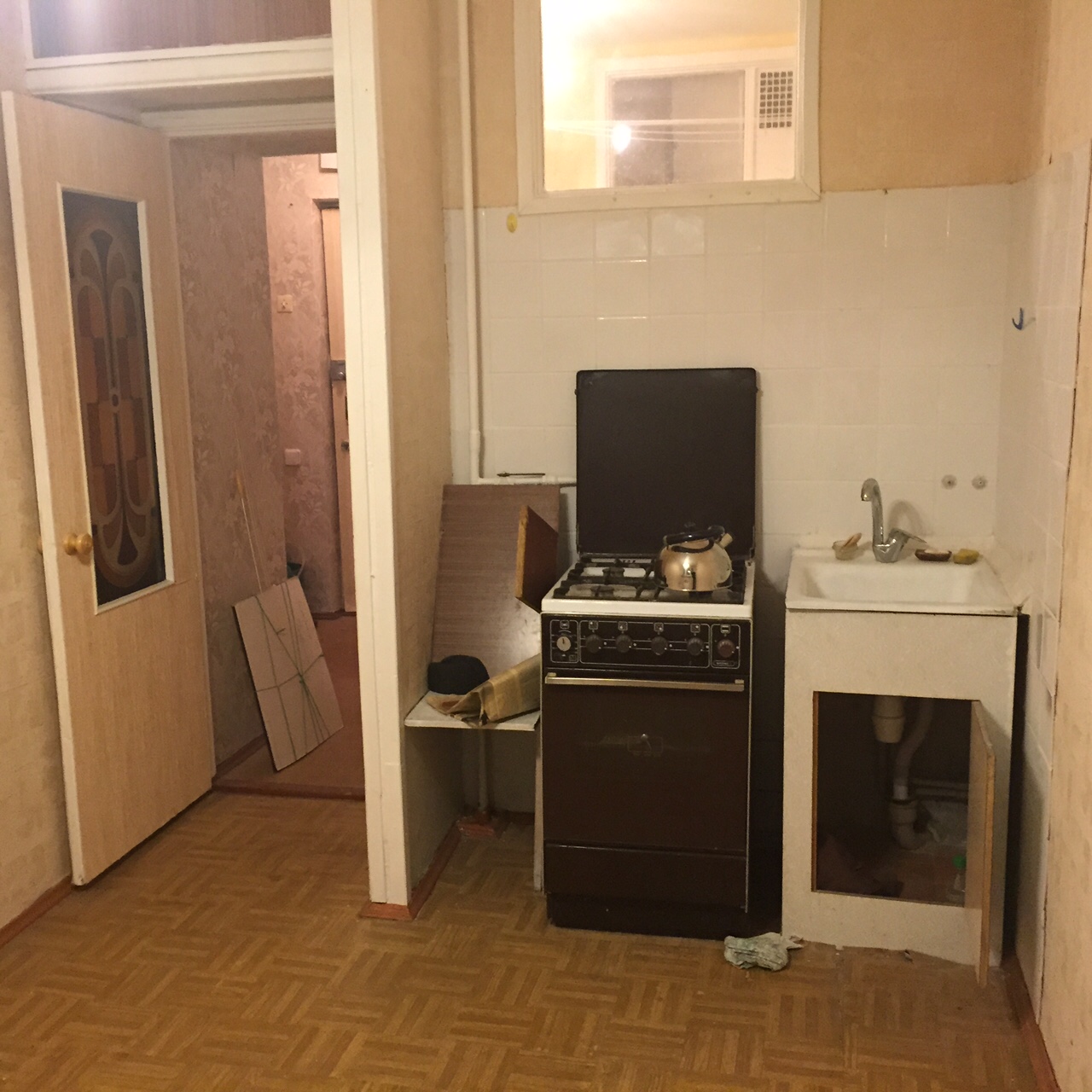
The challenges of this space were the following:
- Small dimensions
- Tight budget
- Low ceilings (only 250 cm)
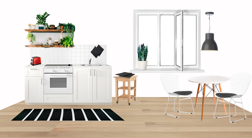
Since the apartment is for rent it doesn’t need to have a lot of storage for cooking pots and utensils. I planned to visually expand the space by using low cabinets only and open shelves above them with the beautifully displayed dishes, cups, books and plants.
White paint for the walls and kitchen cabinets will visually expand the space. Wood, woven baskets, natural greenery will add coziness and freshness.
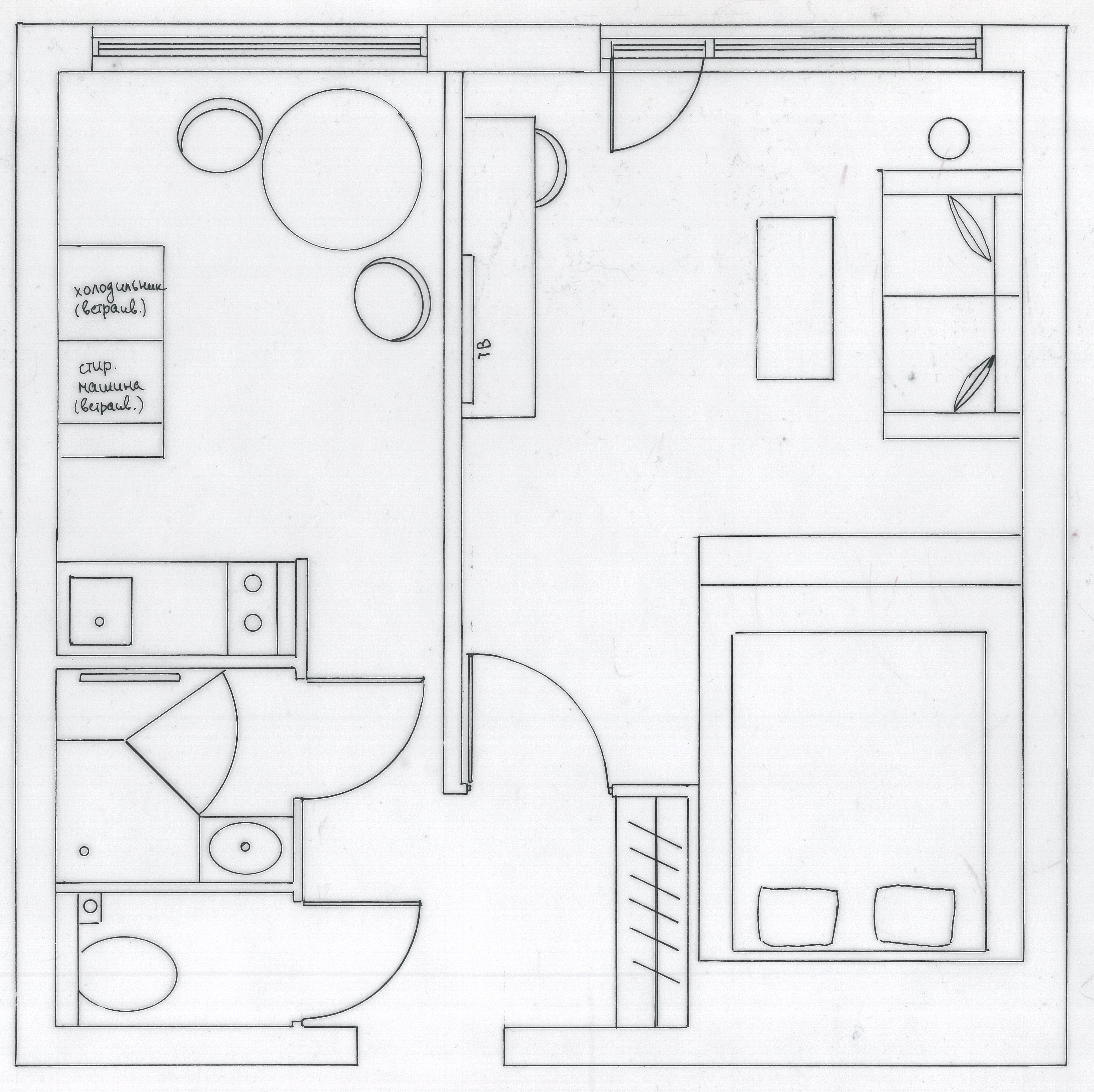
Here is my provisional plan for the whole apartment:
So the cooker and the sink I plan to leave where they are now, but instead of 4 burners I will pick the one with 2 burners only and also will get rid of the oven (I don’t think that in a rented apartment somebody will bake cakes). This will allow me to use the space under the cooker for storage.
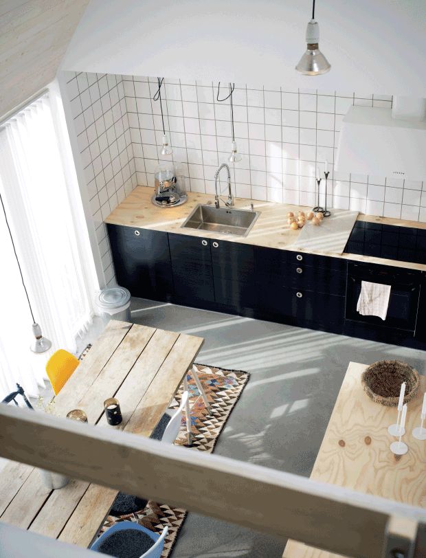
When I start to work on a decorative scheme, I always look for some inspiration. Here are the kitchens that I found, that I really liked:
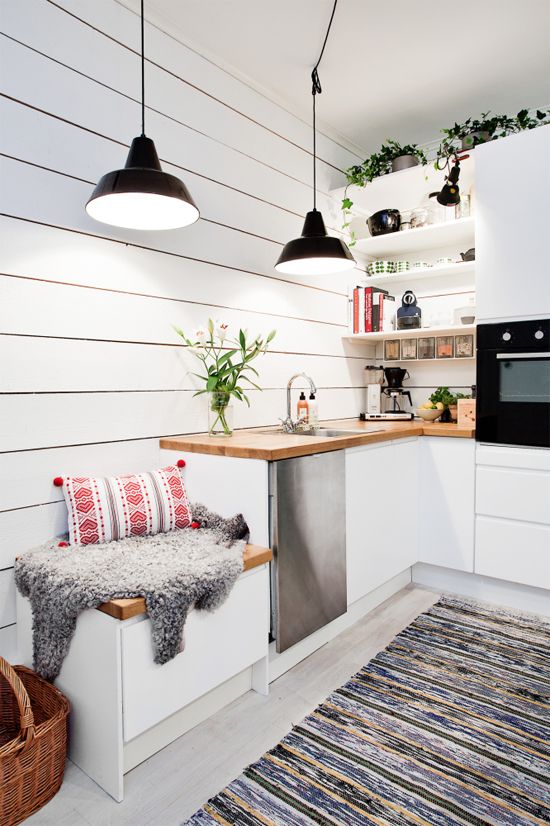
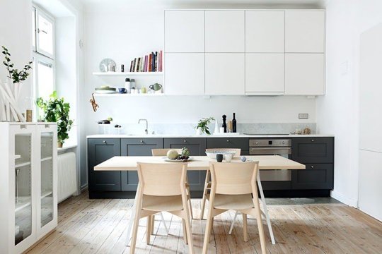
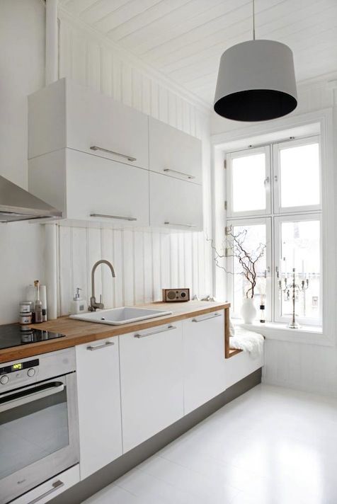
Love on the picture above the combination of natural oak and black, the oriental rug under the dining table looks absolutely amazing. In the following kitchen I liked the idea of arranging a small seat where the cabinets end, I still have that empty corner with unused space so this might be a really good option for utilizing it :
This kitchen looks so minimalistic but at the same time cozy. I think it is because of the books on shelves and natural plants:
Again that little seat at the end of the cabinets! :
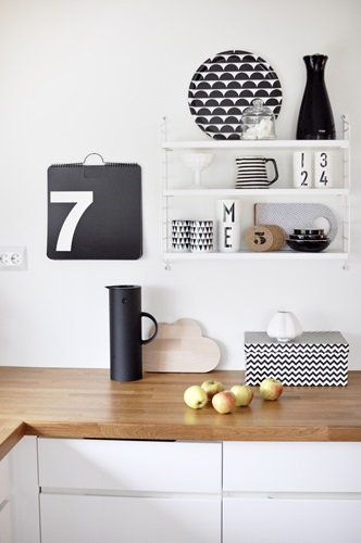
Love how black and white plates and cups are displayed on these shelves:
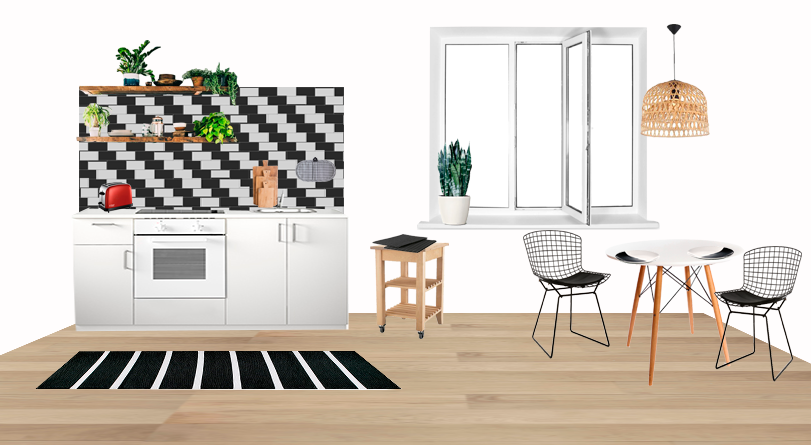
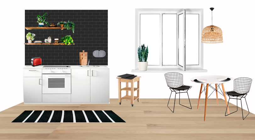
So I finally was ready to put together my scheme for the clients. I prepared three options: with white backsplash, black and black & white for them to choose. Which one you think is the best?
If you like my concepts, you might be interested to check my e-design services.

