How To Design a Living Room Using Live Home 3D
Living room is usually a place in a house, which you want to make the most attractive and welcoming. In this post I want to share with you some important planning principles, which you need to consider on your initial stage of designing – making a floor plan.
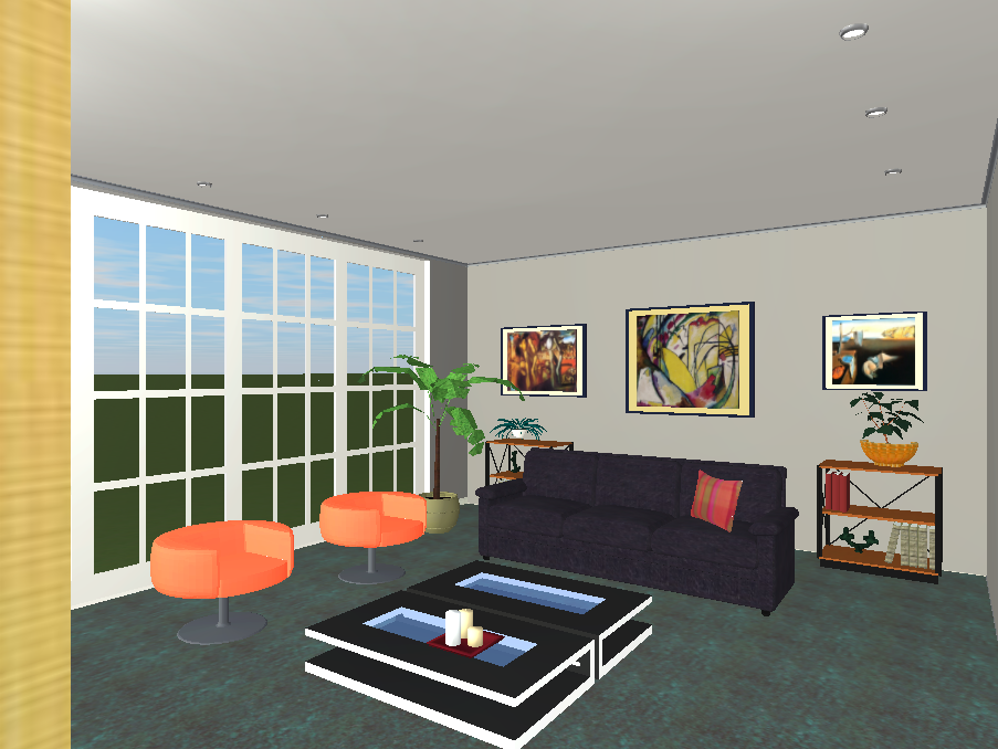
To illustrate them I have made several visualizations using Live Home 3D – I really love this software, especially when I need to draw a layout really quickly and also instantly to preview how it works in a 3D mode. Full review about this program you may read in this post.
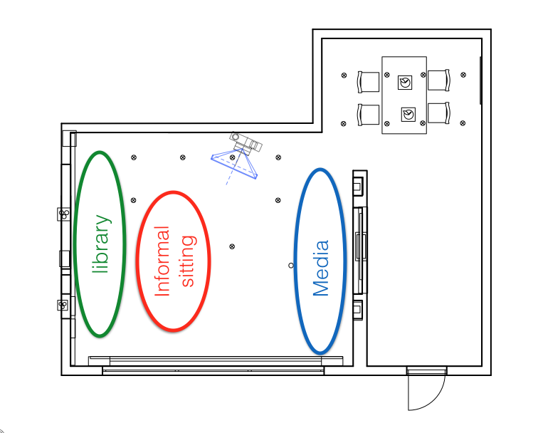
- Zoning. When you begin to plan a room layout, first of all think about various functions within it: e.g. watching tv, informal sitting, library, storage.
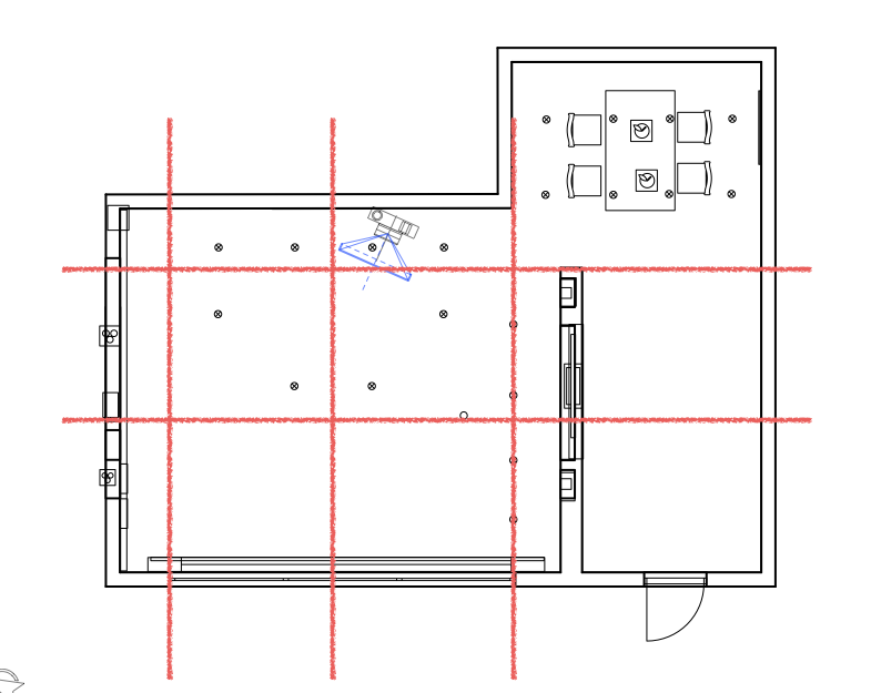
2. Use Architectural grid. AG is a series of imaginary lines highlighting architectural aspects of the room, e.g. windows, wall breaks, extrusions, middle of the room. By placing furniture in line with this features you will make layout more balanced and pleasing to an eye.
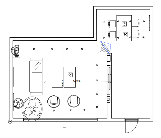
3. Focal Points. Focal point is something what you eye focuses on because it stands out from other objects around it. Definitely, when you enter the room, you want your eye to focus on an attractive feature, such as a beautiful sofa or a fireplace, and definitely not the back of a chair. If you are planning to place a TV in your living room, it naturally becomes a focal point and all other furniture will be placed around it. When allocating TV, remember not to place it facing the window or very close to it, as entering light will reflect on the screen. When deciding on the distance between sofa and TV, as well as the size of the screen you need to buy, remember that simple rule: Distance between Sofa and TV should be equal 3-5 screen diagonals. Also consider the overall dimensions: in a tiny place huge TV will look awkward. In Live Interior 3D I used Measurement tool, located on the top toolbar to quickly check that distance.
4. Correct the shape of the room using furniture.
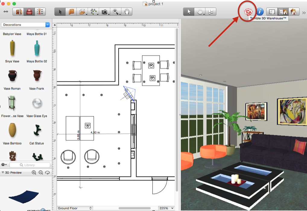
Square shape of the room is the easiest to work with in terms of layout. If the space you design is long and narrow, you can adjust it using shelves and bookcases. Another trick is to divide such space into zones using podium or room dividers. Don’t make the room look too cluttered: according to ergonomics, 50% of the space in a living room should be free of furniture. Live Home 3D created by Belight Software has an extensive library of furniture, to try different options and to see, which one will work best. Also it is linked with Trimble 3D Warehouse and you can download any model directly on your plan. For example, the chairs that I have used were part of software library, while two coffee tables were imported from 3D Warehouse (red box icon on the top right).
5. Space between furniture pieces and traffic flow. When allocating your furniture, remember that the comfortable distance between pieces should be between 30 to 100 cm. There should be adequate circulation space around and in between pieces of furniture. In any situation where paths may potentially cross, it is important to ensure that there will not be a conflict – try to avoid traffic clashing, especially in a living room, where lots of people will use the space.
6. Explore possibilities. When creating a floor plan, make at least three different solutions, so that you don’t necessarily opt for the most obvious choice – try to exhaust the possibilities as you may come up with something more interesting.
7. Heights. It can be easy to forget about the third dimension (height) when working on a layout. Always refer back to the heights of the space – luckily the software that I used allowed me to quickly preview how selected items looked in a third dimension too.

