Colour Trends Forecast For 2015
Haymes, the leading Australian paint manufacturer, has just announced the colour trends forecast for 2015. Three main directions were identified for the upcoming year:
- the neutral series
- bolds and brights
- whites and neutrals
Within these main tendencies Haymes prepared five examples of inspirational palettes which look like this:
Preparing trend forecast is not any easy task: you have to analyse needs and demands of the market, identify which palettes are not relevant to the future anymore and which are still big. Thus, in Haymes they have noticed that demand for neutrals has significantly increased, which explains that two of the identified trends go in this direction. As well as the use of bright and bold colours continues to be one of the popular interior trends.
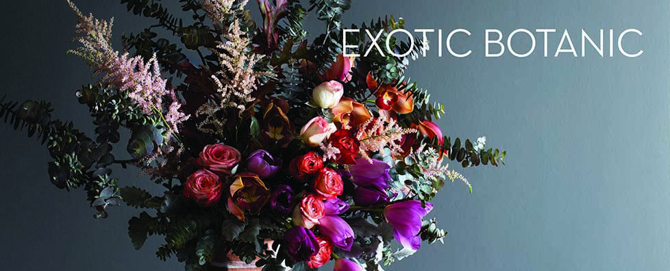
All of the created colour palettes are beautiful and so much inspirational. I start with my favourite one: “Exotic Botanic”
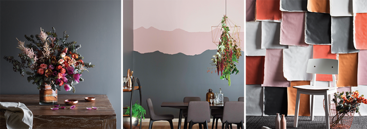
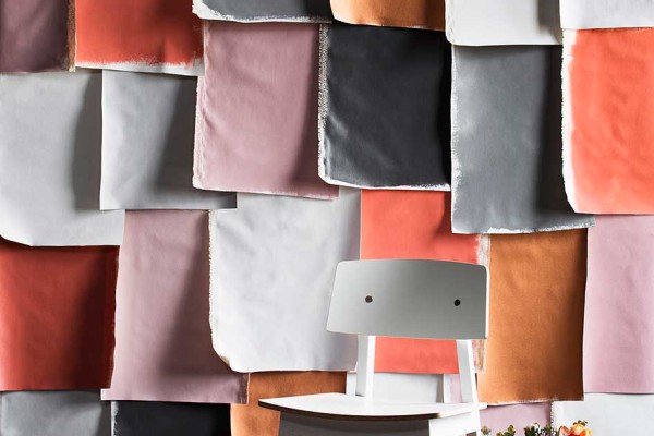
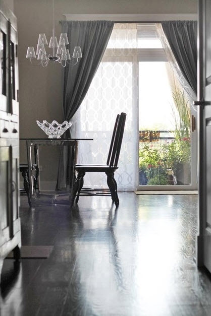
Combination of masculine greys and charcoals with saturated pinks, burnt oranges and ochre yellow creates a very soothing, relaxing feel. A perfect colour scheme for fall! As it is suggested by Haymes, neutrals are used as background and main theme, while reds and yellows are introduced as little accents. Classic scheme which will remain in trend for years.
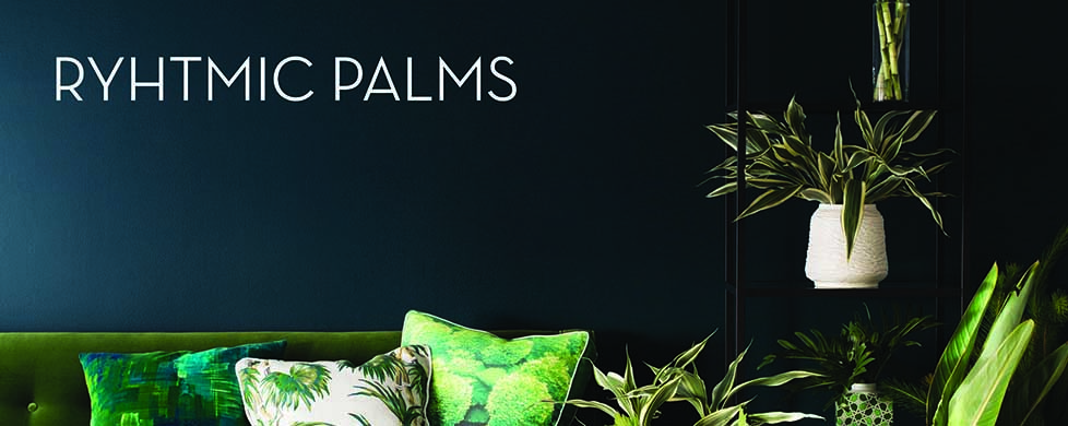
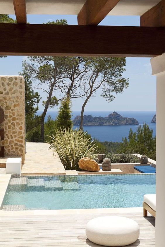
My next favourite palette is Rhythmic Palms – love its deep rich colours reminding me about freshness of tropical forest and spring waters in a hidden oasis. Perfect for decorating living rooms and bedrooms, it will help you to make a real statement in the home if you don’t like neutrals and wishy-washy.
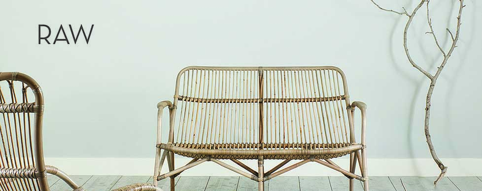
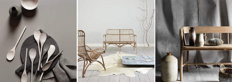
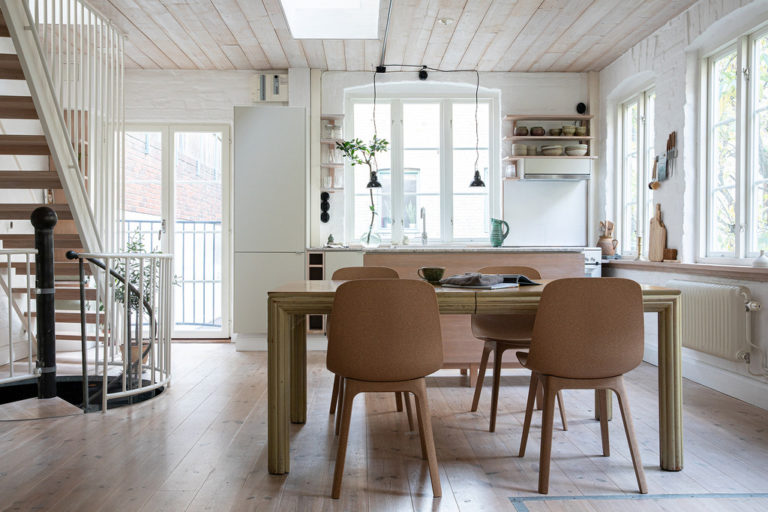
Minimalistic, Scandinavian style decor is still in trend, which explains the necessity in large variety of neutral and off-white tones. This colour palette creates a very clean, decluttered and fresh look. To add warmth and coziness use a lot of texture and layers, otherwise the space might have too “sterile” and empty look.
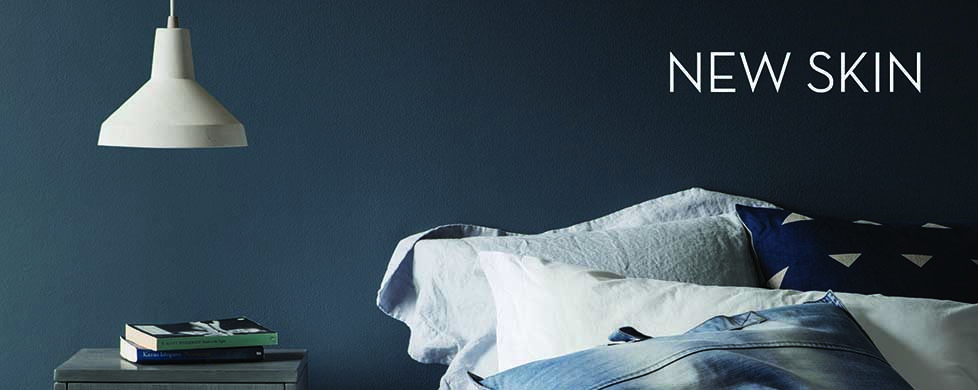
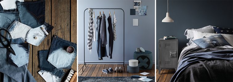
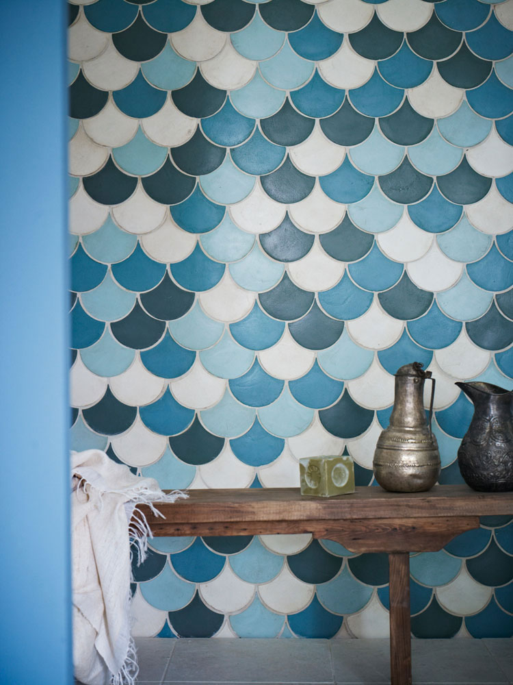
Blues, greys, mineral pastels form the basis of the “New skin” colour palette. Relaxed and cool scheme (probably too cool, if you ask me) provides a sense of tranquility and relaxation.
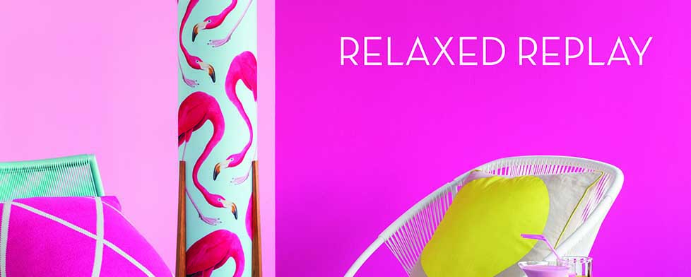
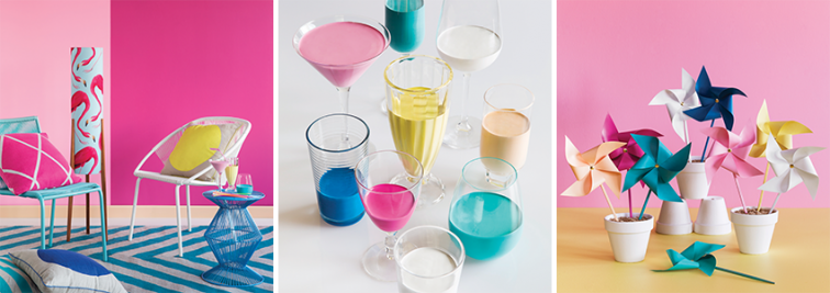
Finally the “Relaxed Replay” – vibrant, bold, radiant, uncompromising colour palette, which at the same time gives us a nostalgic feel. This theme celebrates the brighter side of life and it will look perfect in kids rooms, kitchens and dining.
What do you think of these colour trends? Which of the themes is your favourite? looking forward to hearing you comments!
© L’Essenziale Home Designs, 2014. Unauthorized use and/or duplication of this material without express and written permission from this blog’s author and/or owner is strictly prohibited. Excerpts and links may be used, provided that full and clear credit is given to Anna Kovalchenko and L’Essenziale Home Designs with appropriate and specific direction to the original content.

