7 Common Interior Design Mistakes
Every day I look through an incredible amount of home decorating magazines, websites, blogs. Sometimes I am amazed and thrilled. Sometimes interior design mistakes just shout on me from the screen and pages.
Those who ever did renovation by himself most probably faced a situation when the final result looked not quite the same as it was anticipated. I must say that nobody is safe from doing mistakes when it comes to decorating. Some are possible to correct, another are little and it is even possible to convert them into an interesting feature. In this article today, my list of common interior design mistakes, which is better to avoid.
1) HOUSE LIKE A CLINIC
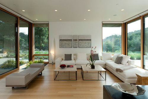
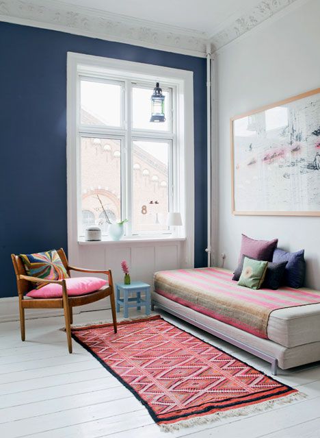
Some people are so much scared to use colour and accessories, as well as to show off their personality, that their homes look like a hotel room or a chamber in an expensive clinic: all neutral beige or sterile white. Of course, this approach to decorating is very safe – you rarely fail if choose all neutrals as they are very easy to mix and match. At the same time, the final result most probably will look very boring and too formal. I am not calling here to paint walls in striking red or glamorous black (though in some cases you can achieve amazing results by doing so), however through adding a little bit of colour (for example, by painting a feature wall), as well as texture and pattern (by throwing colourful rugs and pillows) you can drastically transform the space and make it look cozier and inviting.
3) HOUSE LIKE A PALACE
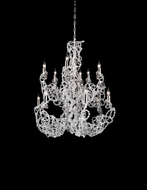
Recently in one of the magazines I’ve read a story about one Russian woman (one oligarch’s wife) who moved to Spain and settled in one of the villages for rich people. Here is how she described her first visits to her new neighbors: “These people have absolutely no idea about luxury. White painted walls, concrete floor and plain linen covers on sofas and chairs are parts of a usual interior here. When they visited our house and saw our golden toilet they fainted from surprise”. I can imagine what these people thought about the taste of this woman, however, the wrong perception about luxury is the common thing among nouveau riche. They just can’t imagine how the “status” dwelling should look like. Thence numerous columns, headboards in Louis XV style, gilded furniture, and Swarovski crystals are perceived by them as the epitome of luxury. They just don’t understand how kitschy and vulgar it might look like.
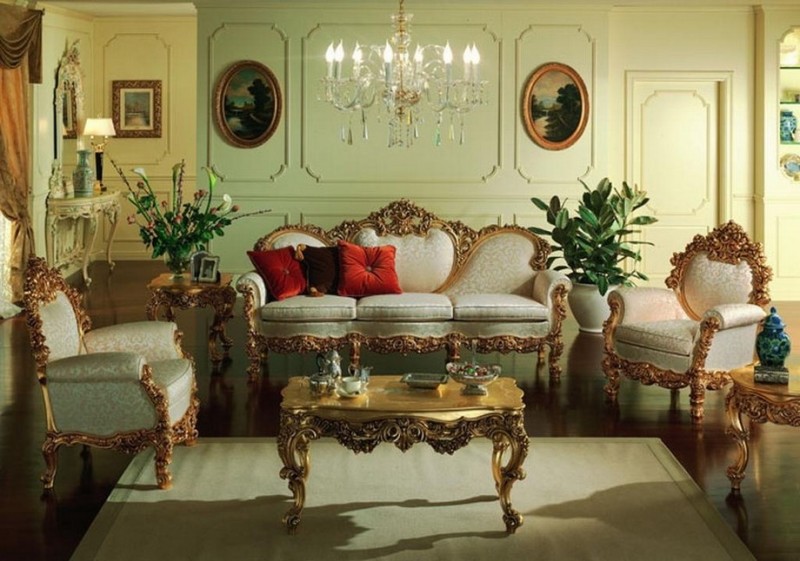
4) HOUSE LIKE A GARAGE SALE
One of the common madness today (the second after the ice-bucket challenge, perhaps) is called Doityourselfmania. It seems that almost every person strongly believes that if he is given a hammer and nails or a paint can he is able to convert an old backless stool into a unique design object. Unfortunately, not all of us are Martha Stewart and the old backless stool even painted in striking turquoise will look like an old backless stool. In the result – some homes are just over-cluttered with ” unique flea-market finds” and outcomes of recent makeover projects.
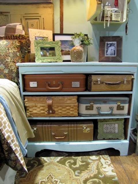
5) HOUSE LIKE A MODERN ART MUSEUM
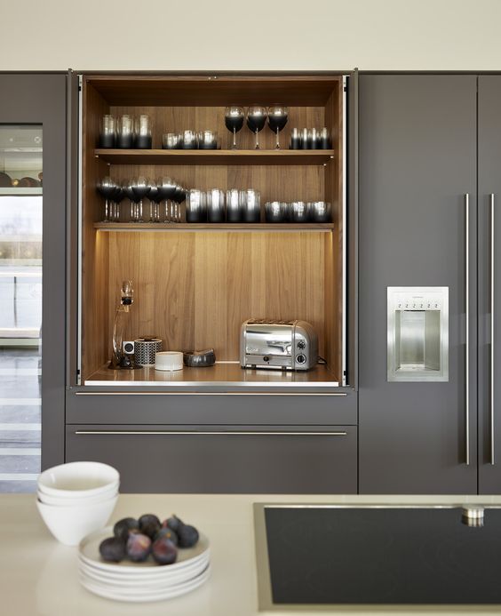
Sometimes you want to fill your house with bold and original solutions, such as a chair with an intricate shape or a sofa with an unusual mechanism. Unfortunately, often it happens that things that look nice, in fact, turn out to be quite uncomfortable.
This issue is the same for art, which is often so distinctive and self-sufficient, that simply can not be combined with other home furnishings. Modern artworks might look great in a gallery or museum but will be completely out of space at home. Big picture or a composition of several paintings or sculptures require a large space to be fit in. Be very careful with such purchases, which are undoubtedly beautiful and worthy of attention, but only fit into an interior in the same style.
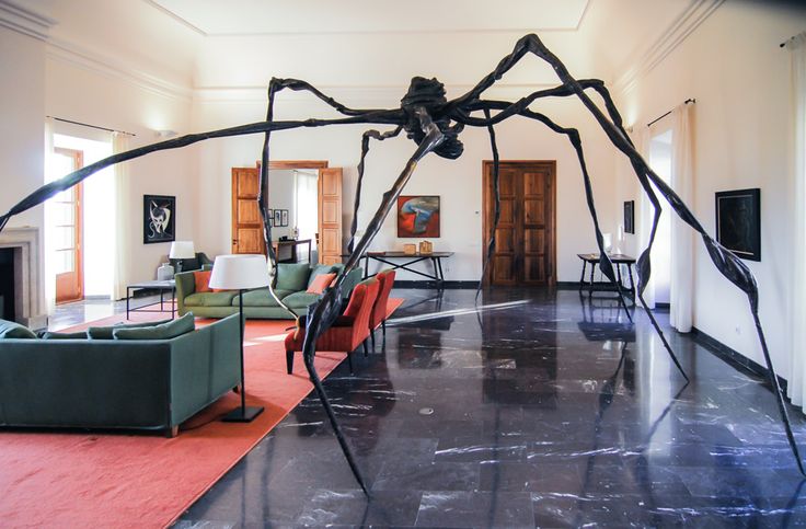
6) HOUSE LIKE A LABYRINTH MINOTAUR
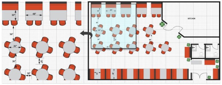
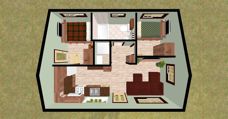
Wrong planning is another common interior design mistake. Very often, because of the limited size of the space, we create additional little rooms – pantries, nurseries, working areas. An apartment which was supposed to be a spacious studio turns into a kind of labyrinth with complicated planning and lots of hidden corners. The right solution for small apartments will be not building extra walls, but clever zoning with removable dividers and screens, rugs, different flooring, and paint.
What other common interior design mistakes you can mention? Please share in the comments below!

