Tour Armonia Yoga Studio In Thessaloniki, Greece
Today Sandra Korka, owner of Square Design Interiors gives L’Essenziale an exclusive talk at what it takes to make a beautiful Yoga studio a reality. Here is what she says about this wonderful project:
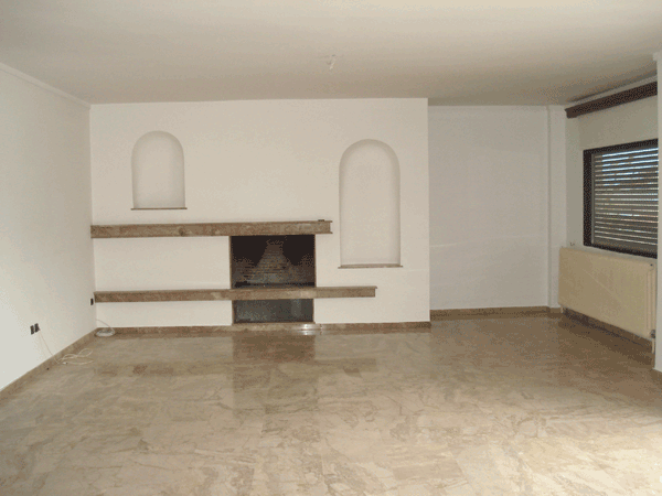
“I knew nothing about Yoga when the owner of the “Armonia Yoga Studio”, approached me to discuss the relocation of her already established yoga studio. There were definitely certain key points to be considered, other than the difference between the form of the old and the new space – the existing space at the time was a ground floor studio, visible to anyone, even passers-by, while the new space was a quite spacious apartment.
So, my first discussion with Vaya was more like an introduction to certain yoga principles and the way they had been running at the old space. Regardless of the nature of the space I have to design, I always need to know the users habits, requirements, needs, if they need to change (and to what extend) certain issues about the way things are run and so on. In order to do this effectively, I visited the old space a couple of times and we discussed advantages and disadvantages of using that particular space and how these could be interpreted into the design development of the new space.
I believe that design is connected to everything around us, as through that solutions are given to certain issues of everyday life. Designing a space does not have to do only with aesthetics. A precedent and fundamental stage is that of functionality. And in order to propose a functional solution, a designer should be able to understand their client and their needs. To me, the aesthetics complement the design solution and should reflect the personality of the end users.
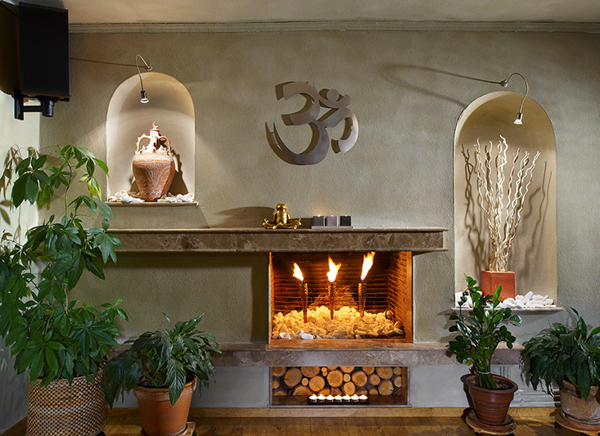
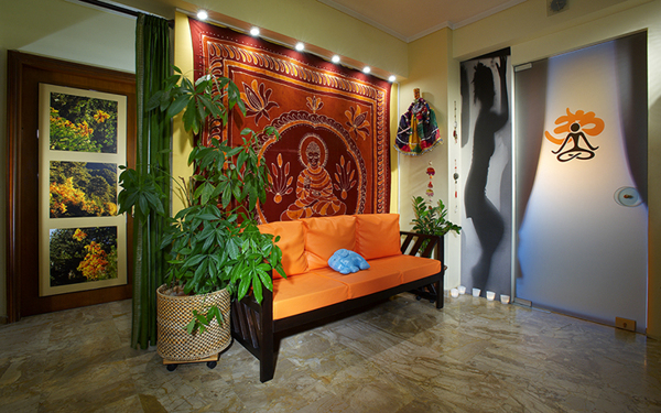
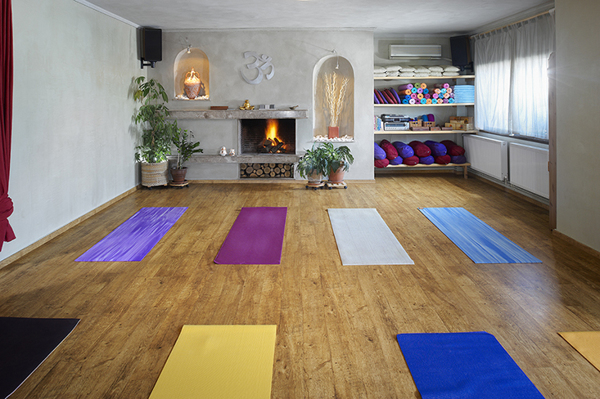
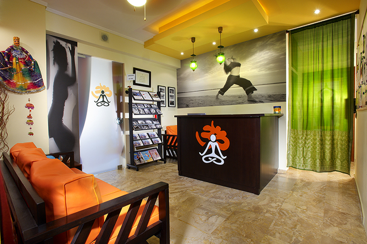
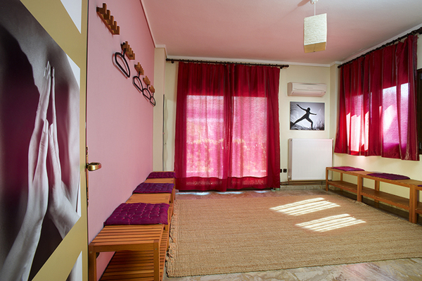
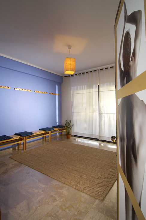
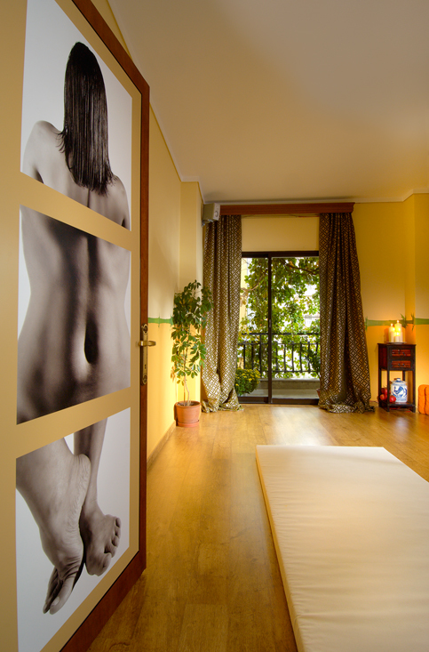
Moving on with the design scheme to be applied to the new space of the studio, all materials, colors and textures were proposed and eventually chosen according to the owners’ (professional) personalities and the way I understood their vision could be reflected through their professional space. The space should allow visitors and teachers to feel relaxed in order to practice yoga effectively and benefit the most, both physically and spiritually. To achieve that, warm coloured wood was matched with neutral colours and carefully selected objects (lighting, accessories, decorative objects). The overall mood was completed by the professional photography of Andreas, as a wonderful series of black and white images were selected to offer an additional feeling of aesthetics and practical signage at the same time.
Two facts I love about my job: I eventually get to be friends with my clients and this is wonderful as it results to a continuous personal and professional relationship and I receive direct feedback on my work and design approach by the end users of the spaces I create and this is the most valuable factor to improve oneself both personally and professionally!”

