Been There, Done That… or 11 Most Hackneyed Design Trends
Have you ever been to an interior space that was so extraordinary and astonishing that took your breath away? Have you ever thought what makes it like that? Most probably a person who decorated it, has tried some totally fresh design ideas, never used before, whether it was the colour combo, furniture, accessories or unusual wall decor.
And now imagine a totally different picture: the trivial colour palette (usually neutrals or pastels), ordinary furniture, design ideas that you have seen a thousand of times. Sad, no? Yet, some designers continue walk the beaten path, scared to be different, innovative, forgetting that this is the reason the client actually hires them (otherwise he could do everything himself, getting ideas from numerous design magazines).
Thinking about this, I created my list of the most clichéd design ideas, which we continue to see every day.
Here is my Golden Raspberry Interior Design Awards:
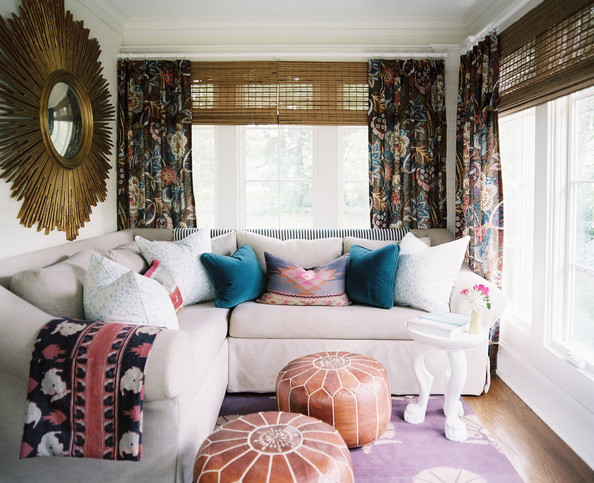
1) Sunburst Mirrors
And the winner is……….. the sunburst mirrors!!! Don’t get me wrong, personally I love them, they are great, they make the statement and they look chic. But I have a great suspicion that I am not the only one, who thinks like that. This is without any doubt the champion, which you can find (I promise) in EVERY home decor magazine. When I see it in the room that I visit, I usually think : ” Oh no, again??!”. You can say that this is iconic design, which has been in place forever. But when iconic is everywhere, don’t you think it’s just boring?
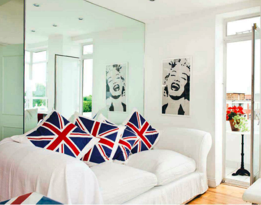
2) Marilyn Monroe Posters
Andy Warhol was a really talented guy and his contribution to the development of pop-art was absolutely undeniable. When I saw for the first time his version of Marilyn Monroe photography, I thought: “Brilliant”. Following Andy Warhol there were thousands other interpretations of the diva’s portraits, so you will be definitely not original when decide to put it on the wall:
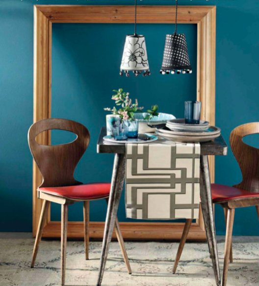
3) Empty Frames
Someone clever thought: “why to invest in the picture, if the frame itself looks pretty well?”. This person was smart and the idea probably seemed new and fresh at that time, but… not anymore. I saw them painted hot pink and blue and yellow, I saw them made from reclaimed wood, I saw them artificially aged and, to be honest, don’t want to see them anymore:
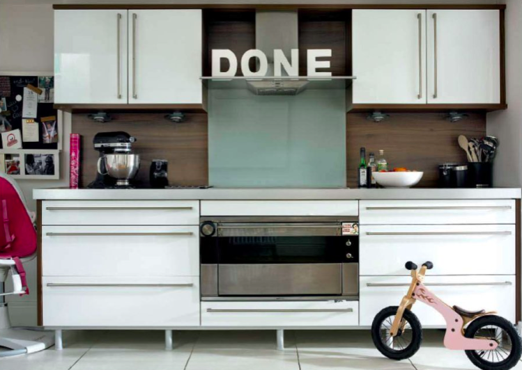
4) Decorative Letters
Home… Love… Sweet… Eat… Laugh… Drink… and so on, – trust me, whatever combination of decorative letters you will put, it will not seem like fresh idea:
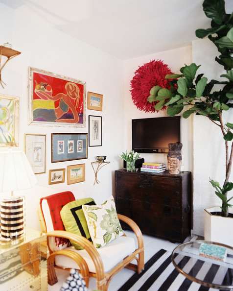
5) Juju Hats
African hats from Cameroon made a big fuss in Interior Design world several years ago and I can understand why: they look unusual, they come in a variety of colours, they are inexpensive and you even can do them yourself. Today, I strongly recommend you to search for alternative accessories, if you want to add some exotic feel to your room:
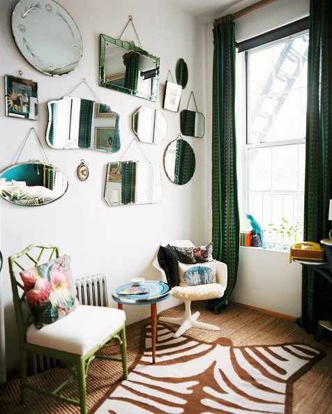
6) Mirrors, Mirrors
Cover your wall with differently sized and shaped mirrors, from the different epochs and styles and become number 100000 after those who did it before you:
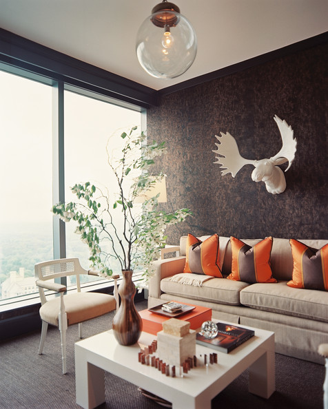
7) Faux Trophy Heads
Though generally I love the idea of not putting the real trophy heads on the walls, but again, this trend is already moth-eaten:
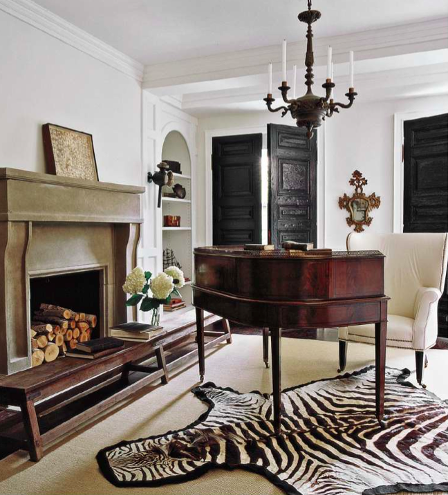
8) Afromania
Zebra rug on the floor, leopard cushions on the sofa and zoomed picture of elephant on the wall – welcome cliche # 8!
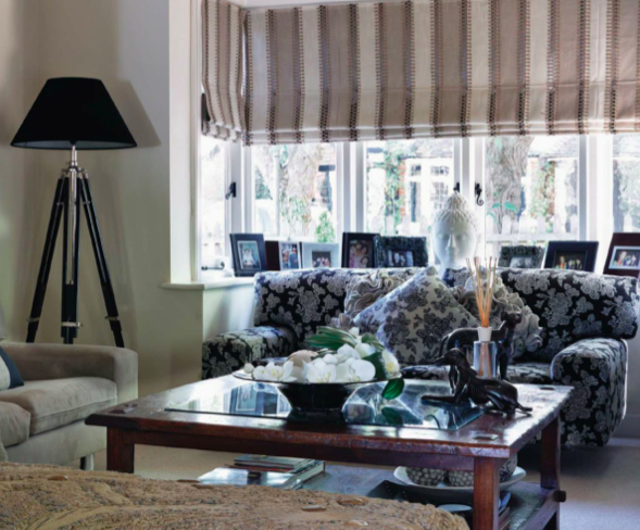
9) Buddha Head
We think Asia, comes in mind Buddha – and we have a wonderful example of stereotyped thinking. Trust me, if you want to bring some Asian feel to your house, there are plenty of other wonderful artisanal pieces of furniture and accessories you can find. So no need to involve Buddha, needless to say that for millions of people it is the primary figure in their religion, and not just part of home decor:
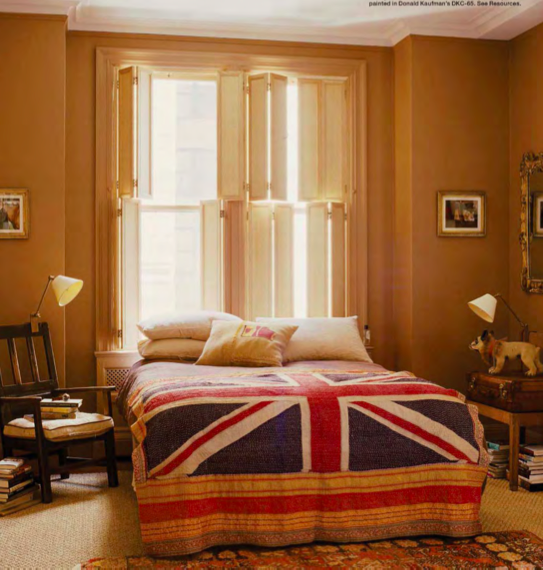
10) The Union Jack
Now I am at the risk of being thrown by rotten tomatoes as I dare to encroach upon the national flag of the United Kingdom. However, truth is truth: the Union Jack today is one of the most overworked design trends:
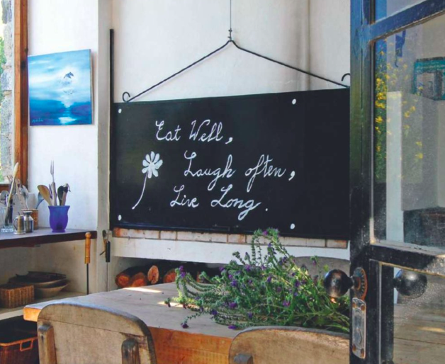
11) Chalkboards
I am finishing my list with chalkboards, which were transformed from the classroom attribute to wall decor and then been used as such many, many times:
In the conclusion I want to say, that all ideas in this post were innovative and fresh once upon a time. Then people used them again, and again, and again… My opinion: it is better to create your own ideas, maybe not so cool and talented, than to use someone’s else and be among million of people who has also tried them.
So, tell me what do you think – are these ideas still trendy and you want to use them or, like me, you want to give them a little break?
What other design trends you are tired of seeing? Looking forward for your comments!
Related articles
- 14 Cool Wall Art Ideas (essenziale-hd.com)
- Take This Dress Out Of Your Wardrobe! Or Clothes On Display… (essenziale-hd.com)

