Finding the Perfect Colour Schemes for Your Home in 6 Easy Steps
Whether you’re building a new home or giving your old one a refresh, nothing is as personal as the choice of colour you use. Pick a colour! Any colour! Sounds easy right? Unfortunately it’s not that simple – but there are some tools and tricks that can help you along the way.
For many, choosing the right colour palette can be the most exciting decorating task and also the most daunting. You want to consider a range of tints that best reflects your personality and lifestyle. Finding the perfect colour scheme for your home isn’t just about the paint on the walls – it’s everything, from the bold shades in your cushions, to the simple tints in your furniture right through to that striking feature wall. How will you make your choice? Check out these hot tips to get you started and start colouring your world today.
1. Start with the Formal Areas of Your Home
Finding where to start can get a little overwhelming, especially with the painting side of things. The ‘busy’ areas in your home, like the dining room, front entry and central living room tend to be the most important colour schemes so decide on these first. Once you have chosen the palette for this, you can pull one colour from each scheme to accent the more private spaces. For example, if you have incorporated a vibrant red into the living room, tone it down to a burgundy for the bedroom.
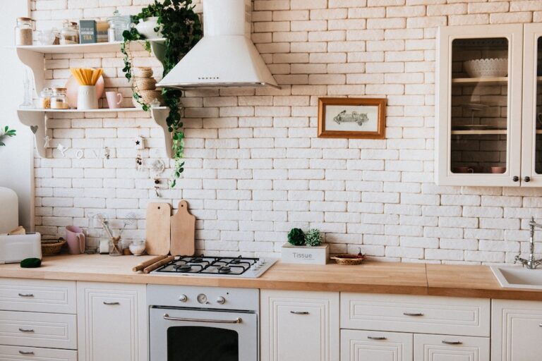
Because the cost of paint is relatively inexpensive, it’s ideal to start with the bigger items first like your furniture and rugs. This will give you a good starting point on the colours you want to incorporate for the walls. For example, if you have upholstery with boldly-coloured patterns or a large piece of artwork, choose a colour scheme from that to use for the space. Consider the use of the room too and how this will reflect your colour choice. Morning rooms tend to look much better brighter, whereas rooms that are used primarily at night can work with darker colours.
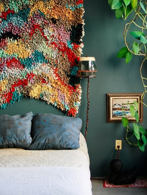
2. Colours You Love vs. Colour Personality
It seems like a very obvious thing to say – pick colours you love – but you’d be surprised how many people opt for whatever is trending. According to Andrew Loader, Managing Director at Andrew Loader Design, colour means different things to different people. “I do think people are drawn to certain colours based on their own personality type”, he says. “Knowing the colours you are most comfortable with, and which ones make you feel the happiest and most uplifted are essential to developing the right colour scheme for your home – irrespective of what current colour trends may be dictating”.
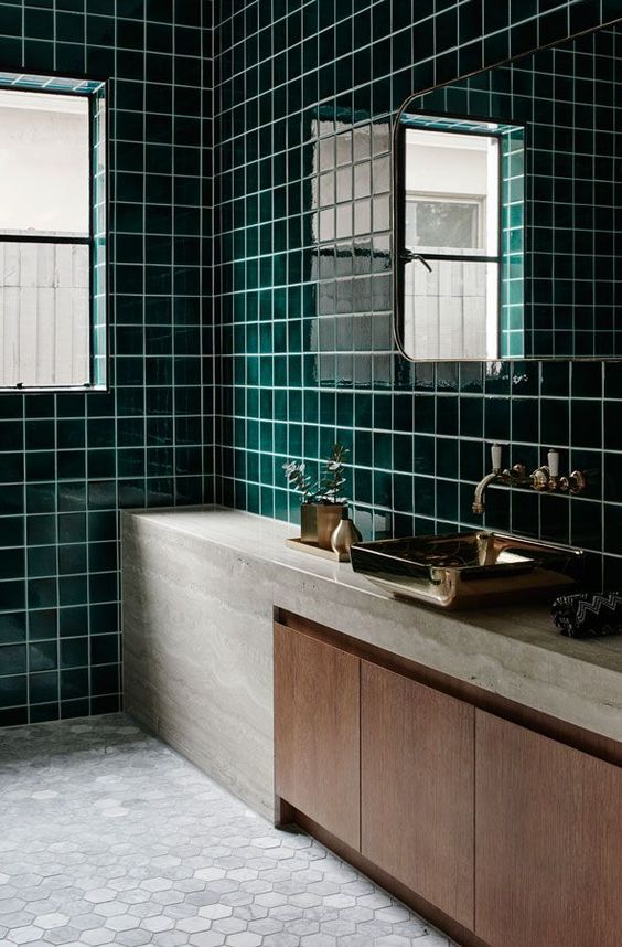
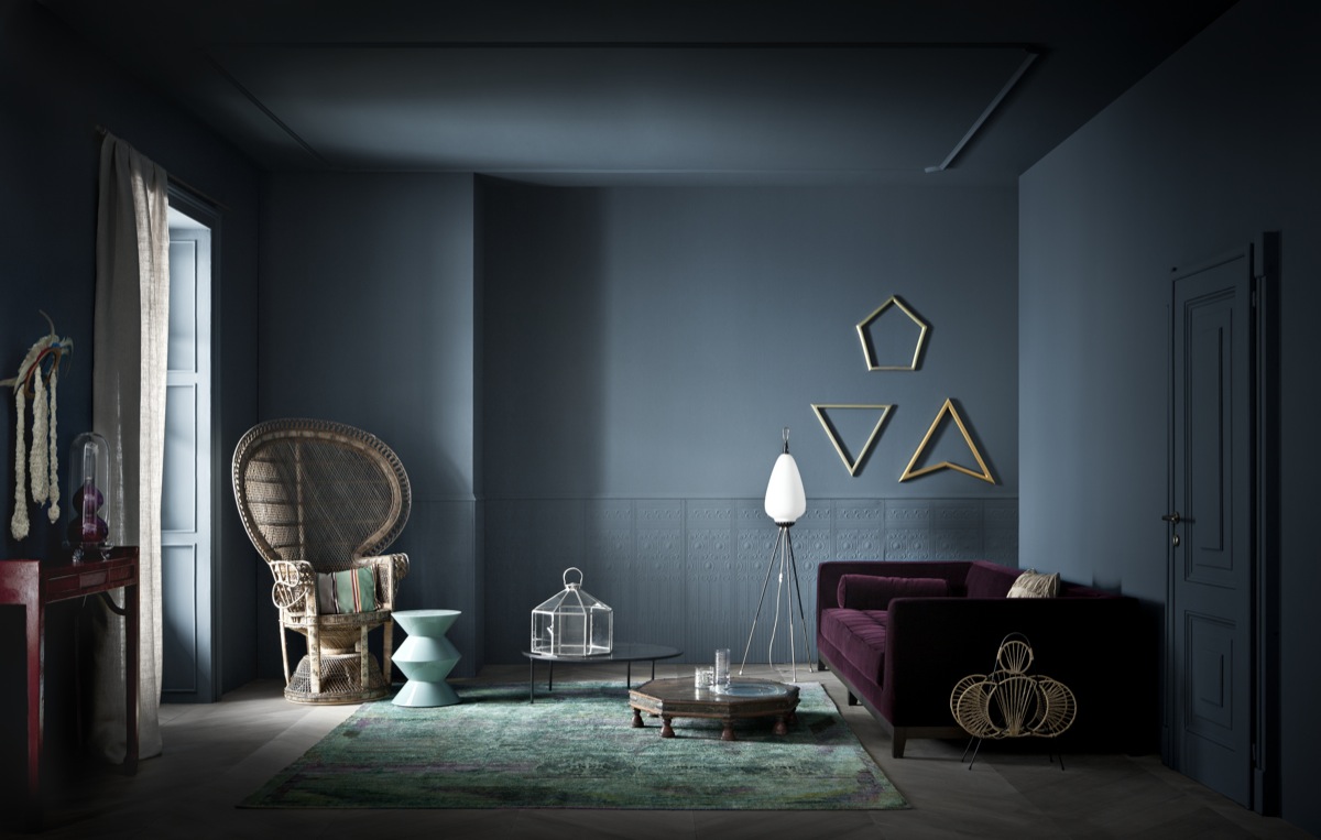
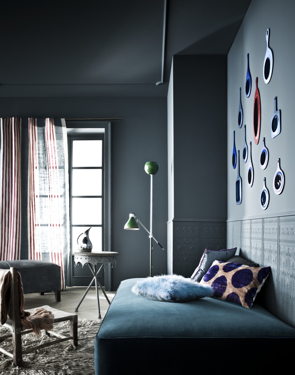
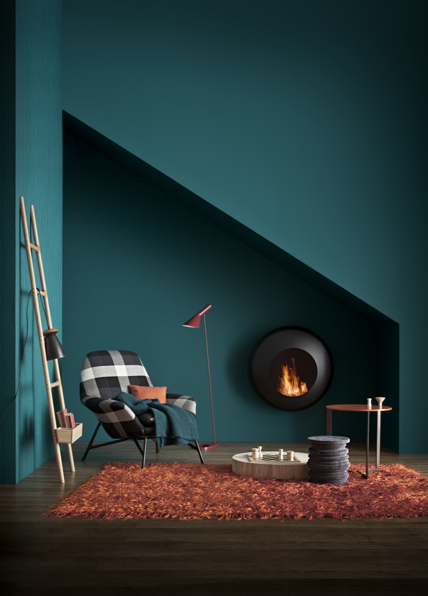
But it’s not just your own personality that’s reflected through your colour choice, but how the colour’s persona shines too. Warm shades like oranges, yellows and reds will give off an energising lively effect, whereas ocean colours like greys and blues promote soothing and calmness so consider the overall mood you want to create in each room too.
3. Time and Place Matters
Lighting plays a huge role when it comes to your colour scheme choices and should never be overlooked. You’ll need to play around with the colours at different times of the day – both morning and night – to understand the variations. You may have found the perfect shade of blue, but it can look like a completely different colour throughout the day. Make sure you put the colour swatches near your furniture too as this can make the tint appear different.
“There are practical issues like the orientation of the space, the amount of natural light it receives and how this will impact on a colour”, explains Loader. “Artificial light can be manipulated to enhance the colour in the evening too so keep this in mind. A colour that looks great in a bright sunlit room can look the reverse in a dull space. At the same time, a colour that looks great in the day can have the reverse effect in the evening if the artificial light isn’t properly considered.”
4. Flow Colours from Room to Room
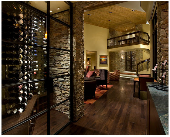
When it comes to any form of interior design and decorating in the home, it’s important a flow is established from room to room. Bring two or three of the same colours and add them into each space to create an interconnected look between rooms. This helps to create a pleasing flow when design elements are carried through. For example, if you have used bright yellows for a feature wall in the living room, use yellow bed linen or throw cushions in the main room.
Whilst you want a smooth continuity throughout the home though, the colour schemes in two-storey homes can be different by separating the upstairs from the downstairs. In single-storey homes or open plan living however, you’ll want to tap into the basic elements of design – colour, light, texture, pattern and balance. “Create a base scheme for the whole home and bring in contrasting accent colours through blocking”, says Loader. The key is to look at the big picture and how everything will fit together.
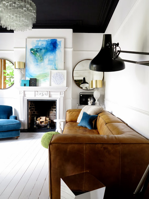
5. A Bold Statement vs. Comfortable
Some homeowners are more comfortable painting their walls with a paler, more neutral colour. If you don’t feel daring enough to make a bold statement with colour on the walls, then look to your furnishings, rugs, curtains, paintings and accessories for diversity. If you do want to make a bold statement on the walls, save for it for rooms that are a little smaller – like a second bathroom or guest room. For larger rooms opt for a feature wall.
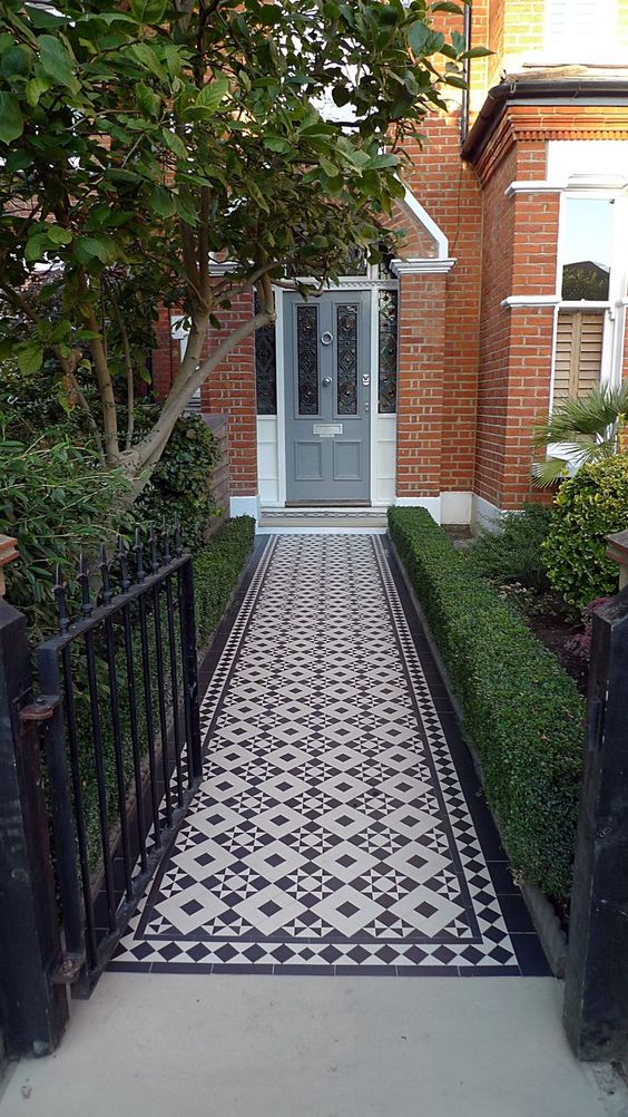
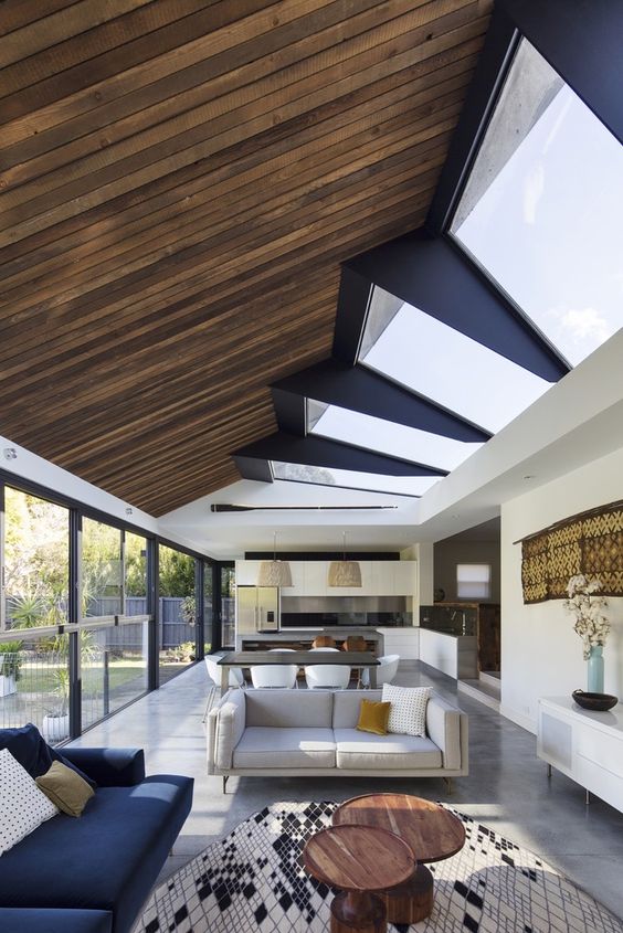
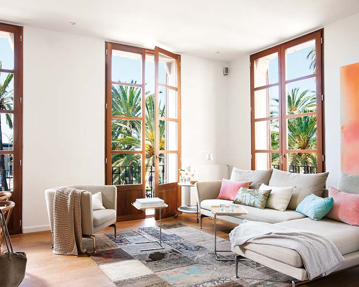
6. Merging the Indoors with Outdoors
This is no new trend, with homeowners wanting to blur the line between indoor and outdoor living in everyday designs. It tends to be popular in creating an entertaining space that can be used all year round, but what about with other elements like colour and texture?
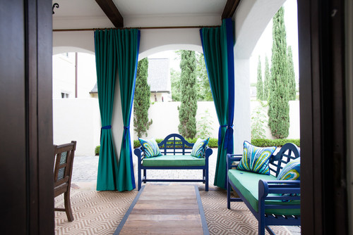
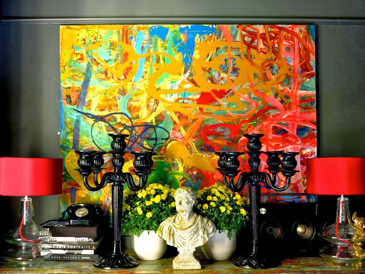
Incorporating the basics of nature inside the home can add warmth to a space and effectively merge the two worlds together. “We love to bring elements of the outdoors inside in our designs and often ask our clients to tell us what inspires them the most in the colours they can see through their windows”, Loader confirms. Not only does it help you to create your own colour scheme, but it blurs this line that’s usually so defined between the two spaces. “Another tip is to look at your favourite piece of art and draw inspiration from the colours on that piece to develop a unique scheme.”
Author Bio
This article is written by Jayde Ferguson